Normally my videos are geared towards the intermediate level user in Tableau but in this post I want to share a video I recorded that tackles basic functions in Tableau that you should know. You will NOT be effective analyzing data in Tableau if you do not have a basic understanding of these functions.
I love to use data from basketball-reference.com in my videos. Specifically you can grab the player statistics I am using in the video here.
This video is so good, it received a mention in the Monthly Tableau roundup. See for yourself!
Also, here is a link to all of the Tableau functions from the knowledge base.
Please make sure to share this link with a new Tableau user in your circle and let me know what you think of the videos in the YouTube comment section.
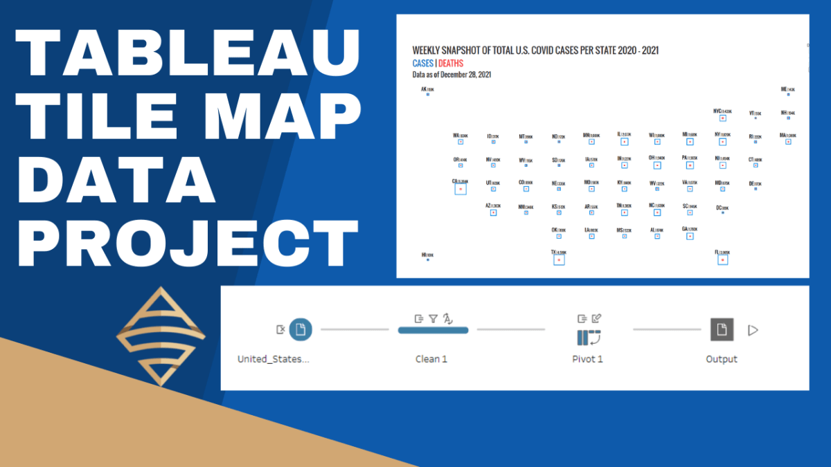
I was recently inspired by some really great tile-maps that have been created in the Tableau community (e.g., see beautiful work by Chimdi Nwosu and Michael Dunphy). Thus, you know I had to come up with a way to construct a simplified map in this style with some data and share with my followers. In these two videos, I’m going to walk you through how to prepare the necessary data file in Tableau Prep Builder and then we’ll build out the tile-map in the second video, step by step.
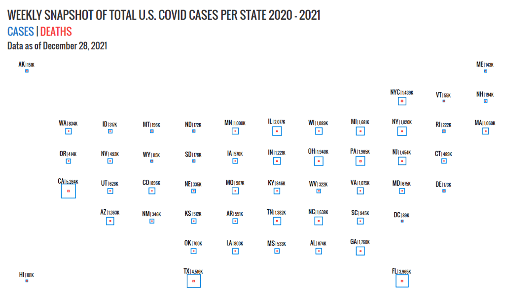
This is a good intermediate level portfolio project for you to follow along with in order to increase your Tableau Desktop and Tableau Prep skills. We’ll use CDC data, specifically United States COVID-19 Cases and Deaths by State over Time, to build the tile-map.
The advantage of a tile-map is that it represents geographic regions (like states) at equal sizes. Thus, the distortions and biases introduced by differences in sizes are eliminated. In the case of the United States, data for smaller regions like Washington D.C. can be interpreted on equal footing with data for a much larger region like California.
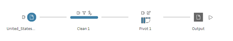
Tableau Prep Builder helps to greatly simply the data shaping process. My only wish is that Tableau would integrate Prep into Tableau Desktop for one seamless data tool to rule them all, but I digress. The process below illustrates how simple it is take some data from an input file, and subsequently clean and pivot the data into a new file. Watch the first video, to learn how to build out this simple flow in Tableau Prep. If you do not have a copy of Tableau Prep, you can complete this lesson on a 14 day trial license of the tool, which you can download here.
Watch the second video for the step by step instructions to build out the tile-map above.
In this video I will teach you how to perform a multiple keyword search in Tableau. I’ll show you how to perform both an OR search & an AND search against keywords you type into your dashboard parameter.
In order to accomplish these tasks, we need to use regular expressions. As I mention in the video, regular expressions can be indecipherable, akin to hieroglyphics or something out of a Dan Brown novel to the average person. You can go find this information on the Tableau knowledge base, but I want you to be the person that understands WHY something works as opposed to just copying and pasting a solution that you cannot explain to yourself or others.
The use case for multiple keyword search is for those times when you need to filter your data by a comment, description or other free form blocks of text that are not necessarily subject to the most stringent data governance rules, because let’s face it, these types of fields exist in abundance. In the video I create a dashboard that illustrates the power that this type of search can bring to your dashboard.
You can interact with the dashboard from the video on my Tableau Public page.
OR SEARCH
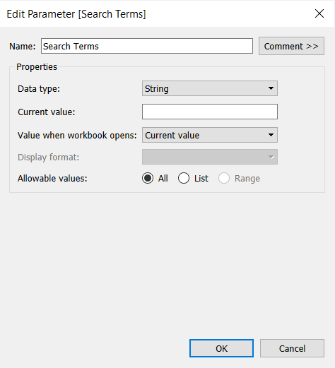
1. CREATE PARAMETER
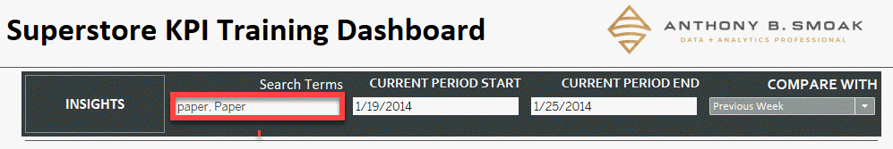
Create a parameter named Search Terms.
Data type: String
Current value: keep it blank.
Allowable values: All
2. CREATE CALCULATED FIELD 1
Create a calculated field named Regex String (OR) including the following formula:
"(" + REPLACE([Search Terms], ',' ,'|') + ")"
Let’s breakdown what is going on with the apparent gibberish seen above (there is a method to the madness here). I’ll assume you want to perform a search against a field that contains the terms “paper” OR “Paper”; the case of the spelling is a factor in the results (case sensitive). To adhere to proper regex formatting, you could write a valid expression as such:
(paper|Paper)
This pattern indicates that you want to return a match on the characters “paper” OR “Paper” literally. You can test this out at https://regex101.com/
Although for some reason the official Tableau knowledge base article says to use the REGEX_REPLACE formula in lieu of REGEX, it is not needed since we are doing a simple replace and not using a regex formula to aid our replacements.
In the Tableau calculated field above, we are using the REPLACE function against the parameter named “[Search Terms]” to replace every instance of a comma with the the ‘|’ pipe symbol.
Think about it, if you type the terms “paper, Paper” into the a dashboard’s search term parameter as seen below, the calculated field will reformat your list into the proper regex format by replacing the comma with a pipe and then enclosing the term within parenthesis; i.e., (paper|Paper).
3. CREATE CALCULATED FIELD 2
Next create a calculated field named Regex OR Filter that contains the following formula:
REGEXP_MATCH([Product Name],[Regex String (OR)])
Let’s breakdown what is going on with the formula seen above. The REGEXP_MATCH formula is evaluating a properly formatted regex expression which is contained within the [Regex String (OR)] calculated field we created in step 2. This calculated field will contain the formatted expression (paper|Paper).
REGEXP_MATCH returns TRUE if a substring of the specified string matches the regex pattern. In our case
[Regex String (OR)] = (paper|Paper)
Thus the REGEXP_MATCH function will evaluate the regex expression (paper|Paper) from the second argument against the [Product Name] field in the first argument. The function will return either TRUE or FALSE depending upon whether a match is located within this field.
3. DRAG FIELDS TO ROWS AND FILTERS SHELF
Place [Product Name] to rows and [Regex OR Filter] to filters, then select True.
AND SEARCH
In order to create the AND search for your dashboard, you will follow very similar steps to the OR search. 1. Create the same parameter named Search Terms as in the OR Search above.
2. CREATE CALCULATED FIELD 1
Next create a calculated field named Regex AND Filter including the following formula:
This may look like something out of a Dan Brown novel, but don’t let it intimidate you. In a similar fashion to the OR search where we replaced commas with a pipe symbol, we are simply replacing commas with the following characters between the double quotes “)(?=.*”
The proper regex pattern to indicate an AND search against the terms paper and Paper within a body of text would be as such:
(?=.paper)(?=.Paper).*
Knowing the proper regex format should make the contents of the calculated field above more clear. We are using the REPLACE function against the parameter named [Search Terms] to replace every instance of a comma with the the “)(?=.*” symbols. Thus “Paper, paper” values typed into the [Search Terms] parameter becomes reformatted into(?=.paper)(?=.Paper).*
Placing .* at the end of the string means that any combination of characters can be placed after the search terms and still yield a TRUE result.
3. CREATE CALCULATED FIELD 2
Next create a calculated field named Regex AND Filter including the following formula:
REGEXP_MATCH([Product Name],[Regex String (AND)])
4.DRAG FIELDS TO ROWS AND FILTERS SHELF
Then place [Product Name] to rows and [Regex OR Filter] to filters, then select True.
CONCLUSION
That wasn’t so horrible was it? If you’re a visual learner like me, then go ahead and watch the video to hammer home the concepts. Hopefully this post will help you understand how these regex patterns work and how they can add value to your next dashboard design! As always if you learned something drop a comment on the YouTube video and let me know.
I was very honored to be selected as a Tableau Ambassador for the second time in 2021. If you follow this link, you’ll see me Anthony Smoak, suited up in the Tableau Public Ambassadors section. I started this blog and YouTube channel as a means to share what I know and what I learn and will continue to do so. The fact that I gain some recognition from Tableau or anyone else is secondary, but I will say it does feel good to be acknowledged by the wider Tableau community for all the off-hours and weekend work it takes to produce stellar content.
I don’t share 10 videos in a week. I have to research what to share, put together a dashboard to illustrate the concepts and record and edit everything all in my “spare” time. Who has any of that these days when we’re all feeling worn out? However, this blog is worth it for me because it forces me to learn and I have grown tremendously since I started this social media sharing journey some years ago.
I mention all of this to simply say thanks for following me and whoever keeps nominating me as an ambassador every year, I’m not mad at you!
One of the cool aspects of being selected as a Tableau ambassador is the swag you receive. Definitely watch the video as I will share an unboxing of this year’s swag for those that are curious.
In the words of the legendary Q-Tip from A Tribe Called Quest , “So give me this award, and let’s not make it the last.”
This post is for everyone who has ever asked, “How do you create an interactive resume in Tableau?” If you’re looking to get noticed as a Tableau visualization developer / subject matter expect, then building out an interactive resume using Tableau is a great place to start. It is a good starter visualization to build because you already have all the data! The data is inherently about you, but you just need some inspiration on how to get started building out your resume.
That’s where I come in, to share with you a place to start for inspiration, and direction on how to build out a few charts I leveraged to construct my interactive resume.
Where to Get Inspired
The first place you want to start looking for interactive Tableau resume inspiration is the Tableau Public Resume Gallery. The Tableau community has done an excellent job of sharing resumes so you don’t have to start from scratch with respect to idea generation. As I was looking through the gallery, I started to notice that most of the resumes had some common DNA, most notably a timeline chart (either linear or Gantt chart) and an abacas chart (both of which I will show you how to build in the video).
My resume is inspired by offerings from both Ann Jackson and Lindsay Betzendahl. When you look through the gallery you may find a resume that fits your personal vision. I’m sure you’ll use a few of the techniques I’m going to share as well.
You can also do a simple google image search on “Tableau Interactive Resume” and you’ll find additional images that link to resources that are not on the official Tableau Public Resume Gallery.
Format Your Data
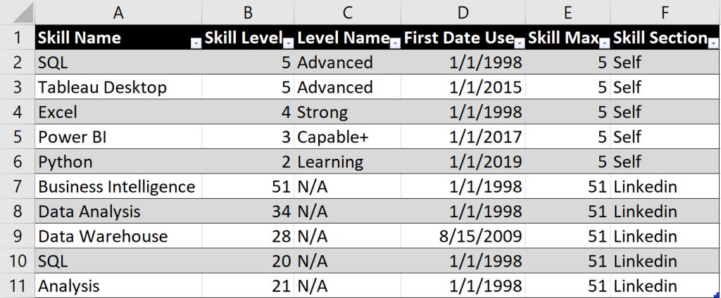
In order to build out the necessary charts to support your resume, you’ll use Excel to format the data. I cover the format for both the timeline chart and the abacas chart in the video, but below is a sneak peek of how I formatted my data for the abacas skills chart.
The data above supports the buildout for two separate abacas charts. One chart is for a self-rating of my skills (rows 2-6), while the other chart is a representation of LinkedIn endorsements (7-11).
Column E represents the maximum value of the skill that I want to present on the abacas chart. Since I was self-rating my skills from a scale of 1 to 5, then 5 was the maximum value represented. For the LinkedIn endorsements, 51 was the highest number I received, thus for all rows supporting this chart, 51 was the maximum value.
Gantt Chart
Every resume needs a timeline! Although I describe how to build a single linear timeline chart in the video above, I have another video that explains how to build a Gannt chart in Tableau. For some of our experiences, we have more than one activity happening at the same time, thus the following video will help in your resume build out as well.
Remember that we all have a story to tell and an interactive resume in Tableau will help you share your experiences and get noticed if done well. Good luck!
All views and opinions are solely my own and do not necessarily reflect those of my employer
I appreciate everyone who has supported this blog and my YouTube channel via merch. Please click here
Thank you!!
Anthony B Smoak
INCREASE YOUR FOCUS TRY BRAIN.FM
When I am focusing hard during the day at work or developing visualizations on the weekend. I use Brain.fm to help me focus when it matters. It’s Science-driven and research-backed functional music designed from the ground up to help you you focus, relax, meditate and sleep. If you’d like to try a free trial check out https://brain.fm/anthonyb
Please use coupon code anthonyb for a 20% discount upon checkout. It helps support this blog and my YouTube channel as I receive a small commission for purchases made through links in this post.
Let’s fix the “Reset All Filters” button in Tableau! Sometimes when we create the Reset All Filters button in Tableau, it doesn’t initially work. In this video and post I will troubleshoot a few of the reasons for the lack of functionality and get you and your dashboard up and running.
If you need a refresher on how to reset all filters in Tableau, make sure to check out this video first.
The inspiration for this post comes from the following dashboard I built for the Real World Fake Data (#RWFD) initiative spearheaded by Mark Bradbourne at Tableau. Mark was kind enough to include my dashboard on his recap of top submissions for this particular challenge. You can interact with the dashboard on my Tableau Public gallery here.
The dashboard above utilizes the reset all filters technique, but I initially ran into an issue when trying to get the technique to work. Here is the first area you should check if you run into issues.
SOURCE SHEETS / TARGET SHEETS
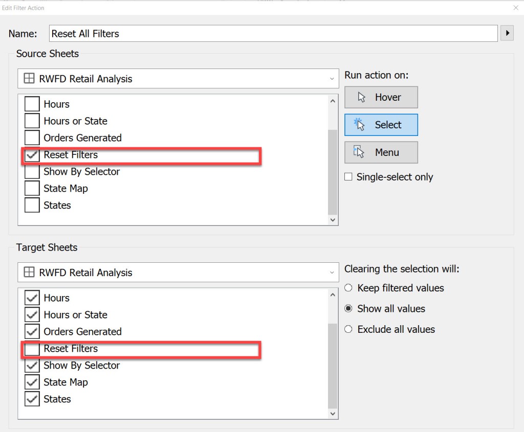
On your dashboard, Select Actions (or CTRL+SHIFT+D), and then edit your Reset All Filters action.
Once you select [Edit] for the dashboard action, make sure that your Reset Filters action is the only selection for your [Source Sheets]. Also make sure that all other sheets on the dashboard that you want to remove filters from are selected on [Target Sheets] EXCEPT for your Reset Filters action. See the figure below.
TARGET FILTERS
Additionally, double check to make sure that you have all of your necessary fields selected in the [Target Filters] section that you want to remove as a filter. I have found that selecting the [All Fields] option never works. I’ll repeat, double check that every field you want to reset appears as a target filter. If it is not there, then simply add it by selecting [Add Filter].
In my my particular circumstance, I did have all of the fields selected in the [Target Filters] section that were required to reset all filters, so I had to keep looking for answers. Let’s move to step 3 in the process.
VISUAL CUES FOR FILTERS
In your workbook, I want you to hunt down any filters that are applied to ALL WORKSHEETS with the same data source. From the Tableau knowledge base, here is a screenshot of the icons applied to fields on the Filters shelf. On your worksheets, look for the cylindrical database icon next to any filters. We will further investigate these filters.
Where you see the cylinder next to any Filters on your worksheets, change the [Apply to Worksheets] option from [All Using This Data Source] to [Selected Worksheets…]. In my case, the offending icon was next to the [Location City] filter.
This next step is key. Make sure to UNCHECK the Reset Filters Worksheet. Your filter should not be applied to the same worksheet that is used to display the Reset All Filters button.
Once you’ve unchecked the Reset Filters worksheet your icon next to the filter will change to the following.
Go back to your dashboard and test to make sure that your reset all filters button functionality works. In my case, the above trick was successful for me. I’m sure it will be for you as well.
Make sure to watch the video below as I step through the checks.
All views and opinions are solely my own and do not necessarily reflect those of my employer
INCREASE YOUR FOCUS TRY BRAIN.FM
When I am focusing hard during the day at work or developing visualizations on the weekend. I use Brain.fm to help me focus when it matters. It’s Science-driven and research-backed functional music designed from the ground up to help you you focus, relax, meditate and sleep. If you’d like to try a free trial check out https://brain.fm/anthonyb
Please use coupon code anthonyb for a 20% discount upon checkout. It helps support this blog and my YouTube channel as I receive a small commission for purchases made through links in this post.
In this video I will provide a method in which you can place your bar chart labels above the bars in Tableau. This technique is based off Adolfo Hernandez’s technique with a little more explanation and additional alternatives for the zero line. Make sure to add this to your bar chart repertoire!
If you want to follow-along with the video, you can download the data at this link:
I recently ran into the issue of not being able to color a dimensional value because my data did not yet contain that specific value. What I learned through trial and error is that I needed to change the calculated field I was using to force an expected value so I could color it appropriately.
I then had to change my calculated field back to what it was originally and hope that Tableau would remember the color. It would be nice if Tableau had a native built in interface to allow users to assign colors to expected values (regardless if the values are currently in the data), but this feature is not available in Tableau (looking at you very talented developers at Tableau).
Watch the Solution:
I created a calculated field with expected outcomes of “Bad”, “Normal” and “Great” based upon numerical profit data. The profit data I had did not support the “Great” value. Thus I had to doctor my calculated field to force the value and then color it. I didn’t know if Tableau would remember my color selection if I changed the calculated field and then changed it back, but it did.
The Forums:
Don’t worry, you are not the only one looking for a solution to this issue. Here are some Tableau forum links that basically ask the same questions.
Hopefully this post helped you in your search to color those non-existing values. For many of us, not all potential values are available in our data sources, and we many not have access to the underlying source data. Having a nice UI means to assign expected values in advance would be extremely useful.
The Dashboard:
I certainly love to develop new dashboards to test out functionality. I built this one to test out a few Ryan Sleeper dashboard tips. Make sure to download the dashboard .twbx file from from my Tableau Public profile (Anthony B Smoak) for free!
Are you looking for the next viz to showcase on your Tableau Public page? In this video I will teach you a technique that spices up the humble stacked bar chart with dynamic totals (using Tableau Set Actions). We will build out the viz step by step with Superstore data.
Stacked Bar Chart with Dynamic Totals
This chart is powered by Tableau Superstore data which is a data set that is readily available on the internet and is packaged as the default data set with Tableau. As you select the three legend categories at the top of the visual, the stacked bar chart sections will appear or disappear. The totals will also automatically update based upon your selection.
How cool is that!!??
I have to give a shoutout to Dorian Banutoiu for originating this technique. A few years ago, Dorian used this technique in a Makeover Monday exercise and it recently caught my attention when I was checking out his Tableau Public page. I immediately attempted to reverse engineer the technique (which admittedly took some effort).
Because I wanted to enable everyone with Tableau and/or Tableau Public to duplicate the chart, I used Tableau Superstore data as my foundation. Make sure to give Dorian a Twitter follow at @canonicalizedco.
What’s In it for You?
By following along with the video, you will utilize multiple Tableau elements such as:
Practice makes perfect so this will be a good opportunity for you to practice multiple Tableau elements with the creation of one visualization. You can click the links on the list above to see additional videos that cover respective areas.
Give Credit
If you do reproduce this visualization step by step or leverage the technique for your Tableau Public page or Linkedin Page, please link to this post or the YouTube video and place “Inspired by Dorian Banutoiu & Anthony Smoak” somewhere on the viz and post text.
Interact with the Finished Visualization
You can interact with the finished visualization on my Tableau Public page here:
I worked hard to create a Tableau dashboard packed with multiple features that any beginner or intermediate user should know how to complete. Use this dashboard as an inspiration regarding techniques to learn for your next Tableau dashboard.
Here are a few of the features included in this dashboard:
Parameters
Dynamic Titles
KPIs
Filters
Context Filters
Top 5 by Dimension
Highlight Actions
Filter Actions
Ranking
Show/Hide Containers
Image Buttons
Parameter Driven Chart Swap
Maps
Shape Files
Reset All Filters
Combo Chart / Dual Axis Chart (Bar in Bar)
Quick Table Calculations
Bullet Chart
Animations
Containerized Dashboard Layout
Because I love to teach in my relatively spare time, I am considering offering 1 on 1 training to learn how to put together this sample dashboard. As I mention in the video, leave a comment with your thoughts on how much of an investment you think someone would make for 3 hours of 1 on 1 training to build this together. Someone would definitely impress their manager or future hiring manager if they had the knowledge to build this type of front end reporting.