Build an Interactive Tableau Resume to Get Noticed

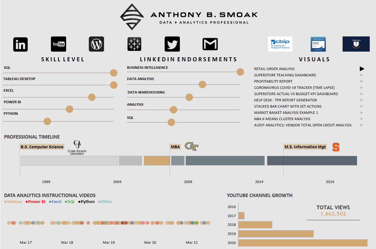
Interact with my resume here: Anthony Smoak Interactive Tableau Public Resume

This post is for everyone who has ever asked, “How do you create an interactive resume in Tableau?” If you’re looking to get noticed as a Tableau visualization developer / subject matter expect, then building out an interactive resume using Tableau is a great place to start. It is a good starter visualization to build because you already have all the data! The data is inherently about you, but you just need some inspiration on how to get started building out your resume.

That’s where I come in, to share with you a place to start for inspiration, and direction on how to build out a few charts I leveraged to construct my interactive resume.

Where to Get Inspired

The first place you want to start looking for interactive Tableau resume inspiration is the Tableau Public Resume Gallery. The Tableau community has done an excellent job of sharing resumes so you don’t have to start from scratch with respect to idea generation. As I was looking through the gallery, I started to notice that most of the resumes had some common DNA, most notably a timeline chart (either linear or Gantt chart) and an abacas chart (both of which I will show you how to build in the video).

My resume is inspired by offerings from both Ann Jackson and Lindsay Betzendahl. When you look through the gallery you may find a resume that fits your personal vision. I’m sure you’ll use a few of the techniques I’m going to share as well.

You can also do a simple google image search on “Tableau Interactive Resume” and you’ll find additional images that link to resources that are not on the official Tableau Public Resume Gallery.

Format Your Data

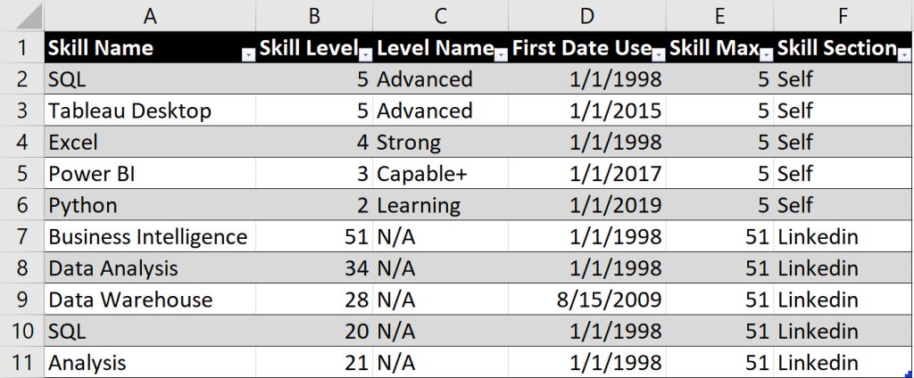
In order to build out the necessary charts to support your resume, you’ll use Excel to format the data. I cover the format for both the timeline chart and the abacas chart in the video, but below is a sneak peek of how I formatted my data for the abacas skills chart.

The data above supports the buildout for two separate abacas charts. One chart is for a self-rating of my skills (rows 2-6), while the other chart is a representation of LinkedIn endorsements (7-11).

Column E represents the maximum value of the skill that I want to present on the abacas chart. Since I was self-rating my skills from a scale of 1 to 5, then 5 was the maximum value represented. For the LinkedIn endorsements, 51 was the highest number I received, thus for all rows supporting this chart, 51 was the maximum value.

Gantt Chart

Every resume needs a timeline! Although I describe how to build a single linear timeline chart in the video above, I have another video that explains how to build a Gannt chart in Tableau. For some of our experiences, we have more than one activity happening at the same time, thus the following video will help in your resume build out as well.

Remember that we all have a story to tell and an interactive resume in Tableau will help you share your experiences and get noticed if done well. Good luck!

Please like and subscribe on the Anthony B. Smoak YouTube channel.

All views and opinions are solely my own and do not necessarily reflect those of my employer

I appreciate everyone who has supported this blog and my YouTube channel via merch. Please click here

Thank you!!

Anthony B Smoak

INCREASE YOUR FOCUS TRY BRAIN.FM

When I am focusing hard during the day at work or developing visualizations on the weekend. I use Brain.fm to help me focus when it matters. It’s Science-driven and research-backed functional music designed from the ground up to help you you focus, relax, meditate and sleep. If you’d like to try a free trial check out https://brain.fm/anthonyb

Please use coupon code anthonyb for a 20% discount upon checkout. It helps support this blog and my YouTube channel as I receive a small commission for purchases made through links in this post.

Fix the Reset All Filters Button in Tableau

Let’s fix the “Reset All Filters” button in Tableau! Sometimes when we create the Reset All Filters button in Tableau, it doesn’t initially work. In this video and post I will troubleshoot a few of the reasons for the lack of functionality and get you and your dashboard up and running.

If you need a refresher on how to reset all filters in Tableau, make sure to check out this video first.

The inspiration for this post comes from the following dashboard I built for the Real World Fake Data (#RWFD) initiative spearheaded by Mark Bradbourne at Tableau. Mark was kind enough to include my dashboard on his recap of top submissions for this particular challenge. You can interact with the dashboard on my Tableau Public gallery here.

The dashboard above utilizes the reset all filters technique, but I initially ran into an issue when trying to get the technique to work. Here is the first area you should check if you run into issues.

SOURCE SHEETS / TARGET SHEETS

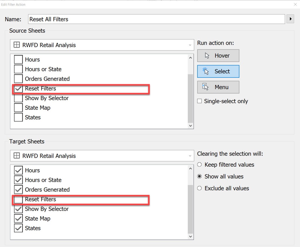
On your dashboard, Select Actions (or CTRL+SHIFT+D), and then edit your Reset All Filters action.

Once you select [Edit] for the dashboard action, make sure that your Reset Filters action is the only selection for your [Source Sheets]. Also make sure that all other sheets on the dashboard that you want to remove filters from are selected on [Target Sheets] EXCEPT for your Reset Filters action. See the figure below.

TARGET FILTERS

Additionally, double check to make sure that you have all of your necessary fields selected in the [Target Filters] section that you want to remove as a filter. I have found that selecting the [All Fields] option never works. I’ll repeat, double check that every field you want to reset appears as a target filter. If it is not there, then simply add it by selecting [Add Filter].

In my my particular circumstance, I did have all of the fields selected in the [Target Filters] section that were required to reset all filters, so I had to keep looking for answers. Let’s move to step 3 in the process.

VISUAL CUES FOR FILTERS

In your workbook, I want you to hunt down any filters that are applied to ALL WORKSHEETS with the same data source. From the Tableau knowledge base, here is a screenshot of the icons applied to fields on the Filters shelf. On your worksheets, look for the cylindrical database icon next to any filters. We will further investigate these filters.

Where you see the cylinder next to any Filters on your worksheets, change the [Apply to Worksheets] option from [All Using This Data Source] to [Selected Worksheets…]. In my case, the offending icon was next to the [Location City] filter.

This next step is key. Make sure to UNCHECK the Reset Filters Worksheet. Your filter should not be applied to the same worksheet that is used to display the Reset All Filters button.

Once you’ve unchecked the Reset Filters worksheet your icon next to the filter will change to the following.

Go back to your dashboard and test to make sure that your reset all filters button functionality works. In my case, the above trick was successful for me. I’m sure it will be for you as well.

Make sure to watch the video below as I step through the checks.

Please like and subscribe on the Anthony B. Smoak YouTube channel.

All views and opinions are solely my own and do not necessarily reflect those of my employer

INCREASE YOUR FOCUS TRY BRAIN.FM

When I am focusing hard during the day at work or developing visualizations on the weekend. I use Brain.fm to help me focus when it matters. It’s Science-driven and research-backed functional music designed from the ground up to help you you focus, relax, meditate and sleep. If you’d like to try a free trial check out https://brain.fm/anthonyb

Please use coupon code anthonyb for a 20% discount upon checkout. It helps support this blog and my YouTube channel as I receive a small commission for purchases made through links in this post.

Do Great Things with Your Data!

Stacked Bar Chart with Dynamic Totals in Tableau

Are you looking for the next viz to showcase on your Tableau Public page? In this video I will teach you a technique that spices up the humble stacked bar chart with dynamic totals (using Tableau Set Actions). We will build out the viz step by step with Superstore data.

Stacked Bar Chart with Dynamic Totals

This chart is powered by Tableau Superstore data which is a data set that is readily available on the internet and is packaged as the default data set with Tableau. As you select the three legend categories at the top of the visual, the stacked bar chart sections will appear or disappear. The totals will also automatically update based upon your selection.

How cool is that!!??

I have to give a shoutout to Dorian Banutoiu for originating this technique. A few years ago, Dorian used this technique in a Makeover Monday exercise and it recently caught my attention when I was checking out his Tableau Public page. I immediately attempted to reverse engineer the technique (which admittedly took some effort).

Because I wanted to enable everyone with Tableau and/or Tableau Public to duplicate the chart, I used Tableau Superstore data as my foundation. Make sure to give Dorian a Twitter follow at @canonicalizedco.

What’s In it for You?

By following along with the video, you will utilize multiple Tableau elements such as:

Practice makes perfect so this will be a good opportunity for you to practice multiple Tableau elements with the creation of one visualization. You can click the links on the list above to see additional videos that cover respective areas.

Give Credit

If you do reproduce this visualization step by step or leverage the technique for your Tableau Public page or Linkedin Page, please link to this post or the YouTube video and place “Inspired by Dorian Banutoiu & Anthony Smoak” somewhere on the viz and post text.

Interact with the Finished Visualization

You can interact with the finished visualization on my Tableau Public page here:

https://tabsoft.co/3oNxq5Z


Please like and subscribe on the Anthony B. Smoak YouTube channel.

All views and opinions are solely my own and do not necessarily reflect those of my employer

Do Great Things with Your Data!

★☆★ Support this Channel: ★☆★

Merch ► shop.spreadshirt.com/AnthonySmoak

★☆★ FOLLOW ME BELOW: ★☆★

Twitter ► https://twitter.com/AnthonySmoak

Facebook ► https://www.facebook.com/AnthonyBSmoak/

Tableau Public ►Search for “Anthony B. Smoak”

The Dos and Don’ts of Designing Efficient Tableau Dashboards

This following is a guest post contributed by Prudhvi Sai Ram, Saneesh Veetil and Chaitanya Sagar.

A dashboard is to a user what an assistant is to a boss. While an assistant helps manage multiple tasks for a boss, a dashboard helps manage multiple data sources for a user. Insights are only as good as the underlying data and dashboards are an excellent medium to provide those insights.

Dashboards provide “at-a-glance” views of key metrics which are relevant for business users to perform their tasks effectively. In other words, dashboards are an interactive form of reporting which provides users with consolidated views of different metrics to make impactful, data-driven decisions. A dashboard should speak on the creator’s behalf, acting as an expert providing actionable insights to its users. The dashboard should be self-sufficient when it comes to answering the question, “what can my data tell me?”

There are a plethora of tools available in the market for creating dashboards. However, a badly designed dashboard or incompatible (or wrong) tool can lead to hundreds of thousands of dollars in investment losses when accounting for inefficient time and effort spent by development and analysis teams. It becomes imperative for an organization to choose the right tool and have a step by step approach for dashboard development.

Currently, one of the top business intelligence tools available in the market is Tableau. It is used to create interactive dashboards for users. Tableau has been named a ‘Leader’ in the Gartner Magic Quadrant for six straight years in a row (Source – Tableau.com).

In this post, we will highlight a few best practices that you should follow when developing your Tableau dashboard. We will also talk about some of the pitfalls you should avoid while creating a Tableau dashboard.

We’ll divide the best practices into three different stages of dashboard development.

  1. Pre-Development: Ideation and Conceptualization
  2. Development
  3. Post Development: Maintenance

Ideation and Conceptualization

During the conceptualization and ideation stage, there are a few aspects that one should consider before starting to develop a dashboard.

1. Goal

Understand clearly why you are creating the dashboard in the first place. What is the end objective that you want to achieve via this dashboard? Is it automating a reporting process at month-end? Is it providing a better visualization to a complex calculation created in another platform?

Having a clear understanding of your dashboarding goal or objective keeps you focused and on the right track.

2. Audience

Keep in mind that your audience is a key part of creating a purposeful, impactful dashboard. The dashboard used by the CEO or other members of the C-suite will be very different from the dashboard used by business unit heads, which in turn will be very different from the dashboards used by branch managers. Thus, you need to consider who will use your dashboard and how will it be used?

For instance, a CEO is interested in key metrics at an overall organizational level like the overall financial and operational heath of the company. On the other hand, a procurement manager would be interested in the amount of material being procured from different vendors and their respective procurement costs. Having a GOAL in mind before development is essential because it helps identify the end user of the dashboard.

3. Key Performance Indicators (KPIs)

After thoroughly understanding the various stakeholder requirements, it is important to develop a list of KPIs for each user and/or department. Having the stakeholders sign-off on dashboard KPIs substantially reduces development and re-work time.

4. Data Sources

After achieving sign-off on KPIs, inventory the various data sources that are required for development. This step is important because each data source can potentially increase complexity and computing costs required to calculate the KPIs. It’s always better to only connect those data sources which contain relevant data.

5. Infrastructure

Storage and computation requirements should be taken into consideration commensurate with the dashboard’s degree of data volume and complexity. Having a right-sized backend infrastructure will improve dashboard performance considerably. Also, it is essential to understand the dashboard’s update frequency. Will the data be refreshed once a day? Is it going to be real-time? Having the answer to these questions will help generate infrastructure requirements that will prevent performance issues down the road.

Development

Once you have identified what needs to be presented on the dashboard and set up the infrastructure, it’s time to move to the second phase of dashboard development.

The following items should be considered during the development phase.

6. Design

Design is an important part of overall dashboard development. You should be very selective with the colors, fonts and font sizes that you employ. There is no rule book that establishes the right color or the right font for dashboard design; in our opinion, one should design with the company’s coloring scheme in mind.

This is a safe bet as it keeps the company’s brand identity intact, especially if the dashboard is accessible to external parties. Fonts should not be very light in color and the charts should not be very bright. Having a subtle color scheme that incorporates the brand’s identity resonates well with internal and external parties.

7. Visualization Impact

Identify the right type of visualization to create an impactful first glance for the users. Certain types of data points are better represented by certain types of visualizations. For instance, time trend analysis is usually represented on a line graph. A comparison of the same metric across different business lines are presented well via a heat map. Consider a sales dashboard where revenue and cost numbers for the current year should be presented as standalone numbers with a larger font size, while the historical trend analysis should be placed below.

8. Captions and Comments

Tableau provides users’ with the functionality to add captions and comments to visualizations. Bear in mind that you won’t be around all the time to explain what the different charts in the dashboard represent. Therefore, add relevant descriptions, comments and/or captions wherever it can be useful for the viewer.

Post Development: Maintenance

Once you have created the dashboard, there are additional aspects you should consider for effective and smooth dashboard operation.

9. Robust Testing

After creating the dashboard, conduct robust testing of the entire platform. Testing helps identify any bugs and deployment errors which if not rectified can lead to system failure or erratic results at a later stage.

10. Maintenance

This is the most ignored phase in the dashboard development lifecycle but it is a crucial phase. Once you have created a dashboard, proper maintenance should be conducted in terms of software updates, connections to databases and infrastructure requirements. If the volume of data increases at a fast pace, you will need to upgrade the storage and computing infrastructure accordingly so that the system doesn’t crash or become prohibitively slow.

Avoid the Following

Up to this point we have highlighted some of the best practices to consider while creating a dashboard. Now, let’s broach the aspects you should avoid while creating a dashboard.

1. Starting with a Complex Dashboard

Remember that creating a dashboard is a phased approach. Trying to develop an overly complicated dashboard in one phase may complicate things and led to project failure. The ideal approach is to inventory and prioritize all requirements and proceed with a phased approach. Start development with the highest priority requirements or KPIs and gradually move to the lower priority KPIs in subsequent phases.

2. Placing Too Many KPIs on a Single Chart

Although Tableau has the capability to handle multiple measures and dimensions in a single chart, you should be judicious while choosing the dimensions and measures you want to present in a single graph. For instance, placing revenue, expenses and profit margins in a single chart may be of value; while placing revenue and vendor details in the same chart may not be as valuable.

3. Allocating Too Little Time to Deployment and Maintenance

The appropriate amount of time, budget and resources should be allocated to each constituent phase of the deployment cycle (i.e., KPI identification, dashboard development, testing and maintenance).

We are sure that after reading this post, you have a better idea regarding what practices should be considered while developing a Tableau dashboard. The principles offered here are from a high level perspective. There may be other project nuances to consider in your specific endeavors. We would be happy to hear your thoughts and the best practices that you follow while creating a Tableau dashboard.

Author Bio

Prudhvi Sai Ram, Saneesh Veetil and Chaitanya Sagar contributed to this article.

Add a “Filters in Use” Alert to Your Tableau Dashboard

In this video we will learn to add a “Filters in Use Alert” to a Tableau Dashboard. If you have a dashboard with multiple filters, apply this quick and easy tip to inform your users that filters are in play. This tip builds upon the dashboard that I showcased recently in a previous post: Add a Reset All Filters Button to Your Tableau Dashboard.

I learned this current tip from a presentation given by Tableau Zen Master Ryan Sleeper, so I have to give credit where credit is due.

If you’re interested in Business Intelligence & Tableau subscribe and check out my videos either here on this site or on my Youtube channel.

Tableau for Marketing: Become a Segmentation Sniper

This article is a guest post.

Did you know that Netflix has over 76,000 genres to categorize its movie and tv show database? Genres, rather micro-genres, could be as granular as “Asian_English_Mother-Son-Love_1980.” This is the level of granularity to which Netflix has segmented its product offerings; i.e, movies and shows.

But do you think this level of segmentation is warranted?

I think the success of Netflix answers this question. Netflix is considered to have one of the best recommendation engines. They’ve even hosted a competition on Kaggle and offered a prize money of USD 1 million to the team beating their recommendation algorithm. This shows the sophistication and advanced capabilities developed by the company on its platform. This recommendation tool is nothing but a segmentation exercise to map the movies and users. Sounds easy, right?

Gone are the days when marketers used to identify their target customers based on their intuition and gut feelings. With the advent of big data tools and technologies, marketers are relying more and more on analytics software to identify the right customer with minimal spend. This is where segmentation comes into play and makes our lives easier. So, let’s first understand what is segmentation? and why do we need segmentation?

Segmentation, in very simple terms, is the grouping of customers in such a way that they have similar traits and attributes. The attributes could be in terms of their likings, preferences, demographic features or socio-economic behavior. Segmentation is mainly applied to customers, but it can refer to products as well. We will explore a few examples as we move ahead in the article.

With tighter marketing budgets, increasing consumer awareness, rising competition, easy availability of alternatives and substitutes, it is imperative to use marketing budgets to prudently to target the right customers, through the right channel, at the right time and offer them the right set of products. Let’s look at an example and understand why segmentation is important for marketers.

There is an e-commerce company which is launching a new service for a specific segment of customers who shop frequently and whose ticket size is also high. For this, the company wants to see which all customers to target for the service. Let’s first look at the data at an aggregate level and then further drill down to understand in detail. There are 5 customers for whom we want to evaluate the spend. The overall scenario is as follows:

Chart1

Should the e-commerce company offer the service to all the five customers?

Who is the right customer to target for this service? Or which is the right customer segment to target?

We will see the details of each of the customers and see the distribution of data.

2

Looking at the data above, it looks like Customer 1 and Customer 2 would be the right target customers for company’s offering. If we were to segment these 5 customers into two segments, then Customer 1 and Customer 2 would fall in one segment because they have higher total spend and higher number of purchases than the other three customers. We can use Tableau to create clusters and verify our hypothesis. Using Tableau to create customer segments, the output would look like as below.

3

Customer 1 and customer 2 are part of cluster 1; while customer 3, customer 4 and customer 5 are part of cluster 2. So, the ecommerce company should focus on all the customers falling into cluster 1 for its service offering.

Let’s take another example and understand the concept further.

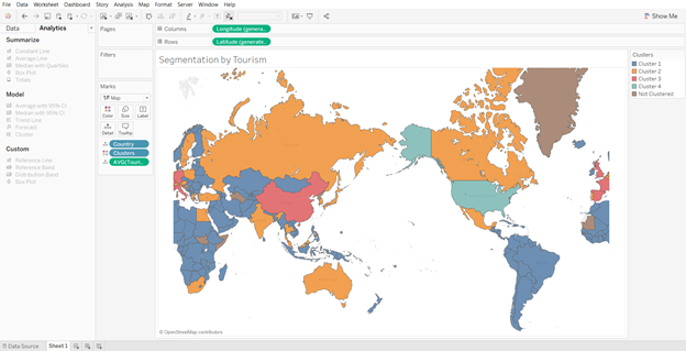
We will try to segment the countries in the world by their inbound tourism industry (using the sample dataset available in Tableau). Creating four segments we get the following output:
4

There are few countries which do not fall into any of the clusters because data for those countries is not available. Looking at clusters closely, we see that the United States of America falls in the cluster 4; while India, Russia, Canada, Australia, among others fall in the cluster 2. Countries in the Africa and South America fall in the cluster 1; while the remaining countries fall in the cluster 3. Thus, it makes it easier for us to segment countries based on certain macro-economic (or other) parameters and develop a similar strategy for countries in the same cluster.

Now, let’s go a step further and understand how Tableau can help us in segmentation.

Segmentation and Clustering in Tableau

Tableau is one of the most advanced visualization and business intelligence tools available in the market today. It provides a lot of interactive and user-friendly visualizations and can handle large amounts of data. It can handle millions of rows at once and provides connection support to almost all the major databases in the market.

With the launch of Tableau 10 in 2016, the company offered a new feature of clustering. Clustering was once considered a technique to be used only by statisticians and advanced data scientists, but with this new feature in Tableau it becomes as easy as simple drag and drop. This feature can provide a big support to marketers in segmenting their customers and products, and get better insights.

Steps to Becoming a Segmentation Sniper

Large number of sales channels, increase in product options and rise in advertisement cost has made it inevitable not only for marketers but for almost all the departments to analyze customer data and understand their behavior to maintain market position. We will now take a small example and analyze the data using Tableau to understand our customer base and zero-in on the target customer segment.

There is a market research done by a publishing company which is mainly into selling of business books. They want to further expand their product offerings to philosophy books, marketing, fiction and biographies. Their objective is to use customer responses and find out which age group like which category of books the most.

For an effective segmentation exercise, one should follow the below four steps.

  1. Understand the objective
  2. Identify the right data sources
  3. Creating segments and micro-segments
  4. Reiterate and refine

We will now understand each of the steps and use Tableau, along with, to see the findings at every step.

  1. Understand the objective

Understanding the objective is the most important thing that you should do before starting the segmentation exercise. Having a clear objective is the most imperative thing because it will help you channelize your efforts towards the objective and prevent you from just spending endless hours in plain slicing and dicing. In our publishing company example, the objective is to find out the target age group which the company should focus on in each of the segments, namely philosophy, marketing, fiction and biography. This will help the publishing company in targeting its marketing campaign to specific set of customers for each of the genres. Also, it will help the company in identifying the target age group that like both business and philosophy or business and marketing, or similar other groups.

  1. Identify the right data sources

In this digital age, data is spread across multiple platforms. Not using the right data sources could prove to be as disastrous as not using analytics at all. Customer data residing in CRM systems, operational data in SAP systems, demographic data, macro-economic data, financial data, social media footprint – there could be endless list of data sources which could prove to be useful in achieving our objective. Identifying right variables from each of the sources and then integrating them to form a data lake forms the basis of further analysis.

In our example, dataset is not as complex as it might be in real life scenarios. We are using a market survey data gathered by a publishing company. The data captures the age of customer and their liking/disliking for different genres of books, namely philosophy, marketing, fiction, business and biography.

  1. Creating segments and micro-segments

At this stage, we have our base data ready in the analyzable format. We will start analyzing data and try to form segments. Generally, you should start by exploring relationships in the data that you are already aware of. Once you establish few relationships among different variables, keep on adding different layers to make it more granular and specific.

We will start by doing some exploratory analysis and then move on to add further layers. Let’s first see the results of the market survey at an aggregate level.

5

From the above analysis, it looks like fiction is the most preferred genre of books among the respondents. But before making any conclusions, let’s explore a little further and move closer to our objective.

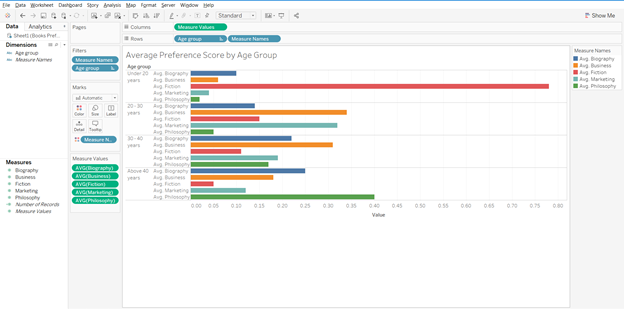
If we split the results by age group and then analyze, results will look something like the below graph.
6

In the above graph, we get further clarity on the genre preferences by respondents. It gives us a good idea as to which age group prefers which genre. Fiction is most preferred by people under the age of 20; while for other age groups fiction is not among the top preference. If we had only taken the average score and went ahead with that, we would have got skewed results. Philosophy is preferred by people above the age of 40; while others prefer business books.

Now moving a step ahead, for each of the genre we want to find out the target age group.

7

The above graph gives us the target group for each of the genres. For biography and philosophy genres, people above the age of 40 are the right customers; while for business and marketing, age group 20-30 years should be the target segment. For fiction, customers under the age of 20 are the right target group.

Reiterate and refine

In the previous section, we created different customer segments and identified the target segment for publishing company. Now, let’s say we need to move one more step ahead and identify only those age groups and genres which have overlap with business genres. To put it the other way, if the publishing company was to target only one new genre (remember, they already have customer base for business books) and one age group, which one should it be?

Using Tableau to develop a relation amongst the different variables, our chart should look like the one below.

8

Starting with the biography genre, age group 30-40 years comes closest to our objective, i.e., people in this age group like both biography and business genre (Biography score – 0.22, Business score – 0.31). Since, we have to find only one genre we will further explore the relationships.

For fiction, there is no clear overall with any of the age groups. For marketing, age group 20-30 year looks to be clear winner. The scores for the groups are – marketing – 0.32, business – 0.34. The relation between philosophy and business is not as strong as it is for business and marketing.

To sum it up, if the publishing company was to launch one more genre of books then it should be marketing and target customer group should be in the range of 20-30 years.

Such analysis can be refined further depending on the data we have. We can add gender, location, educational degree, etc. to the analysis and further refine our target segment to make our marketing efforts more focused.

I think after going through the examples in the article, you can truly appreciate the level of segmentation that Netflix has done and it clearly reflects the reason behind its success.

Author Bio:

Vishal Bagla, Chaitanya Sagar, Saurabh Sood and Saneesh Veetil contributed to this article.

Tableau K-Means Clustering Analysis w/ NBA Data

Interact with this visualization on Tableau Public.

In this video we will explore the Tableau K-Means Clustering algorithm. K-Means Clustering is an effective way to segment your data points into groups when those data points have not explicitly been assigned to groups within your population. Analysts can use clustering to assign customers to different groups for marketing campaigns, or to group transaction items together in order to predict credit card fraud.

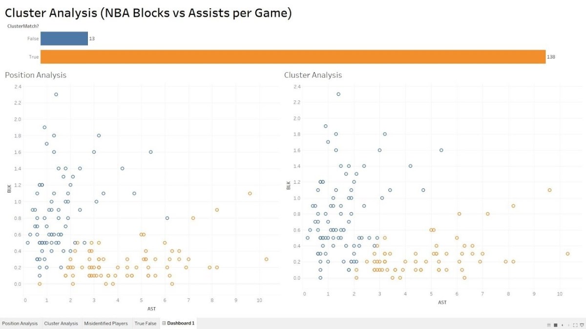
In this analysis, we’ll take a look at the NBA point guard and center positions. Our aim is to determine if Tableau’s clustering algorithm is smart enough to categorize these two distinct positions based upon a player’s number of assists and blocks per game.

Nicola Jokic is a Statistical Unicorn

If you also watch the following video you’ll understand why 6 ft. 11 center Nikola Jokic is mistakenly categorized as a point guard by the algorithm. This big man can drop some dimes!

If you’re interested in Business Intelligence & Tableau subscribe and check out my videos either here on this site or on my Youtube channel.