Free SQL Data Profiling Tool: Idera SQL Data Profiler

In this tip I will provide an overview of a completely free data profiling tool (at least as of the time of this post) that is easy to use if you are in the Microsoft database stack. You can download the IDERA SQL Profiling tool and immediately put it to work to perform basic column profiling and analyses. The tool will display a summary of the data contained in a selected table and each of its columns. 

Use this tool on the following systems:

  • Microsoft SQL Server: 2008 R2, 2012, 2014, 2016; 2017 Windows & Linux (provisional); Express, Standard, Enterprise editions
  • Microsoft Azure SQL Database
  • Amazon Relational Database Service (RDS)

IDERA SQL Data Profiler has some minor quirks but you can’t beat the price. Check out my review in the video above.

Just remember that data profiling should always be done initially before you start analyzing a new dataset or designing a new visualization. Always start with the basics.

If you find this type of instruction valuable make sure to subscribe to my Youtube channel.

Advertisement

Filter Top N Values with a Slicer in Power BI

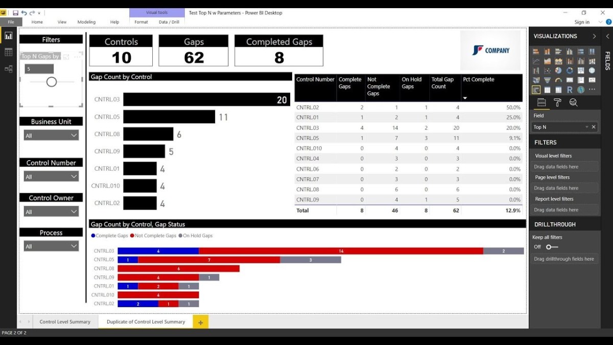
In this video you will learn how to filter the top N values shown in your bar chart visualization using a slicer.

  1. This technique uses one measure that generates a number 1-10, that will be applied to a slicer.
  2. Another measure will basically rank all of the values associated with your data bars and only return the values that are less than or equal to the number you select in the slicer.

The comments that I apply to the DAX function should help make it easy to understand. I have to give a shoutout to GilbertQ from the PowerBI community for coming up with the  initial approach which I tweaked for the video.

As always, If you find this type of instruction valuable make sure to subscribe to my Youtube channel!

How to Compare Actuals vs. Forecast in Tableau

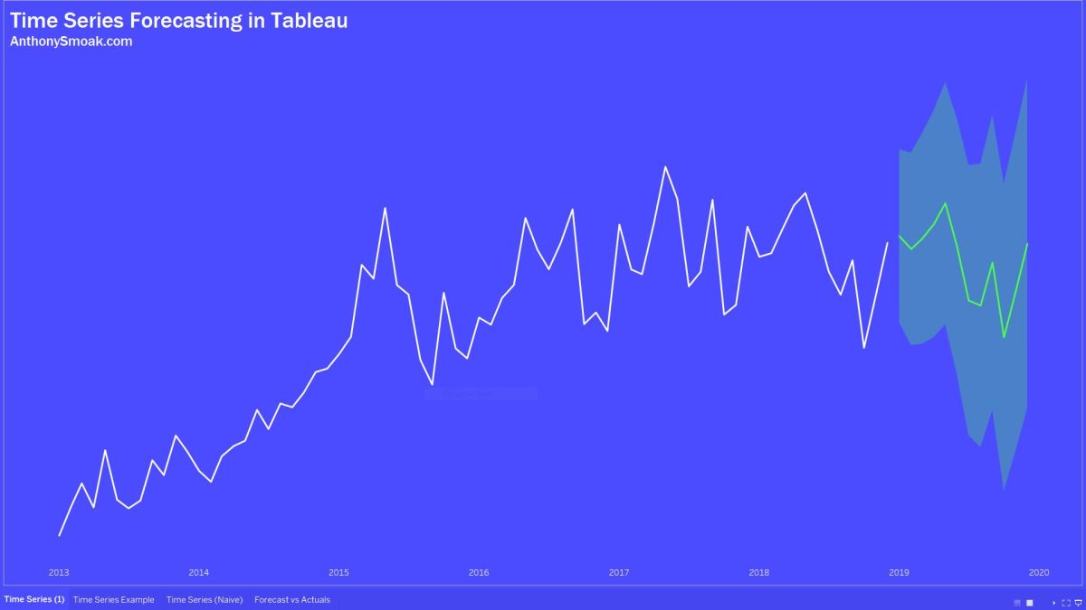
Forecasting in Tableau uses a technique known as exponential smoothing. This is when an algorithm tries to find a regular pattern in your data that can be continued into the future.

In this video I’ll share some helpful tips to help you determine which options you should select that will enable Tableau to make the most predictive forecast for your data. By the end of the video you will be able to differentiate between an additive and multiplicative data pattern and to evaluate MASE to measure the accuracy of the forecast.

I’m not talking about this Mase:

Harlem World

Rather, you’ll learn about the mean absolute scaled error (i.e., MASE) and how it helps you judge the quality of the model.

In addition, you’ll also also learn how to compare your actual data to the Tableau forecast in order to judge if the model is doing its job.

If you’ve used the forecasting capabilities in Tableau without knowing about these concepts, you might have generated an inaccurate error riddled forecast. Don’t just set a forecast and forget it. Watch this video and generate better forecasts in Tableau!

Here is additional reading from Tableau on the forecast descriptions (including MASE).

As always, If you find this type of instruction valuable make sure to subscribe to my Youtube channel.

How to Generate a Forecast in Power BI

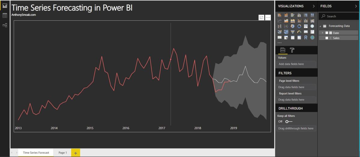
In this video I’ll demonstrate how to use the forecasting analytics option in Power BI. Although Power BI’s forecast algorithm is a black box, it’s more than likely using exponential smoothing to generate results. At a very high level, exponential smoothing is an algorithm that looks for patterns in data and extrapolates that pattern into the future. To help exponential smoothing perform at an optimal level, it is very important to pick an accurate seasonality estimation, as this will have an outsized effect on the time series forecast.

If your data points are at the daily grain, then you’d use 365 as your seasonality value. If your data points are at a monthly grain, then you’d use 12 as your seasonality value. Generally, the more seasonality cycles (e.g., years) that you provide Power BI, the more predictive your forecast will be.

Without giving away the whole video, here is a pro and a con of using forecasting in Power BI.

Con: As I stated earlier the exact algorithm is a black box. Although based upon a Power View blog post, we can reasonably assume exponential smoothing is involved. Furthermore, the results cannot be exported into a spreadsheet and analyzed.

Pro: The ability to “hindcast” allows you to observe if the forecasted values match your actual values. This ability allows you to judge whether the forecast is performing well.

Check out the video; I predict you’ll learn something new.

As always, If you find this type of instruction valuable make sure to subscribe to my Youtube channel.