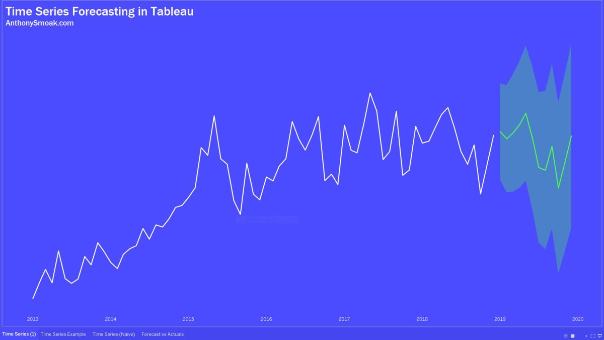
Forecasting in Tableau uses a technique known as exponential smoothing. This is when an algorithm tries to find a regular pattern in your data that can be continued into the future.
In this video I’ll share some helpful tips to help you determine which options you should select that will enable Tableau to make the most predictive forecast for your data. By the end of the video you will be able to differentiate between an additive and multiplicative data pattern and to evaluate MASE to measure the accuracy of the forecast.
I’m not talking about this Mase:

Rather, you’ll learn about the mean absolute scaled error (i.e., MASE) and how it helps you judge the quality of the model.
In addition, you’ll also also learn how to compare your actual data to the Tableau forecast in order to judge if the model is doing its job.
If you’ve used the forecasting capabilities in Tableau without knowing about these concepts, you might have generated an inaccurate error riddled forecast. Don’t just set a forecast and forget it. Watch this video and generate better forecasts in Tableau!
Here is additional reading from Tableau on the forecast descriptions (including MASE).
As always, If you find this type of instruction valuable make sure to subscribe to my Youtube channel.

this was pretty helpful, thanks for the video!
LikeLike