The Wait is Over. Watch this Tableau Dashboard Container Layout Video!
This video was a long time coming. If you’ve ever dealt with layout containers in Tableau (which are about as intuitive as a Thomas Pynchon novel) you know they can leave you scratching your head if you’re new to the tool. And yes, I do own a copy of Gravity’s Rainbow.
Luckily for you I was up I was up at 2:30 a.m. on a Sunday recording the second part of my popular Tableau dashboard tutorial, because that’s how passionate (and stubborn) I am about providing you educational videos of value. Quality over Quantity!
Watch the preview video above, you’ll observe that I’m teaching you a step-by-step breakdown of how I laid out the visual components for an advanced Tableau dashboard using layout containers. This is part two of the series, and while you can absolutely follow along here, the full experience (with all the dashboard elements, charts, and finishing touches) is available to members of my YouTube channel.
I demonstrate a floating container technique that I learned from Curtis Harris’s excellent video on the subject (look up “Things I Know About Tableau Layout Containers” on YouTube).
Before I forget, I want to give a shout out to Dmitry Shirikov, whose original design I reverse engineered and rebuilt (with his permission), and Murilo Cremon for original overall inspiration.
Let’s get into what I actually did.
What You’ll Miss If You Don’t Watch the Full Video
There’s much that you won’t fully grasp until you see it in action in the video. Things like:
How I embedded a YouTube link in an image element
The way I sequence container stacking to prevent the annoying TILE factor
How to work around Tableau’s quirks when resizing and aligning objects
What I do when Tableau auto-adds objects I don’t want
And most importantly, how all the complex pieces come together to form a professionally polished dashboard
If you’ve been struggling with dashboard layouts, or you’ve watched my first Tableau dashboard build and you’ve been waiting forever for part 2, here’s what I recommend:
Rewatch Part 1 of this tutorial series (it’s free on my channel).
Becoming a member supports the channel and helps me keep making high-quality Tableau content. Tutorials like this take hours of research, recording, editing, and production. I don’t mind putting in the work because I know how much value it provides (thank you for all your wonderful comments, I read them all) but your support goes a long way.
Thanks for rocking with me all these years; now get out there and do some great things with your data!
-Anthony Smoak
I appreciate everyone who has supported this blog and my YouTube channel.
Since Tableau Public was recently upgraded to enable local saving (It’s about time), I decided to look and see what new dashboards were out there that I could learn from, and subsequently teach others to rebuild. My mantra is that you learn the most, by teaching others.
I did find the perfect dashboard built by Dmitry Shirikov on his Tableau Public page! There are also design elements from a dashboard created by Murilo Cremon so I tip my cap to him as well.
I reached out to Dmitry via Linkedin and asked for his permission to use this dashboard as a teaching tool for video lessons and he graciously gave me permission. This further demonstrates the collaborative spirit that thrives on Tableau Public. I offer a big thank you to Dmitry!
What I like about his dashboard is the use of the standard Tableau standard superstore dataset combined with interactive/dynamic year over years metrics and thoughtful design.
It contains deceptively simple KPIs, intermediate level metric swapping and a button selector process that relies on parameter actions. Parameter actions update the value of a parameter based on a user interacting with the marks in the view (in this case, the Sales, Profit or Orders dimensions).
I spent a great deal of after-work and weekend time researching how to put this dashboard back together and rebuilt it piece by piece so I could understand what was done.
It also took some time to record and edit this video as it is coming in at over an hour in length! I can’t believe I put this much time and effort into a free product!
My hope is that by dissecting the dashboard and teaching you how to build the chart elements, you can gain some valuable dashboard building insights to add to your repertoire.
If you think a part 2 video regarding the actual dashboard layout will be valuable, please leave a comment on my YouTube channel!
In this video, we’re going to tackle an interesting little challenge – adding dynamic totals to stacked area charts in Tableau. While this may not be a technique for production-ready charts, it’s perfect for those one-time presentations or exports to PowerPoint.
Recently, I had a fantastic 90-minute private data tutoring session with someone who contacted me via this website. During this session, we worked together to address three different data issues, one of which was the quest to display totals for stacked area charts. With some creative thinking and a dash of Tableau magic, I found a solution that I’m excited to share with you.
Use the timestamps below to navigate directly to your desired point in the video.
Historically, creating Sankey charts in Tableau has been a time-consuming process, often requiring the use of complex templates. However, the team at Tableau Public has introduced a game-changing functionality that allows us to create Sankey charts effortlessly. This feature, currently in beta and available for a limited time (like the McRib of data visualizations), enables us to author and publish Sankey charts directly to our Tableau Public profiles.
In this blog post, I’ll briefly walk you through the process of creating one using Tableau Public.
What is a Sankey Chart?
Before we delve into the specifics of this new Tableau Public feature, let’s take a moment to understand what a Sankey chart is and why it’s such a powerful visualization tool. A Sankey chart is a flow diagram that illustrates the movement of data, be it goods, energy, or even money. With a Sankey chart, you can effortlessly compare different data points and identify patterns that might remain hidden in traditional charts or tables.
Testing Out the New Feature
Assuming you already have a Tableau Public profile (and if you don’t, I highly recommend creating one—it’s an incredible platform for sharing your data visualizations with the world). You’ll need to create a visualization directly from your Tableau Public page.
Once you’ve created your visualization, navigate to the “Connect to Data” section. As we’re uploading data from our computer, select the “Upload from Computer” option. Choose the dataset you want to work with—I’ll be using the “Sample Superstore” dataset for this example. After confirming that your data has been successfully imported, select the “Sankey” chart type.
Now, here’s where the magic happens. You’ll notice a “Level” and “Link” section that appears. To define the flow in the Sankey chart, let’s select a dimension like “Segment” and drag it into the “Level” area. Next, grab another dimension—I’ll choose “Region”—and place it in the “Level” area as well. Finally, to quantify the flow, let’s choose a measure like “Sales” and place it in the “Link” area.
Voila! With just a few clicks, we’ve created a Sankey chart. Impressive, isn’t it? You’ll notice the flow between the segments and regions instantly come to life. But we’re not done yet—let’s keep the party going by adding another level.
For the sake of experimentation, let’s grab a dimension like “Ship Status” and drop it into the visualization. Now we have an additional sub-level in our Sankey chart. To avoid overcrowding, we can uncheck the “Allow Labels to Overlap” option, ensuring our chart remains clean and legible.
Keep Innovating for The Analytics Core Audience
Tableau Public’s decision to incorporate this feature highlights their commitment to democratizing data visualization. While the addition of features like Sankey charts to Tableau Public is fantastic, it’s essential that the overlords at Salesforce remember Tableau’s core audience—the general analytics users who are generally decoupled from Salesforce usage. Let’s keep hoping for bigger and better things to come with the tool. This beta signals that they’re heading in the right direction.
(Note: The mentioned feature and availability were accurate as of the blog post’s publication date, but please refer to the Tableau Public documentation for the latest updates and information.)
Yes I put an AI version of myself on the thumbnail. I obviously “Quantum Leaped” from the future to teach you these Advanced Tableau table skills that you’ll encounter in the accompanying video.
Be warned, this is Highly Advanced Tableau!! In the main video, we’ll explore how to generate advanced tables in Tableau (step by step), complete with multiple chart elements displayed on the same table row. It’s OK, you can click the area below since it leads to a YouTube short.
Intro
As a data enthusiast and Tableau user, I always strive to learn new things, experiment with different techniques and share my knowledge with others. Recently, I came across a visualization by Zainab Ayodimeji that caught my attention. Zainab is a Tableau Ambassador and her work is always top-notch, so I reached out to her and asked if I could reverse engineer one of her vizzes for a video. She was cool with it, so I got to work.
The visualization that caught my eye was an advanced Tableau visualization that used normalized data to create sales and profit sparklines for using standard Superstore data. Zainab’s visualization featured a variety of different chart elements, all on the same row, and looked incredibly cool.
I was immediately intrigued and wanted to see if I could reproduce something similar myself, but with a different data set other than the ubiquitous Superstore. So, I got to work on reverse engineering and came up with my own take on Zainab’s visualization.
I discovered that the technique used in her viz was innovated by Sam Parsons, so I also checked out his video on this technique and found it ingenious; very MacGyver like. Sam’s innovative video is the inspirational source for all of these techniques. Watch his video for the concepts, watch my video for practical hands on building.
Watch the Step by Step Re-creation Video to Learn this Advanced Technique
In the video below, I will explain step by step how I used Tableau to create a compelling chart example that will help my viewers understand the Advanced Tableau calculations and concepts it takes to visualize multiple types of charts on one table row.
The dataset that I worked with contained information about the sales and profits of different products sold at a coffee shop as opposed to Superstore data. Recreating the data with a different dataset forced me to understand the concepts better than just copying and pasting the existing code in Zainab’s visualization.
The Reviews are In
Y-Axis Positioning Trick – (How this Process Works)
One of the coolest concepts in this process is the positioning of the chart elements on the same Y-Axis. Again, a big shoutout to Sam Parsons for coming up with these techniques!
The y-axis position is critical because it determines where each data point will be plotted on the chart. As a result of the ingenious calculation, Tableau places all non-line chart elements at a y-axis position of 0.5, which is the middle of the y-axis. However, for line chart elements, the y-axis position is calculated based on the normalized sales or profits value.
To normalize the data, we make the values of the sales and profit of each product fit between a range of 0 and 1 for a consistent Y axis. This allows us to see the trends of the sales and profits of each product at a standard consistent height on the visual.
The sales or profit axis test (a calculated field) determines whether the normalized sales or profits value should be plotted if the chart element is a line. If the test returns a value of 1, Tableau will plot the normalized sales value. If it returns a value of 0, Tableau will plot the normalized profits value. This is determined by checking whether the sales access product field is present in the detail section of the view.
I just realized that I used Quantum Leap and MacGyver references in the same blog post (gettin’ Ziggy with it). After watching my video above, you’ll be able to create an insightful visualization using clever and unconventional methods (not unlike MacGyver making a jetpack out of a toothpick and a piece of gum).
Again, big thanks to Zainab and Sam for influencing this work so I could teach you how to Quantum Leap forward in your Tableau skills (Ok I’ll stop with the puns). Keep doing great things with your data!
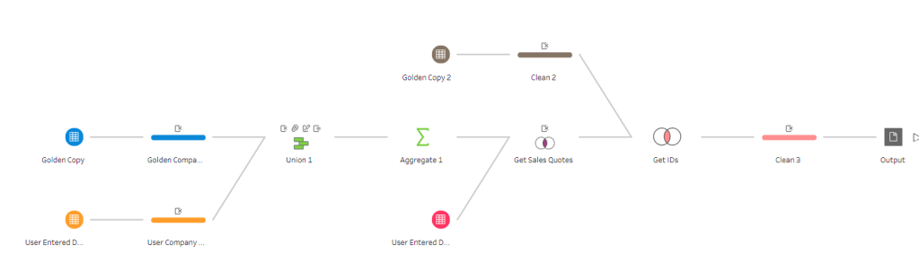
In this video I will build out a Tableau Prep flow that demonstrates one approach to perform fuzzy matching. We’ll perform the fuzzy matching technique on two lists of companies. One list contains a standardized list and the other contains a non-standardized list, and we will match them together using Tableau’s fuzzy algorithm.
Intro
As a working data professional, one of my main responsibilities is to ensure the accuracy and consistency of the data that I work with. One of the challenges I face is dealing with different variations of company names that may exist in different datasets. In the video above, I walk you through a fuzzy match join that I recently performed using Tableau Prep, a data preparation tool, to reconcile these variations.
What is Fuzzy Matching?
First, I want to introduce you to the concept of fuzzy matching. It’s a technique used to match data when there are slight differences in how the data is presented (most likely as a result of bad data governance). For example, if you have two data sets with company names, one may list a company as “Apple Inc.” while the other may list the same company as “Apple Incorporated.” Fuzzy matching would help you match these two records, even though the names are slightly different.
In Tableau Prep, unfortunately fuzzy matching is not a straightforward process like it is in Excel or other tools like Power BI or Alteryx. However, we can use a workaround to achieve a somewhat similar result. Tableau Prep allows you to automatically group values together using fuzzy-match algorithms that find similar values.
High Level Flow Process
To get started, let’s say we have two lists of companies. One is a master list of companies that we want to use as our reference, or “golden” copy. The other is a list of companies that may be misspelled or unstandardized. We want to join these two lists together using fuzzy matching (although technically we employ fuzzy grouping options to enable traditional matching).
Within Tableau Prep I start with two groups of data, a clean “golden copy” of company names and a list of company names that contain poor data quality (i.e., user-entered data, which may have misspelled or unstandardized company names).
Once we have imported both data sets, we can append them using a union step. The union will combine the two lists of company names into one.
Next, we need to perform a fuzzy algorithm on the list of company names. Remember that both the golden copy and the misspelled names are stacked into one column. In Tableau Prep, we’ll use the fuzzy grouping capability to group together similar values, even if they’re not exact matches. We’ll use this technique to group the misspelled company names with their correct counterparts in the “golden” copy.
Granted this approach does not scale terribly well over a large dataset because we need to eyeball each grouping to ensure it is acceptable, but it is a good start. I don’t know of any fuzzy algorithm that guarantees 100% results, as “fuzzy” is inherent in the name of the approach.
Here are a couple of must read posts from the Tableau Knowledge Base for Fuzzy Grouping if you want to understand these automated grouping options:
After the values in the combined column are grouped together into a standardized clean format, we simply need to deduplicate our values so we are left with a 1 to 1 mapping between the incorrect data and the cleaned up result of the fuzzy grouping. We can use this “translation table” as a means to join our Golden Copy dataset to the less standardized dataset (which has the sales data we need to analyze).
Result
By using fuzzy match and Tableau Prep, I was able to successfully reconcile the variations in the company names and match the sales quotes in the “poor data quality” company names data set to their corresponding IDs in the clean golden copy names data set. If you’re stuck in this kind of a scenario at work, use this process to advocate for a cleanup of the data quality at the source of entry or creation.
In conclusion, fuzzy matching is a powerful technique that can help you match data even when the data may not be spelled correctly or may have slight variations. Tableau Prep may not have a straightforward fuzzy matching feature (a la Excel), but we can use fuzzy grouping to achieve similar results.
Here is a pic of the flow we build in the video. I add additional steps for this unique case but ideally to perform the fuzzy grouping we could stop much earlier in the process.
Have you ever wanted to disable the default Tableau highlighting effect when you select a mark on your chart and then remove the filter? Even when the filter is removed via the “Remove All Filters” process, it can be confusing for the user experience when all values remain “greyed out”, tricking the user into thinking that their filter is still applied. This video will help you remedy this issue and improve your dashboard user experience.
Fortunately, there is a solution to this problem that is simple and easy to implement. In this video I will show you how to use a simple calculated field and highlight action to remedy the issue. This should be default behavior in Tableau, (help us out here Tableau!)
The solution approach involves creating a boolean calculated field and setting it initially to TRUE. Then, placing this calculated field on the detail of the chart that has a filter applied. Next, adding a highlight action to the same chart that you want to remove the “greyed out” effect for. In the “Add Highlight Action” pop-up box, the Source Sheet and the Target Sheet should be the same and the Selected Fields option should have the boolean calculated field checked.
By following these steps, you will be able to remove the greyed out effect on your Tableau chart when the “Remove All Filters” process is applied.
This not only improves the appearance of your dashboard but also makes it easier to understand the data.
★☆★ THESE ADDITIONAL FILTERING VIDEOS IN TABLEAU ARE WORTH YOUR TIME ★☆★
Don’t let the greyed out effect on your Tableau charts hold you back any longer. Watch the video and follow the steps outlined in this blog post to improve the appearance and functionality of your Tableau dashboards.
You can also follow my dapper data adventures on Instagram.
I’m proud to announce that I recently passed the Tableau Certified Data Analyst certification. If you found this article, most likely you are looking for a perspective on the exam and how to pass and earn this certification yourself. Here is the story of my journey, which may differ from the typical experience.
I had a New Year’s resolution to add the Tableau Certified Data Analyst certification to my resume because the Tableau Desktop Certified Associate certification I held was due to expire. If you want to read up on how I passed that older exam, you can find my insights here. Some of those insights will also serve you well on passing the current exam.
I believe that certification has its advantages. It’s a way to signal to potential and current employers that you have some defined level of competency in a targeted skill. It’s also a means to strengthen the case to your employer that you deserve additional compensation (if you are under-compensated). Fortunately, I am compensated fairly now, but this has not always been the case (shout-out to highly competent middle office IT pros toiling away underappreciated, but I digress). Finally, studying allows you to stay up-to-date on the latest tools and trends in your chosen domain.
How Much Experience Do You Need?
The official exam guide states, “The best preparation is role experience and time with the product. To be prepared, candidates are strongly encouraged to have at least 6 months of experience.” I would tend to agree with this if you have used the tool extensively during this time frame. Otherwise, I would recommend at least 1 to 2 years experience with the tool and as a data analyst before attempting to sit for this one. Focus on obtaining the Tableau Specialist certification (it never expires) first before attempting this exam.
Why Did I Get Certified?
For my purposes as a senior manager in a consulting practice, certification certainly has benefits with respect to establishing credibility quickly on new projects. I may hold a manager title but you’ll never pry my hands away from keyboard-centric hands-on technical work, as I enjoy being a technical subject matter expert (and teaching/mentoring others).
Other than employment and signaling purposes, an additional benefit of certification is the personal growth and esteem benefits that you gain from tackling a goal. My body of work is visible online and I have years of relevant experience, thus certification is not something I necessarily needed but something I desired.
The main difference between the new Certified Data Analyst exam and the older Desktop Certified Associate exam is that you will now be tested on Tableau Prep, Tableau Server and Tableau Online. Having to understand aspects of Server and Online were initial concerns I held before taking this test.
I have about 7 years of experience between Tableau Public & Desktop and about a year of experience with Tableau Prep so that was not an issue. I have used Tableau Server to publish my dashboards while on a project at a large Fortune 500 company, but I would by no means consider myself a server expert. I’ve used Prep to transform data for clients without issue as it is easy to pick up with exposure and usage. Look at this listing of domain items covered on the exam.
My strategy to compensate for a lack of deep hands on experience in Domain 4 was to perform really well on all the other domains. Using this strategy, I could still potentially score 91% max (assuming I miss every Domain 4 question which would be highly improbable). If you are like me and have deep knowledge of Tableau Desktop, then you should be fine. Do not use a lack of server experience as an excuse to avoid certification. Simply read up on publishing content at these links and you should have a fighting chance. Personally, I found the Certified Data Analyst exam to be somewhat easier than the Desktop Certified Associate exam. Not easy, just a little bit easier with respect to the Tableau Desktop asks.
Another difference between the Certified Data Analyst exam and the older Desktop Certified Associate exam is the presence of a hands-on lab portion. I honestly found this to be the easiest section on the test, although your mileage may vary. There was one question that had me stumped only because I wasn’t sure what was being asked so I built a visual that probably did not reflect the ask. Other than that 1 question, I felt that I nailed this section.
The official exam guide states, “Candidates are encouraged to comment on items in the exam. Feedback from all comments is considered when item performance is reviewed prior to the release of new versions of exam content.” In hindsight, I should have left a comment on the question stating “unclear”.
For the hands on lab (I’m not sharing anything that isn’t already on the exam guide), definitely be familiar with filter and highlight actions, how to use a TOP N filter, how to use parameters with filters, labels, and how to add reference lines and perform custom sorting.
How Did I Prepare?
Honestly, I meant to prepare for at least a week beforehand, but life got in the way. Thus, I literally crammed my review into the span of 7 hours the Saturday before sitting the exam. I do not recommend this if you are not well versed in the tool. I simply needed to review some concepts. The listing at this website provides great links to official Tableau documentation for the subject areas covered on the exam.
Results
I completed the exam with about 35 minutes to spare. After I submitted my results online, I only had to wait an hour before I received an email stating that I had a score available. This is in stark contrast to when the beta exam was in effect. I heard that results would take months to process. I cleared the 75% hurdle despite studying for only a few hours and not having deep experience with Tableau server. I could have easily scored higher given more study time, but I was happy to pass the exam given the meager study time I allotted to the task. I’m not saying that the test was easy, I’m just fortunate that I’ve had enough experience with Desktop that I could “sacrifice” in other areas and still make it across the finish line. This strategy may not work for you if you have under a year’s experience with the tool.
Focus on These Subject Areas:
However, here is the section you came for, this is my abridged list of test focus areas. Make sure to focus on these subject areas to give yourself a good shot at passing the exam.
Start here: Here are 5 useful videos from my catalog that you should review to level up for the exam. I promise they are worth your time and will help you prepare. Do me a favor and like the videos to help others find the content as well!
Best of luck to you. I know that you can pass this test if you have decent hands on experience with the tool. For those of you without a Tableau license, use Tableau Public to study and fill in gaps by reading blogs, watching videos and using Tableau official documentation. I believe in you!
About Me (Data background):
Experience: 15 Years Industry + 8 Years Analytics Consulting
Tableau Certified Data Analyst
2X Tableau Ambassador
M.S. Quantitative Management – Business Analytics – Duke University
Learn how to perform a useful Tableau hack that allows you to display multiple sheets in one container on your Tableau dashboard. In this video I use my personal training dashboard to show you step by step how this trick is performed. This tip is a must know for the intermediate to advanced dashboard builder as it will help you save space on your dashboard.
Watching the video will make the concept clearer but I will provide an overview in this post.
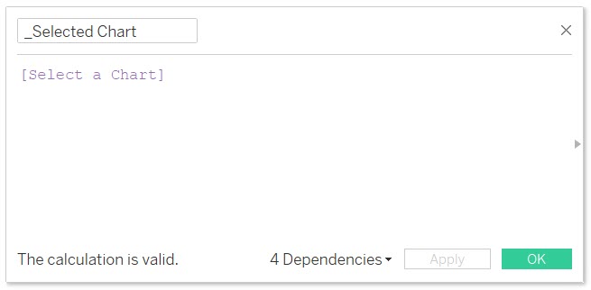
Step 1: I create a Parameter named “Select a Chart”. You can see that I have chosen a list of allowable values and I place into the list the names of charts that I want to swap.
Step 2: I create a calculated field named “_Selected Chart”. It only holds the value of the parameter I created in Step 1.
Step 3: (Use screenshot below)
1. Place the “_Selected Chart” calculated field on the filter shelf of a chart that you wish to show and hide.
2. Edit the “_Selected Chart” filter and select the “Custom value list” option.
3. Type in the respective name of the chart that corresponds to the value that you entered in the parameters allowable values list in Step 1. Hit the plus button to the far right to add the value. Additionally add the value of “All” to the Custom value list in the same manner.
IMPORTANT: the value that you enter into your chart must match EXACTLY to the value that you placed on the parameter allowable values list.
Repeat this process for every chart that you wish to show and hide, making sure to type in the exact samechart name that you entered in the parameter allowable values list in Step 1.
Step 4:
Now it’s time to place all of your charts into the same object (i.e., horizontal or vertical container) on your dashboard . Make sure to show the parameter named “Select a Chart” on the dashboard so you have a combo box with the names of your charts inside that you can select.
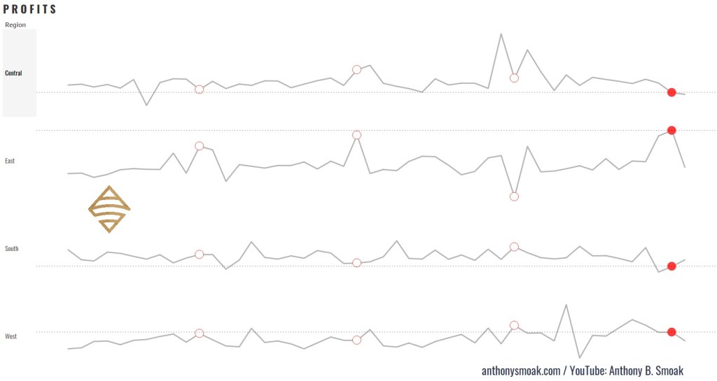
So you want to add some spice to your bland looking Sparklines in Tableau? You have come to the right place (start by watching the video above). Let’s talk about how a Sparkline is defined per Wikipedia:
“A sparkline is a very small line chart, typically drawn without axes or coordinates. It presents the general shape of the variation (typically over time) in some measurement, such as temperature or stock market price, in a simple and highly condensed way. Sparklines are small enough to be embedded in text, or several sparklines may be grouped together as elements of a small multiple. Whereas the typical chart is designed to show as much data as possible, and is set off from the flow of text, sparklines are intended to be succinct, memorable, and located where they are discussed.”
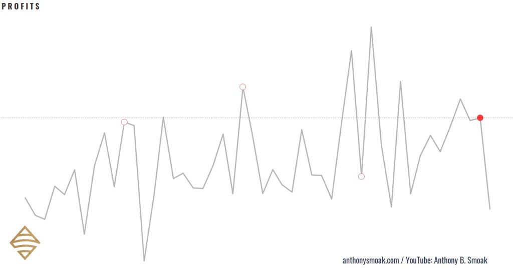
Here are a few examples of Tableau specific sparklines in action (with latest complete month bubble indicators and reference lines): Notice how I do not include any data axes, but you can clearly recognize the data trends in the visuals.
Here is an example of how I used the sparklines demonstrated in the video to build a out a classic yet refined looking Tableau dashboard.
For reference purposes I am going to list three formulas used in the completion of the sparklines, you’ll have to watch the video to learn how to put them together.
In this exercise I am using that standard Tableau Superstore data set which you can perform a Google search to find if you are using Tableau Public.
Calculated Fields
Calculated Field #1 (Name: SPRK_CircleMonths)
This calculated field puts a circle on the penultimate month data points. Penultimate is just a fancy SAT word way of saying “next to last”. When the month of the data point on the line chart (Order Date) equals the next to last order date month in the dataset, then return the Order Date.
//IF THE MONTH OF THE DATE ON THE LINE CHART EQUALS THE MONTH-1 OF THE MAXIMUM DATA POINT
// THEN RETURN THE DATE
If DATEPART('month',[Order Date]) = DATEPART('month',dateadd('month',-1,{MAX([Order Date])}))
Then [Order Date] END
Calculated Field #2 (Name: SPRK_CircleMonths)
This logic will be applied to the circles generated by the previous calculation SPRK_CircleMonths. Only the next to last month will meet the TRUE condition (which will be colored as red).
// IS THE MONTH OF THE CHART DATE EQUAL TO THE MOST RECENT DATE MONTH MINUS 1 MONTH
// E.G., NOV 2018 = NOV 2020 WILL RESOLVE TO TRUE DUE TO MATCHING MONTHS
DATETRUNC('month',[Order Date]) = DATEADD('month',-1,DATETRUNC('month',{max([Order Date])}))
Calculated Field #3 (Name: SPRK_RefLine Profit)
This logic will return the profit associated with the next to last month in the dataset to display on the reference line.
// RETURNS A VALUE USED FOR THE REFERENCE LINE
// IF THE MONTH OF THE DATE = THE MONTH OF THE MAXIMUM DATE MINUS 1 MONTH (GET A COMPLETE FIRST MONTH)
if DATETRUNC('month',[Order Date])
= DATEADD('month',-1,DATETRUNC('month',{max([Order Date])}))
THEN [Profit] END
When you put all the functions together in a manner according to the video, you end up with a more refined sparkline in my opinion. Big shoutout to the Data Duo for the inspiration on the dashboard I created and this technique. If you haven’t checked out any of their work make sure to do so.