You want to build an advanced Zen Master level KPI BAN using Tableau’s latest COVID-19 data? Well you’re in luck as I spent a lot of weekend hours analyzing an impressive dashboard put together by Tableau Zen Masters Anya A’Hearn, Tamas Foldi, Allan Walker, and Jonathan Drummey.
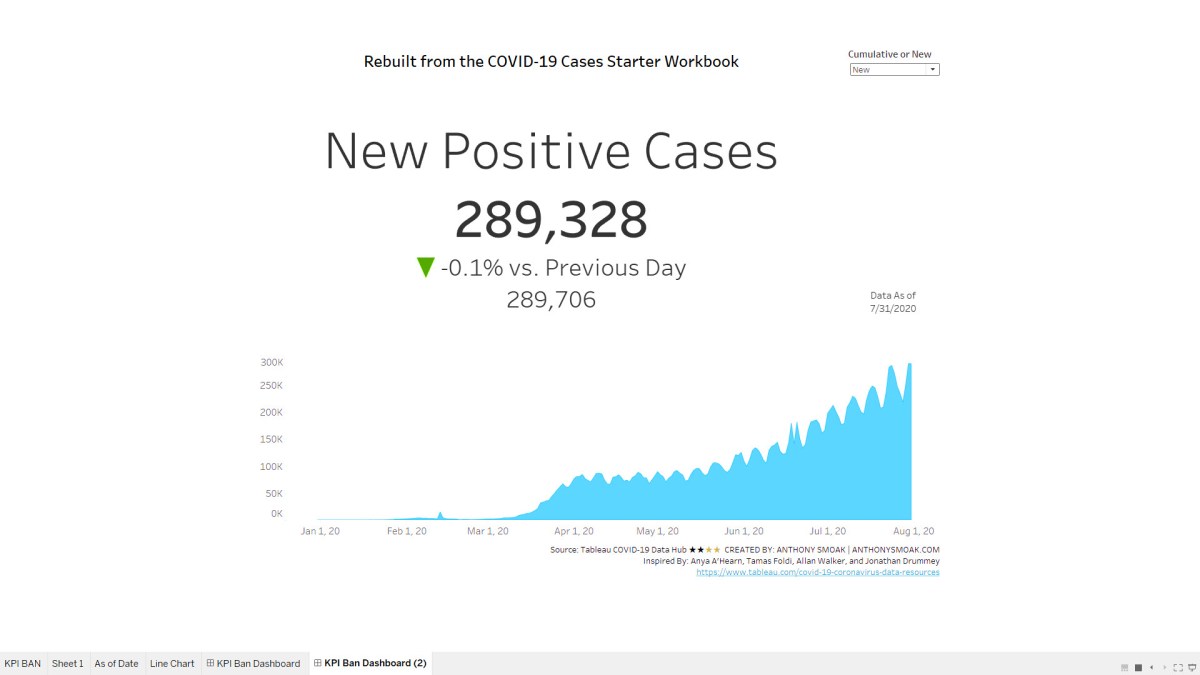
Specifically I was intrigued how they put together the KPI BAN from the dashboard below that highlights either NEW or CUMULATIVE Positive cases and the percentage difference from the previous day.
![]()
The official Tableau COVID-19 tracker database can be found here.
In breaking down their approach I renamed some calculations to better help me organize and understand how they come together to create the KPI.
What’s in it for You?
From a learning standpoint, there is a good mix of parameters, filters, context filters and Level of Detail (LOD) calculations that work in concert to deliver the desired outcome.

In the video you’ll learn how I simplified some of the back-end aspects to be a tad more approachable for beginner to moderate Tableau learners. Of course if you want to see the whole dashboard in context with the original back-end naming conventions and layout you can go download the official workbook and deconstruct it for yourself.
It’s all about learning! I encourage you to make use of workbooks that others have shared for bettering yourself and appreciating skills that are at the next level. Of course, always cite your sources and inspirations!!
As always, If you find this type of instruction valuable make sure to subscribe to my Youtube channel.
Make Sure to Watch this Additional Video Series
Make sure to also check out this extremely useful tutorial on building a COVID-19 Dashboard from scratch. It’s perfect for your first Tableau project with step by step instruction.
All views and opinions are solely my own and do NOT necessarily reflect those my employer.
Do Great Things With Your Data
– Anthony B. Smoak
