Since Tableau Public was recently upgraded to enable local saving (It’s about time), I decided to look and see what new dashboards were out there that I could learn from, and subsequently teach others to rebuild. My mantra is that you learn the most, by teaching others.
I did find the perfect dashboard built by Dmitry Shirikov on his Tableau Public page! There are also design elements from a dashboard created by Murilo Cremon so I tip my cap to him as well.
I reached out to Dmitry via Linkedin and asked for his permission to use this dashboard as a teaching tool for video lessons and he graciously gave me permission. This further demonstrates the collaborative spirit that thrives on Tableau Public. I offer a big thank you to Dmitry!
What I like about his dashboard is the use of the standard Tableau standard superstore dataset combined with interactive/dynamic year over years metrics and thoughtful design.
It contains deceptively simple KPIs, intermediate level metric swapping and a button selector process that relies on parameter actions. Parameter actions update the value of a parameter based on a user interacting with the marks in the view (in this case, the Sales, Profit or Orders dimensions).
I spent a great deal of after-work and weekend time researching how to put this dashboard back together and rebuilt it piece by piece so I could understand what was done.
It also took some time to record and edit this video as it is coming in at over an hour in length! I can’t believe I put this much time and effort into a free product!
My hope is that by dissecting the dashboard and teaching you how to build the chart elements, you can gain some valuable dashboard building insights to add to your repertoire.
If you think a part 2 video regarding the actual dashboard layout will be valuable, please leave a comment on my YouTube channel!
In this video, we’re going to tackle an interesting little challenge – adding dynamic totals to stacked area charts in Tableau. While this may not be a technique for production-ready charts, it’s perfect for those one-time presentations or exports to PowerPoint.
Recently, I had a fantastic 90-minute private data tutoring session with someone who contacted me via this website. During this session, we worked together to address three different data issues, one of which was the quest to display totals for stacked area charts. With some creative thinking and a dash of Tableau magic, I found a solution that I’m excited to share with you.
Use the timestamps below to navigate directly to your desired point in the video.
Historically, creating Sankey charts in Tableau has been a time-consuming process, often requiring the use of complex templates. However, the team at Tableau Public has introduced a game-changing functionality that allows us to create Sankey charts effortlessly. This feature, currently in beta and available for a limited time (like the McRib of data visualizations), enables us to author and publish Sankey charts directly to our Tableau Public profiles.
In this blog post, I’ll briefly walk you through the process of creating one using Tableau Public.
What is a Sankey Chart?
Before we delve into the specifics of this new Tableau Public feature, let’s take a moment to understand what a Sankey chart is and why it’s such a powerful visualization tool. A Sankey chart is a flow diagram that illustrates the movement of data, be it goods, energy, or even money. With a Sankey chart, you can effortlessly compare different data points and identify patterns that might remain hidden in traditional charts or tables.
Testing Out the New Feature
Assuming you already have a Tableau Public profile (and if you don’t, I highly recommend creating one—it’s an incredible platform for sharing your data visualizations with the world). You’ll need to create a visualization directly from your Tableau Public page.
Once you’ve created your visualization, navigate to the “Connect to Data” section. As we’re uploading data from our computer, select the “Upload from Computer” option. Choose the dataset you want to work with—I’ll be using the “Sample Superstore” dataset for this example. After confirming that your data has been successfully imported, select the “Sankey” chart type.
Now, here’s where the magic happens. You’ll notice a “Level” and “Link” section that appears. To define the flow in the Sankey chart, let’s select a dimension like “Segment” and drag it into the “Level” area. Next, grab another dimension—I’ll choose “Region”—and place it in the “Level” area as well. Finally, to quantify the flow, let’s choose a measure like “Sales” and place it in the “Link” area.
Voila! With just a few clicks, we’ve created a Sankey chart. Impressive, isn’t it? You’ll notice the flow between the segments and regions instantly come to life. But we’re not done yet—let’s keep the party going by adding another level.
For the sake of experimentation, let’s grab a dimension like “Ship Status” and drop it into the visualization. Now we have an additional sub-level in our Sankey chart. To avoid overcrowding, we can uncheck the “Allow Labels to Overlap” option, ensuring our chart remains clean and legible.
Keep Innovating for The Analytics Core Audience
Tableau Public’s decision to incorporate this feature highlights their commitment to democratizing data visualization. While the addition of features like Sankey charts to Tableau Public is fantastic, it’s essential that the overlords at Salesforce remember Tableau’s core audience—the general analytics users who are generally decoupled from Salesforce usage. Let’s keep hoping for bigger and better things to come with the tool. This beta signals that they’re heading in the right direction.
(Note: The mentioned feature and availability were accurate as of the blog post’s publication date, but please refer to the Tableau Public documentation for the latest updates and information.)
Yes I put an AI version of myself on the thumbnail. I obviously “Quantum Leaped” from the future to teach you these Advanced Tableau table skills that you’ll encounter in the accompanying video.
Be warned, this is Highly Advanced Tableau!! In the main video, we’ll explore how to generate advanced tables in Tableau (step by step), complete with multiple chart elements displayed on the same table row. It’s OK, you can click the area below since it leads to a YouTube short.
Intro
As a data enthusiast and Tableau user, I always strive to learn new things, experiment with different techniques and share my knowledge with others. Recently, I came across a visualization by Zainab Ayodimeji that caught my attention. Zainab is a Tableau Ambassador and her work is always top-notch, so I reached out to her and asked if I could reverse engineer one of her vizzes for a video. She was cool with it, so I got to work.
The visualization that caught my eye was an advanced Tableau visualization that used normalized data to create sales and profit sparklines for using standard Superstore data. Zainab’s visualization featured a variety of different chart elements, all on the same row, and looked incredibly cool.
I was immediately intrigued and wanted to see if I could reproduce something similar myself, but with a different data set other than the ubiquitous Superstore. So, I got to work on reverse engineering and came up with my own take on Zainab’s visualization.
I discovered that the technique used in her viz was innovated by Sam Parsons, so I also checked out his video on this technique and found it ingenious; very MacGyver like. Sam’s innovative video is the inspirational source for all of these techniques. Watch his video for the concepts, watch my video for practical hands on building.
Watch the Step by Step Re-creation Video to Learn this Advanced Technique
In the video below, I will explain step by step how I used Tableau to create a compelling chart example that will help my viewers understand the Advanced Tableau calculations and concepts it takes to visualize multiple types of charts on one table row.
The dataset that I worked with contained information about the sales and profits of different products sold at a coffee shop as opposed to Superstore data. Recreating the data with a different dataset forced me to understand the concepts better than just copying and pasting the existing code in Zainab’s visualization.
The Reviews are In
Y-Axis Positioning Trick – (How this Process Works)
One of the coolest concepts in this process is the positioning of the chart elements on the same Y-Axis. Again, a big shoutout to Sam Parsons for coming up with these techniques!
The y-axis position is critical because it determines where each data point will be plotted on the chart. As a result of the ingenious calculation, Tableau places all non-line chart elements at a y-axis position of 0.5, which is the middle of the y-axis. However, for line chart elements, the y-axis position is calculated based on the normalized sales or profits value.
To normalize the data, we make the values of the sales and profit of each product fit between a range of 0 and 1 for a consistent Y axis. This allows us to see the trends of the sales and profits of each product at a standard consistent height on the visual.
The sales or profit axis test (a calculated field) determines whether the normalized sales or profits value should be plotted if the chart element is a line. If the test returns a value of 1, Tableau will plot the normalized sales value. If it returns a value of 0, Tableau will plot the normalized profits value. This is determined by checking whether the sales access product field is present in the detail section of the view.
I just realized that I used Quantum Leap and MacGyver references in the same blog post (gettin’ Ziggy with it). After watching my video above, you’ll be able to create an insightful visualization using clever and unconventional methods (not unlike MacGyver making a jetpack out of a toothpick and a piece of gum).
Again, big thanks to Zainab and Sam for influencing this work so I could teach you how to Quantum Leap forward in your Tableau skills (Ok I’ll stop with the puns). Keep doing great things with your data!
Learn how to perform a useful Tableau hack that allows you to display multiple sheets in one container on your Tableau dashboard. In this video I use my personal training dashboard to show you step by step how this trick is performed. This tip is a must know for the intermediate to advanced dashboard builder as it will help you save space on your dashboard.
Watching the video will make the concept clearer but I will provide an overview in this post.
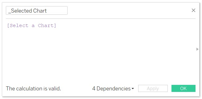
Step 1: I create a Parameter named “Select a Chart”. You can see that I have chosen a list of allowable values and I place into the list the names of charts that I want to swap.
Step 2: I create a calculated field named “_Selected Chart”. It only holds the value of the parameter I created in Step 1.
Step 3: (Use screenshot below)
1. Place the “_Selected Chart” calculated field on the filter shelf of a chart that you wish to show and hide.
2. Edit the “_Selected Chart” filter and select the “Custom value list” option.
3. Type in the respective name of the chart that corresponds to the value that you entered in the parameters allowable values list in Step 1. Hit the plus button to the far right to add the value. Additionally add the value of “All” to the Custom value list in the same manner.
IMPORTANT: the value that you enter into your chart must match EXACTLY to the value that you placed on the parameter allowable values list.
Repeat this process for every chart that you wish to show and hide, making sure to type in the exact samechart name that you entered in the parameter allowable values list in Step 1.
Step 4:
Now it’s time to place all of your charts into the same object (i.e., horizontal or vertical container) on your dashboard . Make sure to show the parameter named “Select a Chart” on the dashboard so you have a combo box with the names of your charts inside that you can select.
In this video I will teach you how to perform a multiple keyword search in Tableau. I’ll show you how to perform both an OR search & an AND search against keywords you type into your dashboard parameter.
In order to accomplish these tasks, we need to use regular expressions. As I mention in the video, regular expressions can be indecipherable, akin to hieroglyphics or something out of a Dan Brown novel to the average person. You can go find this information on the Tableau knowledge base, but I want you to be the person that understands WHY something works as opposed to just copying and pasting a solution that you cannot explain to yourself or others.
The use case for multiple keyword search is for those times when you need to filter your data by a comment, description or other free form blocks of text that are not necessarily subject to the most stringent data governance rules, because let’s face it, these types of fields exist in abundance. In the video I create a dashboard that illustrates the power that this type of search can bring to your dashboard.
You can interact with the dashboard from the video on my Tableau Public page.
OR SEARCH
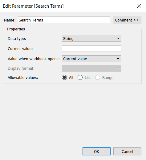
1. CREATE PARAMETER
Create a parameter named Search Terms.
Data type: String
Current value: keep it blank.
Allowable values: All
2. CREATE CALCULATED FIELD 1
Create a calculated field named Regex String (OR) including the following formula:
"(" + REPLACE([Search Terms], ',' ,'|') + ")"
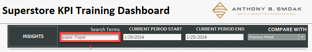
Let’s breakdown what is going on with the apparent gibberish seen above (there is a method to the madness here). I’ll assume you want to perform a search against a field that contains the terms “paper” OR “Paper”; the case of the spelling is a factor in the results (case sensitive). To adhere to proper regex formatting, you could write a valid expression as such:
(paper|Paper)
This pattern indicates that you want to return a match on the characters “paper” OR “Paper” literally. You can test this out at https://regex101.com/
Although for some reason the official Tableau knowledge base article says to use the REGEX_REPLACE formula in lieu of REGEX, it is not needed since we are doing a simple replace and not using a regex formula to aid our replacements.
In the Tableau calculated field above, we are using the REPLACE function against the parameter named “[Search Terms]” to replace every instance of a comma with the the ‘|’ pipe symbol.
Think about it, if you type the terms “paper, Paper” into the a dashboard’s search term parameter as seen below, the calculated field will reformat your list into the proper regex format by replacing the comma with a pipe and then enclosing the term within parenthesis; i.e., (paper|Paper).
3. CREATE CALCULATED FIELD 2
Next create a calculated field named Regex OR Filter that contains the following formula:
REGEXP_MATCH([Product Name],[Regex String (OR)])
Let’s breakdown what is going on with the formula seen above. The REGEXP_MATCH formula is evaluating a properly formatted regex expression which is contained within the [Regex String (OR)] calculated field we created in step 2. This calculated field will contain the formatted expression (paper|Paper).
REGEXP_MATCH returns TRUE if a substring of the specified string matches the regex pattern. In our case
[Regex String (OR)] = (paper|Paper)
Thus the REGEXP_MATCH function will evaluate the regex expression (paper|Paper) from the second argument against the [Product Name] field in the first argument. The function will return either TRUE or FALSE depending upon whether a match is located within this field.
3. DRAG FIELDS TO ROWS AND FILTERS SHELF
Place [Product Name] to rows and [Regex OR Filter] to filters, then select True.
AND SEARCH
In order to create the AND search for your dashboard, you will follow very similar steps to the OR search. 1. Create the same parameter named Search Terms as in the OR Search above.
2. CREATE CALCULATED FIELD 1
Next create a calculated field named Regex AND Filter including the following formula:
This may look like something out of a Dan Brown novel, but don’t let it intimidate you. In a similar fashion to the OR search where we replaced commas with a pipe symbol, we are simply replacing commas with the following characters between the double quotes “)(?=.*”
The proper regex pattern to indicate an AND search against the terms paper and Paper within a body of text would be as such:
(?=.paper)(?=.Paper).*
Knowing the proper regex format should make the contents of the calculated field above more clear. We are using the REPLACE function against the parameter named [Search Terms] to replace every instance of a comma with the the “)(?=.*” symbols. Thus “Paper, paper” values typed into the [Search Terms] parameter becomes reformatted into(?=.paper)(?=.Paper).*
Placing .* at the end of the string means that any combination of characters can be placed after the search terms and still yield a TRUE result.
3. CREATE CALCULATED FIELD 2
Next create a calculated field named Regex AND Filter including the following formula:
REGEXP_MATCH([Product Name],[Regex String (AND)])
4.DRAG FIELDS TO ROWS AND FILTERS SHELF
Then place [Product Name] to rows and [Regex OR Filter] to filters, then select True.
CONCLUSION
That wasn’t so horrible was it? If you’re a visual learner like me, then go ahead and watch the video to hammer home the concepts. Hopefully this post will help you understand how these regex patterns work and how they can add value to your next dashboard design! As always if you learned something drop a comment on the YouTube video and let me know.
This post is for everyone who has ever asked, “How do you create an interactive resume in Tableau?” If you’re looking to get noticed as a Tableau visualization developer / subject matter expect, then building out an interactive resume using Tableau is a great place to start. It is a good starter visualization to build because you already have all the data! The data is inherently about you, but you just need some inspiration on how to get started building out your resume.
That’s where I come in, to share with you a place to start for inspiration, and direction on how to build out a few charts I leveraged to construct my interactive resume.
Where to Get Inspired
The first place you want to start looking for interactive Tableau resume inspiration is the Tableau Public Resume Gallery. The Tableau community has done an excellent job of sharing resumes so you don’t have to start from scratch with respect to idea generation. As I was looking through the gallery, I started to notice that most of the resumes had some common DNA, most notably a timeline chart (either linear or Gantt chart) and an abacas chart (both of which I will show you how to build in the video).
My resume is inspired by offerings from both Ann Jackson and Lindsay Betzendahl. When you look through the gallery you may find a resume that fits your personal vision. I’m sure you’ll use a few of the techniques I’m going to share as well.
You can also do a simple google image search on “Tableau Interactive Resume” and you’ll find additional images that link to resources that are not on the official Tableau Public Resume Gallery.
Format Your Data
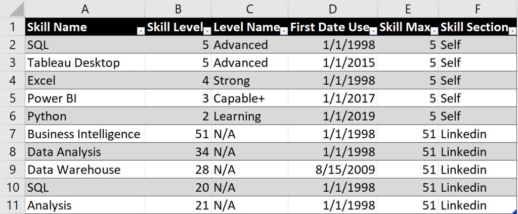
In order to build out the necessary charts to support your resume, you’ll use Excel to format the data. I cover the format for both the timeline chart and the abacas chart in the video, but below is a sneak peek of how I formatted my data for the abacas skills chart.
The data above supports the buildout for two separate abacas charts. One chart is for a self-rating of my skills (rows 2-6), while the other chart is a representation of LinkedIn endorsements (7-11).
Column E represents the maximum value of the skill that I want to present on the abacas chart. Since I was self-rating my skills from a scale of 1 to 5, then 5 was the maximum value represented. For the LinkedIn endorsements, 51 was the highest number I received, thus for all rows supporting this chart, 51 was the maximum value.
Gantt Chart
Every resume needs a timeline! Although I describe how to build a single linear timeline chart in the video above, I have another video that explains how to build a Gannt chart in Tableau. For some of our experiences, we have more than one activity happening at the same time, thus the following video will help in your resume build out as well.
Remember that we all have a story to tell and an interactive resume in Tableau will help you share your experiences and get noticed if done well. Good luck!
All views and opinions are solely my own and do not necessarily reflect those of my employer
I appreciate everyone who has supported this blog and my YouTube channel via merch. Please click here
Thank you!!
Anthony B Smoak
INCREASE YOUR FOCUS TRY BRAIN.FM
When I am focusing hard during the day at work or developing visualizations on the weekend. I use Brain.fm to help me focus when it matters. It’s Science-driven and research-backed functional music designed from the ground up to help you you focus, relax, meditate and sleep. If you’d like to try a free trial check out https://brain.fm/anthonyb
Please use coupon code anthonyb for a 20% discount upon checkout. It helps support this blog and my YouTube channel as I receive a small commission for purchases made through links in this post.
Are you looking for the next viz to showcase on your Tableau Public page? In this video I will teach you a technique that spices up the humble stacked bar chart with dynamic totals (using Tableau Set Actions). We will build out the viz step by step with Superstore data.
Stacked Bar Chart with Dynamic Totals
This chart is powered by Tableau Superstore data which is a data set that is readily available on the internet and is packaged as the default data set with Tableau. As you select the three legend categories at the top of the visual, the stacked bar chart sections will appear or disappear. The totals will also automatically update based upon your selection.
How cool is that!!??
I have to give a shoutout to Dorian Banutoiu for originating this technique. A few years ago, Dorian used this technique in a Makeover Monday exercise and it recently caught my attention when I was checking out his Tableau Public page. I immediately attempted to reverse engineer the technique (which admittedly took some effort).
Because I wanted to enable everyone with Tableau and/or Tableau Public to duplicate the chart, I used Tableau Superstore data as my foundation. Make sure to give Dorian a Twitter follow at @canonicalizedco.
What’s In it for You?
By following along with the video, you will utilize multiple Tableau elements such as:
Practice makes perfect so this will be a good opportunity for you to practice multiple Tableau elements with the creation of one visualization. You can click the links on the list above to see additional videos that cover respective areas.
Give Credit
If you do reproduce this visualization step by step or leverage the technique for your Tableau Public page or Linkedin Page, please link to this post or the YouTube video and place “Inspired by Dorian Banutoiu & Anthony Smoak” somewhere on the viz and post text.
Interact with the Finished Visualization
You can interact with the finished visualization on my Tableau Public page here:
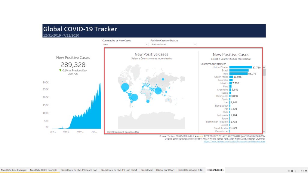
Operation “Reverse Engineer” a Tableau Zen Master dashboard is back in full effect. You know the drill by now, I spent weekend hours analyzing an impressive dashboard put together by Tableau Zen Masters Anya A’Hearn, Tamas Foldi, Allan Walker, and Jonathan Drummey.
In this video I will demonstrate to you how they use parameters to dynamically change the measure that is displayed on both a map and bar chart. Accurate data is made possible through the use of a context filter to equalize the data that is displayed between the United States and all other countries (U.S. data lags by one day).
I should mention that we are using the carefully curated data offered at the Tableau’s COVID-19 Data Hub.
What’s in it for You?
You will learn a neat little trick that encapsulates multiple measures into one calculated field. By using two parameters we can update our visuals to display the correct measure based upon user selected options. This even applies to the size of our marks on a map. You have to love the dynamic nature of Tableau!
In order to understand how we work with the current Tableau COVID-19 data file, you should watch the first video as a prerequisite.
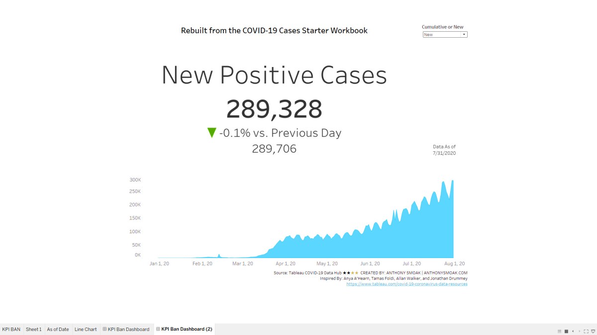
I spent a lot of time breaking down how #Tableau put together this 1 KPI in their #COVID19 Cases Starter Workbook so you don't have to. Thank you to the Zen Masters who enabled this KPI for great dashboard design and data. https://t.co/bUjKT6E9Y8pic.twitter.com/d4DdgJCDJ5
Also Make Sure to Watch this Additional Video Series
Make sure to also check out this extremely useful tutorial on building a COVID-19 Dashboard from scratch. It’s perfect for your first Tableau project with step by step instruction.
You want to build an advanced Zen Master level KPI BAN using Tableau’s latest COVID-19 data? Well you’re in luck as I spent a lot of weekend hours analyzing an impressive dashboard put together by Tableau Zen Masters Anya A’Hearn, Tamas Foldi, Allan Walker, and Jonathan Drummey.
Specifically I was intrigued how they put together the KPI BAN from the dashboard below that highlights either NEW or CUMULATIVE Positive cases and the percentage difference from the previous day.
The official Tableau COVID-19 tracker database can be found here.
In breaking down their approach I renamed some calculations to better help me organize and understand how they come together to create the KPI.
From a learning standpoint, there is a good mix of parameters, filters, context filters and Level of Detail (LOD) calculations that work in concert to deliver the desired outcome.
In the video you’ll learn how I simplified some of the back-end aspects to be a tad more approachable for beginner to moderate Tableau learners. Of course if you want to see the whole dashboard in context with the original back-end naming conventions and layout you can go download the official workbook and deconstruct it for yourself.
It’s all about learning! I encourage you to make use of workbooks that others have shared for bettering yourself and appreciating skills that are at the next level. Of course, always cite your sources and inspirations!!
As always, If you find this type of instruction valuable make sure to subscribe to my Youtube channel.
Make Sure to Watch this Additional Video Series
Make sure to also check out this extremely useful tutorial on building a COVID-19 Dashboard from scratch. It’s perfect for your first Tableau project with step by step instruction.