Join my YouTube channel to get access to perks:
https://www.youtube.com/channel/UCL2ls5uXExB4p6_aZF2rUyg/join

Join my YouTube channel to get access to perks:
https://www.youtube.com/channel/UCL2ls5uXExB4p6_aZF2rUyg/join

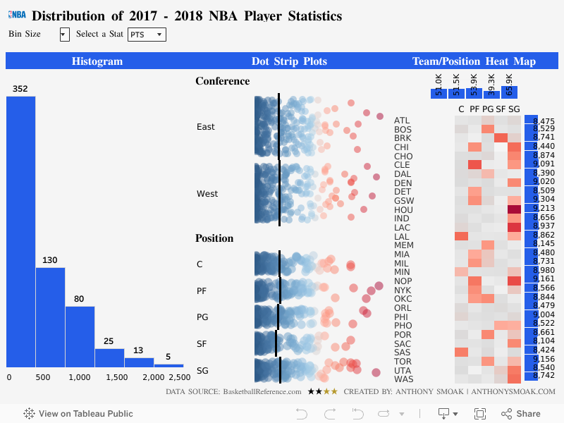
In this video tutorial I describe a dashboard that I put together that displays the distribution of various NBA player statistics. I use the always handy parameter to enable the user to choose which statistics are displayed on the dashboard. Although I’m showing sports statistics measures in this dashboard, it could easily be repurposed to show the distribution of a variety of business related metrics.
I break the dashboard up into three areas: histogram, dot strip plot, and heat map. In the second part of the video, I describe in detail how to build out a jittered dot strip plot. The benefit of the jittered dot strip plot is that the marks representing NBA players obstruct each other much less as compared to the linear dot strip plot.
Techniques used in the dashboard were previous outlined in my Ultimate Slope Graph and How to Use Jittering in Tableau (Scattered Data Points) posts.
Feel free to head to my Tableau Public page and download the workbook for yourself. Drop me a line in the comments or on YouTube if you learned something.
As always, do great things with your data!
If you find this type of instruction valuable make sure to subscribe to my YouTube channel.
All views and opinions are solely my own and do NOT necessarily reflect those of my employer.
