Sum Top and Bottom 10 Products by Sales in Power BI

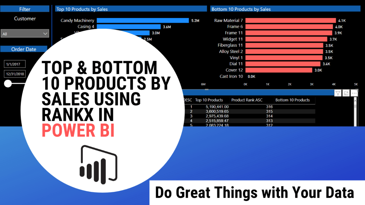
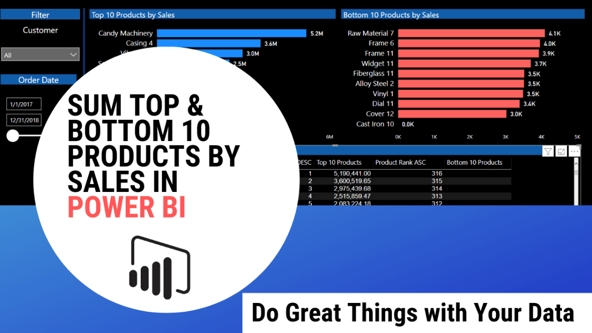
In this video we will cover how to calculate the aggregate sum of only the Top and Bottom 10 Product Sales using DAX in Power BI. There are always multiple ways to accomplish a task with Power BI and DAX but I will share the technique I used to visualize the Bottom 10 Sales Products when there is a rare single tie among the products. The solution may be a bit over-engineered to my data-set but the aim is to share an approach you can use to tackle similar data issues in your dashboards. It’s well worth the watch!

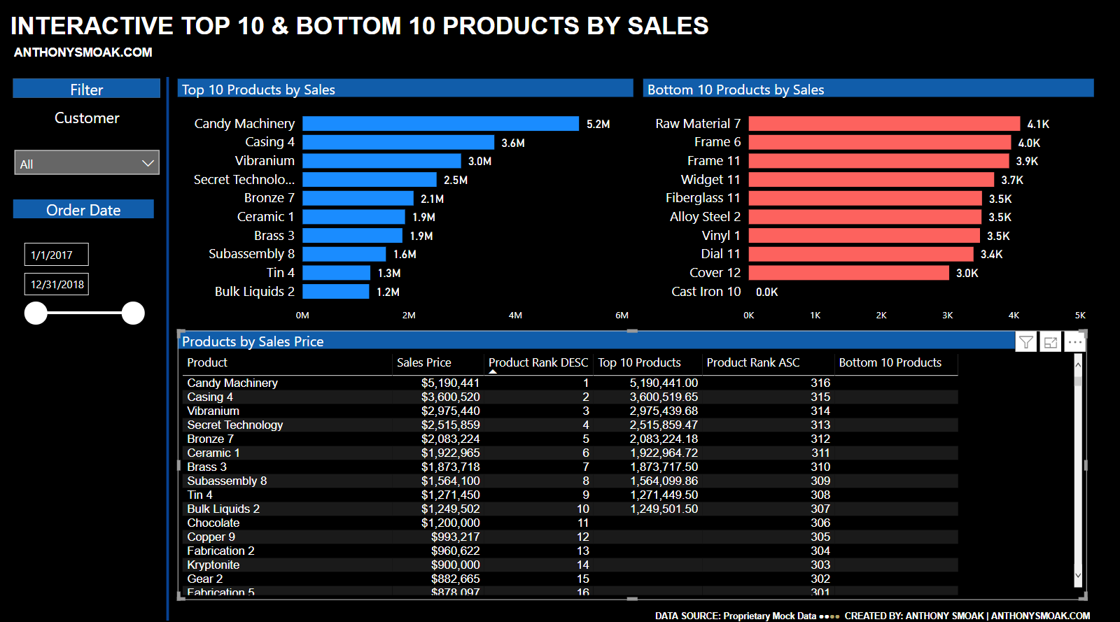
I won’t give way the whole video but I’ll share the DAX formula to sum the Top 10 products by Sales Price from my table named ‘Company Sales Data’.

1_SumSalesTop10Products = 
CALCULATE(
          SUM('Company Sales Data'[Sales Price]),
          TOPN(
               10,GROUPBY('Company Sales Data','Company Sales Data'[Product]),
               CALCULATE(sum('Company Sales Data'[Sales Price]))
              )
         )

I have created a variable named 1_SumSalesTop10Products that uses the CALCULATE function to

  • SUM the [Sales Price] variable from the [Company Sales Data] table (see the first argument to the CALCULATE function);
  • But it only sums the [Sales Price] for the TOP 10 highest selling products, because we use the TOP N function to create a temporary table that only returns the products with the 10 highest aggregated Sales Prices;
    • The GROUP BY function is used to aggregate the table rows by product and then the CALCULATE argument sums the Sales Price for the aggregated products;

Don’t let this scare you off, watch the video to get a better understanding, and to learn how I sum the Bottom 10 products by Sales Price.

As always, get out there and do some great things with your data!

Advertisement

Top and Bottom 10 Products by Sales Using RANKX in Power BI

In this video we’ll venture outside of the default Power BI TOPN functionality used to isolate the top and bottom N values in a visual. Because you’re an astute follower of my blog and YouTube channel, you want to know more than default functionality. The key to pulling off this feat lies with the RANKX function. By using RANKX to provide a ranking to each row in our data set, we can then determine the TOP and BOTTOM 10 values.

Of course watch the video for further breakdown, but the key to using RANKX effectively in Power BI is to use the ALL function as a parameter. In this way the contents of the entire table are considered for appropriate ranking.

The DESC or ASC parameters will enable the calculation of a rank in either descending or ascending sort order.

And finally the DENSE parameter tells RANKX how ties should be handled in the data. For example if you provide DENSE as a parameter, if 10 values are tied with a rank of 1 then the next value will receive a rank of 2.

Power BI Top 10 and Bottom 10 Thumbnail

Here is an example use of RANKX that will return a ranking of Sales Price by Product, that ranks the results in descending order (highest Sales receive the lowest ranks) and ties are in contiguous order. Watch the video to determine how to calculate the BOTTOM 10 ranking and to use RANKX to enable the top or bottom 10 values in a visualization.

As a refresher, check out this popular video to build the calendar table referenced in this video: Power BI Dashboard Tutorial: Year over Year Difference Analysis

If you find this type of instruction valuable make sure to subscribe to my Youtube channel.

All views and opinions are solely my own and do NOT necessarily reflect those of my employer.

INCREASE YOUR FOCUS TRY BRAIN.FM

When I am focusing hard during the day at work or developing visualizations on the weekend. I use Brain.fm to help me focus when it matters. It’s Science-driven and research-backed functional music designed from the ground up to help you you focus, relax, meditate and sleep. If you’d like to try a free trial check out https://brain.fm/anthonyb

Please use coupon code anthonyb for a 20% discount upon checkout. It helps support this blog and my YouTube channel as I receive a small commission for purchases made through links in this post.

Do Great Things with Your Data!

Create a Bar Chart in Python using Matplotlib and Pandas

In this Python visualization tutorial you’ll learn how to create and save as a file a stylish bar chart in Python using Matplotlib and Pandas. We’ll easily read in a .csv file to a Pandas dataframe and then let Matplotlib perform the visualization. As a bonus you’ll also learn how to save the plot as a file.

I am using the Anaconda Distribution which is a great one stop shop for all your python needs as it is a free and open source distribution of python. I love this option because it gives you the ability to quickly download multiple python packages for analyses and visualizations. As a bonus it includes Jupyter notebooks (which is a web based environment for writing code).

Packages Used

In case you aren’t familiar with Python packages:

  • Pandas is the killer app so to speak for reading, writing and wrangling data.
  • Matplotlib is the visualization plotting library we will use.
  • Pyplot is collection of functions that enables changes to a figure. Think of a figure as a container that can contain multiple plots know as axes. We can plot our bar chart in the figure plotting area and then enhance the plot with labels, etc.
  • Finally OS is a module that enables the use of operating system functionality. We’ll use this package to point our working directory to where our .csv file is located.

Once you follow the instructions in the video, you’ll produce an image like the following which can be saved to a directory location of your choice.

Keep this Matplotlib style sheet reference handy for changing up your visual.

NBA Blocks

As always, If you find this type of instruction valuable make sure to subscribe to my Youtube channel.

All views and opinions are solely my own and do NOT necessarily reflect those of my employer.