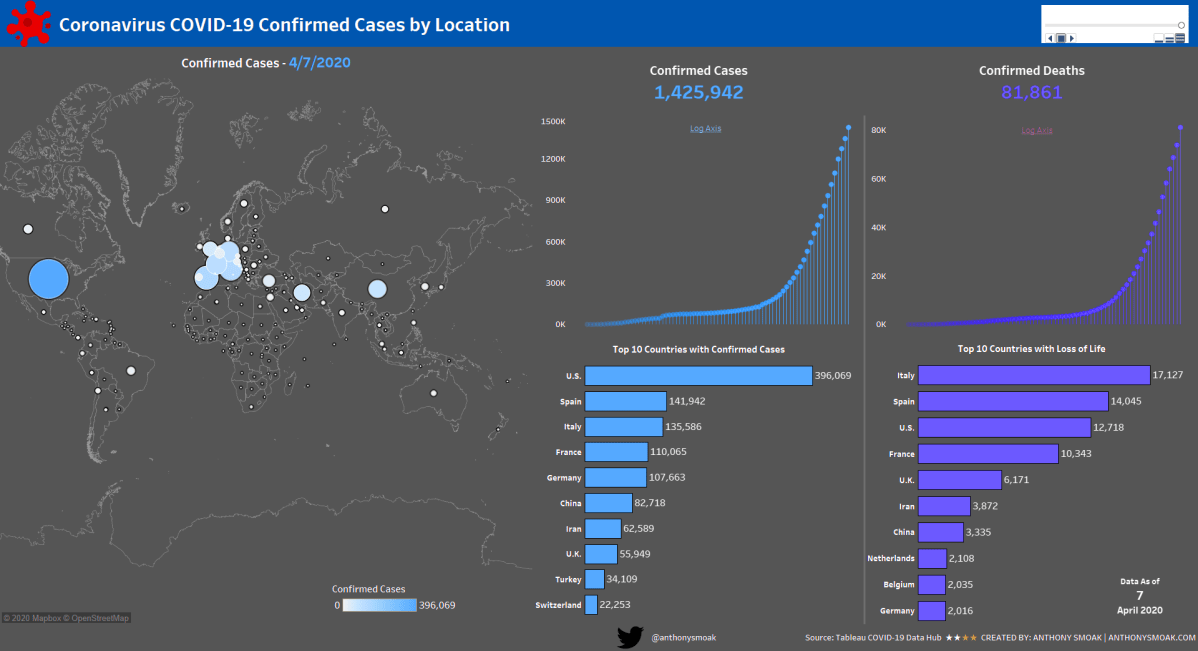
I hope everyone is safe and staying indoors during this challenging time. Like most of you, I find myself with an abundance of weekend time to spend indoors. I’ve used some of this time crafting a dashboard series leveraging the outstanding COVID-19 data hub provided by Tableau.
I did not expect the series to be as popular as it turned out to be, but it is one of my most viewed lessons on YouTube!

In this set of videos you will learn how to use Tableau and the Johns Hopkins data set which tracks COVID-19 cases across the globe, to assemble a dashboard. The great part about this dashboard is that it can be put together without reliance on overly complex calculations or the need to be a graphic designer, and it looks amazing if I do say so myself.
This dashboard utilizes the Tableau pages functionality to enable animation; as dates change the dashboard updates to reflect the current number of confirmed cases and deaths at that point in time.
Another cool trick is the use of containers to swap visualizations on the same dashboard. I use this functionality to switch between a linear and logarithmic scale for confirmed cases and deaths. You will need at least Tableau 2019.2 to use the sheet swapping functionality.
The first video provides an overview of the Tableau data-set and touches upon the visualizations required to build out the dashboard.
By popular demand, the second video goes more in-depth on the formatting and color scheme of each of the visualizations.
In my opinion the best part of the series is the 3rd video. I spend a full 93 minutes demonstrating various topics on dashboard refinement.
- Eliminating the hard-coding and manual sorts using a level of detail calculated field
- Detailed formatting with containers (applicable to all dashboards)
- Tableau sheet swapping using containers
- Making a Tableau Data Connection
When you get through with the first three videos you can opt for bonus material that teaches you how to implement a “bar chart race” aspect to the countries.
Instead of the same countries remaining static, they will move up and down depending upon the number of cases or deaths associated with a particular date.

Learn the Tableau “bar chart race” effect in Part 4 here:
Feel free to interact with the original viz or the Bar Chart Race version on Tableau public:
As always, If you find this type of instruction valuable make sure to subscribe to my Youtube channel.
All views and opinions are solely my own and do NOT necessarily reflect those of my employer.

