Add Totals to Stacked Bar Charts in Tableau


In this video I demonstrate a couple of methods that will display the total values of your stacked bar charts in Tableau. The first method deals with a dual axis approach while the second method involves individual cell reference lines. Both approaches accomplish the same objective. Hope you enjoy this tip!

If you’re interested in Business Intelligence & Tableau subscribe and check out my videos either here on this site or on my Youtube channel.

Tableau K-Means Clustering Analysis w/ NBA Data

Interact with this visualization on Tableau Public.

In this video we will explore the Tableau K-Means Clustering algorithm. K-Means Clustering is an effective way to segment your data points into groups when those data points have not explicitly been assigned to groups within your population. Analysts can use clustering to assign customers to different groups for marketing campaigns, or to group transaction items together in order to predict credit card fraud.

In this analysis, we’ll take a look at the NBA point guard and center positions. Our aim is to determine if Tableau’s clustering algorithm is smart enough to categorize these two distinct positions based upon a player’s number of assists and blocks per game.

Nicola Jokic is a Statistical Unicorn

If you also watch the following video you’ll understand why 6 ft. 11 center Nikola Jokic is mistakenly categorized as a point guard by the algorithm. This big man can drop some dimes!

If you’re interested in Business Intelligence & Tableau subscribe and check out my videos either here on this site or on my Youtube channel.

Ranking Banks by Number of Complaints

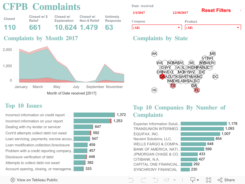
I recently downloaded a dataset from the Consumer Finance Protection Bureau (CFPB) in order to construct a handy visualization. The CFPB maintains a database that houses a collection of complaints on a range of consumer financial products and services that are sent to companies for a response.

Per the CFPB, “the database also includes information about the actions taken by the company in response to the complaint, such as, whether the company’s response was timely and how the company responded.”

Although the database is updated daily, I chose to visualize information from the complete year of 2017. In fairness to the financial institutions, company level information should be considered in context of company size and/or market share.

Financial institutions analyze this information frequently as a way of understanding and continuously improving their customer service.

I highly recommend “The Big Book of Dashboards” by Jeffrey Shaffer, Andy Cotgreave and Steve Wexler. The book contains a number of visualization examples that provide guidance on dashboard creation for any number of business use cases. In this Tableau Public dashboard I relied heavily on the visual guidance for their Complaints Dashboard as you can observe.

Screen Shot 2018-06-03 at 10.02.14 PM

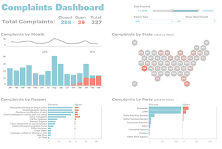
Complaints Dashboard from “The Big Book of Dashboards”

Click on the picture link to view the dashboard on Tableau Public (not optimized for mobile).

Dashboard 1

If you’re interested in Business Intelligence & Tableau subscribe and check out my videos either here on this site or on my Youtube channel.

Create Multiple KPI Donut Charts in Tableau

In honor of National Doughnut Day (June 1st), let’s devour this sweet Tableau tip without worrying about the calories. In this video I we will create a multiple donut chart visualization that will display the sum of profits by a region. Then we’ll use the donuts as a filter for a simple dashboard. Once you finish watching this video you’ll know how to create and use donut charts as a filter to other information on your dashboard.

I know that donuts are not considered best practice, (especially when negative numbers are involved) but they have their uses. Assuming you know that bar charts are a best practice, it never hurts to learn other techniques that add a little “flair” from the boring world of bar charts.

Have you ever looked at a Picasso painting? Obviously Picasso was well versed in painting best practices (understatement) but in some of his art, the people are not rendered in the best practice. Always learn the best practices, but know when to leave them behind and add a little flair! (In no way am I comparing myself to Picasso).

Three-Musicians-By-Pablo-Picasso

Three Musicians – Pablo Picasso

Three Musicians by Picasso is not best practice but it is a work of art!

If you’re interested in Business Intelligence & Tableau subscribe and check out my videos either here on this site or on my Youtube channel.