In honor of National Doughnut Day (June 1st), let’s devour this sweet Tableau tip without worrying about the calories. In this video I we will create a multiple donut chart visualization that will display the sum of profits by a region. Then we’ll use the donuts as a filter for a simple dashboard. Once you finish watching this video you’ll know how to create and use donut charts as a filter to other information on your dashboard.
I know that donuts are not considered best practice, (especially when negative numbers are involved) but they have their uses. Assuming you know that bar charts are a best practice, it never hurts to learn other techniques that add a little “flair” from the boring world of bar charts.
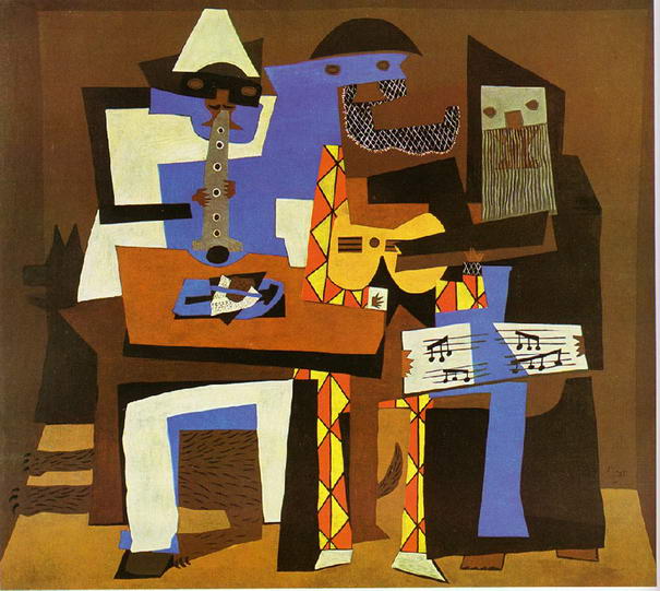
Have you ever looked at a Picasso painting? Obviously Picasso was well versed in painting best practices (understatement) but in some of his art, the people are not rendered in the best practice. Always learn the best practices, but know when to leave them behind and add a little flair! (In no way am I comparing myself to Picasso).

Three Musicians – Pablo Picasso
Three Musicians by Picasso is not best practice but it is a work of art!
If you’re interested in Business Intelligence & Tableau subscribe and check out my videos either here on this site or on my Youtube channel.
