How to Make a Histogram in Excel

Let’s learn how to build a histogram in Excel with some interesting NBA data. Personally, I use the histogram in my data analyses to help me understand how my data is distributed and to identify any outliers or extreme values that warrant further investigation. In this blog post, I’ll use Kobe Bryant’s playoff career scoring game log as our data source to create a histogram in Excel. Sound fun? Of course, it does. Let’s go!

Inserting a Histogram Chart in Excel

I advocate that you watch the video above for more detail, but you’ll find this blog post equally informative. To create a histogram in Excel, we’ll need a column of numerical data to analyze. In this case, I have Kobe Bryant’s playoff career scoring game log, which shows how many points he scored in each of his playoff games during his career. I referenced this data from basketballreference.com.

The first step is to highlight the data column and press [Ctrl + Shift + Down] to select the entire range. Then, go to the Insert tab and click on the Histogram icons as shown below. This will insert a histogram chart based on your data.

Formatting the Histogram Chart in Excel

The default histogram chart may not look very attractive or informative. Thus, we will use my personal favorite technique to kick start the formatting (the “easy” way) which is the selection of “Layout 2” as a chart style.

Now this option may be easy (if you’re using Excel 2016 or greater) but you must know which additional options to change in order to make the histogram look more presentable.

The Layout 2 style does an excellent job of removing the horizontal grid lines and vertical axis (so we can keep the Edward Tufte style “chart junk” to a minimum). It also adds data labels to our bar charts as well for interpretation clarity.

Formatting the Histogram Chart in Excel

We can further improve our histogram’s appearance by applying some formatting options. For example, we can:

  • Delete the grid lines and the vertical axis that we don’t need (already performed by Layout 2)
  • Increase the font size of the data labels
  • Change the fill color of the bars
  • Add a chart title

To access the formatting options, right-click on any element of the chart and select “Format”. Alternatively, we can hit [Ctrl + 1] to open the Format pane.

Adjusting the Bin Size and the Overflow/Underflow Options in Excel

One of the most important aspects of any histogram is the bin size, which determines how the data is grouped into intervals. The bin size affects the shape and the interpretation of our histogram. We can adjust the bin size by selecting the horizontal axis and changing the “Bin width” option in the Format pane.

The default bin size for this data set is 5.7, which means that the data is grouped into intervals of 5.7 points. For example, the first bin includes the values from 0 to 5.7, the second bin includes the values from 5.7 to 11.4, and so on.

However, this bin size may not be very intuitive or meaningful. A better option for our histogram is to use a bin size of 5, which means that the data is grouped into intervals of 5 points. For example, the first bin includes the values from 0 to 5, the second bin includes the values from 6 to 10, and so on. This makes the histogram easier to read and understand.

Another option that we can adjust in the histogram chart is the overflow and the underflow bins. These are special bins that capture the values that are above or below a certain threshold.

For example, we may want to create an overflow bin that includes all the games where Kobe scored more than 40 points, and an underflow bin that includes all the games where he scored less than 10 points. To do this, we can select the horizontal axis and change the Overflow bin and the Underflow bin options in the Format pane.

After applying the overflow and the underflow options, the histogram chart looks like this:

Histogram Axis Notation

You’ll notice the histogram’s horizontal axis includes both brackets “[” and parentheses “(“. I will quote the Microsoft blog to explain this notation.

“In our design, we follow best practices for labeling the Histogram axis and adopt notation that is commonly used in math and statistics. For example, a parenthesis, ‘(‘ or ‘)’, connotes the value is excluded whereas a bracket, ‘[‘ or ‘]’, means the value is included. “

In our histogram for example, the notation (20, 25] indicates that the respective bar includes any value greater than 20 but less than or equal to 25.

Interpreting the Histogram Chart and Finding Outliers in Excel

Our new histogram isn’t just pretty, it’s equally informative allowing us to answer questions that we couldn’t easily determine from a wall of numbers in spreadsheet form. The histogram easily helps us understand Kobe’s playoff scoring distribution. We also gain an understanding of his outlier games. For example, we can now:

  • ..locate the mode, which is the most frequent value or interval. In this case, the mode is the interval from 20 to 25, which means that Kobe Bryant scored between 20 and 25 points in most of his playoff games.
  • ..find the range, which is the difference between the maximum and the minimum values. In this case, the range is 50, which means that Kobe Bryant’s playoff scoring varied from 0 to 50 points.
  • ..find the skewness, which is the asymmetry of the distribution. In this case, the distribution is right-skewed, which means that the longer tail of values is on the right side of the distribution. This indicates that Kobe Bryant’s playoff scoring was more concentrated in the lower values. This makes perfect sense as it is much harder to score more points as opposed to lesser points.
  • ..find the outliers, which are the values that are far away from the rest of the data. In this case, the outliers are the point score values that are greater than 40.

I hope you enjoyed this blog post and learned how to create a histogram in Excel to analyze data distribution and outliers!!!

Let me leave you with this highlight package of Kobe’s best dunks:

I appreciate everyone who has supported this blog and my YouTube channel via merch. Please check out the logo shop here.

If you want to learn all the latest tips and tricks in core data analysis tools, stay in contact with me through my various social media presences.

And don’t forget to subscribe to my YouTube channel for more data analyst tips and tricks.

Thank you!!

Anthony B Smoak

Credit Where Credit is Due: Kobe wallpaper created by James Chen <– (great job James!!)

Use Excel to Connect to SQL Server Data

TLDR

Connect directly to SQL Server data from within Excel. Also learn how to add and modify SQL statements from within Excel and pass them to SQL Server for data retrieval. If you need to quickly refresh data from SQL Server without hassle, then you need to watch this video!!

Intro

As a data professional, I am always looking for ways to optimize my workflow and increase efficiency. One of the techniques that I have found particularly helpful is making a direct connection between Excel and SQL Server. In this video, I will show you how to set up this direct connection and explain the benefits of using it.

What is a Direct Connection Between SQL and Excel?

First of all, let me explain what I mean by a direct connection between these two tools. Typically, when working with data in Excel, you would export the data from SQL Server into a .csv file and then import that file into Excel. This process can be time-consuming and cumbersome, especially if you are working with large datasets. With a direct connection, you can access the data in SQL Server directly from Excel, without the need for any intermediate steps.

What Do I Demonstrate in the Video?

To demonstrate this in the video, I walk you through an example. I am using the Wide World Importers DW sample database from Microsoft, which you can easily import into SQL Server. Within this database, I am looking at the fact.order table, which has over 230,000 rows and many columns. In Excel, I start with a blank sheet and navigate to the Data ribbon. From there, I select “From Database” and then “From SQL Server Database.”

This prompts me to enter a server name and a database name. If you have access to SQL Server, you can find the server name by connecting to the database engine. Otherwise, you may need to reach out to your database administrator to obtain this information (always stay on your DBA’s good side, if you know what’s good for you). Once you enter the server and database names, you can hit “OK” and Excel will work its magic to establish a connection.

At this point, you can preview the data from the table that you want to import. Excel will give you the option to transform the data if necessary, but we’ll just hit “Load.” Excel will then create a connection and query the SQL Server database and load the data directly into Excel. This means that you can always access the most up-to-date version of the data, without having to worry about exporting and importing files!!

Advantages of Connecting SQL and Excel

Now, let’s say that you need to update the data in Excel at a later time. Perhaps you have some ad hoc processes that reference this data and you need to ensure that you always have the latest version. With a direct connection, this is easy to do. You can simply go to the Data ribbon and select “Refresh.” Excel will connect to SQL Server and update the data in your Excel sheet with the latest data from the database.

This is incredibly powerful because it means that you can share your Excel sheet with others without worrying about whether they have the latest version of the data. As long as they have access to the SQL Server database, they will always see the most up-to-date version of the data when they open the Excel sheet.

One thing to keep in mind is that this type of direct connection is best suited for ad hoc purposes!! In other words, you should not use this to create production worksheets that will be used by others. This is because the direct connection is dependent on having access to the SQL Server database. If that access is lost, the Excel sheet will no longer be able to connect to the database and the data will be lost. Therefore, it is best to use this type of connection for temporary analysis and reporting purposes.

Once you have successfully set up the direct connection between Excel and SQL Server, you can easily refresh the data whenever you need it. To refresh the data, all you have to do is go to the Data tab, and click on the “Refresh All” button. This will refresh all the data connections in your workbook, including the connection to SQL Server.

Powerful Excel Functionality (PivotTables and Pivot Charts)

I don’t reference this in the video, but you can also use Excel’s PivotTables and PivotCharts to analyze and visualize the data. PivotTables allow you to group and summarize data in many different ways, while PivotCharts provide a visual representation of the data that is easy to understand. It may be easier for you to manipulate this data in Excel and extract additional insights than in SQL Server.

Financial analysts, in particular, should avoid taking manual inputs from any and everywhere (especially ungoverned data sources) and using this type of refresh for production purposes. As a recovering financial analyst I know your management hates automation and loves when you cut and paste random information from Bob in division finance. I also know they want to see you work 12 hours a day because the CFO needs that monthly IT spend variance to budget!! Please do yourself a favor and meditate hard for serenity every Sunday night.

Conclusion

In conclusion, using a direct connection between Excel and SQL Server can greatly improve your workflow when working with large datasets. By leveraging the full power of SQL Server’s querying capabilities and Excel’s Pivot tools, you can create powerful AD-HOC reports and analyze data in ways that would be difficult or impossible with other tools. Consider setting up a direct connection to SQL Server to streamline your ad-hoc workflow and improve your productivity.

Additional References to Maximize Your Learning

All views and opinions are solely my own and do not necessarily reflect those of my employer

I appreciate everyone who has supported this blog and my YouTube channel via merch. Please check out the logo shop here.

Thank you!!

Anthony B Smoak

P.S. I respect your hustle Financial Analysts. I ask that you respect those who want to make your life easier with report automation!!

Build Dynamic SQL with SQL Server and Excel

In this video you will learn how to use the SQL CASE statement to add “filter flexibility” to your front-end Excel worksheet, thus taking your SQL + Excel skills to the next level. I’ll reveal the UPDATED code I used to build a dynamic SQL statement using SQL Server and Excel.

By using Excel as a tool to pass cell values to SQL Server queries, you’ll be able to generate dynamic SQL statements on the fly, saving time and reducing the risk of errors in your code. Building upon the previous video “Call a SQL Server Stored Procedure using Excel Parameters”, let’s enhance your SQL skills and streamline your workflow.

Here is a screenshot of the front end Excel worksheet we setup in previous videos. This Excel sheet will execute a stored procedure call with parameters supplied from cells on the sheet.

Below is the stored procedure I use to enhance the code from previous videos. I setup a static SQL string that will serve as the base of the SQL statement. I then use the CASE statement to evaluate the cell values incoming from the Excel worksheet (with some slight manipulation for empty and default date values incoming from Excel).

Depending upon those values, the filter clause is dynamically built and appended to the base of the SQL string, which is then executed with the sp_executedqsl command. This command has many advantages with respect to protecting your code from a SQL injection attack.

If you need a breakdown of the code and the worksheet functionality, make sure to watch the video below.

Additional References to Maximize Your Learning

I always have fun creating this type of content and sharing with you, my YouTube channel followers.

Stay in contact with me through my various social media presences.

All views and opinions are solely my own and do not necessarily reflect those of my employer

I appreciate everyone who has supported this blog and my YouTube channel via merch. Please check out the logo shop here.

Thank you!!

Anthony B Smoak

Passing Parameter Values from Excel to SQL Server

If you’re working with data in Excel and need to connect to a SQL Server database, there are a couple of ways to pass parameter values from Excel to SQL Server. In my first video, “Passing Parameter Values from Excel to SQL Server,” I show you how to connect to SQL Server and read values from a cell and pass those values to a native SQL query without using parameters.

Advantage: The first approach has the advantage of being quick and easy to implement. This is because it does not require any additional setup or configuration, such as creating stored procedures in SQL Server. Instead, the values are passed directly to the query, which can be executed immediately.

However, this approach can also be prone to SQL injection attacks, where a hacker inputs malicious SQL code into an input field in order to gain unauthorized access to the database.

Verdict: Speed over Security. Good for Ad-Hoc personal use.

In my second video, “Call a SQL Server Stored Procedure using Excel Parameters,” I demonstrate how to connect to SQL Server from Excel and pass cell values from Excel to SQL Server using a stored procedure. This approach is more secure because the values are passed to a stored procedure rather than a query. It simply requires the setup of a stored procedure in SQL Server, and I show you two ways to accomplish this feat.

Advantage: Stored procedures provide an added layer of security because they can be set to execute with specific permissions, and can be audited for changes and usage. This makes it harder for an attacker to gain unauthorized access to the database or to execute malicious SQL commands.

However, the potential small disadvantage of this approach is that the stored procedures will need to be updated and managed separately from the Excel file.

If you’re new to working with SQL Server and Excel, I recommend watching both videos. The first video will give you a good overview of the basics, while the second video will show you a more secure way to pass parameter values.

I always have fun creating this type of content and sharing with you, my YouTube channel followers.

You can also follow my dapper data adventures on Instagram.

All views and opinions are solely my own and do not necessarily reflect those of my employer

I appreciate everyone who has supported this blog and my YouTube channel via merch. Please check out the logo shop here.

Thank you!!

Anthony B Smoak

Easily Unprotect a Sheet in Excel if you Forgot the Password

How do I unprotect an Excel worksheet if I forgot the password? I’m going to come to your rescue. This tip will come in handy when you are under pressure to make some changes and don’t feel like performing massive rework. Save yourself some time and watch the video.

You can follow along with the steps below, but give the video a try if any of the steps are unclear.

Let’s say you want to unprotect your file but you get a message like the one below when you try to change a cell value.

  1. First make a COPY of your protected file in order to avoid potential corruption. Make sure the File name extensions box is checked on the View ribbon in File Explorer.

2. Change the file name extension from .xlsx to .zip

3. You might see a text box appear that says, “If you change a file name extension, the file might become unusable. Are you sure you want to change it?” Select Yes.

4. Double click on the zip folder to open it. Make sure you have a zip file program installed on your Windows machine.

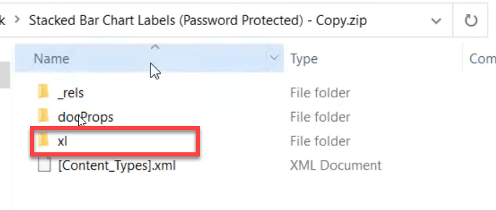
5. Navigate to the xl folder and open this folder.

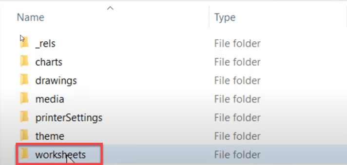
6. Next navigate to the worksheets folder and open it.

6. Open the .xml sheet that corresponds to the sheet you’d like to unprotect. In my case this is sheet1.xml

7. Within the .xml file perform a CTRL+F to find the term “protection”. You should have a hit on the term if your excel sheet is protected.

8. Do not change anything in the file yet. Make a copy of this file and copy it to your desktop or another safe place to where you can easily navigate.

9. Open the copy of your .xml sheet in notepad.

10. In the copy of your notepad .xml file search once again for the term “protection”. When you find the appropriate section, make sure to delete the entire line between and including the opening and closing < > values.

11. Save your notepad file and copy the desktop .xml file back into the zipped folder. It is ok to copy and replace the file at this point.

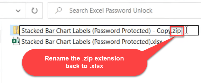
12. Rename the .zip file back to .xlsx and your file icon should turn back into the appropriate Excel icon.

13. Congratulations!! You should be able to open your file now without the password protection popup box and make appropriate changes. Leave me a comment on the video if this tip helped you out in some way.

Please like and subscribe on the Anthony B. Smoak YouTube channel.

All views and opinions are solely my own and do not necessarily reflect those of my employer

I appreciate everyone who has supported this blog and my YouTube channel.

Address Matching in Excel Using Levenshtein Distance

For my Data Analysts, in this video I will demonstrate how to perform a column comparison between two address fields so you don’t have to manually review every row. We’ll use a VBA function from Stack Overflow to provide the comparison results.

I should point out that Excel is NOT the preferred method for address matching, but sometimes it is your only option due to lack of time or better tools. Ideally, you should use address correction software that “fixes spelling errors, corrects abbreviations, and standardizes capitalization so each address in your list complies with the USPS official format” – (per the USPS). Once your addresses are standardized, THEN you should perform a comparison, but this rarely happens.

What typically happens is that some poor analyst like you is conscripted into performing address matching manually using some combination of SQL Server and manual Excel processes. That’s why a Google search led you to this page!

If you ever have to perform address matching in Excel, this could be you!

Informally, the Levenshtein distance between two words is the minimum number of single-character edits (insertions, deletions or substitutions) required to change one word into the other.

For example:

  • The string “HAT” as compared to “hat” would have a Levenshtein Distance of 3
    • Since the function is case sensitive all three characters are different
  • The string “HAT” as compared to “BAT” would have a Levenshtein Distance of 1
    • To turn the first string into the second string it would take 1 substitution of characters (H changed to B or vice-versa)
  • The lower the number, the more the strings are similar
  • The higher the number, the more the strings are dissimilar.

Activate the Developer Tab in Excel

The Developer tab is the place to go when you want to do or use the following:

  • Write macros
  • Run macros that you previously recorded
  • Create VBA Modules and User Defined Functions <– This is our sweet spot
  1. On the File tab, go to Options > Customize Ribbon
  2. Under Customize the Ribbon and under Main Tabs, select the Developer check box

Create a Module in Excel

  1. On the Developer tab select Visual Basic
  2. In the VBA interface select Insert > Module

Insert Levenshtein Distance Function VBA Code

  1. Go to this link at Stack Overflow to view the code as originally referenced
  2. Or, simply copy the code below as developed by user “smirkingman” which is the first answer.
    • Big shoutout to “smirkingman” for this great resource!
Option Explicit
Public Function Levenshtein(s1 As String, s2 As String)

Dim i As Integer
Dim j As Integer
Dim l1 As Integer
Dim l2 As Integer
Dim d() As Integer
Dim min1 As Integer
Dim min2 As Integer

l1 = Len(s1)
l2 = Len(s2)
ReDim d(l1, l2)
For i = 0 To l1
    d(i, 0) = i
Next
For j = 0 To l2
    d(0, j) = j
Next
For i = 1 To l1
    For j = 1 To l2
        If Mid(s1, i, 1) = Mid(s2, j, 1) Then
            d(i, j) = d(i - 1, j - 1)
        Else
            min1 = d(i - 1, j) + 1
            min2 = d(i, j - 1) + 1
            If min2 < min1 Then
                min1 = min2
            End If
            min2 = d(i - 1, j - 1) + 1
            If min2 < min1 Then
                min1 = min2
            End If
            d(i, j) = min1
        End If
    Next
Next
Levenshtein = d(l1, l2)
End Function
  1. Paste the code into your newly created Excel module
  2. Debug > Compile VBAProject

You should not experience any errors after compiling the code.

Watch the Video to Use the Function

Using this function in a judicious manner can help you cut down on the mental energy required to manually review the address columns on each row. It is much better to mentally focus on 25% of the rows than 100%. The fewer rows you have to manually review in Excel, the less the chance of you making an error.


Please like and subscribe on the Anthony B. Smoak YouTube channel.

All views and opinions are solely my own and do not necessarily reflect those of my employer

Do Great Things with Your Data!


★☆★ Support this Channel: ★☆★

Merch ► shop.spreadshirt.com/AnthonySmoak

★☆★ FOLLOW ME BELOW: ★☆★

This image has an empty alt attribute; its file name is anthony-smoak-twitter.jpg

Twitter ► https://twitter.com/AnthonySmoak

Facebook ► https://www.facebook.com/AnthonyBSmoak/

Tableau Public ►Search for “Anthony B. Smoak”

Photo by Oladimeji Ajegbile from Pexels

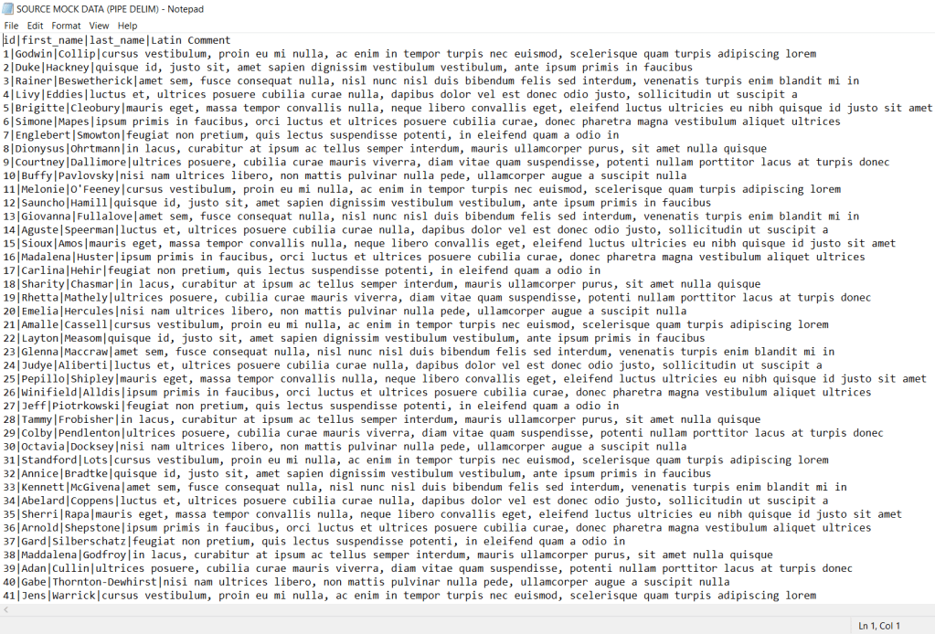
How to Change the Text Delimiter in Excel

No more COMMA DRAMA! In this video I will show you how to change the default comma delimiter in Excel when making .csv (comma separated value) files. Sometimes text fields in your file have comments that you need to preserve in a flat file. This means you have to change the delimiter. Watch the video for a demonstration and keep reading for a quick reference.

I should note that as of the time of this post I am using Windows 10 Home.

Step 1

Search for “Set Regional Format”

Step 2

Select Additional date, time & regional settings

Step 3

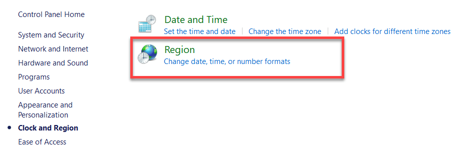
Select Region

Step 4

Select Additional Settings

Then in the List Separator box, change the comma to a pipe.

When you save your .csv file in Excel, it will now be pipe delimited instead of comma delimited.

Your flat file will transition from this:

to this

Do Great Things with Your Data

Anthony B. Smoak

Please like and subscribe on the Anthony B. Smoak YouTube channel!
Definitely pick up some merch if you’ve enjoyed this blog and YouTube channel over the years.

All views and opinions are solely my own and do not necessarily reflect those of my employer.

Add Total Values for Stacked Column and Stacked Bar Charts in Excel

This is the only video you need to learn how to add add totals to stacked bar charts and stacked column charts in Excel. Make sure to watch the video because I have you covered both ways.

I’m more of a video explanation person, so make sure to watch the video so the steps are clearer. Then refer to the bulleted steps as reference once you have the initial basic understanding.

The Keys to Adding Totals to the Stacked Column Chart Above:

  • Add a “Grand Total” column to your data
  • Highlight your data not including the “Grand Total” column
  • On the “Insert” menu select a “2-D Stacked Column” chart
  • Select “Switch Row/Column” as necessary so your first data column is listed on the X axis
  • Select the chart and then expand the data range to include the “Grand Total” column
    • Add “Data Labels” to the Grand Total series on the chart
  • Right click on the Grand Total and “Change Series Chart Type”, the viz becomes a “Combo” chart
  • Change the “Grand Total” series chart type to a “Line”, while leaving all others as a “Stacked Column”
  • Format the line’s data label, changing the Label Position to “Above”
  • Select the line, format the data series and change the “Line” option to “No Line” in order to leave only the totals and hide the line.

The Keys to Adding Totals to the Stacked Bar Chart Above:

  • Add both “Grand Total” and “Spacing” columns to your data
    • Highlight your data including the “Spacing” column but not including the “Grand Total” column
      • The “Spacing” column should have a value of 0 at this point
    • On the “Insert” menu select a “2-D Stacked Bar Chart”
    • Select “Switch Row/Column” as necessary so the “Spacing” values are not listed as an option on the Y axis
    • Change the “Spacing” column values to a number (e.g., 1000) big enough to make a new category visible on the stacked bar chart
    • Right click to “Format Data Labels” and change the “Label Options” to “Value from Cells”
      • In the “Select Data Label Range” pop up box, highlight the values from the “Grand Total” column
      • Change the “Label Position” to “Inside Base”
    • On the chart select the Grand Total Series and right click so the “Fill” option appears
      • Change the “Fill” to “No Fill”
    • Change the values in the “Spacing” column to 0
    • Delete the “Grand Total” entry from the Legend

You can thank me by liking and subscribing to my YouTube Channel

All views and opinions are solely my own and do NOT necessarily reflect those of my employer.

Do Great Things with Your Data

– Anthony B. Smoak

shop.spreadshirt.com/AnthonySmoak