Build Better Sparklines in Tableau

So you want to add some spice to your bland looking Sparklines in Tableau? You have come to the right place (start by watching the video above). Let’s talk about how a Sparkline is defined per Wikipedia:

“A sparkline is a very small line chart, typically drawn without axes or coordinates. It presents the general shape of the variation (typically over time) in some measurement, such as temperature or stock market price, in a simple and highly condensed way. Sparklines are small enough to be embedded in text, or several sparklines may be grouped together as elements of a small multiple. Whereas the typical chart is designed to show as much data as possible, and is set off from the flow of text, sparklines are intended to be succinct, memorable, and located where they are discussed.”

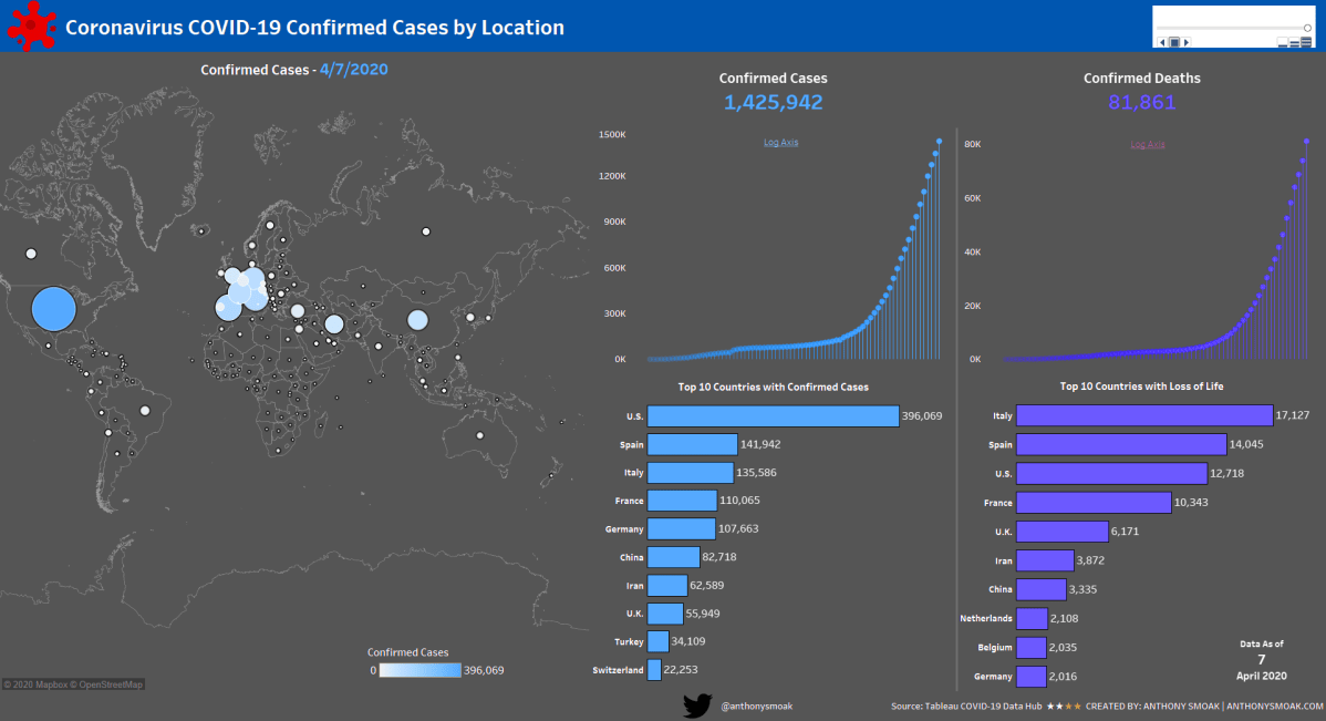
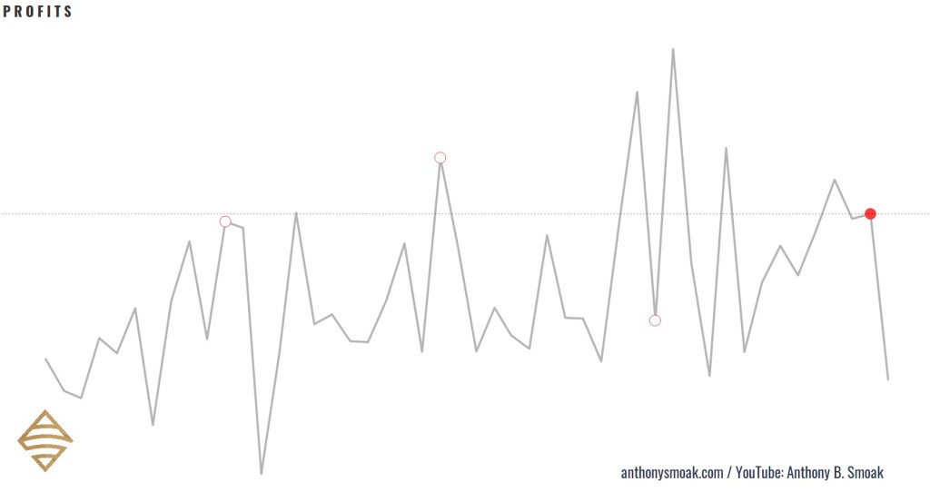
Here are a few examples of Tableau specific sparklines in action (with latest complete month bubble indicators and reference lines): Notice how I do not include any data axes, but you can clearly recognize the data trends in the visuals.

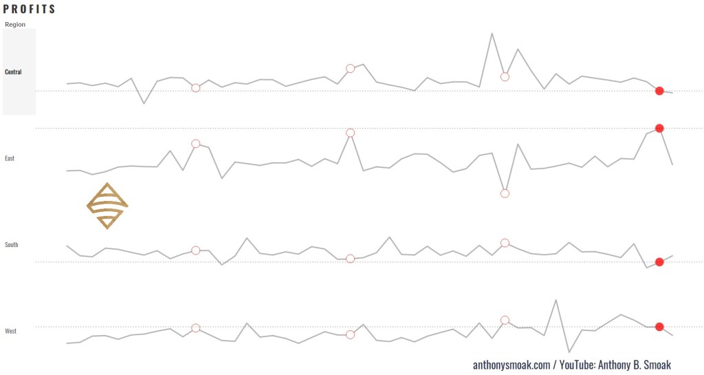
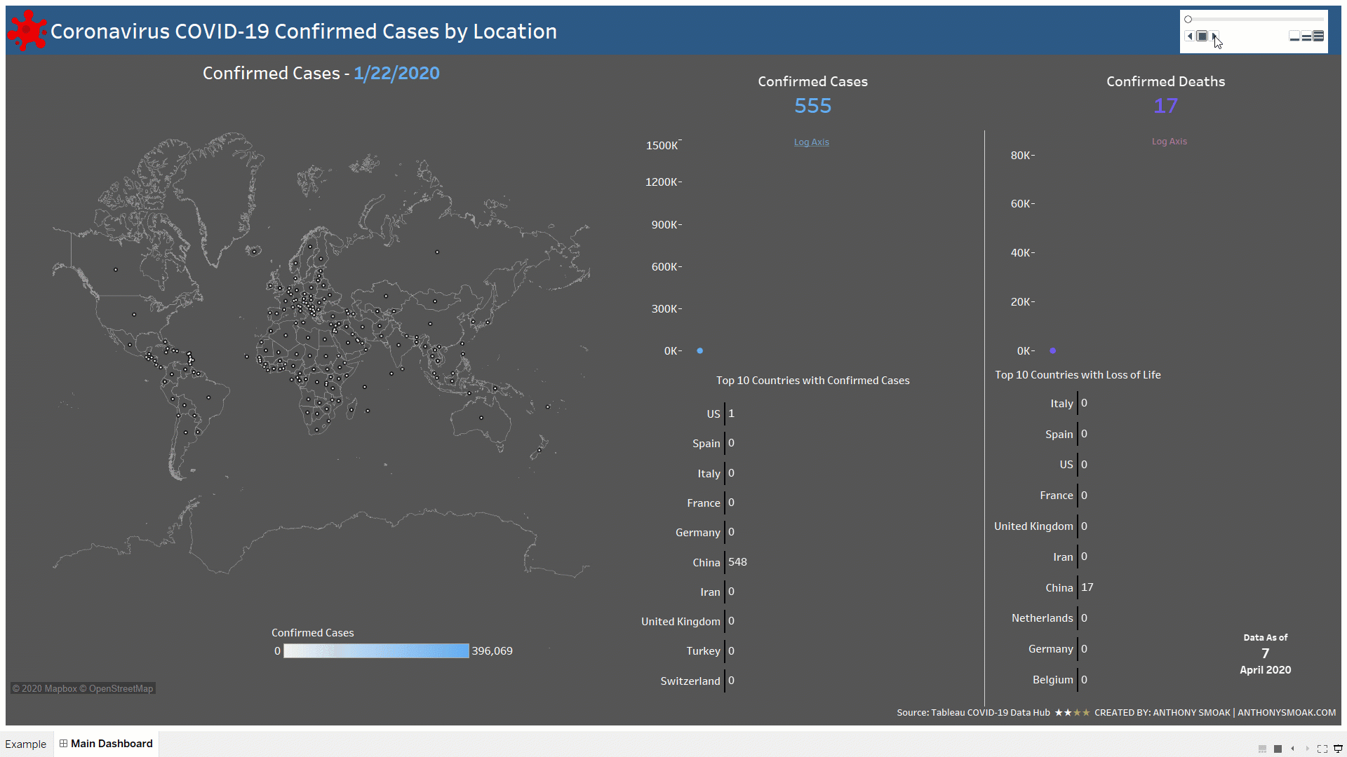
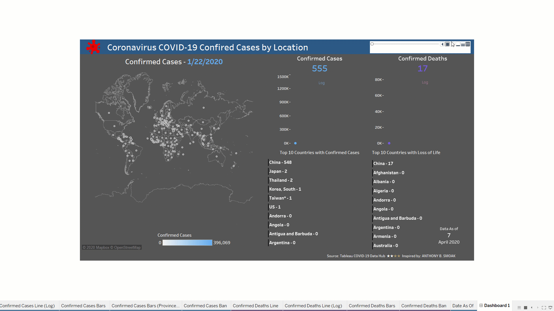
Here is an example of how I used the sparklines demonstrated in the video to build a out a classic yet refined looking Tableau dashboard.

Interact with and download this workbook here.

For reference purposes I am going to list three formulas used in the completion of the sparklines, you’ll have to watch the video to learn how to put them together.

In this exercise I am using that standard Tableau Superstore data set which you can perform a Google search to find if you are using Tableau Public.

Calculated Fields

Calculated Field #1 (Name: SPRK_CircleMonths)

This calculated field puts a circle on the penultimate month data points. Penultimate is just a fancy SAT word way of saying “next to last”. When the month of the data point on the line chart (Order Date) equals the next to last order date month in the dataset, then return the Order Date.

//IF THE MONTH OF THE DATE ON THE LINE CHART EQUALS THE MONTH-1 OF THE MAXIMUM DATA POINT
// THEN RETURN THE DATE
If DATEPART('month',[Order Date]) = DATEPART('month',dateadd('month',-1,{MAX([Order Date])}))
Then [Order Date] END

Calculated Field #2 (Name: SPRK_CircleMonths)

This logic will be applied to the circles generated by the previous calculation SPRK_CircleMonths. Only the next to last month will meet the TRUE condition (which will be colored as red).

// IS THE MONTH OF THE CHART DATE EQUAL TO THE MOST RECENT DATE MONTH MINUS 1 MONTH
// E.G., NOV 2018 = NOV 2020 WILL RESOLVE TO TRUE DUE TO MATCHING MONTHS
DATETRUNC('month',[Order Date]) = DATEADD('month',-1,DATETRUNC('month',{max([Order Date])}))

Calculated Field #3 (Name: SPRK_RefLine Profit)

This logic will return the profit associated with the next to last month in the dataset to display on the reference line.

// RETURNS A VALUE USED FOR THE REFERENCE LINE
// IF THE MONTH OF THE DATE = THE MONTH OF THE MAXIMUM DATE MINUS 1 MONTH (GET A COMPLETE FIRST MONTH)
if DATETRUNC('month',[Order Date]) 
= DATEADD('month',-1,DATETRUNC('month',{max([Order Date])}))
THEN [Profit] END

When you put all the functions together in a manner according to the video, you end up with a more refined sparkline in my opinion. Big shoutout to the Data Duo for the inspiration on the dashboard I created and this technique. If you haven’t checked out any of their work make sure to do so.

Please like and subscribe on the Anthony B. Smoak YouTube channel.

All views and opinions are solely my own and do not necessarily reflect those of my employer

I appreciate everyone who has supported this blog and my YouTube channel via merch. Please click here

Thank you!!

Anthony B Smoak

Tableau Tile Map Data Project

I was recently inspired by some really great tile-maps that have been created in the Tableau community (e.g., see beautiful work by Chimdi Nwosu and Michael Dunphy). Thus, you know I had to come up with a way to construct a simplified map in this style with some data and share with my followers. In these two videos, I’m going to walk you through how to prepare the necessary data file in Tableau Prep Builder and then we’ll build out the tile-map in the second video, step by step.

This is a good intermediate level portfolio project for you to follow along with in order to increase your Tableau Desktop and Tableau Prep skills. We’ll use CDC data, specifically United States COVID-19 Cases and Deaths by State over Time, to build the tile-map.

The advantage of a tile-map is that it represents geographic regions (like states) at equal sizes. Thus, the distortions and biases introduced by differences in sizes are eliminated. In the case of the United States, data for smaller regions like Washington D.C. can be interpreted on equal footing with data for a much larger region like California.

Tableau Prep Builder helps to greatly simply the data shaping process. My only wish is that Tableau would integrate Prep into Tableau Desktop for one seamless data tool to rule them all, but I digress. The process below illustrates how simple it is take some data from an input file, and subsequently clean and pivot the data into a new file. Watch the first video, to learn how to build out this simple flow in Tableau Prep. If you do not have a copy of Tableau Prep, you can complete this lesson on a 14 day trial license of the tool, which you can download here.

Watch the second video for the step by step instructions to build out the tile-map above.

Please like and subscribe on the Anthony B. Smoak YouTube channel.

All views and opinions are solely my own and do not necessarily reflect those of my employer

I appreciate everyone who has supported this blog and my YouTube channel via merch. Please click here

Thank you!!

Anthony B Smoak

Tableau Dynamic Maps with Parameters: A COVID Dashboard Breakdown

Operation “Reverse Engineer” a Tableau Zen Master dashboard is back in full effect. You know the drill by now, I spent weekend hours analyzing an impressive dashboard put together by Tableau Zen Masters Anya A’Hearn, Tamas Foldi, Allan Walker, and Jonathan Drummey.

In this video I will demonstrate to you how they use parameters to dynamically change the measure that is displayed on both a map and bar chart. Accurate data is made possible through the use of a context filter to equalize the data that is displayed between the United States and all other countries (U.S. data lags by one day).

I should mention that we are using the carefully curated data offered at the Tableau’s COVID-19 Data Hub.

What’s in it for You?

You will learn a neat little trick that encapsulates multiple measures into one calculated field. By using two parameters we can update our visuals to display the correct measure based upon user selected options. This even applies to the size of our marks on a map. You have to love the dynamic nature of Tableau!

In order to understand how we work with the current Tableau COVID-19 data file, you should watch the first video as a prerequisite.

Also Make Sure to Watch this Additional Video Series

Make sure to also check out this extremely useful tutorial on building a COVID-19 Dashboard from scratch. It’s perfect for your first Tableau project with step by step instruction.

All views and opinions are solely my own and do NOT necessarily reflect those of my employer.

Do Great Things With Your Data

-Anthony B. Smoak

Build a Tableau COVID-19 Dashboard

I hope everyone is safe and staying indoors during this challenging time. Like most of you, I find myself with an abundance of weekend time to spend indoors. I’ve used some of this time crafting a dashboard series leveraging the outstanding COVID-19 data hub provided by Tableau.

I did not expect the series to be as popular as it turned out to be, but it is one of my most viewed lessons on YouTube!

Tableau COVID Dashboard GIF

In this set of videos you will learn how to use Tableau and the Johns Hopkins data set which tracks COVID-19 cases across the globe, to assemble a dashboard. The great part about this dashboard is that it can be put together without reliance on overly complex calculations or the need to be a graphic designer, and it looks amazing if I do say so myself.

This dashboard utilizes the Tableau pages functionality to enable animation; as dates change the dashboard updates to reflect the current number of confirmed cases and deaths at that point in time.

Another cool trick is the use of containers to swap visualizations on the same dashboard. I use this functionality to switch between a linear and logarithmic scale for confirmed cases and deaths. You will need at least Tableau 2019.2 to use the sheet swapping functionality.

The first video provides an overview of the Tableau data-set and touches upon the visualizations required to build out the dashboard.

By popular demand, the second video goes more in-depth on the formatting and color scheme of each of the visualizations.

In my opinion the best part of the series is the 3rd video. I spend a full 93 minutes demonstrating various topics on dashboard refinement.

  1. Eliminating the hard-coding and manual sorts using a level of detail calculated field
  2. Detailed formatting with containers (applicable to all dashboards)
  3. Tableau sheet swapping using containers
  4. Making a Tableau Data Connection

When you get through with the first three videos you can opt for bonus material that teaches you how to implement a “bar chart race” aspect to the countries.

Instead of the same countries remaining static, they will move up and down depending upon the number of cases or deaths associated with a particular date.

Tableau COVID Dashboard Pt4 Gif Proj

Learn the Tableau “bar chart race” effect in Part 4 here:

Feel free to interact with the original viz or the Bar Chart Race version on Tableau public:

As always, If you find this type of instruction valuable make sure to subscribe to my Youtube channel.

All views and opinions are solely my own and do NOT necessarily reflect those of my employer.