How to Generate a Forecast in Power BI

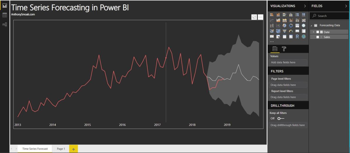
In this video I’ll demonstrate how to use the forecasting analytics option in Power BI. Although Power BI’s forecast algorithm is a black box, it’s more than likely using exponential smoothing to generate results. At a very high level, exponential smoothing is an algorithm that looks for patterns in data and extrapolates that pattern into the future. To help exponential smoothing perform at an optimal level, it is very important to pick an accurate seasonality estimation, as this will have an outsized effect on the time series forecast.

If your data points are at the daily grain, then you’d use 365 as your seasonality value. If your data points are at a monthly grain, then you’d use 12 as your seasonality value. Generally, the more seasonality cycles (e.g., years) that you provide Power BI, the more predictive your forecast will be.

Without giving away the whole video, here is a pro and a con of using forecasting in Power BI.

Con: As I stated earlier the exact algorithm is a black box. Although based upon a Power View blog post, we can reasonably assume exponential smoothing is involved. Furthermore, the results cannot be exported into a spreadsheet and analyzed.

Pro: The ability to “hindcast” allows you to observe if the forecasted values match your actual values. This ability allows you to judge whether the forecast is performing well.

Check out the video; I predict you’ll learn something new.

As always, If you find this type of instruction valuable make sure to subscribe to my Youtube channel.

Tableau K-Means Clustering Analysis w/ NBA Data

Interact with this visualization on Tableau Public.

In this video we will explore the Tableau K-Means Clustering algorithm. K-Means Clustering is an effective way to segment your data points into groups when those data points have not explicitly been assigned to groups within your population. Analysts can use clustering to assign customers to different groups for marketing campaigns, or to group transaction items together in order to predict credit card fraud.

In this analysis, we’ll take a look at the NBA point guard and center positions. Our aim is to determine if Tableau’s clustering algorithm is smart enough to categorize these two distinct positions based upon a player’s number of assists and blocks per game.

Nicola Jokic is a Statistical Unicorn

If you also watch the following video you’ll understand why 6 ft. 11 center Nikola Jokic is mistakenly categorized as a point guard by the algorithm. This big man can drop some dimes!

If you’re interested in Business Intelligence & Tableau subscribe and check out my videos either here on this site or on my Youtube channel.

What Exactly is Hadoop & MapReduce?

In a nutshell, Hadoop is an open source framework that enables the distributed processing of large amounts of data over multiple servers. In effect it is a distributed file system tailored to the storage needs of big data analysis. In lieu of holding all of the data required on one big expensive machine, Hadoop offers a scalable solution of incorporating more drives and data sources as the need arises.

Having the storage capacity for big data analyses in place is instrumental, but equally important is having the means to process data from the distributed sources. This is where Map Reduce comes into play.

Map Reduce is a programming model introduced by Google for processing and generating large data sets on clusters of computers. This video from IBM Analytics does an excellent job of presenting a clear concise description of what Map Reduce accomplishes.

Interpret Big Data with Caution

One caution with respect to employing big data (or any other data reliant technique) is the tendency of practitioners to have an overconfidence in understanding the inputs and interpreting the outputs. It sounds like a fundamental concept but if one does not have a strong understanding of what the incoming data signifies, then the interpreted output is highly likely to be biased. As is the case with the concept of sampling, if the sample is not representative of the larger whole then bias will occur. Example:

“Consider Boston’s Street Bump smartphone app, which uses a phone’s accelerometer to detect potholes without the need for city workers to patrol the streets. As citizens of Boston download the app and drive around, their phones automatically notify City Hall of the need to repair the road surface.” [1]

One would be tempted to conclude that the data that feeds into the app would reasonably represent all of the potholes in the city. In actuality, the data that was fed into the app represented those potholes in areas inhabited by young, affluent smartphone owners. The city runs the risk of neglecting areas where older, less affluent, non smartphone owners experience potholes; which is a significant portion of the city.

“As we move into an era in which personal devices are seen as proxies for public needs, we run the risk that already existing inequities will be further entrenched. Thus, with every big data set, we need to ask which people are excluded. Which places are less visible? What happens if you live in the shadow of big data sets?” [2]

[1] http://www.ft.com/intl/cms/s/2/21a6e7d8-b479-11e3-a09a-00144feabdc0.html

[2] https://hbr.org/2013/04/the-hidden-biases-in-big-data/