Add Total Values for Stacked Column and Stacked Bar Charts in Excel

This is the only video you need to learn how to add add totals to stacked bar charts and stacked column charts in Excel. Make sure to watch the video because I have you covered both ways.

I’m more of a video explanation person, so make sure to watch the video so the steps are clearer. Then refer to the bulleted steps as reference once you have the initial basic understanding.

The Keys to Adding Totals to the Stacked Column Chart Above:

  • Add a “Grand Total” column to your data
  • Highlight your data not including the “Grand Total” column
  • On the “Insert” menu select a “2-D Stacked Column” chart
  • Select “Switch Row/Column” as necessary so your first data column is listed on the X axis
  • Select the chart and then expand the data range to include the “Grand Total” column
    • Add “Data Labels” to the Grand Total series on the chart
  • Right click on the Grand Total and “Change Series Chart Type”, the viz becomes a “Combo” chart
  • Change the “Grand Total” series chart type to a “Line”, while leaving all others as a “Stacked Column”
  • Format the line’s data label, changing the Label Position to “Above”
  • Select the line, format the data series and change the “Line” option to “No Line” in order to leave only the totals and hide the line.

The Keys to Adding Totals to the Stacked Bar Chart Above:

  • Add both “Grand Total” and “Spacing” columns to your data
    • Highlight your data including the “Spacing” column but not including the “Grand Total” column
      • The “Spacing” column should have a value of 0 at this point
    • On the “Insert” menu select a “2-D Stacked Bar Chart”
    • Select “Switch Row/Column” as necessary so the “Spacing” values are not listed as an option on the Y axis
    • Change the “Spacing” column values to a number (e.g., 1000) big enough to make a new category visible on the stacked bar chart
    • Right click to “Format Data Labels” and change the “Label Options” to “Value from Cells”
      • In the “Select Data Label Range” pop up box, highlight the values from the “Grand Total” column
      • Change the “Label Position” to “Inside Base”
    • On the chart select the Grand Total Series and right click so the “Fill” option appears
      • Change the “Fill” to “No Fill”
    • Change the values in the “Spacing” column to 0
    • Delete the “Grand Total” entry from the Legend

You can thank me by liking and subscribing to my YouTube Channel

All views and opinions are solely my own and do NOT necessarily reflect those of my employer.

Do Great Things with Your Data

– Anthony B. Smoak

shop.spreadshirt.com/AnthonySmoak

Advertisement

Drill from Region to State Using Parameter Actions in Tableau

When the data goes high, you can go low; to misquote a common saying. In this video I’ll show you how to start at a region level on your Tableau map and then drill into the State.

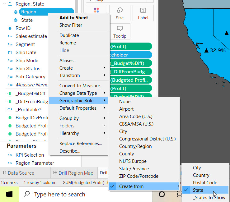
If you’re using the Tableau Superstore data set, make sure the Region and State fields are assigned to a geographic role. Most likely you will need to change the Region to a geographic role, which is created from the State field.

At a high level we’ll have a dual axis based upon the latitude, with the top latitude displaying the regions and the bottom latitude displaying the state. When we layer them on top of each other, we begin to create the illusion of the drill.

We’ll use a parameter creatively named [Region Parameter] which contains all of the regions. From there we’ll create a calculated field named [_States to show] as follows:

If [Region]=[Region Parameter]
Then [State]
END

In order to institute the drill, we’ll create a worksheet parameter action that will change the value of the region parameter on user selection. This causes the clause (If [Region]=[Region Parameter]) to evaluate to TRUE which then causes the display to show the states for the selected region.

It sounds more complicated than it is, so just make sure to watch the video for understanding and clarity.

As a bonus, I’ll show you how to achieve this effect where the selected region does not cause the other regions to gray out. Notice on the second map how all the non selected regions do not lose emphasis; this is not the default effect. It’s the little “show-off” details like this that can up your Tableau game. You’re welcome!

You can thank me by watching, liking and subscribing:

All views and opinions are solely my own and do NOT necessarily reflect those of my employer.

Do Great Things with Your Data

Anthony B. Smoak

How to Filter your Tableau Viz in Tooltip (Top 10 Values)

Visualizations in tooltips, affectionately know as “Viz in tooltip” is a handy feature available in Tableau that enables “details on demand” functionality. As the user hovers over a specific mark or data point, additional details are revealed that are filtered specifically for that mark from another worksheet.

In the example above, as the user hovers over a bar, they obtain additional details about the three most profitable products associated with the respective bar.

As I learned in a very informative Tableau presentation for tooltip wonks (myself included), the underlying architecture is built upon action commands and shares many commonalities with action filters. For viz in tooltip performance considerations, use smaller and fewer visualizations. Also try to avoid maps and other complex visualizations that have significant mark density.

If your tooltip responsiveness is greater than 2 seconds or the height and or width is greater than 600 pixels, then consider rethinking your approach. According to Tableau best practice, users are not willing to wait more than 2 seconds hovering over a mark for a reveal.

Since the viz in tool tip passes filters between worksheets, this means we can make use of context filters (click this link for a fantastic overview) to limit the number of marks returned and help improve performance.

This is the Section You are Here for

Context filters also help solve the problem of returning the Top N records associated with a mark. When you assign a viz in tooltip on your source sheet, a set filter is applied on the target (i.e., viz in tooltip) worksheet. If you’re a frequent watcher of my videos you know that the Tableau order of operations prevents the default set filter from returning a proper Top N.

By adding the set filter to the context on the Order of Operations skyscraper, the data is pre-filtered by your dimension first (e.g., State) and then the Top N filter is applied. When the set filter turns gray, you know it’s working.

Notice that the Context Filter box is above the Sets entry; which means that the Context filter is evaluated BEFORE the set. Make sure to watch the video to learn how to limit to the Top 10 cities based upon a hovered state.

Check out the video for details and may all your viz in tooltips be context appropriate!

All views and opinions are solely my own and do NOT necessarily reflect those of my employer.

Do Great Things With Your Data

-Anthony B. Smoak