Create an Interactive Stacked Bar Chart in Tableau

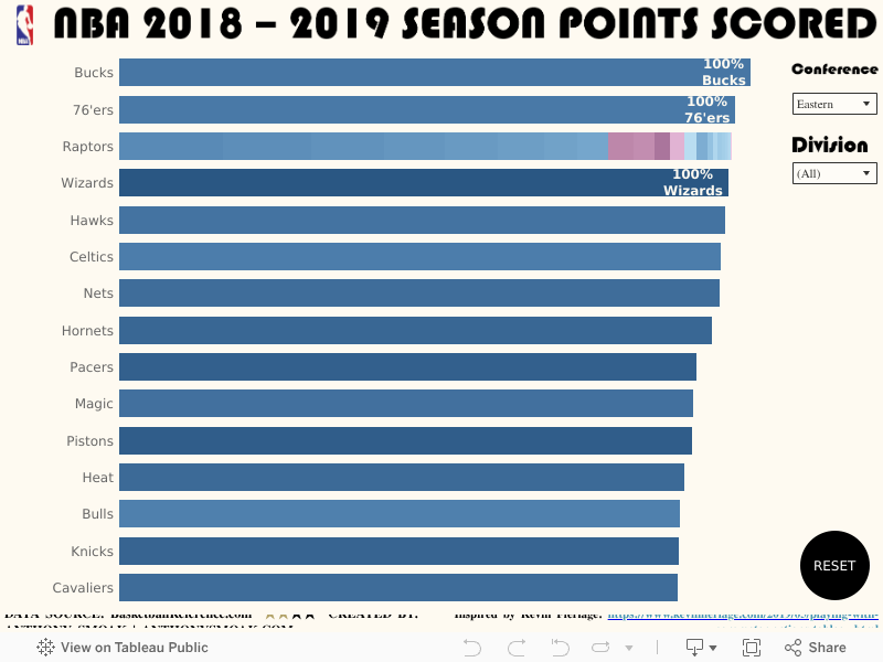
In this post we’ll use the new parameter action functionality in Tableau to create an interactive stacked bar chart. When we select a dimension from the viz, we can drill down into a sub-dimension. Parameter actions are new to Tableau as of version 2019.2. In the video we use an NBA data set which you can download in a workbook if you visit my Tableau Public viz.

This neat little trick relies upon the creation of a parameter named [Team Name Parameter] and two dimensions.

  • Dimension #1 is the [Team Name]
  • Dimension #2 is the [Player Name]

There is an implied hierarchical relationship between [Team Name] and [Player Name] as teams are naturally comprised of players.

We will also create a calculated field named [Player Drill] that is defined as such:

IF [Team Name Parameter] = [Team Name] THEN [Player Name]
ELSE [Team Name]
END

When we place the [Player Drill] calculated field on color on the marks card and setup our parameter actions (watch the video for instruction), the user selection of a [Team Name] on the bar chart will feed the [Team Name Parameter]. This causes all of the players on the selected team to be displayed with their respective breakdown of points scored.

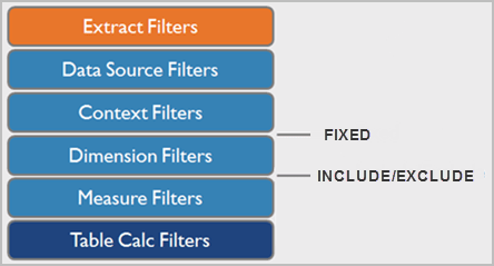
Bonus: There is a FIXED LOD lesson in this video as well as a Star Wars reference which I’m sure you’ll have no issue finding. Here’s a hint:

It’s really not complicated so don’t let all the words here confuse you. Just watch the video and do some great things with your data! Interact with the viz below:

As always, If you find this type of instruction valuable make sure to subscribe to my Youtube channel.

All views and opinions are solely my own and do NOT necessarily reflect those of my employer.

This video was definitely inspired by Kevin Flerlage who has a great blog post on the uses of parameter actions in Tableau. Check it out here.

Create a Customizable Heat Map in Power BI

In this video we’ll learn how to create a customizable heat map in Power BI without using the prepackaged downloadable visual. A heat map (or heatmap) is a graphical representation of data where the individual values contained in a matrix are represented as colors. A heat map helps draw your eye to the most and least popular areas within the matrix. The cells contained within the table either contain color-coded categorical data or numerical data, that is based on a color scale.

Matrix

Wrong Matrix

I have some fun in the video with a dashboard that I constructed using a publicly available data set from Microsoft, but in the lesson we’ll create the following:

Heatmap

Make sure to watch the video, download the data set and follow along with the instructions.

If you find this type of instruction valuable make sure to subscribe to my YouTube channel.

All views and opinions are solely my own and do NOT necessarily reflect those of my employer.

Tableau Sales Dashboard Tutorial using Table Calculations

In this Tableau data visualization tutorial, we’ll learn to use the LOOKUP table calculation function to return sales revenue for the same day last year. A number of different techniques are used in the creation of this dashboard.

I designed this dashboard solely as a teaching exercise to help you understand the LOOKUP function and how to show the same date last year in a separate column.

  • As we learned in a previous video Tableau Table Calculations Simplified, (make sure to watch this video afterwards for more clarity), we’ll compute using specific dimensions and then use “At the level” to make sure our LOOKUP table calculation is performing correctly.
  • The “Show Missing Values” option is selected to fill in date gaps in the data set that do not exist. Ensuring 365 dates per year are present in the visualization enables the offset (i.e., -1) in the LOOKUP calculation to arrive at correct sales revenue from the same day in the previous year.
  • You’ll learn that we can filter on a table calculation by using another table calculation. Filters based on table calculations do not filter out underlying data. Instead, the data is hidden from the view, allowing dimension members to be hidden from the view without impacting the data in the view.

Tableau Order of Operations

Observe the Tableau filter order of operations above. Applying a dimension filter before the Table Calculation filter removes underlying data which affects the proper functioning of Table calculations. Typically, Table Calculations only work on values that are visible in the view. By applying a table calculation (which is last in the order of operations) you preserve underlying data but filter out data from the view.

Interact with this dashboard via the picture link:

You need to read these posts and watch these videos for additional information:

As always, If you find this type of instruction valuable make sure to subscribe to my Youtube channel.

All views and opinions are solely my own and do NOT necessarily reflect those of my employer.