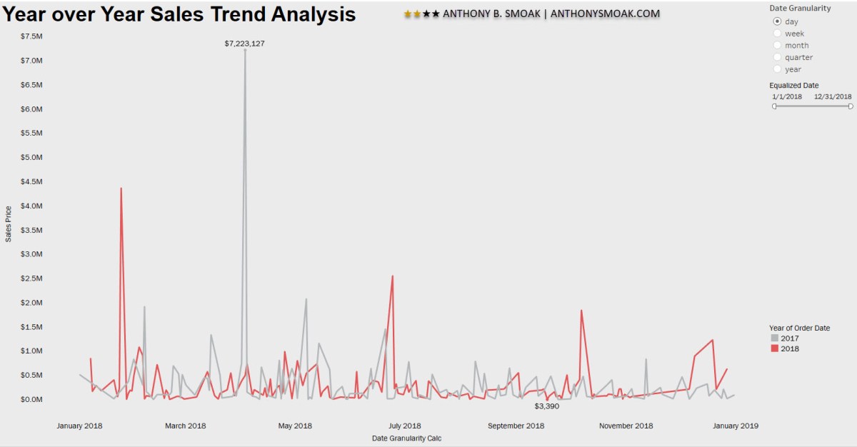
In this Tableau data visualization tutorial I used a technique shared by Tableau Zen Master Ryan Sleeper to “equalize” dates across the same axis. This date equalization calculated field enables year over year, quarter over quarter, month over month, week over week and same day last year comparisons.
MAKEDATE(2018,MONTH([Your Date]), DAY([Your Date]))

Call in The Equalizer for this Analysis
It’s a pretty clever way of preserving the same month and day of date values across many years and updating their respective years to one common year.
For example, all dates would retain their current month and day but would share the year value of ‘2018’. In this manner, data points from various years can be stacked on top of each other for comparison purposes.
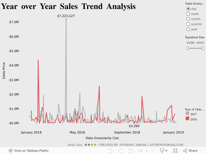
Additionally, by creating a parameter value for a specific date part (i.e., year, month, week, etc.,) the user has control over the level of comparisons in the visualization.
You’ll have to watch the video to see the details. Again, thanks to Ryan Sleeper for sharing this tip with the Tableau community which enabled me to apply it to my dataset and share it with you in video form.
As always, If you find this type of instruction valuable make sure to subscribe to my Youtube channel.
All views and opinions are solely my own and do NOT necessarily reflect those of my employer.
