Learn Advanced Tables in Tableau (Step by Step)

TLDR

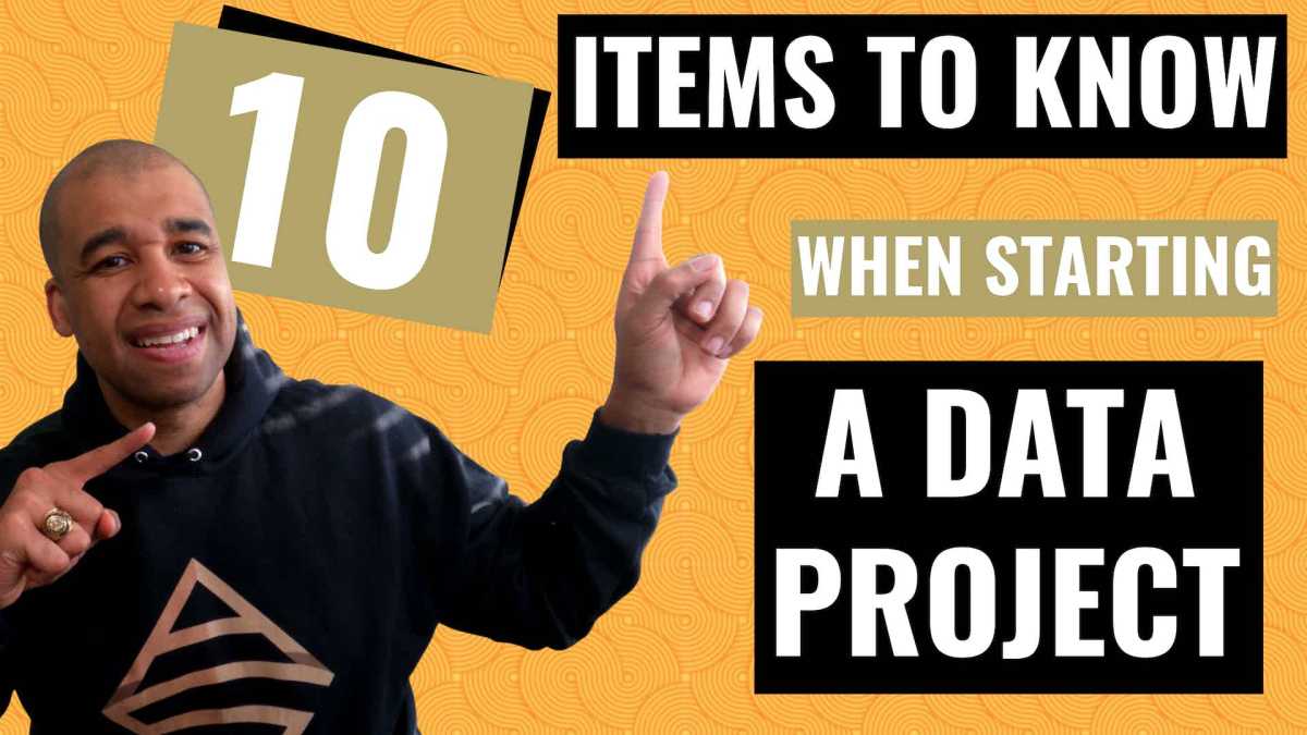
Yes I put an AI version of myself on the thumbnail. I obviously “Quantum Leaped” from the future to teach you these Advanced Tableau table skills that you’ll encounter in the accompanying video.

Be warned, this is Highly Advanced Tableau!! In the main video, we’ll explore how to generate advanced tables in Tableau (step by step), complete with multiple chart elements displayed on the same table row. It’s OK, you can click the area below since it leads to a YouTube short.

Intro

As a data enthusiast and Tableau user, I always strive to learn new things, experiment with different techniques and share my knowledge with others. Recently, I came across a visualization by Zainab Ayodimeji that caught my attention. Zainab is a Tableau Ambassador and her work is always top-notch, so I reached out to her and asked if I could reverse engineer one of her vizzes for a video. She was cool with it, so I got to work.

The visualization that caught my eye was an advanced Tableau visualization that used normalized data to create sales and profit sparklines for using standard Superstore data. Zainab’s visualization featured a variety of different chart elements, all on the same row, and looked incredibly cool.

I was immediately intrigued and wanted to see if I could reproduce something similar myself, but with a different data set other than the ubiquitous Superstore. So, I got to work on reverse engineering and came up with my own take on Zainab’s visualization.

I discovered that the technique used in her viz was innovated by Sam Parsons, so I also checked out his video on this technique and found it ingenious; very MacGyver like. Sam’s innovative video is the inspirational source for all of these techniques. Watch his video for the concepts, watch my video for practical hands on building.

Watch the Step by Step Re-creation Video to Learn this Advanced Technique

In the video below, I will explain step by step how I used Tableau to create a compelling chart example that will help my viewers understand the Advanced Tableau calculations and concepts it takes to visualize multiple types of charts on one table row.

The dataset that I worked with contained information about the sales and profits of different products sold at a coffee shop as opposed to Superstore data. Recreating the data with a different dataset forced me to understand the concepts better than just copying and pasting the existing code in Zainab’s visualization.

The Reviews are In

Y-Axis Positioning Trick – (How this Process Works)

One of the coolest concepts in this process is the positioning of the chart elements on the same Y-Axis. Again, a big shoutout to Sam Parsons for coming up with these techniques!

The y-axis position is critical because it determines where each data point will be plotted on the chart. As a result of the ingenious calculation, Tableau places all non-line chart elements at a y-axis position of 0.5, which is the middle of the y-axis. However, for line chart elements, the y-axis position is calculated based on the normalized sales or profits value.

To normalize the data, we make the values of the sales and profit of each product fit between a range of 0 and 1 for a consistent Y axis. This allows us to see the trends of the sales and profits of each product at a standard consistent height on the visual.

The sales or profit axis test (a calculated field) determines whether the normalized sales or profits value should be plotted if the chart element is a line. If the test returns a value of 1, Tableau will plot the normalized sales value. If it returns a value of 0, Tableau will plot the normalized profits value. This is determined by checking whether the sales access product field is present in the detail section of the view.

Download the Workbook for This Technique

Download at this link.

Conclusion

I just realized that I used Quantum Leap and MacGyver references in the same blog post (gettin’ Ziggy with it). After watching my video above, you’ll be able to create an insightful visualization using clever and unconventional methods (not unlike MacGyver making a jetpack out of a toothpick and a piece of gum).

Again, big thanks to Zainab and Sam for influencing this work so I could teach you how to Quantum Leap forward in your Tableau skills (Ok I’ll stop with the puns). Keep doing great things with your data!

I appreciate everyone who has supported this blog and my YouTube channel via merch. Please check out the logo shop here.

Stay in contact with me through my various social media presences.

Thank you!!

Anthony B Smoak

Advertisement

10 Items to Know When Starting A New Data Project

Are you a data professional looking to start a new data project?

Then you need to review my 10-point checklist to make sure you’re on the right track. Starting a new data project can be overwhelming. But don’t worry, with my 20 years of experience, I’m here to guide you through it.

Typically when I start to perform a new data related task or analysis for a project, I have to make sure that I meet the expected objectives, which often include identifying patterns, trends, and insights that can be used to drive business decisions.

10 Point Checklist

Point 1: First things first, you need to understand the nature of the deliverable that’s being asked for. Is it a new report, database table, column, data visualization, calculation, or a change to any of the above? In a similar fashion you also need to understand the technologies in play that you have to work with. This could be anything from Tableau, Power BI, SQL Server, Oracle, Teradata or even Microsoft Access (yes, people still use this tool).

Point 2: It’s crucial to know the desired delivery time frame for your project. You don’t want to end up with a longer timeline than what the project manager or client had in mind. Communication is key in this situation.

Point 3: Who is the intended audience for this deliverable? If it’s for an executive audience, you may need to roll the numbers up and take out some detail. If it’s for an analyst or operational audience, you may want to leave in more detail.

Point 4: How much historical data is required? What is the anticipated volume of data that your deliverable is going to generate? Don’t get caught in a situation where your solution can’t handle the trending analyses for a 2 year time frame when you only pulled data for the last 6 months.

Point 5: Understand the volume of data that your solution will generate. For example, a 5 million row output is not conducive to a 100% Excel approach. You will definitely be in the land of database analyses. However you may later present the data at an aggregated level (see point 3) via Excel but hopefully using a real data visualization tool .

Point 6: You need to understand if there’s any Personally Identifiable Information (PII) or sensitive data that you need to access in order to carry out the request. This could include social security numbers, passport numbers, driver’s license numbers, or credit card numbers.

Point 7: It’s important to understand the business processes behind the request. As data people, we tend to focus only on the data piece of the puzzle, but understanding more about the relevant business process can help you deliver the better results for your end users.

Point 8: Try to find and understand any relevant KPIs associated with the business processes on which your data project/task is affecting.

Point 9: Perform data profiling on your datasets! This can’t be stated enough. Profiling leads to understanding data quality issues and can help lead you to the source of the issues so they can be stopped.

Here are a few data profiling videos I’ve created over the years to give you a sense of data profiling in action.

Point 10: Understand how your solution will impact existing business process. By changing a column or calculation, how does this impact upstream or downstream processes? Keep your email inbox clean of those headache emails that are going to ask why the data looks different than it did last week. Most likely there was not a clear communication strategy to inform everyone of the impact of your changes.

Bonus Considerations:

Here are a few bonus considerations since you had the good fortune of reading this blog post and not just stopping at the video.

Bonus Point 1: Consider any external factors that could impact your data project. For example, changes in regulations can impact the data that you collect, analyze, and use. If the government imposes stricter regulations on data privacy (see point 6 above), you may need to change your data sources or analysis methods to comply with these regulations.

Bonus Point 2: Consider internal organizational politics when starting on a project. If you work in a toxic or siloed organization (it happens), access to data can be a challenge. For example, if the marketing department controls customer data, accessing that data for a sales analysis project may be challenging due to internal strife and/or unnecessary burdensome roadblocks.

Internal politics can also lead to potential conflicts of interest, such as when stakeholders have different goals or agendas. For example, if your data analyses could impact a department’s budget, that department may have an incentive to influence your work outcome to their advantage (or try to discredit you or your work by any means necessary).

Bonus Point 3: Finally, make sure to document everything. This includes the business requirements, technical requirements, saved emails, and any changes that were made along the way.

When I started my first office position as an intern at a well known Fortune 500 company, my mentor told me the first rule of corporate life was to C.Y.A. I’m sure you know what that means to cover. Having solid documentation of your work and an email trail for decisions made along the way can keep you out of hot water.

Conclusion

And there you have it, my 10-point checklist for starting a new data project. By following these steps, you’ll be well on your way to delivering high-quality results. Don’t forget to like and subscribe for more data-related content!

I appreciate everyone who has supported this blog and my YouTube channel via merch. Please check out the logo shop here.

Stay in contact with me through my various social media presences.

Keep doing great things with your data!

Anthony B. Smoak