One of the great options available in Power BI is the capability to “drill through” to another report page. In this manner you can focus on a particular entity such as a customer, internal division, supplier or any other dimension of importance.
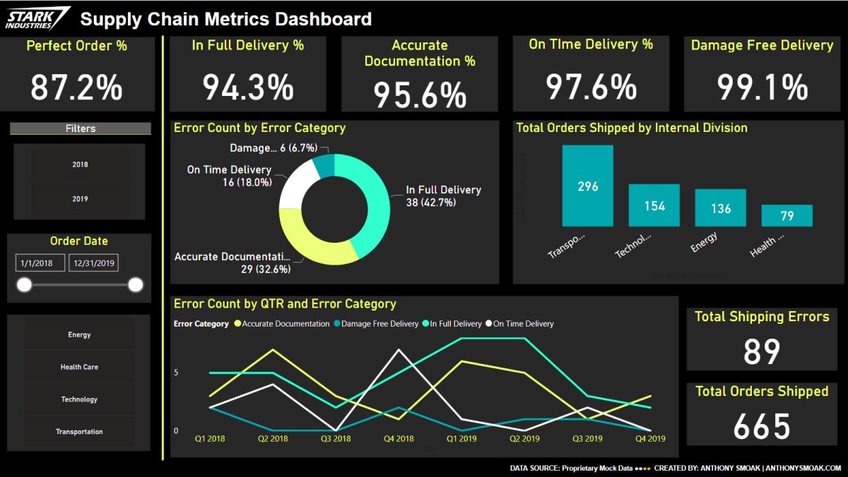
Different users have different data needs. When designing a dashboard typically the Key Performance Indicators (KPIs) are aggregated at a high level on the initial visualization. This offers executives and management types a “bird’s eye view” of performance.
Personally, I am a fan of BANs (look up the term in a dashboard design context if you are not familiar) when I want to highlight key takeaways.
Subsequent lower level dashboard pages can offer analysts and others the ability to either explore data with additional interactivity or simply display a static detailed report. The point is to start at a high level and allow your user to drill to a more granular level of data.
In this video I demonstrate the use of the drill through functionality in Power BI. In this scenario, you are the Chief Supply Chain officer trying to gauge your Perfect Order Percentage KPI for several internal divisions. When it’s time to sit down with your four division mangers to discuss their performance on this metric, you want the ability to start at a high level and then drill through to a static report based upon their respective internal divisions or on a specific shipping error.

Drill through on “In Full Delivery” error category
Do not try and cram every visualization, chart, table or gauge under the sun into a dashboard! Take advantage of drill through functionality and tailor your data presentation for specific user groups. This general concept applies to any data visualization tool, but if you’re using Power BI then this video will help you understand the specific steps required to enable drill through functionality.
I’m frequently questioned where I obtain mock data for my scenarios. My secret source is mockaroo.com which is a great starting point for developing test data.
As always, do great things with your data.
Anthony B. Smoak, CBIP
If you find this type of instruction valuable make sure to subscribe to my Youtube channel.
Check out other Power BI videos of interest definitely worth your time:
- Calculate Bar Chart Percent of Total in Power BI
- Power BI Dashboard Tutorial: Year over Year Difference Analysis
- Time Series Forecasting in Power BI
All views and opinions are solely my own and do NOT necessarily reflect those of my employer.


