The London Whale Trading Incident

Once again I am digging into my digital crates to share an informative post. Here is a small writeup from a Syracuse graduate Enterprise Risk Management class (IST 625) I completed concerning JP Morgan Chase and the “London Whale”. The post is slightly edited from the final version I submitted. The assignment was as follows:

“This assignment requires you to research an organization that has suffered a devastating loss from a so-called ‘low frequency or low probability but-high consequence’ event, to understand what happened to that company during and after that event, and to synthesize what we can learn from their experiences.”

In gambling parlance, a whale is a high roller who bets big and has the potential to cause the house substantial losses if he/she stops betting at the wrong time. Although the whale at the center of this episode wasn’t sitting in a casino, the house (JPMorgan) experienced substantial losses when the betting stopped.

JP Morgan Overview

JPMorgan Chase is the largest financial holding company in the United Sates and has more than 2 trillion dollars in assets. It is also a global financial services firm with more than 250,000 employees (United States Senate pg. 24). The company has more than 5,600 branches and is a strong market participant in the mortgage lending, investment banking and credit card spaces (Hoover’s Company Records, 2014). JP Morgan’s principal bank subsidiary, JPMorgan Chase Banks is also the largest bank in the United States.

The current Chairman and CEO of JP Morgan Chase is Mr. James “Jamie” Dimon. Previous to 2012, Mr. Dimon’s name was associated with the eponymously named “Dimon principle”. “The ‘Dimon principle,’ as it is known, was shorthand for a safe bank with regular profits” (Ebrahimi, Aldrick & Wilson, 2012). With Mr. Dimon guiding the firm, JP Morgan held an excellent reputation with respect to risk management. The same could not be said of similar financial firms who were no longer “going concerns” as a result of the 2008 Great Recession.

“So when the US Government desperately sought someone with the balance sheet for the corporate rescue acts necessary to prevent financial meltdown, it sent for Dimon. In what were admittedly sweetened deals, JP Morgan swallowed bankrupt investment bank Bear Stearns and cash-strapped retail lender Washington Mutual” (Osborne, 2011). Emerging from the 2008 financial crisis unscathed, Mr. Dimon became more powerful and confident. He frequently railed against the need for government regulations with regard to proprietary trading in large financial firms. (Scuffham & Laurent, 2012) quote Mr. Dimon as stating, “We must not let regulatory reform and requirements create excessive bureaucracy and unnecessary permanent costs.”

Unfortunately for JP Morgan Chase and Mr. Dimon, subsequent trading events and risk management failures of 2011 would tarnish the firm and the CEO’s cultivated and highly regarded reputation.

London Whale Trades

(English, 2012) offers an analogy of the high risk/low frequency event that occurred in JP Morgan’s Chief Investment Office (i.e. CIO). Imagine a scalper who purchased 50,000 tickets to a sporting event with a capacity of 75,000 seats. The event is not nearly as popular as was anticipated by the scalper, thus the going price on the tickets plummets rapidly as would be ticket buyers wait for prices to fall further from face value. The scalper intended to hold tickets for the long term expecting high demand but with too many people on the sidelines betting that prices would fall, the scalper had to cut losses and sell at a drastic loss.

The “London Whale” trader at the center of this JP Morgan controversy was a French national and London based trader named Bruno Iksil who was known for being a successful leviathan risk taker. Mr. Iksil worked for the firm’s Chief Investment Office. Since JP Morgan has an excess of deposits after the firm makes loans available to business and consumers, this excess cash is invested by the CIO group to hedge against disparate investment actions undertaken by other areas of the bank.

The stated purpose of the CIO unit was to protect the bank from losses and interest rate risk by acting as a hedge and offsetting the bank’s other credit risks. The CIO unit is not tasked with proprietary or “prop” trading (essentially placing bets) intended to boost profits. Prop trading is the mandate of the company’s Investment Banking Division. In 2009 alone the CIO group’s Synthetic Credit Portfolio (SCP) of financial derivatives generated 1.05 billion dollars for the bank (United States Senate, pg.87). Ultimately JP Morgan would end up being a victim of its own success as it continued to conduct proprietary trades in the CIO division.

Bruno Iksil and the London CIO office were steadily racking up daily losses in the hundreds of millions of dollars by investing in synthetic derivatives (i.e. Credit Default swaps or CDS). The trading positions that the CIO office held were not hedging against other bank investments, as was the purported charge of this office. Credit default swaps are financial derivatives the provide investors insurance on bonds against potential default. Mr. Iksil, “has been selling protection on an index of 125 companies in the form of credit-default swaps. That essentially means he is betting on the improving credit of those companies, which he does through the index—CDX IG 9—tracking these companies” (Bianco, 2012, para 5).

Needless to say, the companies in the index did not improve. The initial 100 million dollar position that the CIO office held in the CDX IG 9 index was essentially cornering the market and when there were no willing buyers, the firm had to sell at massive loss.

In April of 2012 the press began running stories about the identity of the “London Whale”. The massively large trades in credit default swaps (the same complex financial instruments that doomed A.I.G during the 2008 financial crisis) began to affect credit markets worldwide. Initially, by the end of the week on May 11, 2012 when the firm held a hastily convened conference call regarding transparency around the London Whale trades, JP Morgan suffered a loss of 14.4 billion from its market capitalization as its stock price fell 11.47% in two days (Ebrahimi, Aldrick & Wilson, 2012). By the end of May the synthetic derivatives portfolio alone had lost 2 billion dollars. By the end of June the losses doubled to 4.4 billion and eventually reached 6.2 billion by the end of the year (United States Senate, pg. 12).

Initial Management Response

Once the CIO division management learned of Bruno Iksil’s precarious investment positions, “it could have announced the maximum possible losses from the trades. Instead it said what the losses were at that moment in time, and hoped a change in sentiment and some clever trading would stop them spiralling [sic]”. To the London Whale’s credit, once he observed the potential for disaster, he suggested that the division take a loss or “full pain” which would have been an additional 100 million dollars wiped out (Farrell, 2012), far less than the eventual 6.2 billion dollar total loss number.

Amazingly, Mr. Iksil’s management began to take actions that would conceal the magnitude of losses reported. Recorded telephone calls, instant messages and a shadow spreadsheet containing actual projected losses, revealed how traders were pressured to minimize the expected losses of the SCP (Synthetic Credit Portfolio) (United States Senate Report, pg. 20).

Internal CIO management also disregarded their own risk metrics such as the VaR or value at risk, which estimates the maximum risk of loss over the course of a day. This warning sign metric was ignored and then actually raised. CEO Jamie Dimon, Chief Risk Officer John Hogan and CIO head Ina Drew, “approved the temporary increase in the Firm-wide VaR limit, and Ms. Drew approved a temporary increase in CIO’s 10-Q VaR limit.” (JPMorgan Chase & Co, 2013 pg. 79)

Senior bank management was told that potential losses were massive and no longer functioned as a hedge to the bank; management then proceeded to downplay those issues until the losses mounted into the billions of dollars (United States Senate, pg.21). On an April 13, 2102 first quarter conference call CEO Jamie Dimon dismissed the initial publicity surrounding the London Whale trades by characterizing them as a “complete tempest in a teapot” (United States Senate pg. 17). By June 2013, Mr. Dimon’s stated to a Senate Panel on the trading losses, “Let me first say, when I made that statement, I was dead wrong” (PBS NewsHour, 2012).

Remediation and Outcomes

CEO Jamie Dimon stated, “CIO will no longer trade a synthetic credit portfolio and will focus on its core mandate of conservatively investing excess deposits to earn a fair return” (JPMorgan Chase & Co., 2012(a), pg. 3). Management instituted a number of changes as a result of the CIO trading imbroglio. All CIO managers based in London with any responsibility for the Synthetic Credit Portfolio were separated from the firm with no severance and without 2012 incentive compensation. (JPMorgan Chase & Co., 2012(a), pg.22).

JP Morgan instituted significant changes for the better in the CIO Risk Management organization. A new Chief Risk Officer was empowered to hire additional senior level officers to “extend the capacity of the Risk function within CIO, Treasury and Corporate, and he has made 20 such hires since May 2012” (JPMorgan Chase & Co., 2012(a), pg.114). Along with upgraded personnel skills in the CIO Risk organization, management rightfully instituted a common sense approach to structural issues.

In the pre “Whale trades” environment, the CIO Risk Committee met infrequently and did not contain any members from outside of the CIO organization. This lack of diversity in the realm of “risk-thought” fostered a group think/rubber-stamp mentality. CIO Risk managers did not feel “sufficiently independent” from the CIO business to ask hard questions or criticize trading strategies (JPMorgan Chase & Co., 2012(a), pgs. 12-13).

Industry Impact

“Dimonfreude” was a term coined in the wake of the trading losses, “it means taking great satisfaction in the misfortunes of the JPMorgan boss” (Foley, 2012). Yet, the fall out from JP Morgan’s episode was more than mere embarrassment for the firm and the CEO’s reputation in the area of risk management. To the chagrin of Mr. Dimon, this episode strengthened the case for more government oversight of the financial industry. In the words of then Treasury Secretary Timothy Geithner, “I think this failure of risk management is just a very powerful case for financial reform” (Shorter, Murphy & Miller, 2012, pg. 24).

References

Bianco, J. (2012). Understanding J.P. Morgan’s Loss, And Why More Might Be Coming. The Big Picture. Retrieved February 2, 2014, from http://www.ritholtz.com/blog/2012/05/understanding-j-p-morgans-loss-and-why-more-might-be-coming/

English, S. (2012). How London Whale’s errors attracted the market sharks. The Independent. Retrieved from Factiva.

Ebrahimi., H., Aldrick, P., & Wilson, H. (2012). The day JP Morgan’s Jamie Dimon lost his sparkle; Breathtaking risk failures at JP Morgan have left the bank’s reputation on the edge. The Telegraph Online. Retrieved from Factiva.

Farrell, M. (2013). JPMorgan slashes Dimon’s bonus by 53%. CNN Wire. Retrieved from Factiva.

Foley, S. Jamie Dimon Chief executive, JP Morgan Chase (2012). The Independent. Retrieved from Factiva.

Hoover’s Company Records. (2014). JPMorgan Chase & Co. Austin, U.S. Retrieved from http://search.proquest.com.libezproxy2.syr.edu/docview/230565788?accountid=14214

JPMorgan Chase & Co. (2012)(a). JPMORGAN CHASE REPORTS SECOND-QUARTER 2012 NET INCOME OF $5.0 BILLION,OR $1.21 PER SHARE, ON REVENUE OF $22.9BILLION. Retrieved February 1, 2014 from http://files.shareholder.com/downloads/ONE/2939707738x0x582870/6a286dff-ad7e-40ba-92ef-e6ff1b3be161/JPM_2Q12_EPR_Final.pdf

JPMorgan Chase & Co. (2012)(b). CIO Task Force Update. Retrieved February 1, 2014 from http://files.shareholder.com/downloads/ONE/2939707738x0x582869/df1f2a5a-927e-4c10-a6a5-a8ebd8dafd69/CIO_Taskforce_FINAL.pdf

JPMorgan Chase & Co. (2013). Report of JPMorgan Chase & Co. Management Task Force Regarding 2012 CIO Losses. Retrieved February 1, 2014 from http://files.shareholder.com/downloads/ONE/2272984969x0x628656/4cb574a0-0bf5-4728-9582-625e4519b5ab/Task_Force_Report.pdf

Osborne, A. (2012). JP Morgan $2bn loss: Dimon’s in the rough; Be careful what you wish for. The Telegraph Online. Retrieved from Factiva.

PBS NewsHour. JPMorgan Chase’s Big Losses, Big Risk: Blip on Radar or Systemic? Retrieved February 1, 2014 from http://www.pbs.org/newshour/bb/business-jan-june12-jamiedimon_06-13/

Scuffham, M. & Laurent, L. (2012). Trader known as ‘London Whale’ for his huge, hidden bets. The Globe and Mail. Retrieved from Factiva.

Shorter, G., Murphy, E., Miller, R. (2012). JP Morgan Trading Losses: Implications for the Volcker Rule and Other Regulation. Congressional Research Service. Washington, DC. Retrieved from https://www.fas.org/sgp/crs/misc/R42665.pdf

United States Senate. (2013). JPMorgan Chase Whale Trades: A Case History of Derivates Risks And Abuses. Staff Report. Washington, DC. Retrieved from http://www.hsgac.senate.gov/download/report-jpmorgan-chase-whale-trades-a-case-history-of-derivatives-risks-and-abuses-march-15-2013

This post does not necessarily represent the views of my employer and is solely my own analysis as required for a graduate school short assignment.

Picture Copyright : Andrey Kiselev on 123rf.com

Connecting Tableau with R: Combining Beauty and Power

The following is a guest post from Sinna Muthiah Meiyappan.

Tableau, as we all know, is the go-to tool for visualization. R is an open-source statistical language used by academicians, statisticians, data analysts and data scientists to develop machine learning models. R’s popularity is owed to the power of its packages.

Why Connect Tableau with R?

An analytics tool can generate enormous value if it has the following aspects:

1) a user-friendly interface for a business user
2) the scope and power to run different analyses and deliver the results to the interface in an easily interpretable way for the business user to understand and make decisions

Tableau can be used to develop beautiful dashboards which can serve as a very good user interface. R can be used to develop and run complex machine learning models whose results can be displayed in Tableau dashboards in an easily interpretable way.

In short, by linking Tableau and R, you are giving business users the opportunity to create enormous value by running and analyzing the results of complex machine learning models without having knowledge or experience in R!

How to Connect Tableau with R

1) Install Rserve package and run Rserve command by typing the following lines in your R console:

install.packages("Rserve")
Rserve()

Now, R should print ‘Starting Rserve…’. If you observe this output, then R is reaching out to Tableau for a connection.

2) Open Tableau & click on Help > Settings & Performance > Manage External Service Connections.
3) In the dialog box that opens, choose ‘localhost’ for Server and type ‘6311’ for Port.
4) Then, click on Test Connection

Now, you should get a dialog box stating, ‘Successfully connected to the R serve service’. If you observe this message, then you are all set to use the power of R from within Tableau.

Objective of this article

All companies maintain a database containing details about their customers. Customer Segmentation using clustering algorithms is a proven technique used by companies to understand its customers. This helps you offer targeted deals that convert better! The objective of this article is to create a dashboard where an executive from a wholesale business can segment customers using R within Tableau, without having to know R Programming, just by clicking in the dashboard. Then, visualize the different customer segments to find patterns that can be used to make business decisions like providing incentives, discounts, etc.

Dataset Used

The dataset referenced in this post can be downloaded in CSV format from UCI Machine Learning repository by clicking on ‘Data Folder’ link at the top left of the page. In this dataset, each row contains details about a customer of the Wholesaler regarding his channel, region and the dollar amount spent by him on different product categories like Fresh, Frozen, Grocery, Milk, Detergent Paper & Delicatessen. This dataset can be mined to understand the buying patterns/characteristics of customers based on their spending.

Designing a Customer Segmentation dashboard in Tableau

Loading data into Tableau

Open the CSV file, add a column named ‘Customer ID’ and fill it from 1 to 440.
Connect to the CSV file using the ‘Text File’ option in Tableau and you should see the below screen in your Tableau worksheet.

Picture1

Creating Parameters

Let’s cluster users based on their spending in different categories using k-means clustering algorithm. K-Means is an unsupervised learning algorithm that identifies clusters in data based on similarity of features used to form the clusters. In our case, these features would be the customers spending in different categories.

K-means algorithm requires the following two inputs for it to form clusters: (1) the number of clusters to be formed & (2) How many times to run the algorithm before picking the best clusters. Basically, the K-Means algorithm takes as many random center points as specified by the user in input 1 and starts assigning the data points to these center points based on the criteria defined to calculate distance. Once all points are assigned, it measures the Sum of Squared Errors (SSE). This process is repeated as many times as specified in input 2. Then, the model with the least SSE is picked and shown as the result.

Let’s give the option of specifying the number of clusters formed to the user who is going to use the dashboard by creating a Tableau parameter. To do that, right click on the Measures pane and click on ‘Create Parameter’. Fill the Create Parameter dialog box with details as shown below and click OK.

Picture2

Right click on the newly created ‘Centers’ parameter and select ‘Show Parameter Control’ and set Centers value to 5.
For our results to be reproducible, we need to ‘set seed’ in R. The seed defines the random numbers generated that are used in the algorithms. So, whenever we set the same seed and run a model, we would get the same results. Let us give this option of defining the seed also to our user by creating a parameter as follows:

Picture3

Right click on the newly created ‘Seed’ parameter and select ‘Show Parameter Control’ and set seed value to 500. Now, your screen should look like this:

Picture4

SCRIPT Functions to Receive Data From R

Now, to segment customers into different clusters, we are going to pass data to R, cluster it and get the results back in a Calculated Field that can be used in Tableau Visualizations. Tableau has four scripting functions which are related to the type of data they would receive from the external service Tableau is connected to. They are SCRIPT_REAL, SCRIPT_INT, SCRIPT_BOOL & SCRIPT_STR.

The syntax of a Script function is as follows:
SCRIPT_XXX (‘code to be executed as a string’, argument 1, argument2, etc.)

The arguments are referred as ‘.arg1’, ‘.arg2’, etc. respectively inside the code. All the arguments whether quantitative or categorical should be passed as aggregated versions to R since this is a table calculation. Since all our variables are quantitative, we aggregate them using the SUM function. The last line of the code in string would be returned as an output of the function by R to this calculated field.

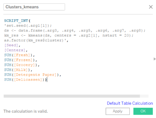
So, let’s create a Calculated Field named ‘Cluster_kmeans’ with the following code in it and click OK:

Picture5

Code Recap:

1) Line 1: Sets seed, so that the results can be regenerated again if needed. As already said, K-means choses the center points at random and starts assigning data points to these cluster centers. The clustering results will change if these center points change. So, seed is used to define the random numbers generated so that if you set the same seed and run, the same center points will be taken up for clustering.

2) Line 2: Combines all features (i.e. the customer spends in each category) that must be used for clustering into a data frame.

3) Line 3: Runs the k Means model 20 times, in the above generated data frame, with as many cluster centers as specified by the user in the dashboard.

4) Line 4: The best model out of the above 20 is picked and its results are returned to the Cluster_kmeans calculated field in Tableau, which can be used in visualizations.

We pass 8 arguments to the Script function. First is Seed, second is Centers (as in the number of clusters that we want k-means algorithm to form for this data) and the remaining 6 are the spend in each category. The six spend arguments are vectors of 440 dollar amounts each (as there are 40 customers in our dataset).

What is interesting is, the Seed and Centers parameters are also passed as vectors of length 440, but of the same value. i.e. Seed has ‘500’ repeated 440 times. In R, we pass a single number as seed, not a vector of length more than 1. So, we extract the first element of the vector alone and pass it to ‘set.seed’ function as follows:

Set.seed(.arg1[1])

Similarly, to the centers argument of k-means algorithm also we pass only a single value. If given a single value, the algorithm generates that many number of random centers and starts assigning points to clusters. If you give a vector to this argument, then it takes the values in the vector as the spatial location of center points and starts assigning points to clusters. Now, if you pass a vector of length 440 where all values in the vector being the same, then you would get an error as follows:

Error in kmeans(ds, centers = .arg2, nstart = 20) : initial centers are not distinct

To avoid this, we extract the first element of the vector alone and pass it to ‘kmeans’ function as follows:

km_res <- kmeans(ds, centers = .arg2[1], nstart = 20)

Visualizing the clusters created by R

Now that the calculated field for clusters is created, we can start creating the visualization shown in the figure below. Before that, go to Analysis > Aggregate Measures and turn it off. Because, if you don’t, Tableau will aggregate all the spend for all customers and send a single row of input to R, resulting in the following error. This error says there are more than one center points to start with and only one data point that can be assigned. Hence, the clustering cannot be completed.

Error in kmeans(ds, centers = .arg2[1], nstart = 20) : more cluster centers than distinct data points

Picture6

This sheet describes the spend of each cluster in Fresh and Frozen categories. To create the above visualization in Tableau, do the following:

1) Drag and drop ‘Cluster_kmeans’ into ‘Columns’ shelf and into Color
2) Drag and drop ‘Fresh’ and ‘Frozen’ into ‘Rows’ shelf
3) Set the chart type to ‘Gantt Bar’
4) From ‘Analytics’ tab at the top left, drag and drop ‘Box Plot’ into ‘Cells’ of the chart
5) From ‘Analytics’ tab at the top left, drag and drop ‘Average Line’ into ‘Panes’ of the chart
6) Adjust Opacity in the color palette by setting it to 50%
7) Fix the Y-axis of the graphs to read from 0 to 115,000 so that it would be easier to compare across all the six charts we are going to develop for the dashboard. ( I chose 115,000 as the upper limit, because the max spend by a single customer in a single category is of the order of 112k)
8) You can adjust the tooltip to reflect the information that you deem necessary/relevant at this point.

Now, similarly create two other worksheets which would look as follows:

Picture7

This sheet describes the spend of each cluster in Milk and Groceries categories.

Picture8

This sheet describes the spend of each cluster in Delicatessen and Detergent Paper categories.

Creating Customer Segmentation Dashboard

Create a new dashboard and drag all three worksheets you created into the dashboard. Arrange the parameter controls and chart legends appropriately. Use blank containers to fill space if needed. Now your dashboard may look like this.

Picture9

So now, we have put together a dashboard where a business user (in this case, the Wholesaler) can choose how many clusters he wants to form from his customer data and understand about the different clusters formed. The cluster results generated are always reproducible if the user inputs the same seed again (in this case 500).

Recalculating Clusters at the Snap of Your Fingers!

To change the number of clusters from 5 to any other value, all the user must do is to change the number in the Centers parameter list box. Tableau will pass the updated parameter to R, clusters will be re-calculated through Table calculation in R, and the dashboard will be updated to reflect the new cluster details! The below image shows the dashboard when the Centers is changed from 5 to 3.

Picture10

Features of this Customer Segmentation Dashboard

Since, we fixed all Y axes to the same range, these charts are comparable across too.
The Gantt bar chart shows each customer as a bar in the chart. This will also help us identify if the clusters formed have too few customers in them (they will have very few bars) so that, we can be taking decisions keeping that in mind.
Hovering over the box plots in each pane will give details about the quantiles of spending by the respective cluster in that respective category.

Clicking on a specific cluster in the chart legend at the right top will highlight only that cluster in the dashboard by dimming others and all the average lines in each category pane will be recalculated to show the average spend of this specific cluster in that category.

Interpreting Results and Taking Actions to Generate Business Value

We, at Perceptive Analytics, feel that the main aim of any business intelligence dashboard is to deliver insight and inspire action of the business users. Because, business value will not be created until any one of them acts on the insights! It is our (dashboard designer’s) job to make sure that the dashboard is designed in a way such that the business users does not have to spend more time searching for insights or trying to understand the dashboard.

They should spend very less time in organizing data & more time in interpreting information / insights and creating / strategizing action plans.
Let’s now see what insights we can generate out of this dashboard with three clusters, shown above:

  • The highest spend in registered by a customer in Fresh category (at the left top of the dashboard).
  • Categories Fresh, Grocery, Milk and Detergents Paper have registered a decent number of spends above 20k dollars. So, these are the categories where the Wholesaler gets more money from his customers.
  • Looking at the spending pattern of the three clusters formed in the above graph, I can gather the following:
    • Cluster1 (Blue) seems to spend in all categories indifferently (In all categories, their spend is spread above and below the respective category average spend)
    • Cluster2 (Orange) spends way above category averages in grocery, milk and detergents paper categories
    • Cluster3 (Green) spends extra ordinarily in Fresh category and like Cluster1 in all other categories.

Within the same cluster, some customers purchase many items, others less. Recommendations can be provided to those who purchase less based on the missing items, compared to the customer who purchased more in the same category. Category related offer mails and discount mails can be targeted to those group of customers who actively purchase in that respective category.

Now, the wholesaler can create test and control groups within clusters and start sending targeted marketing campaigns to the customers in relevant segments. The test and control split would be useful to know if the campaigns are working or not. By continuously repeating this experiment of targeted marketing campaigns and analyzing the results after, the wholesaler can fine-tune himself to look for patterns in his customer data and know what kind of a marketing campaign will motivate them to purchase more.

Conclusion

In this article, we created a dashboard that enables a business user to segment customers and visualize the spending patterns of different clusters to understand customers better. We leveraged the power of R to segment the customers from within Tableau itself. This knowledge can be used to make business decisions like offering trade discounts or targeted promotional offers.

Author Bio

This article was contributed by Sinna Muthiah Meiyappan.

Image courtesy of ARPORN SEEMAROJ / 123rf.com

How to Drill into Data Using Set Actions in Tableau

Drilling with Set Actions

If you’ve ever tried to use the default drill functionality within Tableau, you know that it could be a more user friendly experience. The default table drill functionality opens all of the options at the next drill level which can force a user to lose sight of the data upon which they’re focusing. A more user-friendly option enables the user to only drill into a specific selected value where focus and attention can be maintained. This is otherwise known as asymmetric drill down.

Fortunately as of version 2018.3, Tableau has added Set Actions as a new functionality. At a high level, developers can take an existing set and update its values based upon a user’s actions in the visualization. The set can be employed via a calculated field within the visualization, via direct placement in the visualization or on the marks card property.

In lay terms this means empowering a user with more interactivity to impact their analyses.

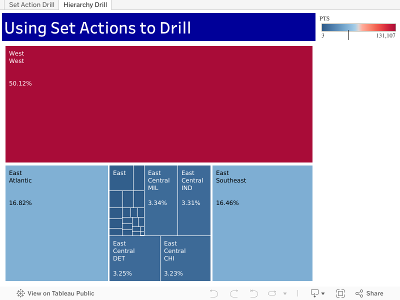
In this first video, I’ll demonstrate a use of set actions on an NBA data set. We’ll drill from Conference to Division to Team to Player. This tip will be easily applicable to your Tableau data. And with the bonus tree-map tip you’ll release your inner Piet Mondrian.

Feel free to interact with the set action example on Tableau Public and then download and dissect the workbook.


Drilling with Level of Detail (LOD) Calculations
If you want to stay with a classic approach, a nice Level of Detail (LOD) workaround can be employed to drill into the next level. Here is a tip that accomplishes a similar outcome where I demonstrate a technique originally presented by Marc Rueter at Tableau Conference 2017.

Now that I’ve equipped you with the knowledge to incorporate customized drilling functionality into your analyses, go forth and do some great things with your data!

References:

https://onlinehelp.tableau.com/current/pro/desktop/en-us/actions_sets.htm
https://www.tableau.com/learn/tutorials/on-demand/set-actions
https://www.basketball-reference.com/leagues/NBA_2018.html
https://www.youtube.com/watch?v=d22A4XVoUEs

Image Copyright dzxy on 123rf.com

T-SQL Tips and Quick Reference

Whenever I have to fire up SQL Server to perform some analyses there are a few functions, keywords and capabilities that I always find myself referring to in order to analyze my data. As is the case with most T-SQL users, even those of us that have been using T-SQL for over a decade, in our heads we always know what we want to do but will refer to our favorite syntax reference sources in order to progress. I decided to make a handy reference sheet for myself and then decided to post it here for anyone else.

How to Create a Temporary Table in T-SQL / SQL Server

Temporary (i.e., temp) tables enable the storage of result sets from SQL scripts yet require less record locking overhead and thus increase performance. They remain in effect until they are explicitly dropped, or until the connection that created them is discontinued.

As I see it, their main benefit is that they preclude me from writing difficult to comprehend nested queries since I can place a result set inside a temp table and then join it back to a normal table at-will.

In this example, the results of permanent table ‘TABLE1’ will be placed into global temporary table ##TEMPTABLE:

SELECT 
     FIELDNAME1,
     FIELDNAME2,
     FILEDNAME3 
INTO ##TEMPTABLE 
FROM TABLE1

Temp tables are stored in the tempdb system database.

TempDB

“The tempdb system database is a global resource that is available to all users connected to the instance of SQL Server or connected to SQL Database.”

Additional Reference:

What do the Hashtags Mean in T-SQL Temp Table Creation?

 The number of hash signs “#” preceding the name of the temp table affects whether the scope of the table is local or global.

  • If you precede the temp table name with “#”, then the table will be treated as a local temp table.
  • If you precede the temp table with “##”, then the table will be treated as a global temp table.

“You can create local and global temporary tables. Local temporary tables are visible only in the current session, and global temporary tables are visible to all sessions. Temporary tables cannot be partitioned. Prefix local temporary table names with single number sign (#table_name), and prefix global temporary table names with a double number sign (##table_name).”

Additional References:


How to Drop a Temp Table
in T-SQL / SQL Server

 There are times when you will need to rerun code that creates a temp table. If the temp table has already been created, you will encounter an error.

“There is already an object named ‘##TEMP_TABLE_NAME’ in the database.”

Place the following code above the creation of your temp tables to force SQL Server to drop the temp table if it already exists. Change ##TEMP_TABLE_NAME to your table name and use the correct number of hashtags as applicable to a local (#) or global (##) temp table.

IF OBJECT_ID('tempdb..##TEMP_TABLE_NAME') IS NOT NULL
DROP TABLE ##TEMP_TABLE_NAME

How to Add a New Field to a Temp Table in T-SQL / SQL Server (ALTER TABLE)

Here is example T-SQL that illustrates how to add a new field to a global temp table. The code below adds a simple bit field (holds either 1 or 0) named FIELD1 to the temp table, declares it as NOT NULL (i.e., it must have a value) and then defaults the value to 0.

ALTER TABLE ##TEMP_TABLE
ADD FIELD1 Bit NOT NULL DEFAULT (0)

The following code changes the data type of an existing field in a global temp table. FIELD1 has its data type changed to NVARCHAR(2) and is declared as NOT NULL.

ALTER TABLE ##TEMP_TABLE
ALTER COLUMN FIELD1 NVARCHAR(20) NOT NULL;

Additional References:


How to Use a CASE Statement in T-SQL / SQL Server

The following information on the CASE statement is direct from Microsoft:

The CASE expression evaluates a list of conditions and returns one of multiple possible result expressions. The CASE expression has two formats:

  • The simple CASE expression compares an expression to a set of simple expressions to determine the result.
  • The searched CASE expression evaluates a set of Boolean expressions to determine the result.

Both formats support an optional ELSE argument.

CASE can be used in any statement or clause that allows a valid expression. For example, you can use CASE in statements such as SELECT, UPDATE, DELETE and SET, and in clauses such as select_list, IN, WHERE, ORDER BY, and HAVING.

Examples from Microsoft:

SELECT
ProductNumber,
Category =
CASE ProductLine
WHEN 'R' THEN 'Road'
WHEN 'M' THEN 'Mountain'
WHEN 'T' THEN 'Touring'
WHEN 'S' THEN 'Other sale items'
ELSE 'Not for sale'
 END,
Name
FROM Production.Product
ORDER BY ProductNumber;


SELECT
ProductNumber,
Name,
"Price Range" =
CASE
WHEN ListPrice =  0 THEN 'Mfg item - not for resale'
WHEN ListPrice = 50 and ListPrice = 250 and ListPrice < 1000 THEN 'Under $1000'
ELSE 'Over $1000'
END
FROM Production.Product
ORDER BY ProductNumber ;

Here is a link to great post that highlights some of the unexpected results when using the CASE statement.


How to Use the Cast Function in T-SQL / SQL Server

When you need to convert a data field or expression to another data type then the cast function can be helpful. I typically have the need to take imported text fields and evaluate them as a datetime. The cast statement below helps me resolve this issue.

Select cast(txtOrder_Date as datetime) as Order_Date

This statement can also be used in a WHERE clause to filter the text as if it were a true datetime field/.

Where cast(txtOrder_Date as datetime)) between '20170101' and '20181231'

Furthermore, you can cast a literal string to an integer or decimal as needed.

Select cast(‘12345’ as int) as Integer_Field
Select cast(‘12345.12’’ as decimal (9,2)) as Decimal_Field

When your FIELDNAME is a text value, you can use the cast function to change its data type to an integer or decimal, and then sum the results. Here are a few examples I have had to use in the past with the sum function.

sum(cast(FIELDNAME as int)) as Sum_Overall_Qty

sum(cast(ltrim(rtrim(FIELDNAME2)) as decimal(38,2))) as Sum_Sales_Price

Additional Reference:


Using the REPLACE Function in T-SQL / SQL Server

The Replace function is useful when you need to replace all occurrences of one character or substring with another character or substring. The following select will replace the string ‘Anthony’ with ‘Tony’.

Select REPLACE(‘My name is Anthony’, ‘Anthony’, ‘Tony’);

REPLACE Function

Additional Reference:


How to Convert a Negative Text Number in Parenthesis Format to a Numeric Data Type (T-SQL / SQL Server)

I’ve found this particular expression useful when trying to convert a negative number in text format to a decimal value when the text is enclosed in parentheses; i.e., changing (123.45) to -123.45

It makes use of the REPLACE function to find the leading parenthesis and replace it with a negative sign. This first REPLACE is nested inside another REPLACE function in order to find the trailing parenthesis and replace

Select cast(replace(replace('(123.45)','(','-'),')','') as money);

REPLACE function2

You can also use the convert function to accomplish the same result. Below I used this line of code to sum the negative formatted text (represented by FIELD_NAME) by converting it to the money data type after replacing the parenthesis.

sum(convert(money,replace(replace(FIELD_NAME,'(','-'),')',''))) as Sum_Domestic_Price


COALESCE Function in T-SQL / SQL Server

The COALESCE function is very useful when replacing NULL field values with a substitute value. Per Microsoft, the COALESCE function evaluates in order a comma delimited list of expressions and returns the current value of the first expression that initially does not evaluate to NULL.

For example,

SELECT COALESCE(NULL, NULL, 'third_value', 'fourth_value');

returns the third value because the third value is the first value that is not null. I will use the COALESCE function at times to replace NULL values with 0 for use in calculations.

Select COALESCE(NULL_FIELD, 0)

https://docs.microsoft.com/en-us/sql/t-sql/language-elements/coalesce-transact-sql?view=sql-server-2017