The Power BI Decomposition Tree Guide for Data Analysis

I was recently teaching someone how to use the decomposition tree in Power BI and it clicked that this topic would make for a great video lesson. What I love about the decomposition tree is that it enables data analysts to conduct root cause analyses, identify patterns and discover insights that are not readily apparent. For example, if we want to understand the contributing factors to our small business profits based upon the data at hand, this visual fits the need to a tee.

Specifically, the decomposition tree lets you visualize data across multiple dimensions and enables drilling down into your dimensions in any order. As a bonus, it’s also an artificial intelligence (i.e., A.I.) visualization, so you can ask it to find the next dimension to drill down into based on certain criteria.

This A.I. also had the “answers”

The picture below illustrates how our Smoaking Coffee Company Profits can be subdivided by dimensions across the top of the visual. Massachusetts apparently likes their coffee (Smoaking Coffee is hypothetically better than Dunkin’).

Absolute vs Relative AI Splits

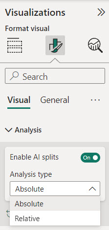
Another benefit of the decomposition tree is the ability to choose between two types of AI splits: absolute and relative. AI splits are the automatic breakdowns that Power BI suggests based on your data.

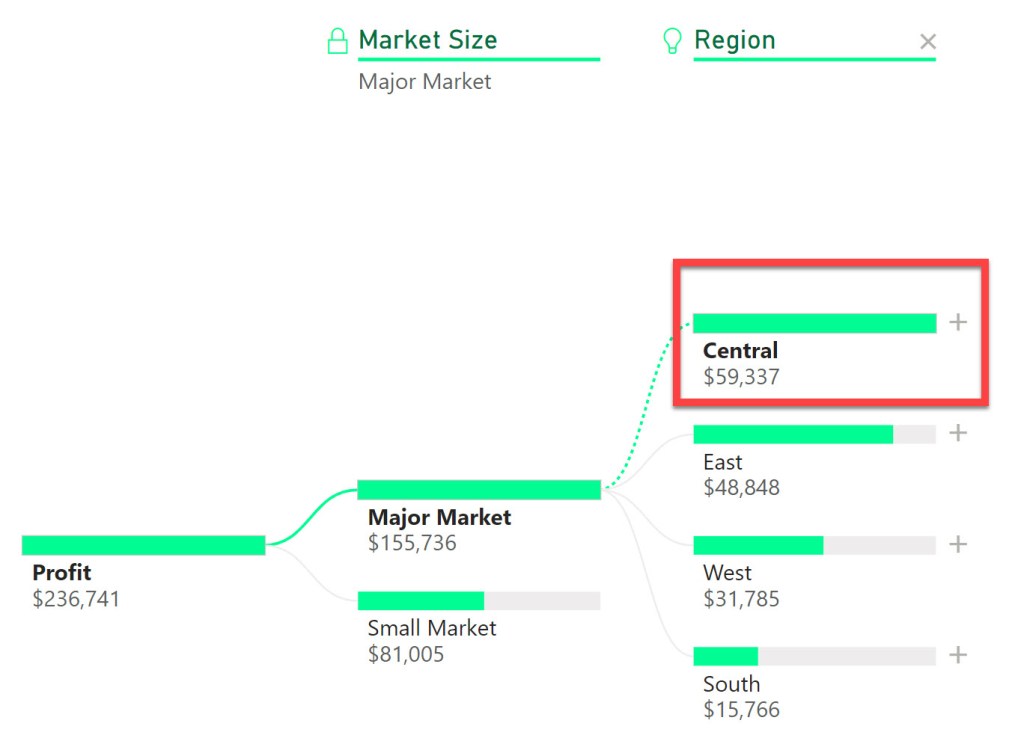
Absolute AI splits show you the highest or lowest contributors to the measure you are analyzing. In my example, if we are looking at profit by market size, the absolute AI split for high value will show us the market size that has the highest profit, in this case the Central region with $59,337 in profit.

Relative AI splits shows us the most interesting or unusual contributors to the measure we are analyzing. For example, if we switch the Analysis type to Relative from Absolute and perform the same analysis, the relative AI split will show us the product category that has the highest profit compared to its expected value based on the other categories. In this instance it is the Colombian coffee with $44,131 in profit. This number is lower than the absolute value of $59,337, but relative to it’s other product peers, it stands out.

You can switch between absolute and relative AI splits by going to the format visual pane and selecting the analysis option. You can also choose whether you want to see the high or low values by clicking on the arrow next to the plus sign on the actual decomposition tree values.

Drill Through to Details

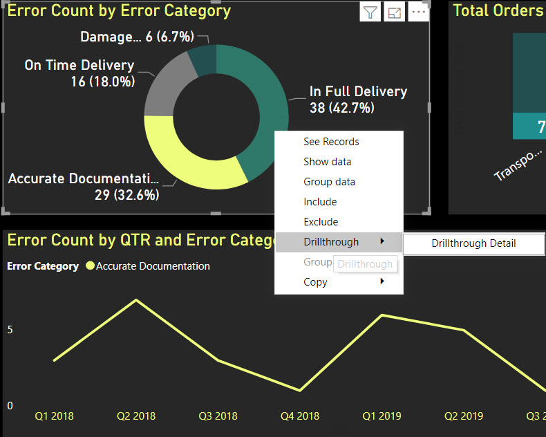
The decomposition tree is a great way to get a high-level overview of your data, but sometimes you may want to see the details behind the numbers. For example, if you are looking at profit by region, you may want to see the individual transactions that make up the profit for a specific region.

Power BI allows you to drill through to another page that shows the details of your data. To do this, you need to have a detail page that has the same measure as the one you are using in the decomposition tree. For example, if you are using profit as your measure, you need to have a detail page that has profit as well.

To drill through, you need to right-click on a node in the decomposition tree and select drill through to your detail page.

This will take you to the detail page and apply the filters based on the path you followed in the decomposition tree. For example, if you drilled through to the product value of Colombian, you will see the details of the profit transactions for products noted as Colombian.

This is a very useful feature that allows you to see the underlying data behind the summary. You can also use the back button to go back to the decomposition tree and explore other paths.

Use Bookmarks to Save and Share Your Analysis

Another cool feature of the decomposition tree is that it fully supports bookmarks. Bookmarks are a way to save and share your analysis with others. You can use bookmarks to capture the state of your report, including the filters, slicers, and visuals.

To create a bookmark, you need to go to the view tab and select bookmarks pane. Then, you need to click on the add button to create a new bookmark. You can give it a name and a description to make it easy to identify.

You can also link your bookmarks to buttons or images on your report. This way, you can create interactive scenarios that allow you to switch between different views of your data. For example, you can create a button that shows you the decomposition tree for the lowest state profit value and associated region.

To link a bookmark to a button or an image, you need to select the button or the image and go to the action option in the format shape pane. Then, you need to turn on the action and select bookmark as the type. You can then choose the bookmark that you want to link to the button or the image.

Using bookmarks, you can create dynamic and engaging reports that showcase your analysis and tell a story with your data.

Some Final Tips

Before I conclude, I want to share some final tips on how to use the decomposition tree in Power BI.

  1. You can rename your dimensions in the decomposition tree by selecting them in the Visualizations pane “Explain By” area. Simply right click on a value and select “Rename for this visual”. This can help you to customize the labels and make them more meaningful.
  2. You can lock the values in the decomposition tree by selecting the area to the left of the dimension name at the top of the decomposition tree visual (select the light bulb if the dimension was placed in the visual by AI). This will prevent the users from changing the nodes or the AI splits. This can be useful if you want to fix the analysis and avoid confusion.
  3. The maximum number of levels and data points that can be displayed in the decomposition tree are 50 levels and 5000 data points. I hope you never get to that point, however if you’re at that point, just start over; your visual is way too cluttered.

Conclusion

Watch the video to understand how you can use the decomposition tree in Power BI to analyze your data and conduct root cause analyses.

Yes I did get carried away with AI in the thumbnail picture for this video. I was always a fan of the John Stewart version of Green Lantern so I had to play around with AI to get a close approximation of me as a Lantern. May the decomposition tree work for you in brightest day and darkest night!!

I appreciate everyone who has supported this blog and my YouTube channel via merch. Please check out the logo shop here.

If you want to learn all the latest tips and tricks in core data analysis tools, stay in contact with me through my various social media presences.

And don’t forget to subscribe to my YouTube channel for more data analyst tips and tricks.

Thank you!!

Anthony B Smoak

Build a Power BI Pop Out Slicer

Save more screen for your team! The pop out slicer panel is a perfect way to conserve space while building out your dashboard (i.e., reports) in Power BI desktop. It really is a slick feature that allows you to conserve limited reporting space by hiding your slicers until the user presses a button to reveal your data filtering options.

In this video you can watch me build out the slicer panel step by step using bookmarks, selection panel and buttons.

Power BI Pop Out Slicer (Short GIF)

  • Bookmarks are a configured view of a report page, including filters, slicers, and the state of visuals.
  • The selection panel allows you to show and hide current objects on the current report page.
  • Buttons enable users to hover, click, and further interact with Power BI content

The data sample used for this tutorial is here: https://docs.microsoft.com/en-us/power-bi/sample-financial-download

As always, do great things with your data.

Anthony B. Smoak, CBIP

If you find this type of instruction valuable make sure to subscribe to my Youtube channel.

Check out other Power BI videos of interest definitely worth your time:

All views and opinions are solely my own and do not necessarily reflect those of my employer.

How to Drill Through in Power BI

One of the great options available in Power BI is the capability to “drill through” to another report page. In this manner you can focus on a particular entity such as a customer, internal division, supplier or any other dimension of importance.

Different users have different data needs. When designing a dashboard typically the Key Performance Indicators (KPIs) are aggregated at a high level on the initial visualization. This offers executives and management types a “bird’s eye view” of performance.

Personally, I am a fan of BANs (look up the term in a dashboard design context if you are not familiar) when I want to highlight key takeaways.

BANs

Subsequent lower level dashboard pages can offer analysts and others the ability to either explore data with additional interactivity or simply display a static detailed report. The point is to start at a high level and allow your user to drill to a more granular level of data.

In this video I demonstrate the use of the drill through functionality in Power BI. In this scenario, you are the Chief Supply Chain officer trying to gauge your Perfect Order Percentage KPI for several internal divisions. When it’s time to sit down with your four division mangers to discuss their performance on this metric, you want the ability to start at a high level and then drill through to a static report based upon their respective internal divisions or on a specific shipping error.

DrillThrough

Drill through on “In Full Delivery” error category

Do not try and cram every visualization, chart, table or gauge under the sun into a dashboard! Take advantage of drill through functionality and tailor your data presentation for specific user groups. This general concept applies to any data visualization tool, but if you’re using Power BI then this video will help you understand the specific steps required to enable drill through functionality.

I’m frequently questioned where I obtain mock data for my scenarios. My secret source is mockaroo.com which is a great starting point for developing test data.

As always, do great things with your data.

Anthony B. Smoak, CBIP

If you find this type of instruction valuable make sure to subscribe to my Youtube channel.

Check out other Power BI videos of interest definitely worth your time:

All views and opinions are solely my own and do NOT necessarily reflect those of my employer.

Sum Top and Bottom 10 Products by Sales in Power BI

In this video we will cover how to calculate the aggregate sum of only the Top and Bottom 10 Product Sales using DAX in Power BI. There are always multiple ways to accomplish a task with Power BI and DAX but I will share the technique I used to visualize the Bottom 10 Sales Products when there is a rare single tie among the products. The solution may be a bit over-engineered to my data-set but the aim is to share an approach you can use to tackle similar data issues in your dashboards. It’s well worth the watch!

I won’t give way the whole video but I’ll share the DAX formula to sum the Top 10 products by Sales Price from my table named ‘Company Sales Data’.

1_SumSalesTop10Products = 
CALCULATE(
          SUM('Company Sales Data'[Sales Price]),
          TOPN(
               10,GROUPBY('Company Sales Data','Company Sales Data'[Product]),
               CALCULATE(sum('Company Sales Data'[Sales Price]))
              )
         )

I have created a variable named 1_SumSalesTop10Products that uses the CALCULATE function to

  • SUM the [Sales Price] variable from the [Company Sales Data] table (see the first argument to the CALCULATE function);
  • But it only sums the [Sales Price] for the TOP 10 highest selling products, because we use the TOP N function to create a temporary table that only returns the products with the 10 highest aggregated Sales Prices;
    • The GROUP BY function is used to aggregate the table rows by product and then the CALCULATE argument sums the Sales Price for the aggregated products;

Don’t let this scare you off, watch the video to get a better understanding, and to learn how I sum the Bottom 10 products by Sales Price.

As always, get out there and do some great things with your data!

Top and Bottom 10 Products by Sales Using RANKX in Power BI

In this video we’ll venture outside of the default Power BI TOPN functionality used to isolate the top and bottom N values in a visual. Because you’re an astute follower of my blog and YouTube channel, you want to know more than default functionality. The key to pulling off this feat lies with the RANKX function. By using RANKX to provide a ranking to each row in our data set, we can then determine the TOP and BOTTOM 10 values.

Of course watch the video for further breakdown, but the key to using RANKX effectively in Power BI is to use the ALL function as a parameter. In this way the contents of the entire table are considered for appropriate ranking.

The DESC or ASC parameters will enable the calculation of a rank in either descending or ascending sort order.

And finally the DENSE parameter tells RANKX how ties should be handled in the data. For example if you provide DENSE as a parameter, if 10 values are tied with a rank of 1 then the next value will receive a rank of 2.

Power BI Top 10 and Bottom 10 Thumbnail

Here is an example use of RANKX that will return a ranking of Sales Price by Product, that ranks the results in descending order (highest Sales receive the lowest ranks) and ties are in contiguous order. Watch the video to determine how to calculate the BOTTOM 10 ranking and to use RANKX to enable the top or bottom 10 values in a visualization.

As a refresher, check out this popular video to build the calendar table referenced in this video: Power BI Dashboard Tutorial: Year over Year Difference Analysis

If you find this type of instruction valuable make sure to subscribe to my Youtube channel.

All views and opinions are solely my own and do NOT necessarily reflect those of my employer.

INCREASE YOUR FOCUS TRY BRAIN.FM

When I am focusing hard during the day at work or developing visualizations on the weekend. I use Brain.fm to help me focus when it matters. It’s Science-driven and research-backed functional music designed from the ground up to help you you focus, relax, meditate and sleep. If you’d like to try a free trial check out https://brain.fm/anthonyb

Please use coupon code anthonyb for a 20% discount upon checkout. It helps support this blog and my YouTube channel as I receive a small commission for purchases made through links in this post.

Do Great Things with Your Data!

Create a Customizable Heat Map in Power BI

In this video we’ll learn how to create a customizable heat map in Power BI without using the prepackaged downloadable visual. A heat map (or heatmap) is a graphical representation of data where the individual values contained in a matrix are represented as colors. A heat map helps draw your eye to the most and least popular areas within the matrix. The cells contained within the table either contain color-coded categorical data or numerical data, that is based on a color scale.

Matrix

Wrong Matrix

I have some fun in the video with a dashboard that I constructed using a publicly available data set from Microsoft, but in the lesson we’ll create the following:

Heatmap

Make sure to watch the video, download the data set and follow along with the instructions.

If you find this type of instruction valuable make sure to subscribe to my YouTube channel.

All views and opinions are solely my own and do NOT necessarily reflect those of my employer.

Filter Top N Values with a Slicer in Power BI

In this video you will learn how to filter the top N values shown in your bar chart visualization using a slicer.

  1. This technique uses one measure that generates a number 1-10, that will be applied to a slicer.
  2. Another measure will basically rank all of the values associated with your data bars and only return the values that are less than or equal to the number you select in the slicer.

The comments that I apply to the DAX function should help make it easy to understand. I have to give a shoutout to GilbertQ from the PowerBI community for coming up with the  initial approach which I tweaked for the video.

As always, If you find this type of instruction valuable make sure to subscribe to my Youtube channel!

How to Generate a Forecast in Power BI

In this video I’ll demonstrate how to use the forecasting analytics option in Power BI. Although Power BI’s forecast algorithm is a black box, it’s more than likely using exponential smoothing to generate results. At a very high level, exponential smoothing is an algorithm that looks for patterns in data and extrapolates that pattern into the future. To help exponential smoothing perform at an optimal level, it is very important to pick an accurate seasonality estimation, as this will have an outsized effect on the time series forecast.

If your data points are at the daily grain, then you’d use 365 as your seasonality value. If your data points are at a monthly grain, then you’d use 12 as your seasonality value. Generally, the more seasonality cycles (e.g., years) that you provide Power BI, the more predictive your forecast will be.

Without giving away the whole video, here is a pro and a con of using forecasting in Power BI.

Con: As I stated earlier the exact algorithm is a black box. Although based upon a Power View blog post, we can reasonably assume exponential smoothing is involved. Furthermore, the results cannot be exported into a spreadsheet and analyzed.

Pro: The ability to “hindcast” allows you to observe if the forecasted values match your actual values. This ability allows you to judge whether the forecast is performing well.

Check out the video; I predict you’ll learn something new.

As always, If you find this type of instruction valuable make sure to subscribe to my Youtube channel.

Use the Power BI Switch Function to Group By Date Ranges

In this latest video, I’ll explain how to use a handy DAX function in Power BI in order to group dates together for reporting. We’ll examine a dashboard that contains fields corresponding to purchase item, purchase date and purchase cost. We’ll then create a calculated column and use the SWITCH function in Power BI to perform our date grouping on the purchase date.

Watch the video to learn how to group dates into the following aging buckets, which can be customized to fit your specific need.

  • 0-15 Days
  • 16-30 Days
  • 31-59 Days
  • 60+ Days

If you are familiar with SQL, then you’ll recognize that the SWITCH function is very similar to the CASE statement; which is SQL’s way of handling IF/THEN logic.

Even though we’re creating a calculated column within Power BI itself, best practice is to push calculated fields to the source when possible. The closer calculated fields are to the underlying source data, the better the performance of the dashboard.

Calculate Bar Chart Percent of Total in Power BI

The humble bar chart is the heart and soul of any visualization tool and is the most effective way to compare individual categorical values. We as humans are very adept at detecting small differences in length from a common baseline [1].

To quote the Harvard Business Review [2], “The ability to create smart data visualizations was once a nice-to-have skill. But in today’s complex business world, where the amount of data is overwhelming, being able to create and communicate through compelling data visualizations is a must-have skill for managers.”

If you’re going to start learning a new visualization tool, there is no better place to start than with bar chart basics. In this video I will share how to place a “percent of total” measure (i.e. value) on a Power BI bar chart. We’ll also briefly touch upon customizing the chart’s diverging color scheme.

Since Microsoft is basically giving away Power BI Desktop for free, it may become as ubiquitous as Excel. Don’t be left out!

As always, If you find this type of instruction valuable make sure to subscribe to my Youtube channel.

References:

[1] Cotgreave, A., Shaffer, J., Wexler, S. (2017). The Big Book of Dashboards: Visualizing Your Data Using Real-World Business Scenarios. Hoboken, NJ: John Wiley & Sons, Inc.

[2] https://hbr.org/webinar/2018/02/the-right-stuff-chart-types-and-visualization-best-and-worst-practices

Make sure to watch the video for clarity but the generic version of the formula is as follows:

Vehicle Pct Total Sales = DIVIDE(sum([Measure]),CALCULATE(sum[Measure]),ALLSELECTED((‘Your Dataset’))))

All views and opinions are solely my own and do NOT necessarily reflect those my employer.