Connecting Tableau with R: Combining Beauty and Power

The following is a guest post from Sinna Muthiah Meiyappan.

Tableau, as we all know, is the go-to tool for visualization. R is an open-source statistical language used by academicians, statisticians, data analysts and data scientists to develop machine learning models. R’s popularity is owed to the power of its packages.

Why Connect Tableau with R?

An analytics tool can generate enormous value if it has the following aspects:

1) a user-friendly interface for a business user
2) the scope and power to run different analyses and deliver the results to the interface in an easily interpretable way for the business user to understand and make decisions

Tableau can be used to develop beautiful dashboards which can serve as a very good user interface. R can be used to develop and run complex machine learning models whose results can be displayed in Tableau dashboards in an easily interpretable way.

In short, by linking Tableau and R, you are giving business users the opportunity to create enormous value by running and analyzing the results of complex machine learning models without having knowledge or experience in R!

How to Connect Tableau with R

1) Install Rserve package and run Rserve command by typing the following lines in your R console:

install.packages("Rserve")
Rserve()

Now, R should print ‘Starting Rserve…’. If you observe this output, then R is reaching out to Tableau for a connection.

2) Open Tableau & click on Help > Settings & Performance > Manage External Service Connections.
3) In the dialog box that opens, choose ‘localhost’ for Server and type ‘6311’ for Port.
4) Then, click on Test Connection

Now, you should get a dialog box stating, ‘Successfully connected to the R serve service’. If you observe this message, then you are all set to use the power of R from within Tableau.

Objective of this article

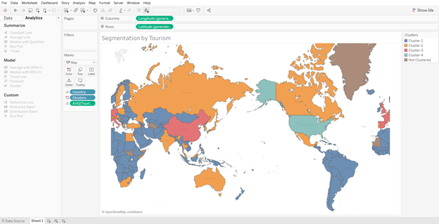
All companies maintain a database containing details about their customers. Customer Segmentation using clustering algorithms is a proven technique used by companies to understand its customers. This helps you offer targeted deals that convert better! The objective of this article is to create a dashboard where an executive from a wholesale business can segment customers using R within Tableau, without having to know R Programming, just by clicking in the dashboard. Then, visualize the different customer segments to find patterns that can be used to make business decisions like providing incentives, discounts, etc.

Dataset Used

The dataset referenced in this post can be downloaded in CSV format from UCI Machine Learning repository by clicking on ‘Data Folder’ link at the top left of the page. In this dataset, each row contains details about a customer of the Wholesaler regarding his channel, region and the dollar amount spent by him on different product categories like Fresh, Frozen, Grocery, Milk, Detergent Paper & Delicatessen. This dataset can be mined to understand the buying patterns/characteristics of customers based on their spending.

Designing a Customer Segmentation dashboard in Tableau

Loading data into Tableau

Open the CSV file, add a column named ‘Customer ID’ and fill it from 1 to 440.
Connect to the CSV file using the ‘Text File’ option in Tableau and you should see the below screen in your Tableau worksheet.

Picture1

Creating Parameters

Let’s cluster users based on their spending in different categories using k-means clustering algorithm. K-Means is an unsupervised learning algorithm that identifies clusters in data based on similarity of features used to form the clusters. In our case, these features would be the customers spending in different categories.

K-means algorithm requires the following two inputs for it to form clusters: (1) the number of clusters to be formed & (2) How many times to run the algorithm before picking the best clusters. Basically, the K-Means algorithm takes as many random center points as specified by the user in input 1 and starts assigning the data points to these center points based on the criteria defined to calculate distance. Once all points are assigned, it measures the Sum of Squared Errors (SSE). This process is repeated as many times as specified in input 2. Then, the model with the least SSE is picked and shown as the result.

Let’s give the option of specifying the number of clusters formed to the user who is going to use the dashboard by creating a Tableau parameter. To do that, right click on the Measures pane and click on ‘Create Parameter’. Fill the Create Parameter dialog box with details as shown below and click OK.

Picture2

Right click on the newly created ‘Centers’ parameter and select ‘Show Parameter Control’ and set Centers value to 5.
For our results to be reproducible, we need to ‘set seed’ in R. The seed defines the random numbers generated that are used in the algorithms. So, whenever we set the same seed and run a model, we would get the same results. Let us give this option of defining the seed also to our user by creating a parameter as follows:

Picture3

Right click on the newly created ‘Seed’ parameter and select ‘Show Parameter Control’ and set seed value to 500. Now, your screen should look like this:

Picture4

SCRIPT Functions to Receive Data From R

Now, to segment customers into different clusters, we are going to pass data to R, cluster it and get the results back in a Calculated Field that can be used in Tableau Visualizations. Tableau has four scripting functions which are related to the type of data they would receive from the external service Tableau is connected to. They are SCRIPT_REAL, SCRIPT_INT, SCRIPT_BOOL & SCRIPT_STR.

The syntax of a Script function is as follows:
SCRIPT_XXX (‘code to be executed as a string’, argument 1, argument2, etc.)

The arguments are referred as ‘.arg1’, ‘.arg2’, etc. respectively inside the code. All the arguments whether quantitative or categorical should be passed as aggregated versions to R since this is a table calculation. Since all our variables are quantitative, we aggregate them using the SUM function. The last line of the code in string would be returned as an output of the function by R to this calculated field.

So, let’s create a Calculated Field named ‘Cluster_kmeans’ with the following code in it and click OK:
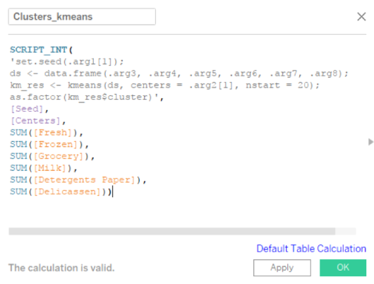
Picture5

Code Recap:

1) Line 1: Sets seed, so that the results can be regenerated again if needed. As already said, K-means choses the center points at random and starts assigning data points to these cluster centers. The clustering results will change if these center points change. So, seed is used to define the random numbers generated so that if you set the same seed and run, the same center points will be taken up for clustering.

2) Line 2: Combines all features (i.e. the customer spends in each category) that must be used for clustering into a data frame.

3) Line 3: Runs the k Means model 20 times, in the above generated data frame, with as many cluster centers as specified by the user in the dashboard.

4) Line 4: The best model out of the above 20 is picked and its results are returned to the Cluster_kmeans calculated field in Tableau, which can be used in visualizations.

We pass 8 arguments to the Script function. First is Seed, second is Centers (as in the number of clusters that we want k-means algorithm to form for this data) and the remaining 6 are the spend in each category. The six spend arguments are vectors of 440 dollar amounts each (as there are 40 customers in our dataset).

What is interesting is, the Seed and Centers parameters are also passed as vectors of length 440, but of the same value. i.e. Seed has ‘500’ repeated 440 times. In R, we pass a single number as seed, not a vector of length more than 1. So, we extract the first element of the vector alone and pass it to ‘set.seed’ function as follows:

Set.seed(.arg1[1])

Similarly, to the centers argument of k-means algorithm also we pass only a single value. If given a single value, the algorithm generates that many number of random centers and starts assigning points to clusters. If you give a vector to this argument, then it takes the values in the vector as the spatial location of center points and starts assigning points to clusters. Now, if you pass a vector of length 440 where all values in the vector being the same, then you would get an error as follows:

Error in kmeans(ds, centers = .arg2, nstart = 20) : initial centers are not distinct

To avoid this, we extract the first element of the vector alone and pass it to ‘kmeans’ function as follows:

km_res <- kmeans(ds, centers = .arg2[1], nstart = 20)

Visualizing the clusters created by R

Now that the calculated field for clusters is created, we can start creating the visualization shown in the figure below. Before that, go to Analysis > Aggregate Measures and turn it off. Because, if you don’t, Tableau will aggregate all the spend for all customers and send a single row of input to R, resulting in the following error. This error says there are more than one center points to start with and only one data point that can be assigned. Hence, the clustering cannot be completed.

Error in kmeans(ds, centers = .arg2[1], nstart = 20) : more cluster centers than distinct data points

Picture6

This sheet describes the spend of each cluster in Fresh and Frozen categories. To create the above visualization in Tableau, do the following:

1) Drag and drop ‘Cluster_kmeans’ into ‘Columns’ shelf and into Color
2) Drag and drop ‘Fresh’ and ‘Frozen’ into ‘Rows’ shelf
3) Set the chart type to ‘Gantt Bar’
4) From ‘Analytics’ tab at the top left, drag and drop ‘Box Plot’ into ‘Cells’ of the chart
5) From ‘Analytics’ tab at the top left, drag and drop ‘Average Line’ into ‘Panes’ of the chart
6) Adjust Opacity in the color palette by setting it to 50%
7) Fix the Y-axis of the graphs to read from 0 to 115,000 so that it would be easier to compare across all the six charts we are going to develop for the dashboard. ( I chose 115,000 as the upper limit, because the max spend by a single customer in a single category is of the order of 112k)
8) You can adjust the tooltip to reflect the information that you deem necessary/relevant at this point.

Now, similarly create two other worksheets which would look as follows:

Picture7

This sheet describes the spend of each cluster in Milk and Groceries categories.

Picture8

This sheet describes the spend of each cluster in Delicatessen and Detergent Paper categories.

Creating Customer Segmentation Dashboard

Create a new dashboard and drag all three worksheets you created into the dashboard. Arrange the parameter controls and chart legends appropriately. Use blank containers to fill space if needed. Now your dashboard may look like this.

Picture9

So now, we have put together a dashboard where a business user (in this case, the Wholesaler) can choose how many clusters he wants to form from his customer data and understand about the different clusters formed. The cluster results generated are always reproducible if the user inputs the same seed again (in this case 500).

Recalculating Clusters at the Snap of Your Fingers!

To change the number of clusters from 5 to any other value, all the user must do is to change the number in the Centers parameter list box. Tableau will pass the updated parameter to R, clusters will be re-calculated through Table calculation in R, and the dashboard will be updated to reflect the new cluster details! The below image shows the dashboard when the Centers is changed from 5 to 3.

Picture10

Features of this Customer Segmentation Dashboard

Since, we fixed all Y axes to the same range, these charts are comparable across too.
The Gantt bar chart shows each customer as a bar in the chart. This will also help us identify if the clusters formed have too few customers in them (they will have very few bars) so that, we can be taking decisions keeping that in mind.
Hovering over the box plots in each pane will give details about the quantiles of spending by the respective cluster in that respective category.

Clicking on a specific cluster in the chart legend at the right top will highlight only that cluster in the dashboard by dimming others and all the average lines in each category pane will be recalculated to show the average spend of this specific cluster in that category.

Interpreting Results and Taking Actions to Generate Business Value

We, at Perceptive Analytics, feel that the main aim of any business intelligence dashboard is to deliver insight and inspire action of the business users. Because, business value will not be created until any one of them acts on the insights! It is our (dashboard designer’s) job to make sure that the dashboard is designed in a way such that the business users does not have to spend more time searching for insights or trying to understand the dashboard.

They should spend very less time in organizing data & more time in interpreting information / insights and creating / strategizing action plans.
Let’s now see what insights we can generate out of this dashboard with three clusters, shown above:

  • The highest spend in registered by a customer in Fresh category (at the left top of the dashboard).
  • Categories Fresh, Grocery, Milk and Detergents Paper have registered a decent number of spends above 20k dollars. So, these are the categories where the Wholesaler gets more money from his customers.
  • Looking at the spending pattern of the three clusters formed in the above graph, I can gather the following:
    • Cluster1 (Blue) seems to spend in all categories indifferently (In all categories, their spend is spread above and below the respective category average spend)
    • Cluster2 (Orange) spends way above category averages in grocery, milk and detergents paper categories
    • Cluster3 (Green) spends extra ordinarily in Fresh category and like Cluster1 in all other categories.

Within the same cluster, some customers purchase many items, others less. Recommendations can be provided to those who purchase less based on the missing items, compared to the customer who purchased more in the same category. Category related offer mails and discount mails can be targeted to those group of customers who actively purchase in that respective category.

Now, the wholesaler can create test and control groups within clusters and start sending targeted marketing campaigns to the customers in relevant segments. The test and control split would be useful to know if the campaigns are working or not. By continuously repeating this experiment of targeted marketing campaigns and analyzing the results after, the wholesaler can fine-tune himself to look for patterns in his customer data and know what kind of a marketing campaign will motivate them to purchase more.

Conclusion

In this article, we created a dashboard that enables a business user to segment customers and visualize the spending patterns of different clusters to understand customers better. We leveraged the power of R to segment the customers from within Tableau itself. This knowledge can be used to make business decisions like offering trade discounts or targeted promotional offers.

Author Bio

This article was contributed by Sinna Muthiah Meiyappan.

Image courtesy of ARPORN SEEMAROJ / 123rf.com

Advertisement

The Dos and Don’ts of Designing Efficient Tableau Dashboards

This following is a guest post contributed by Prudhvi Sai Ram, Saneesh Veetil and Chaitanya Sagar.

A dashboard is to a user what an assistant is to a boss. While an assistant helps manage multiple tasks for a boss, a dashboard helps manage multiple data sources for a user. Insights are only as good as the underlying data and dashboards are an excellent medium to provide those insights.

Dashboards provide “at-a-glance” views of key metrics which are relevant for business users to perform their tasks effectively. In other words, dashboards are an interactive form of reporting which provides users with consolidated views of different metrics to make impactful, data-driven decisions. A dashboard should speak on the creator’s behalf, acting as an expert providing actionable insights to its users. The dashboard should be self-sufficient when it comes to answering the question, “what can my data tell me?”

There are a plethora of tools available in the market for creating dashboards. However, a badly designed dashboard or incompatible (or wrong) tool can lead to hundreds of thousands of dollars in investment losses when accounting for inefficient time and effort spent by development and analysis teams. It becomes imperative for an organization to choose the right tool and have a step by step approach for dashboard development.

Currently, one of the top business intelligence tools available in the market is Tableau. It is used to create interactive dashboards for users. Tableau has been named a ‘Leader’ in the Gartner Magic Quadrant for six straight years in a row (Source – Tableau.com).

In this post, we will highlight a few best practices that you should follow when developing your Tableau dashboard. We will also talk about some of the pitfalls you should avoid while creating a Tableau dashboard.

We’ll divide the best practices into three different stages of dashboard development.

  1. Pre-Development: Ideation and Conceptualization
  2. Development
  3. Post Development: Maintenance

Ideation and Conceptualization

During the conceptualization and ideation stage, there are a few aspects that one should consider before starting to develop a dashboard.

1. Goal

Understand clearly why you are creating the dashboard in the first place. What is the end objective that you want to achieve via this dashboard? Is it automating a reporting process at month-end? Is it providing a better visualization to a complex calculation created in another platform?

Having a clear understanding of your dashboarding goal or objective keeps you focused and on the right track.

2. Audience

Keep in mind that your audience is a key part of creating a purposeful, impactful dashboard. The dashboard used by the CEO or other members of the C-suite will be very different from the dashboard used by business unit heads, which in turn will be very different from the dashboards used by branch managers. Thus, you need to consider who will use your dashboard and how will it be used?

For instance, a CEO is interested in key metrics at an overall organizational level like the overall financial and operational heath of the company. On the other hand, a procurement manager would be interested in the amount of material being procured from different vendors and their respective procurement costs. Having a GOAL in mind before development is essential because it helps identify the end user of the dashboard.

3. Key Performance Indicators (KPIs)

After thoroughly understanding the various stakeholder requirements, it is important to develop a list of KPIs for each user and/or department. Having the stakeholders sign-off on dashboard KPIs substantially reduces development and re-work time.

4. Data Sources

After achieving sign-off on KPIs, inventory the various data sources that are required for development. This step is important because each data source can potentially increase complexity and computing costs required to calculate the KPIs. It’s always better to only connect those data sources which contain relevant data.

5. Infrastructure

Storage and computation requirements should be taken into consideration commensurate with the dashboard’s degree of data volume and complexity. Having a right-sized backend infrastructure will improve dashboard performance considerably. Also, it is essential to understand the dashboard’s update frequency. Will the data be refreshed once a day? Is it going to be real-time? Having the answer to these questions will help generate infrastructure requirements that will prevent performance issues down the road.

Development

Once you have identified what needs to be presented on the dashboard and set up the infrastructure, it’s time to move to the second phase of dashboard development.

The following items should be considered during the development phase.

6. Design

Design is an important part of overall dashboard development. You should be very selective with the colors, fonts and font sizes that you employ. There is no rule book that establishes the right color or the right font for dashboard design; in our opinion, one should design with the company’s coloring scheme in mind.

This is a safe bet as it keeps the company’s brand identity intact, especially if the dashboard is accessible to external parties. Fonts should not be very light in color and the charts should not be very bright. Having a subtle color scheme that incorporates the brand’s identity resonates well with internal and external parties.

7. Visualization Impact

Identify the right type of visualization to create an impactful first glance for the users. Certain types of data points are better represented by certain types of visualizations. For instance, time trend analysis is usually represented on a line graph. A comparison of the same metric across different business lines are presented well via a heat map. Consider a sales dashboard where revenue and cost numbers for the current year should be presented as standalone numbers with a larger font size, while the historical trend analysis should be placed below.

8. Captions and Comments

Tableau provides users’ with the functionality to add captions and comments to visualizations. Bear in mind that you won’t be around all the time to explain what the different charts in the dashboard represent. Therefore, add relevant descriptions, comments and/or captions wherever it can be useful for the viewer.

Post Development: Maintenance

Once you have created the dashboard, there are additional aspects you should consider for effective and smooth dashboard operation.

9. Robust Testing

After creating the dashboard, conduct robust testing of the entire platform. Testing helps identify any bugs and deployment errors which if not rectified can lead to system failure or erratic results at a later stage.

10. Maintenance

This is the most ignored phase in the dashboard development lifecycle but it is a crucial phase. Once you have created a dashboard, proper maintenance should be conducted in terms of software updates, connections to databases and infrastructure requirements. If the volume of data increases at a fast pace, you will need to upgrade the storage and computing infrastructure accordingly so that the system doesn’t crash or become prohibitively slow.

Avoid the Following

Up to this point we have highlighted some of the best practices to consider while creating a dashboard. Now, let’s broach the aspects you should avoid while creating a dashboard.

1. Starting with a Complex Dashboard

Remember that creating a dashboard is a phased approach. Trying to develop an overly complicated dashboard in one phase may complicate things and led to project failure. The ideal approach is to inventory and prioritize all requirements and proceed with a phased approach. Start development with the highest priority requirements or KPIs and gradually move to the lower priority KPIs in subsequent phases.

2. Placing Too Many KPIs on a Single Chart

Although Tableau has the capability to handle multiple measures and dimensions in a single chart, you should be judicious while choosing the dimensions and measures you want to present in a single graph. For instance, placing revenue, expenses and profit margins in a single chart may be of value; while placing revenue and vendor details in the same chart may not be as valuable.

3. Allocating Too Little Time to Deployment and Maintenance

The appropriate amount of time, budget and resources should be allocated to each constituent phase of the deployment cycle (i.e., KPI identification, dashboard development, testing and maintenance).

We are sure that after reading this post, you have a better idea regarding what practices should be considered while developing a Tableau dashboard. The principles offered here are from a high level perspective. There may be other project nuances to consider in your specific endeavors. We would be happy to hear your thoughts and the best practices that you follow while creating a Tableau dashboard.

Author Bio

Prudhvi Sai Ram, Saneesh Veetil and Chaitanya Sagar contributed to this article.

Tableau Sales Dashboard Performance

The following is a guest post. Find more information on dashboards here.

Business heads often use KPI tracking dashboards that provide a quick overview of their company’s performance and well-being. A KPI tracking dashboard collects, groups, organizes and visualizes the company’s important metrics either in a horizontal or vertical manner. The dashboard provides a quick overview of business performance and expected growth.

An effective and visually engaging way of presenting the main figures in a dashboard is to build a KPI belt by combining text, visual cues and icons. By using KPI dashboards, organizations can access their success indicators in real time and make better informed decisions that support long-term goals.

What is a KPI?

KPIs (i.e. Key Performance Indicators) are also known as performance metrics, performance ratios or business indicators. A Key Performance Indicator is a measurable value that demonstrates how effectively a company is achieving key business objectives.

A sales tracking dashboard provides a complete visual overview of the company’s sales performance by year, quarter or month. Additional information such as the number of new leads and the value of deals can also be incorporated.

Example of KPIs on a Sales Dashboard:

  • Number of New Customers and Leads
  • Churn Rate (i.e. how many people stop using the product or service)
  • Revenue Growth Rate
  • Comparison to Previous Periods
  • Most Recent Transactions
  • QTD (quarter to date) Sales
  • Profit Rate
  • State Wise Performance
  • Average Revenue for Each Customer

Bringing It All Together with Dashboards and Stories

An essential element of Tableau’s value is delivered via dashboards. Well-designed dashboards are visually engaging and draw in the user to play with the information. Dashboards can facilitate details-on-demand that enable the information consumer to understand what, who, when, where, how and perhaps even why something has changed.

Best Practices to Create a Simple and Effective Dashboard to Observe Sales Performance KPIs

A well-framed KPI dashboard instantly highlights problem areas. The greatest value of a modern business dashboard lies in its ability to provide real-time information about a company’s sales performance. As a result, business leaders, as well as project teams, are able to make informed and goal-oriented decisions, acting on actual data instead of gut feelings. The choice of chart types on a dashboard should highlight KPIs effectively.

Bad Practices Examples in a Sales Dashboard:

  • A sales report displaying 12 months of history for twenty products; 12 × 20 = 240 data points.
    • Multiple data points do not enable the information consumer to effectively discern trends and outliers as easily as a time-series chart comprised of the same information
  • The quality of the data won’t matter if the dashboard takes five minutes to load
  • The dashboard fails to convey important information quickly
  • The pie chart has too many slices, and performing precise comparisons of each product sub-category is difficult
  • The cross-tab at the bottom requires that the user scroll to see all the data

Now, we will focus on the best practices to create an effective dashboard to convey the most important sales information. Tableau is designed to supply the appropriate graphics and chart types by default via the “Show me” option.

I. Choose the Right Chart Types

With respect to sales performance, we can use the following charts to show the avg. sales, profits, losses and other measures.

  • Bar charts to compare numerical data across categories to show sales quantity, sales expense, sales revenue, top products and sales channel etc. This chart represents sales by region.

1

  • Line charts to illustrate sales or revenue trends in data over a period of time:

2

  • A Highlight table allows us to apply conditional formatting (a color scheme in either a continuous or stepped array of colors from highest to lowest) to a view.

3

  • Use Scatter plots or scatter graphs to investigate the relationship between different variables or to observe outliers in data. Example: sales vs profit:

4

  • Use Histograms to see the data distribution across groups or to display the shape of the sales distribution:

5

Advanced Chart Types:

  • Use Bullet graphs to track progress against a goal, a historical sales performance or other pre-assigned thresholds:

6

  • The Dual-line chart (or dual-axis chart), is an extension of the line chart and allows for more than one measure to be represented with two different axis ranges. Example: revenue vs. expense
  • The Pareto chart is the most important chart in a sales analysis. The Pareto principle is also known as 80-20 rule; i.e roughly 80% of the effects come from 20% of the causes.

7

When performing a sales analysis, this rule is used for detecting the 80% of total sales derived from 20% of the products.

  • Use Box plots to display the distribution of data through their quartiles and to observe the major data outliers

8

Tableau Sales Dashboard

Here is a Tableau dashboard comprised of the aforementioned charts. This interactive dashboard enables the consumer to understand sales information by trend, region, profit and top products.

9

II. Use Actions to filter instead of Quick Filters

Using actions in place of Quick Filters provides a number of benefits. First, the dashboard will load more quickly. Using too many Quick Filters or trying to filter a very large dimension set can slow the load time because Tableau must scan the data to build the filters. The more quick filters enabled on the dashboard, the longer it will take the dashboard to load.

III. Build Cascading Dashboard Designs to Improve Load Speed

By creating a series of four-panel, four cascading dashboards the load speed was improved dramatically and the understandability of the information presented was greatly enhanced. The top-level dashboard provided a summary view, but included filter actions in each of the visualizations that allowed the executive to see data for different regions, products, and sales teams.

IV. Remove All Non-Data-Ink

Remove any text, lines, or shading that doesn’t provide actionable information. Remove redundant facts. Eliminate anything that doesn’t help the audience understand the story contained in the data.

V. Create More Descriptive Titles for Each Data Pane

Adding more descriptive data object titles will make it easier for the audience to interpret the dashboard. For example:

  • Bullet Graph—Sales vs. Budget by Product
  • Sparkline—Sales Trend
  • Cross-tab—Summary by Product Type
  • Scatter Plot—Sales vs. Marketing Expense

VI. Ensure That Each Worksheet Object Fits Its Entire View

When possible, change the graphs fit from “Normal” to “Entire View” so that all data can be displayed at once.

VII. Adding Dynamic Title Content

There is an option to use dynamic content and titles within Tableau. Titles can be customized in a dynamic way so that when a filter option is selected, the title and content will change to reflect the selected value. A dynamic title expresses the current content. For example: if the dashboard title is “Sales 2013” and the user has selected year 2014 from the filter, the title will update to “Sales 2014”.

VIII. Trend Lines and Reference Lines

Visualizing granular data sometimes results in random-looking plots. Trend lines help users interpret data by fitting a straight or curved line that best represents the pattern contained within detailed data plots. Reference lines help to compare the actual plot against targets or to create statistical analyses of the deviation contained in the plot; or the range of values based on fixed or calculated numbers.

IX. Using Maps to Improve Insight

Seeing the data displayed on a map can provide new insights. If an internet connection is not available, Tableau allows a change to locally-rendered offline maps. If the data includes geographic information, we can very easily create a map visualization.

10

This map represents sales by state. The red color represents negative numbers and the green color represents positive numbers.

X. Developing an Ad Hoc Analysis Environment

Tableau facilitates ad hoc analysis in three ways:

  1. Generating new data with forecasts
  2. Designing flexible views using parameters
  3. Changing or creating designs in Tableau Server

XI. Using Filters Wisely

Filters generally improve performance in Tableau. For example, when using a dimension filter to view only the West region, a query is passed to the underlying data source, resulting in information returned for only that region. We can see the sales performance of the particular region in the dashboard. By reducing the amount of data returned, performance improves.

Enhance Visualizations Using Colors, Labels etc.

I. Using colors:

Color is a vital way of understanding and categorizing what we see. We can use color to tell a story about the data, to categorize, to order and to display quantity. Color helps with distinguishing the dimensions. Bright colors pop at us, and light colors recede into the background. We can use color to focus attention on the most relevant parts of the data visualization. We choose color to highlight some elements over others, and use it to convey a message.

Red is used to denote smaller values, and blue or green is used to denote higher values. Red is often seen as a warning color to show the loss or any negative number whereas blue or green is seen as a positive result to show profit and other positive values.

Without colors:

11

With colors:

12

II. Using Labels:

Enable labels to call out marks of interest and to make the view more understandable. Data labels enable comprehension of exact data point values. In Tableau, we can turn on mark labels for marks, selected marks, highlighted marks, minimum and maximum values, or only the line ends.

Without labels:

13

With labels:

14Using Tableau to enhance KPI values

The user-friendly interface allows non-technical users to quickly and easily create customized dashboards. Tableau can connect to nearly any data repository, from MS Excel to Hadoop clusters. As mentioned above, using colors and labels, we can enhance visualization and enhance KPI values. Here are some additional ways by which we can enhance the values especially with Tableau features.

I. Allow for Interactivity

Playing, exploring, and experimenting with the charts is what keeps users engaged. Interactive dashboards enable the audiences to perform basic analytical tasks such as filtering views, drilling down and examining underlying data – all with little training.

II. Custom Shapes to Show KPIs

Tableau shapes and controls can be found in the marks card to the right of the visualization window. There are plenty of options built into Tableau that can be found in the shape palette.

15

Custom shapes are very powerful when telling a story with visualizations in dashboards and reports. We can create unlimited shape combinations to show mark points and create custom formatting. Below is an example that illustrates how we can represent the sales or profit values with a symbolic presentation.

16

Here green arrows indicate good sales progress and red arrows indicate a fall in Year over Year Sales by Category

III. Creating Calculated Fields

Calculated fields can be used to create new dimensions such as segments, or new measures such as ratios. There are many reasons to create calculated fields in Tableau. Here are just a few:

  1. Segmentation of data in new ways on the fly
  2. Adding a new dimension or a new measure before making it a permanent field in the underlying data
  3. Filtering out unwanted results for better analyses
  4. Using the power of parameters, putting the choice in the hands of end users
  5. Calculating ratios across many different variables in Tableau, saving valuable database processing and storage resources

IV. Data-Driven Alerts

With version 10.3, Tableau has introduced a very useful feature: Data-Driven Alerts. We may want to use alerts to notify users or to remind that a certain filter is on and want to be alerted somehow if performance is ever higher or lower than expected. Adding alerts to dashboards can help elicit necessary action by the information consumer. This is an example of a data driven alert that we can set while displaying a dashboard or worksheet.

17

In a Tableau Server dashboard, we can set up automatic mail notifications to a set of recipients when a certain value reaches a specific threshold.

Summary

For an enterprise, a dashboard is a visual tool to help track, monitor and analyze information about the organization. The aim is to enable better decision making.

A key feature of sales dashboards in Tableau is interactivity. Dashboards are not simply a set of reports on a page; they should tell a story about the business. In order to facilitate the decision-making process, interactivity is an important part of assisting the decision-maker to get to the heart of the analysis as quickly as possible.

Author Bio:

Neeru Gupta, Chaitanya Sagar, Prudhvi Sai Ram and Saneesh Veetil contributed to this article.

Tableau for Marketing: Become a Segmentation Sniper

This article is a guest post.

Did you know that Netflix has over 76,000 genres to categorize its movie and tv show database? Genres, rather micro-genres, could be as granular as “Asian_English_Mother-Son-Love_1980.” This is the level of granularity to which Netflix has segmented its product offerings; i.e, movies and shows.

But do you think this level of segmentation is warranted?

I think the success of Netflix answers this question. Netflix is considered to have one of the best recommendation engines. They’ve even hosted a competition on Kaggle and offered a prize money of USD 1 million to the team beating their recommendation algorithm. This shows the sophistication and advanced capabilities developed by the company on its platform. This recommendation tool is nothing but a segmentation exercise to map the movies and users. Sounds easy, right?

Gone are the days when marketers used to identify their target customers based on their intuition and gut feelings. With the advent of big data tools and technologies, marketers are relying more and more on analytics software to identify the right customer with minimal spend. This is where segmentation comes into play and makes our lives easier. So, let’s first understand what is segmentation? and why do we need segmentation?

Segmentation, in very simple terms, is the grouping of customers in such a way that they have similar traits and attributes. The attributes could be in terms of their likings, preferences, demographic features or socio-economic behavior. Segmentation is mainly applied to customers, but it can refer to products as well. We will explore a few examples as we move ahead in the article.

With tighter marketing budgets, increasing consumer awareness, rising competition, easy availability of alternatives and substitutes, it is imperative to use marketing budgets to prudently to target the right customers, through the right channel, at the right time and offer them the right set of products. Let’s look at an example and understand why segmentation is important for marketers.

There is an e-commerce company which is launching a new service for a specific segment of customers who shop frequently and whose ticket size is also high. For this, the company wants to see which all customers to target for the service. Let’s first look at the data at an aggregate level and then further drill down to understand in detail. There are 5 customers for whom we want to evaluate the spend. The overall scenario is as follows:

Chart1

Should the e-commerce company offer the service to all the five customers?

Who is the right customer to target for this service? Or which is the right customer segment to target?

We will see the details of each of the customers and see the distribution of data.

2

Looking at the data above, it looks like Customer 1 and Customer 2 would be the right target customers for company’s offering. If we were to segment these 5 customers into two segments, then Customer 1 and Customer 2 would fall in one segment because they have higher total spend and higher number of purchases than the other three customers. We can use Tableau to create clusters and verify our hypothesis. Using Tableau to create customer segments, the output would look like as below.

3

Customer 1 and customer 2 are part of cluster 1; while customer 3, customer 4 and customer 5 are part of cluster 2. So, the ecommerce company should focus on all the customers falling into cluster 1 for its service offering.

Let’s take another example and understand the concept further.

We will try to segment the countries in the world by their inbound tourism industry (using the sample dataset available in Tableau). Creating four segments we get the following output:

4

There are few countries which do not fall into any of the clusters because data for those countries is not available. Looking at clusters closely, we see that the United States of America falls in the cluster 4; while India, Russia, Canada, Australia, among others fall in the cluster 2. Countries in the Africa and South America fall in the cluster 1; while the remaining countries fall in the cluster 3. Thus, it makes it easier for us to segment countries based on certain macro-economic (or other) parameters and develop a similar strategy for countries in the same cluster.

Now, let’s go a step further and understand how Tableau can help us in segmentation.

Segmentation and Clustering in Tableau

Tableau is one of the most advanced visualization and business intelligence tools available in the market today. It provides a lot of interactive and user-friendly visualizations and can handle large amounts of data. It can handle millions of rows at once and provides connection support to almost all the major databases in the market.

With the launch of Tableau 10 in 2016, the company offered a new feature of clustering. Clustering was once considered a technique to be used only by statisticians and advanced data scientists, but with this new feature in Tableau it becomes as easy as simple drag and drop. This feature can provide a big support to marketers in segmenting their customers and products, and get better insights.

Steps to Becoming a Segmentation Sniper

Large number of sales channels, increase in product options and rise in advertisement cost has made it inevitable not only for marketers but for almost all the departments to analyze customer data and understand their behavior to maintain market position. We will now take a small example and analyze the data using Tableau to understand our customer base and zero-in on the target customer segment.

There is a market research done by a publishing company which is mainly into selling of business books. They want to further expand their product offerings to philosophy books, marketing, fiction and biographies. Their objective is to use customer responses and find out which age group like which category of books the most.

For an effective segmentation exercise, one should follow the below four steps.

  1. Understand the objective
  2. Identify the right data sources
  3. Creating segments and micro-segments
  4. Reiterate and refine

We will now understand each of the steps and use Tableau, along with, to see the findings at every step.

  1. Understand the objective

Understanding the objective is the most important thing that you should do before starting the segmentation exercise. Having a clear objective is the most imperative thing because it will help you channelize your efforts towards the objective and prevent you from just spending endless hours in plain slicing and dicing. In our publishing company example, the objective is to find out the target age group which the company should focus on in each of the segments, namely philosophy, marketing, fiction and biography. This will help the publishing company in targeting its marketing campaign to specific set of customers for each of the genres. Also, it will help the company in identifying the target age group that like both business and philosophy or business and marketing, or similar other groups.

  1. Identify the right data sources

In this digital age, data is spread across multiple platforms. Not using the right data sources could prove to be as disastrous as not using analytics at all. Customer data residing in CRM systems, operational data in SAP systems, demographic data, macro-economic data, financial data, social media footprint – there could be endless list of data sources which could prove to be useful in achieving our objective. Identifying right variables from each of the sources and then integrating them to form a data lake forms the basis of further analysis.

In our example, dataset is not as complex as it might be in real life scenarios. We are using a market survey data gathered by a publishing company. The data captures the age of customer and their liking/disliking for different genres of books, namely philosophy, marketing, fiction, business and biography.

  1. Creating segments and micro-segments

At this stage, we have our base data ready in the analyzable format. We will start analyzing data and try to form segments. Generally, you should start by exploring relationships in the data that you are already aware of. Once you establish few relationships among different variables, keep on adding different layers to make it more granular and specific.

We will start by doing some exploratory analysis and then move on to add further layers. Let’s first see the results of the market survey at an aggregate level.

5

From the above analysis, it looks like fiction is the most preferred genre of books among the respondents. But before making any conclusions, let’s explore a little further and move closer to our objective.

If we split the results by age group and then analyze, results will look something like the below graph.

6

In the above graph, we get further clarity on the genre preferences by respondents. It gives us a good idea as to which age group prefers which genre. Fiction is most preferred by people under the age of 20; while for other age groups fiction is not among the top preference. If we had only taken the average score and went ahead with that, we would have got skewed results. Philosophy is preferred by people above the age of 40; while others prefer business books.

Now moving a step ahead, for each of the genre we want to find out the target age group.

7

The above graph gives us the target group for each of the genres. For biography and philosophy genres, people above the age of 40 are the right customers; while for business and marketing, age group 20-30 years should be the target segment. For fiction, customers under the age of 20 are the right target group.

Reiterate and refine

In the previous section, we created different customer segments and identified the target segment for publishing company. Now, let’s say we need to move one more step ahead and identify only those age groups and genres which have overlap with business genres. To put it the other way, if the publishing company was to target only one new genre (remember, they already have customer base for business books) and one age group, which one should it be?

Using Tableau to develop a relation amongst the different variables, our chart should look like the one below.

8

Starting with the biography genre, age group 30-40 years comes closest to our objective, i.e., people in this age group like both biography and business genre (Biography score – 0.22, Business score – 0.31). Since, we have to find only one genre we will further explore the relationships.

For fiction, there is no clear overall with any of the age groups. For marketing, age group 20-30 year looks to be clear winner. The scores for the groups are – marketing – 0.32, business – 0.34. The relation between philosophy and business is not as strong as it is for business and marketing.

To sum it up, if the publishing company was to launch one more genre of books then it should be marketing and target customer group should be in the range of 20-30 years.

Such analysis can be refined further depending on the data we have. We can add gender, location, educational degree, etc. to the analysis and further refine our target segment to make our marketing efforts more focused.

I think after going through the examples in the article, you can truly appreciate the level of segmentation that Netflix has done and it clearly reflects the reason behind its success.

Author Bio:

Vishal Bagla, Chaitanya Sagar, Saurabh Sood and Saneesh Veetil contributed to this article.

Tableau Filtering Actions Made Easy

This is a guest post provided by Vishal Bagla, Chaitanya Sagar, and Saneesh Veetil.

Tableau is one of the most advanced visualization tools available on the market today. It is consistently ranked as a ‘Leader’ in Gartner’s Magic Quadrant. Tableau can process millions of rows of data and perform a multitude of complex calculations with ease. But sometimes analyzing large amounts of data can become tedious if not performed properly. Tableau provides many features that make our lives easier with respect to handling datasets big and small, which ultimately enables powerful visualizations.

Tableau’s filtering actions are useful because they create subsets of a larger dataset to enable data analysis at a more granular level. Filtering also aids user comprehension of data. Within Tableau data can be filtered at the data source level, sheet level or dashboard level. The application’s filtering capabilities enable data cleansing and can also increase processing efficiency. Furthermore, filtering aids with unnecessary data point removal and enables the creation of user defined date or value ranges. The best part is that all of these filtering capabilities can be accessed by dragging and dropping. Absolutely no coding or elaborate data science capabilities are required to use these features in Tableau.

In this article, we will touch upon the common filters available in Tableau and how they can be used to create different types of charts. After reading this article, you should be able to understand the following four filtering techniques in Tableau:

  1. Keep Only/Exclude Filters
  2. Dimension and Measure Filters
  3. Quick Filters
  4. Higher Level Filters

We will use the sample ‘Superstore’ dataset built in Tableau to understand these various functions.

1. Keep Only/Exclude Filters in Tableau

These filters are the easiest to use in Tableau. You can filter individual/multiple data points in a chart by simply selecting them and choosing the “Keep Only” or “Exclude” option. This type of filter is useful when you want to focus on a specific set of values or a specific region in a chart.

While using the default Superstore dataset within Tableau, if we want to analyze sales by geography, we’d arrive at the following chart.

1.png

However, if we want to keep or exclude data associated with Washington state, we can just select the “Washington” data point on the map. Tableau will then offer the user the option to “Keep Only” or “Exclude”. We can then simply choose the option that fits our need.

2.png

2. Dimension and Measure Filters

Dimension and measure filters are the most common filters used while working with Tableau. These filters enable analysis at the most granular level. Let’s examine the difference between a dimension filter and a measure filter.

Dimension filters are applied to data points which are categorical in nature (e.g. country names, customer names, patient names, products offered by a company, etc.). When using a dimension filter, we can individually select each of the values that we wish to include or exclude. Alternatively, we can identify a pattern for the values that we wish to filter.

Measure filters can be applied to data points which are quantitative in nature, (e.g. sales, units, etc.). For measure filters, we generally work with numerical functions such as sum, average, standard deviation, variance, minimum or maximum.

Let’s examine dimension filters using the default Tableau Superstore dataset. The chart below displays a list of customers and their respective sales.

3.png

Let’s examine how to exclude all customers whose names start with the letter ‘T’ and then subsequently keep only the top 5 customers by Sales from the remaining list.

One way would be to simply select all the customers whose names start with ‘T’ and then use the ‘Exclude’ option to filter out those customers. However, this is not a feasible approach when we have hundreds or thousands of customers. We will use a dimension filter to perform this task.

When you move the Customer Name field from the data pane to the filters pane, a dialogue box like the one shown below will appear.

4.png

As shown in the above dialogue box, you can select all the names starting with “T” and exclude them individually. The dialogue box should look like the one shown below.

5.png

The more efficient alternative is to go to the Wildcard tab in the dialogue box and select the “Exclude” check box. You can then choose the relevant option “Does not start with”.

6.png

To filter the top 5 customers by sales, right click on “Customer Name” in the Filters area, select “Edit Filter” and then go to the “Top” tab in the filter dialogue box. Next, choose the “By Field” option. Make your selections align to the following screenshot.

top-5-customers-by-sales-filter

After performing the necessary steps, the output will yield the top 5 customers by sales.

top 5 customers by sales

Let’s move on to measure filtering within the same Tableau Superstore dataset. We’re going to filter the months where 2016 sales were above $50,000. Without a measure filter applied, our sales data for 2016 would look like the following:

9.png

To filter out the months where sales were more than $50,000, move the sales measure from the data pane to the filter pane. Observe the following:

10.png

Here, we can choose any one of the filter options depending upon our requirement. Let’s choose sum and click on “Next”. As shown below, we are provided with four different options.

11.png

We can then choose one of the following filter options:

  • Enter a range of values;
  • Enter the minimum value that you want to display using the “At least” tab;
  • Enter the maximum value that you want to display using the “At most” tab;
  • From the Special tab, select “all values”, “null values” or “non-null” values;

Per our example, we want to filter for sales that total more than $50,000. Thus, we will choose the “At least” tab and enter a minimum value of 50,000.

12.png

In the output, we are left with the six months (i.e. March, May, September, October, November, December) that have a sum of sales that is greater than $50,000.

13.png

Similarly, we can choose other options such as minimum, maximum, standard deviation, variance, etc. for measure filters. Dimension and measure filters make it very easy to analyze our data. However, if the dataset is very large, measure filters can lead to slow performance since Tableau needs to analyze the entire dataset before it filters out the relevant values.

3. Quick Filters

Quick filters are radio buttons or check boxes that enable the selection of different categories or values that reside in a data field. These filters are very intuitive and infuse your visualizations with additional interactivity. Let’s review how to apply quick filters in our Tableau sheet.

In our scenario, we have sales data for different product segments and different regions from 2014 to 2019. Our data looks like the following:

14.png

We want to filter the data by segments and see data for only two segments (Consumer and Corporate). One way to do this would be to use a dimension filter, but what if we want to compare segments and change the segment every now and then? In this scenario, a quick filter would be a useful addition to the visualization. To add a quick filter, right click on the “Segment” dimension in Marks pane and choose “Show Filter”.

15.png

Once we click on “Show Filter”, a box will appear on the right side of the Tableau screen. The box contains all constituent values of the Segment dimension. At this point, we could choose to filter on any segment value available in the quick filter box. If we were to select both Consumer and Corporate values, Tableau will display two charts instead of three.

16

Similarly, we can add other quick filters for region, country, ship status or any other dimension.

17.png

4. Higher Level Filters

Dimension, measure and quick filters are very easy to use and make the process of analyzing data hassle free. However, when multiple filters are used on a large data source, processing becomes slow and inefficient. Application performance degrades with each additional filter.

The right way to begin working with a large data source is to initially filter when making a connection to the data. Once the data is filtered at this stage, any further analysis will be performed on the remaining data subset; in this manner, data processing is more efficient. These filters are called Macro filters or Higher-Level filters. Let’s apply a macro level filter on our main data source.

We can choose the “Add” option under the Filters tab in top right corner of the Data Source window.

18.png

Once we click on “Add”, Tableau opens a window which presents an option to add various filters.

19.png

Upon clicking “Add” in the Edit Data Source Filters dialogue box, we’re presented with the entire list of variables in the dataset. We can then add filters to the one we select. Let’s say we want to add a filter to the Region field and include only the Central and East region in our data.

20.png

Observe that, our dataset is filtered at the data source level. Only those data points where the region is either Central or East will be available for our analyses. Let’s turn our attention back to the sales forecast visualization that we used to understand quick filters.

21

In the above window, we observe options for only “Central” and “East” in the Region Filter pane. This means that our filter applied at the data source level was successful.

Hopefully after reading this article you are more aware of both the importance and variety of filters available in Tableau. However, using unnecessary filters in unorthodox ways can lead to performance degradation and impact overall productivity. Therefore, always assess if you’re adding unnecessary options to your charts and dashboards that have the potential to negatively impact performance.

Author Bio:

Vishal Bagla, Chaitanya Sagar, and Saneesh Veetil contributed to this article.