By now you’ve probably heard that the Los Angeles Lakers were a pretty solid dynasty in the latter half of the 90’s. I was never a Michael Jordan and Bulls fan during their reign of terror in the 90’s. It all started with the Bulls first title at the expense of Lakers’ fans back in 1991.
So while I must admit that “The Last Dance” was a well executed documentary focused on a team I didn’t care for, it did evoke nostalgia for the 90’s.
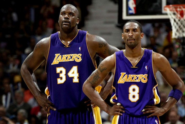
Although we suffering Lakers’ fans had to wait our turn, we did get the last laugh as “The Next Dance” revolved around a young Kobe Bryant and prime era Shaquille O’Neil.
I built a ribbon chart visualization in Power BI showcasing the top scorers from 1995 to the three peat years ending in 2002. Thank you Spencer Baucke for the ingenious web scraping technique!
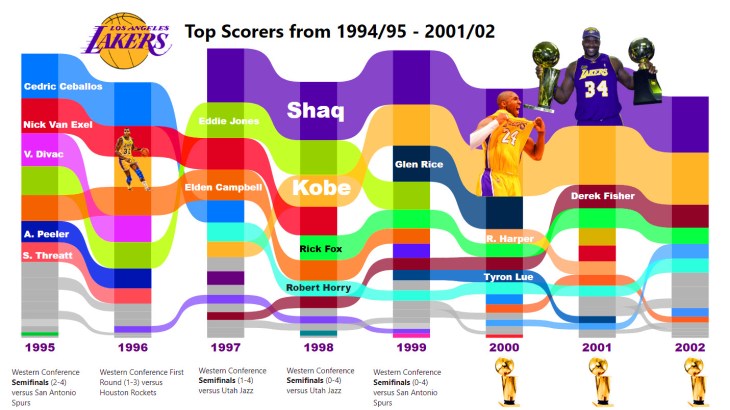
Follow along in the video and make a ribbon chart for your favorite NBA team.
As always, do great things with your data.
Anthony B. Smoak, CBIP
Inspiration ► https://bit.ly/2WZFWCA
If you find this type of instruction valuable make sure to subscribe to my Youtube channel.
Check out other Power BI videos of interest definitely worth your time:
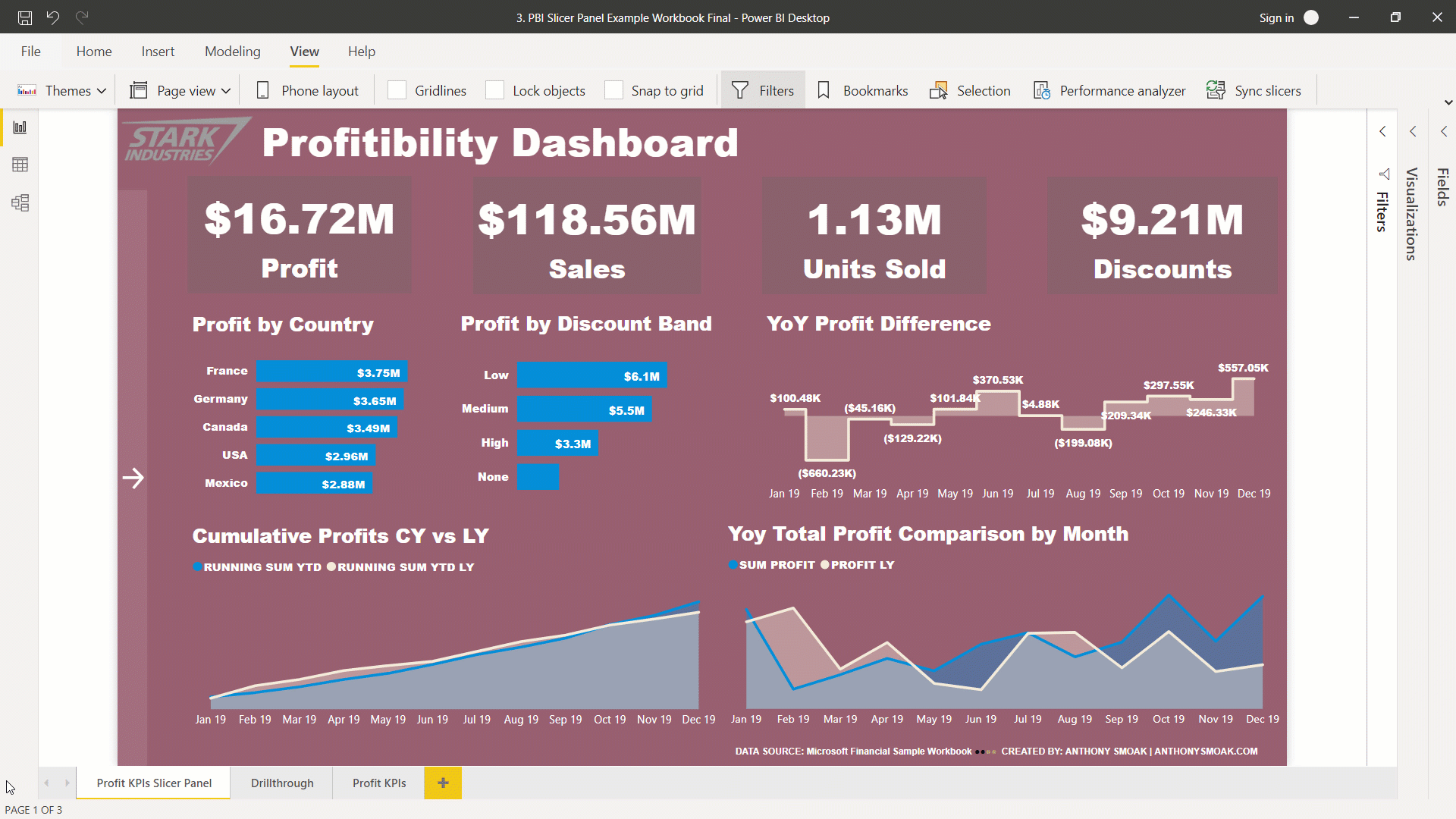
- Build a Power BI Pop Out Slicer
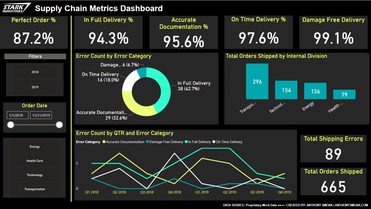
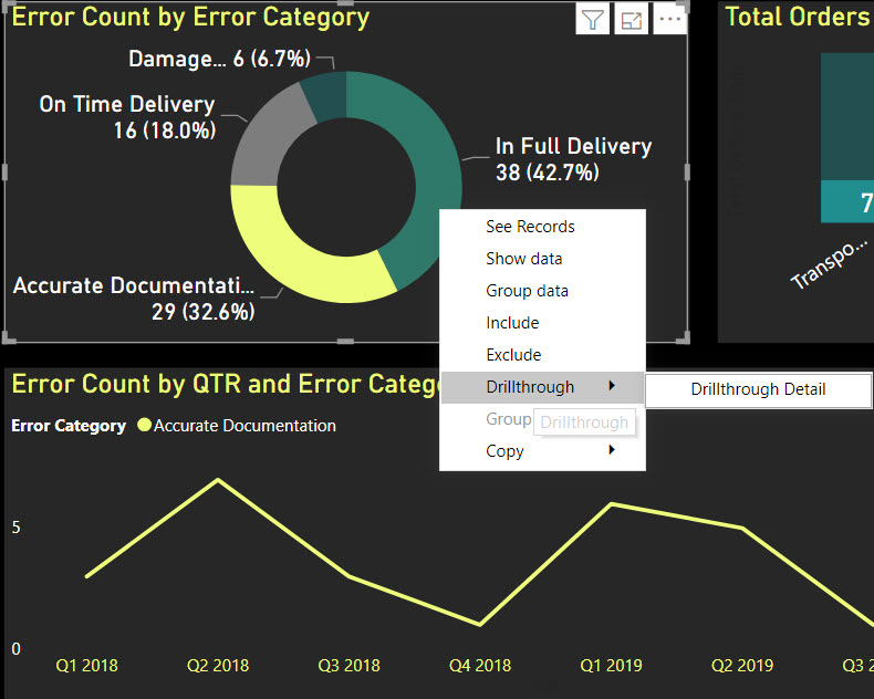
- How to Drill Through in Power BI
- Calculate Bar Chart Percent of Total in Power BI
- Power BI Dashboard Tutorial: Year over Year Difference Analysis
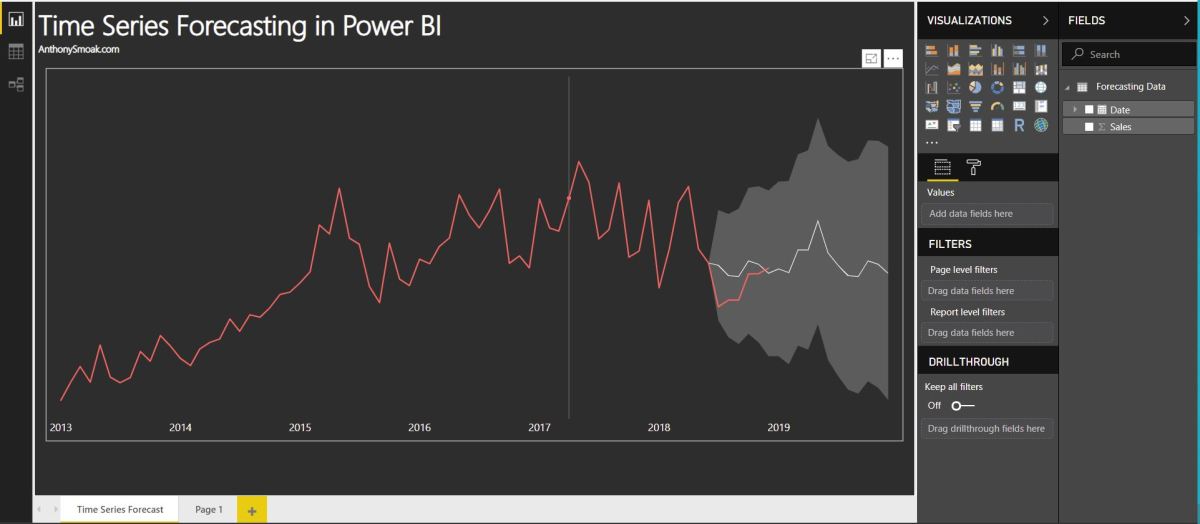
- Time Series Forecasting in Power BI
All views and opinions are solely my own and do not necessarily reflect those of my employer.
Kobe & Shaq Image: David Sherman / NBAE via Getty Images file