How to Extract Web Data with Power BI

By now you’ve probably heard that the Los Angeles Lakers were a pretty solid dynasty in the latter half of the 90’s. I was never a Michael Jordan and Bulls fan during their reign of terror in the 90’s. It all started with the Bulls first title at the expense of Lakers’ fans back in 1991.

So while I must admit that “The Last Dance” was a well executed documentary focused on a team I didn’t care for, it did evoke nostalgia for the 90’s.

Kobe Shaq

Although we suffering Lakers’ fans had to wait our turn, we did get the last laugh as “The Next Dance” revolved around a young Kobe Bryant and prime era Shaquille O’Neil.

I built a ribbon chart visualization in Power BI showcasing the top scorers from 1995 to the three peat years ending in 2002. Thank you Spencer Baucke for the ingenious web scraping technique!
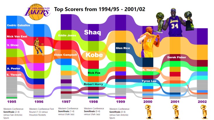
Lakers Ribbon Chart Thumbnail

Follow along in the video and make a ribbon chart for your favorite NBA team.

As always, do great things with your data.

Anthony B. Smoak, CBIP

Inspiration ► https://bit.ly/2WZFWCA

If you find this type of instruction valuable make sure to subscribe to my Youtube channel.

Check out other Power BI videos of interest definitely worth your time:

All views and opinions are solely my own and do not necessarily reflect those of my employer.

Kobe & Shaq Image: David Sherman / NBAE via Getty Images file

Advertisement

The Ultimate Tableau Slope Graph Video

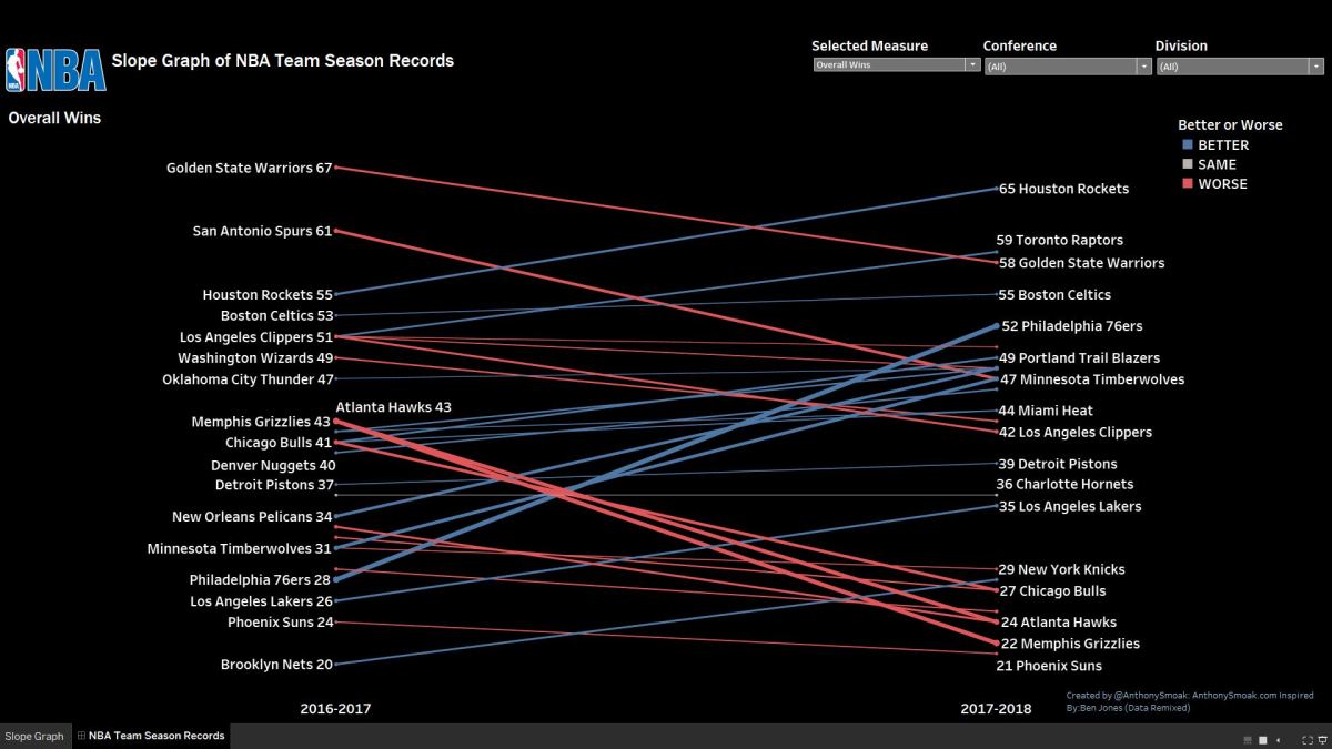
In this video I tackle the subject of slope graphs also known as slope charts. I had some fun putting together this dashboard that illustrates the changes in wins for NBA teams during the 2016-2017 and 2017-2018 seasons. From the video you’ll discover that Chicago, Atlanta and Memphis are on a Hindenburg-like trajectory, while trusting the process in Philadelphia led to huge season gains in overall wins.

Here’s what you will learn from this video:

  • How to create a parameter that enables a user to select which win statistic measure to visualize;
  • How to use Table calculations like, LOOKUP(), FIRST() and LAST() to calculate period over period change;
  • How the impact of Mike Conley’s injury affected the Memphis Grizzlies last season;

Click the pic to interact with the Tableau Public visualization, also download the workbook and data to dissect as needed.

For your convenience the calculated fields that I used to create the measures are listed here. Note that [Selected Measure] is a parameter that you need to create that lists all of the measures.

Calc Select Measure
CASE [Selected Measure]
WHEN “Home Losses” Then [Home Losses]
WHEN “Home Wins” Then [Home Wins]
WHEN “Overall Losses” Then [Overall Losses]
WHEN “Overall Wins” Then [Overall Wins]
WHEN “Road Losses” Then [Road Losses]
WHEN “Road Wins” Then [Road Wins]
WHEN “vs East Conf Losses” Then [vs East Conf Losses]
WHEN “vs East Conf Wins” Then [vs East Conf Wins]
WHEN “vs West Conf Losses” Then [vs West Conf Losses]
WHEN “vs West Conf Wins” Then [vs West Conf Wins]

END
Better or Worse
IF [Selected Measure] = “Home Wins” OR
[Selected Measure] = “Overall Wins” OR
[Selected Measure] = “Road Wins” OR
[Selected Measure] = “vs East Conf Wins” OR
[Selected Measure] = “vs West Conf Wins”
THEN
//WIN MEASURES: Negative delta treated as “WORSE”, Positive delta treated as “BETTER”
(IF [Delta] < 0 THEN “WORSE” ELSEIF [Delta] = 0 THEN “SAME” ELSE “BETTER” END)
ELSE
//LOSS MEASURES: Positive delta treated as “WORSE” (more losses are worse), Negative delta treated as “BETTER”
(IF [Delta] > 0 THEN “WORSE” ELSEIF [Delta] = 0 THEN “SAME” ELSE “BETTER” END)
END
Delta
LOOKUP(SUM([Calc Select Measure]),LAST()) – LOOKUP(SUM([Calc Select Measure]),FIRST())
Delta ABS Value
ABS(LOOKUP(SUM([Calc Select Measure]),LAST()) – LOOKUP(SUM([Calc Select Measure]),FIRST()))
ToolTip
<Team> Trend: <AGG(Better or Worse)> by <AGG(Delta ABS Value)>
During the <Season> Season, the <Team> had <SUM(Calc Select Measure)> <Parameters.Selected Measure>.

I have to give thanks to Ben Jones at the Data Remixed blog for the inspiration!

As always, If you find this type of instruction valuable make sure to subscribe to my YouTube channel.

All views and opinions are solely my own and do NOT necessarily reflect those of my employer.

Row and Column Highlighting in Tableau

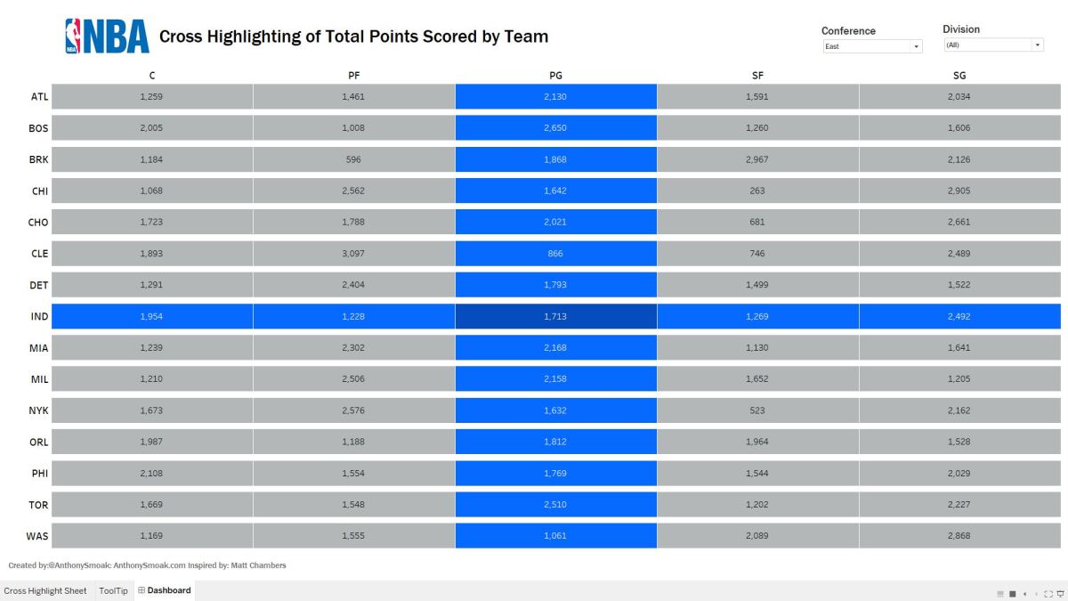
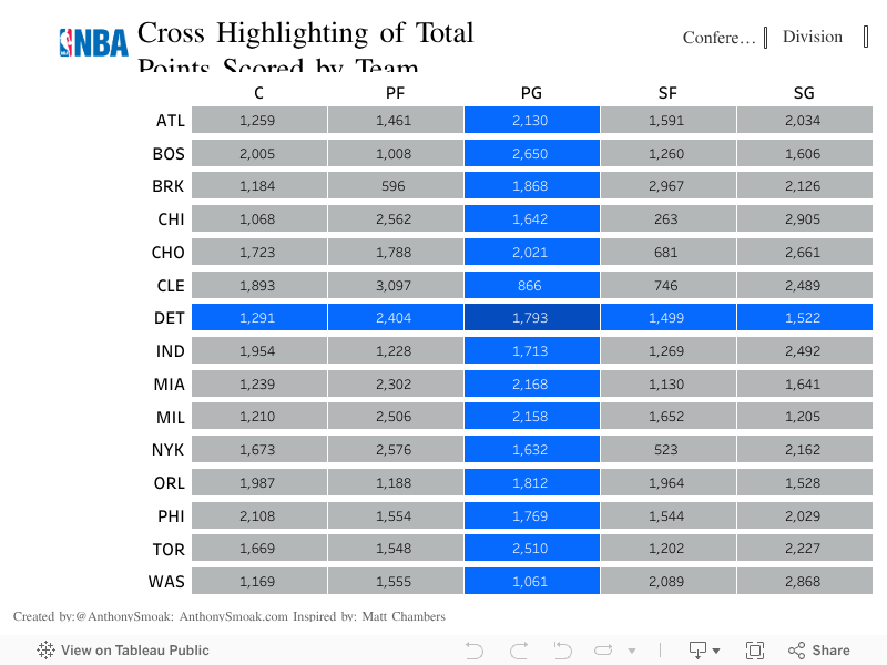
In this post you’ll learn how to highlight values in your Tableau table using set actions. The dashboard in this video displays the number of total points scored by NBA teams by position in the 2017-2018 season. I will give you step by step instructions on how to implement row and column highlighting on this dataset downloaded from basketballreference.com.

I’ve only made a few minor tweaks but this technique was developed by Tableau Zen Master Matt Chambers. You can check out his blog at sirvizalot.com and follow him at Big shout out to Matt for sharing this technique with the Tableau community!

You can interact with my visualization on Tableau Public:

If you find this type of instruction valuable make sure to subscribe to my Youtube channel!

Building a Donut Chart in Tableau Using NBA Data

In this video I will show you how to create a donut chart in Tableau. Since a donut chart is essentially a hoop, I put together this quick visualization using NBA data. Visualization aficionados will advise to use pie/donut charts sparingly but they can add value when showing values with respect to the whole. Enjoy!


If you’re interested in Business Intelligence & Tableau please subscribe and check out my videos either here on this site or on my Youtube channel.

L.A. Lakers Visualization: R Code Plus Illustrator for the Win

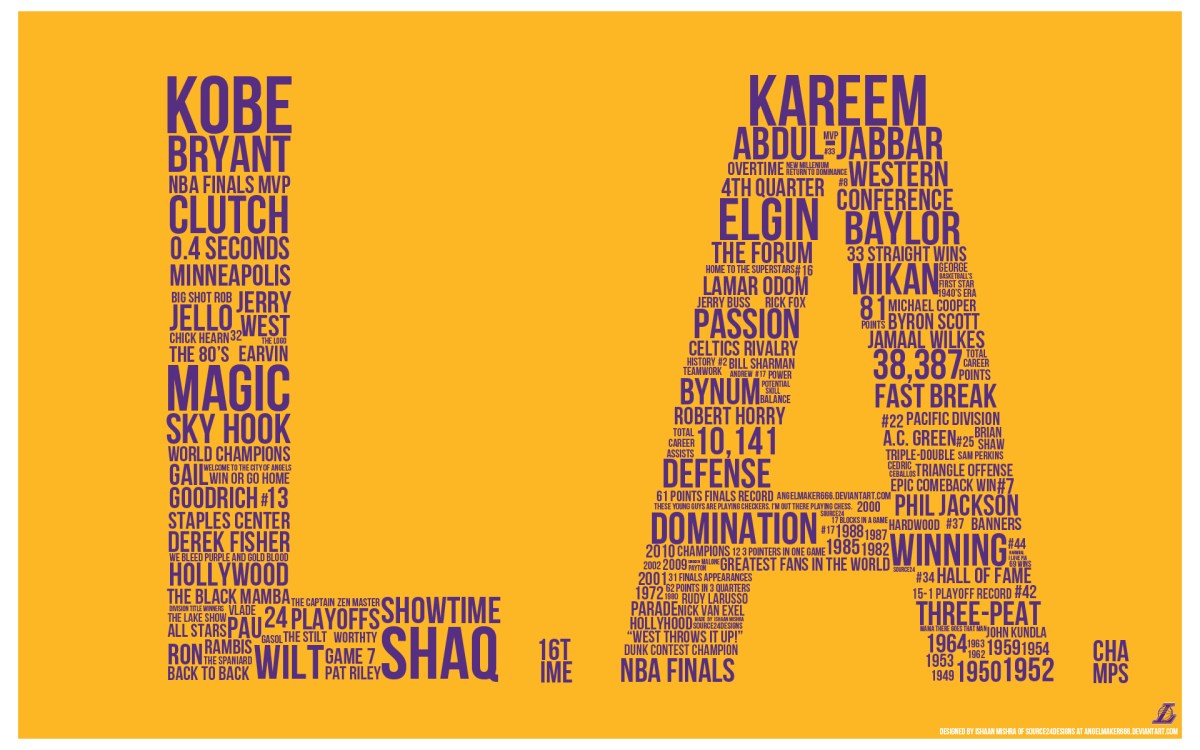
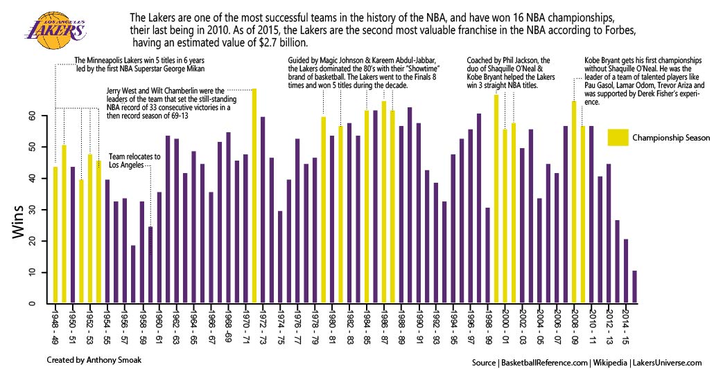
I am a huge Los Angeles Lakers fan since I grew up on the West Coast; I lived in Los Angeles for a year and Las Vegas for many years as a kid. Magic Johnson and the “Showtime” squad of the 80’s will always be the best team dynasty in NBA history in my rather biased opinion. I wanted to make a visualization using base R code to plot a bar chart of Lakers wins by season and then use Adobe Illustrator to complete the effort. Using a .csv data file from Basketball-Reference.com I was able to tell the story of the franchise in an easy to comprehend visualization. I love bringing data to life and making it tell a story!

Laker Wins By Season

Twitter Link