Address Matching in Excel Using Levenshtein Distance

For my Data Analysts, in this video I will demonstrate how to perform a column comparison between two address fields so you don’t have to manually review every row. We’ll use a VBA function from Stack Overflow to provide the comparison results.

I should point out that Excel is NOT the preferred method for address matching, but sometimes it is your only option due to lack of time or better tools. Ideally, you should use address correction software that “fixes spelling errors, corrects abbreviations, and standardizes capitalization so each address in your list complies with the USPS official format” – (per the USPS). Once your addresses are standardized, THEN you should perform a comparison, but this rarely happens.

What typically happens is that some poor analyst like you is conscripted into performing address matching manually using some combination of SQL Server and manual Excel processes. That’s why a Google search led you to this page!

If you ever have to perform address matching in Excel, this could be you!

Informally, the Levenshtein distance between two words is the minimum number of single-character edits (insertions, deletions or substitutions) required to change one word into the other.

For example:

  • The string “HAT” as compared to “hat” would have a Levenshtein Distance of 3
    • Since the function is case sensitive all three characters are different
  • The string “HAT” as compared to “BAT” would have a Levenshtein Distance of 1
    • To turn the first string into the second string it would take 1 substitution of characters (H changed to B or vice-versa)
  • The lower the number, the more the strings are similar
  • The higher the number, the more the strings are dissimilar.

Activate the Developer Tab in Excel

The Developer tab is the place to go when you want to do or use the following:

  • Write macros
  • Run macros that you previously recorded
  • Create VBA Modules and User Defined Functions <– This is our sweet spot
  1. On the File tab, go to Options > Customize Ribbon
  2. Under Customize the Ribbon and under Main Tabs, select the Developer check box

Create a Module in Excel

  1. On the Developer tab select Visual Basic
  2. In the VBA interface select Insert > Module

Insert Levenshtein Distance Function VBA Code

  1. Go to this link at Stack Overflow to view the code as originally referenced
  2. Or, simply copy the code below as developed by user “smirkingman” which is the first answer.
    • Big shoutout to “smirkingman” for this great resource!
Option Explicit
Public Function Levenshtein(s1 As String, s2 As String)

Dim i As Integer
Dim j As Integer
Dim l1 As Integer
Dim l2 As Integer
Dim d() As Integer
Dim min1 As Integer
Dim min2 As Integer

l1 = Len(s1)
l2 = Len(s2)
ReDim d(l1, l2)
For i = 0 To l1
    d(i, 0) = i
Next
For j = 0 To l2
    d(0, j) = j
Next
For i = 1 To l1
    For j = 1 To l2
        If Mid(s1, i, 1) = Mid(s2, j, 1) Then
            d(i, j) = d(i - 1, j - 1)
        Else
            min1 = d(i - 1, j) + 1
            min2 = d(i, j - 1) + 1
            If min2 < min1 Then
                min1 = min2
            End If
            min2 = d(i - 1, j - 1) + 1
            If min2 < min1 Then
                min1 = min2
            End If
            d(i, j) = min1
        End If
    Next
Next
Levenshtein = d(l1, l2)
End Function
  1. Paste the code into your newly created Excel module
  2. Debug > Compile VBAProject

You should not experience any errors after compiling the code.

Watch the Video to Use the Function

Using this function in a judicious manner can help you cut down on the mental energy required to manually review the address columns on each row. It is much better to mentally focus on 25% of the rows than 100%. The fewer rows you have to manually review in Excel, the less the chance of you making an error.


Please like and subscribe on the Anthony B. Smoak YouTube channel.

All views and opinions are solely my own and do not necessarily reflect those of my employer

Do Great Things with Your Data!


★☆★ Support this Channel: ★☆★

Merch ► shop.spreadshirt.com/AnthonySmoak

★☆★ FOLLOW ME BELOW: ★☆★

This image has an empty alt attribute; its file name is anthony-smoak-twitter.jpg

Twitter ► https://twitter.com/AnthonySmoak

Facebook ► https://www.facebook.com/AnthonyBSmoak/

Tableau Public ►Search for “Anthony B. Smoak”

Photo by Oladimeji Ajegbile from Pexels

Advertisement

Add Totals to Stacked Bar Charts in Tableau


In this video I demonstrate a couple of methods that will display the total values of your stacked bar charts in Tableau. The first method deals with a dual axis approach while the second method involves individual cell reference lines. Both approaches accomplish the same objective. Hope you enjoy this tip!

If you’re interested in Business Intelligence & Tableau subscribe and check out my videos either here on this site or on my Youtube channel.

Tableau K-Means Clustering Analysis w/ NBA Data

Interact with this visualization on Tableau Public.

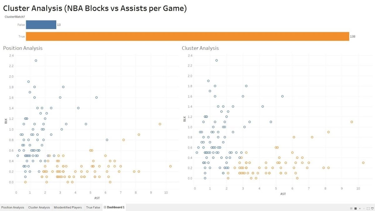
In this video we will explore the Tableau K-Means Clustering algorithm. K-Means Clustering is an effective way to segment your data points into groups when those data points have not explicitly been assigned to groups within your population. Analysts can use clustering to assign customers to different groups for marketing campaigns, or to group transaction items together in order to predict credit card fraud.

In this analysis, we’ll take a look at the NBA point guard and center positions. Our aim is to determine if Tableau’s clustering algorithm is smart enough to categorize these two distinct positions based upon a player’s number of assists and blocks per game.

Nicola Jokic is a Statistical Unicorn

If you also watch the following video you’ll understand why 6 ft. 11 center Nikola Jokic is mistakenly categorized as a point guard by the algorithm. This big man can drop some dimes!

If you’re interested in Business Intelligence & Tableau subscribe and check out my videos either here on this site or on my Youtube channel.

How to Build a Waterfall Chart in Tableau

In this video I will show you how to go “Chasing Waterfalls” in Tableau (apologies to TLC). Waterfall charts are ideal for demonstrating the journey between an initial value and an ending value. It is a visualization that breaks down the cumulative effect of positive and negative contributions. You’ve probably seen them used in financial statements or at your quarterly town hall meeting. Enjoy!

If you’re interested in Business Intelligence & Tableau please subscribe and check out my videos either here on this site or on my Youtube channel.

How to Highlight the Top 3 Bar Chart Values in Tableau

In this video I will show you how to highlight the top three highest sales values on a bar chart. I will also teach you how to add a nested dimension and properly sort the values while keeping the top three values highlighted. Enjoy!

If you’re interested in Business Intelligence & Tableau please subscribe and check out my videos either here on this site or on my Youtube channel.


Building a Donut Chart in Tableau Using NBA Data

In this video I will show you how to create a donut chart in Tableau. Since a donut chart is essentially a hoop, I put together this quick visualization using NBA data. Visualization aficionados will advise to use pie/donut charts sparingly but they can add value when showing values with respect to the whole. Enjoy!


If you’re interested in Business Intelligence & Tableau please subscribe and check out my videos either here on this site or on my Youtube channel.

Create a Well Designed Pareto Chart in Tableau

In this video I will show you how to visualize Vilfredo Pareto’s namesake chart in Tableau. The Pareto Principle defines the 80/20 rule in that roughly 80% of the effects come from 20% of the causes.

I will use sample Tableau Superstore data to determine which states are responsible for 80% of sales. I’ll start with a basic Pareto chart and then move on to a visualization with a little more flair. This video should serve you well in your future data analyses.


If you’re interested in Business Intelligence & Tableau please subscribe and check out my videos either here on this site or on my Youtube channel.

B.I. Basics Part 3: Create a Gantt Chart in Excel

If you’ve ever had to put together a quick timeline to share with someone without the need to resort to full blown Microsoft Project then you will find this video helpful. I will show you how to create a very simple but effective Gantt chart that will satisfy your inner project manager. Definitely keep this tip in your Excel toolkit.

If you’re interested in Business Intelligence & Tableau please subscribe and check out my videos either here on this site or on my Youtube channel.

B.I. Basics Part 2: Sorting “Correctly” in Tableau

For those of you that are familiar with Tableau, you know that sorting can be an exercise in frustration and futility. Fortunately when you understand how Tableau intends its sort functionality to work, you’ll discover that there is a method to the madness. My video presents a simple solution that will alleviate your sorting frustration and should find a place in your Tableau toolbox.

If you’re interested in Business Intelligence & Tableau please subscribe and check out my videos either here on this site or on my Youtube channel.