The Wait is Over. Watch this Tableau Dashboard Container Layout Video!
This video was a long time coming. If you’ve ever dealt with layout containers in Tableau (which are about as intuitive as a Thomas Pynchon novel) you know they can leave you scratching your head if you’re new to the tool. And yes, I do own a copy of Gravity’s Rainbow.
Luckily for you I was up I was up at 2:30 a.m. on a Sunday recording the second part of my popular Tableau dashboard tutorial, because that’s how passionate (and stubborn) I am about providing you educational videos of value. Quality over Quantity!
Watch the preview video above, you’ll observe that I’m teaching you a step-by-step breakdown of how I laid out the visual components for an advanced Tableau dashboard using layout containers. This is part two of the series, and while you can absolutely follow along here, the full experience (with all the dashboard elements, charts, and finishing touches) is available to members of my YouTube channel.
I demonstrate a floating container technique that I learned from Curtis Harris’s excellent video on the subject (look up “Things I Know About Tableau Layout Containers” on YouTube).
Before I forget, I want to give a shout out to Dmitry Shirikov, whose original design I reverse engineered and rebuilt (with his permission), and Murilo Cremon for original overall inspiration.
Let’s get into what I actually did.
What You’ll Miss If You Don’t Watch the Full Video
There’s much that you won’t fully grasp until you see it in action in the video. Things like:
How I embedded a YouTube link in an image element
The way I sequence container stacking to prevent the annoying TILE factor
How to work around Tableau’s quirks when resizing and aligning objects
What I do when Tableau auto-adds objects I don’t want
And most importantly, how all the complex pieces come together to form a professionally polished dashboard
If you’ve been struggling with dashboard layouts, or you’ve watched my first Tableau dashboard build and you’ve been waiting forever for part 2, here’s what I recommend:
Rewatch Part 1 of this tutorial series (it’s free on my channel).
Becoming a member supports the channel and helps me keep making high-quality Tableau content. Tutorials like this take hours of research, recording, editing, and production. I don’t mind putting in the work because I know how much value it provides (thank you for all your wonderful comments, I read them all) but your support goes a long way.
Thanks for rocking with me all these years; now get out there and do some great things with your data!
-Anthony Smoak
I appreciate everyone who has supported this blog and my YouTube channel.
Since Tableau Public was recently upgraded to enable local saving (It’s about time), I decided to look and see what new dashboards were out there that I could learn from, and subsequently teach others to rebuild. My mantra is that you learn the most, by teaching others.
I did find the perfect dashboard built by Dmitry Shirikov on his Tableau Public page! There are also design elements from a dashboard created by Murilo Cremon so I tip my cap to him as well.
I reached out to Dmitry via Linkedin and asked for his permission to use this dashboard as a teaching tool for video lessons and he graciously gave me permission. This further demonstrates the collaborative spirit that thrives on Tableau Public. I offer a big thank you to Dmitry!
What I like about his dashboard is the use of the standard Tableau standard superstore dataset combined with interactive/dynamic year over years metrics and thoughtful design.
It contains deceptively simple KPIs, intermediate level metric swapping and a button selector process that relies on parameter actions. Parameter actions update the value of a parameter based on a user interacting with the marks in the view (in this case, the Sales, Profit or Orders dimensions).
I spent a great deal of after-work and weekend time researching how to put this dashboard back together and rebuilt it piece by piece so I could understand what was done.
It also took some time to record and edit this video as it is coming in at over an hour in length! I can’t believe I put this much time and effort into a free product!
My hope is that by dissecting the dashboard and teaching you how to build the chart elements, you can gain some valuable dashboard building insights to add to your repertoire.
If you think a part 2 video regarding the actual dashboard layout will be valuable, please leave a comment on my YouTube channel!
Let’s learn how to build a histogram in Excel with some interesting NBA data. Personally, I use the histogram in my data analyses to help me understand how my data is distributed and to identify any outliers or extreme values that warrant further investigation. In this blog post, I’ll use Kobe Bryant’s playoff career scoring game log as our data source to create a histogram in Excel. Sound fun? Of course, it does. Let’s go!
Inserting a Histogram Chart in Excel
I advocate that you watch the video above for more detail, but you’ll find this blog post equally informative. To create a histogram in Excel, we’ll need a column of numerical data to analyze. In this case, I have Kobe Bryant’s playoff career scoring game log, which shows how many points he scored in each of his playoff games during his career. I referenced this data from basketballreference.com.
The first step is to highlight the data column and press [Ctrl + Shift + Down] to select the entire range. Then, go to the Insert tab and click on the Histogram icons as shown below. This will insert a histogram chart based on your data.
Formatting the Histogram Chart in Excel
The default histogram chart may not look very attractive or informative. Thus, we will use my personal favorite technique to kick start the formatting (the “easy” way) which is the selection of “Layout 2” as a chart style.
Now this option may be easy (if you’re using Excel 2016 or greater) but you must know which additional options to change in order to make the histogram look more presentable.
The Layout 2 style does an excellent job of removing the horizontal grid lines and vertical axis (so we can keep the Edward Tufte style “chart junk” to a minimum). It also adds data labels to our bar charts as well for interpretation clarity.
Formatting the Histogram Chart in Excel
We can further improve our histogram’s appearance by applying some formatting options. For example, we can:
Delete the grid lines and the vertical axis that we don’t need (already performed by Layout 2)
Increase the font size of the data labels
Change the fill color of the bars
Add a chart title
To access the formatting options, right-click on any element of the chart and select “Format”. Alternatively, we can hit [Ctrl + 1] to open the Format pane.
Adjusting the Bin Size and the Overflow/Underflow Options in Excel
One of the most important aspects of any histogram is the bin size, which determines how the data is grouped into intervals. The bin size affects the shape and the interpretation of our histogram. We can adjust the bin size by selecting the horizontal axis and changing the “Bin width” option in the Format pane.
The default bin size for this data set is 5.7, which means that the data is grouped into intervals of 5.7 points. For example, the first bin includes the values from 0 to 5.7, the second bin includes the values from 5.7 to 11.4, and so on.
However, this bin size may not be very intuitive or meaningful. A better option for our histogram is to use a bin size of 5, which means that the data is grouped into intervals of 5 points. For example, the first bin includes the values from 0 to 5, the second bin includes the values from 6 to 10, and so on. This makes the histogram easier to read and understand.
Another option that we can adjust in the histogram chart is the overflow and the underflow bins. These are special bins that capture the values that are above or below a certain threshold.
For example, we may want to create an overflow bin that includes all the games where Kobe scored more than 40 points, and an underflow bin that includes all the games where he scored less than 10 points. To do this, we can select the horizontal axis and change the Overflow bin and the Underflow bin options in the Format pane.
After applying the overflow and the underflow options, the histogram chart looks like this:
Histogram Axis Notation
You’ll notice the histogram’s horizontal axis includes both brackets “[” and parentheses “(“. I will quote the Microsoft blog to explain this notation.
“In our design, we follow best practices for labeling the Histogram axis and adopt notation that is commonly used in math and statistics. For example, a parenthesis, ‘(‘ or ‘)’, connotes the value is excluded whereas a bracket, ‘[‘ or ‘]’, means the value is included. “
In our histogram for example, the notation (20, 25] indicates that the respective bar includes any value greater than 20 but less than or equal to 25.
Interpreting the Histogram Chart and Finding Outliers in Excel
Our new histogram isn’t just pretty, it’s equally informative allowing us to answer questions that we couldn’t easily determine from a wall of numbers in spreadsheet form. The histogram easily helps us understand Kobe’s playoff scoring distribution. We also gain an understanding of his outlier games. For example, we can now:
..locate the mode, which is the most frequent value or interval. In this case, the mode is the interval from 20 to 25, which means that Kobe Bryant scored between 20 and 25 points in most of his playoff games.
..find the range, which is the difference between the maximum and the minimum values. In this case, the range is 50, which means that Kobe Bryant’s playoff scoring varied from 0 to 50 points.
..find the skewness, which is the asymmetry of the distribution. In this case, the distribution is right-skewed, which means that the longer tail of values is on the right side of the distribution. This indicates that Kobe Bryant’s playoff scoring was more concentrated in the lower values. This makes perfect sense as it is much harder to score more points as opposed to lesser points.
..find the outliers, which are the values that are far away from the rest of the data. In this case, the outliers are the point score values that are greater than 40.
I hope you enjoyed this blog post and learned how to create a histogram in Excel to analyze data distribution and outliers!!!
Let me leave you with this highlight package of Kobe’s best dunks:
In this video, we’re going to tackle an interesting little challenge – adding dynamic totals to stacked area charts in Tableau. While this may not be a technique for production-ready charts, it’s perfect for those one-time presentations or exports to PowerPoint.
Recently, I had a fantastic 90-minute private data tutoring session with someone who contacted me via this website. During this session, we worked together to address three different data issues, one of which was the quest to display totals for stacked area charts. With some creative thinking and a dash of Tableau magic, I found a solution that I’m excited to share with you.
Use the timestamps below to navigate directly to your desired point in the video.
Historically, creating Sankey charts in Tableau has been a time-consuming process, often requiring the use of complex templates. However, the team at Tableau Public has introduced a game-changing functionality that allows us to create Sankey charts effortlessly. This feature, currently in beta and available for a limited time (like the McRib of data visualizations), enables us to author and publish Sankey charts directly to our Tableau Public profiles.
In this blog post, I’ll briefly walk you through the process of creating one using Tableau Public.
What is a Sankey Chart?
Before we delve into the specifics of this new Tableau Public feature, let’s take a moment to understand what a Sankey chart is and why it’s such a powerful visualization tool. A Sankey chart is a flow diagram that illustrates the movement of data, be it goods, energy, or even money. With a Sankey chart, you can effortlessly compare different data points and identify patterns that might remain hidden in traditional charts or tables.
Testing Out the New Feature
Assuming you already have a Tableau Public profile (and if you don’t, I highly recommend creating one—it’s an incredible platform for sharing your data visualizations with the world). You’ll need to create a visualization directly from your Tableau Public page.
Once you’ve created your visualization, navigate to the “Connect to Data” section. As we’re uploading data from our computer, select the “Upload from Computer” option. Choose the dataset you want to work with—I’ll be using the “Sample Superstore” dataset for this example. After confirming that your data has been successfully imported, select the “Sankey” chart type.
Now, here’s where the magic happens. You’ll notice a “Level” and “Link” section that appears. To define the flow in the Sankey chart, let’s select a dimension like “Segment” and drag it into the “Level” area. Next, grab another dimension—I’ll choose “Region”—and place it in the “Level” area as well. Finally, to quantify the flow, let’s choose a measure like “Sales” and place it in the “Link” area.
Voila! With just a few clicks, we’ve created a Sankey chart. Impressive, isn’t it? You’ll notice the flow between the segments and regions instantly come to life. But we’re not done yet—let’s keep the party going by adding another level.
For the sake of experimentation, let’s grab a dimension like “Ship Status” and drop it into the visualization. Now we have an additional sub-level in our Sankey chart. To avoid overcrowding, we can uncheck the “Allow Labels to Overlap” option, ensuring our chart remains clean and legible.
Keep Innovating for The Analytics Core Audience
Tableau Public’s decision to incorporate this feature highlights their commitment to democratizing data visualization. While the addition of features like Sankey charts to Tableau Public is fantastic, it’s essential that the overlords at Salesforce remember Tableau’s core audience—the general analytics users who are generally decoupled from Salesforce usage. Let’s keep hoping for bigger and better things to come with the tool. This beta signals that they’re heading in the right direction.
(Note: The mentioned feature and availability were accurate as of the blog post’s publication date, but please refer to the Tableau Public documentation for the latest updates and information.)
Yes I put an AI version of myself on the thumbnail. I obviously “Quantum Leaped” from the future to teach you these Advanced Tableau table skills that you’ll encounter in the accompanying video.
Be warned, this is Highly Advanced Tableau!! In the main video, we’ll explore how to generate advanced tables in Tableau (step by step), complete with multiple chart elements displayed on the same table row. It’s OK, you can click the area below since it leads to a YouTube short.
Intro
As a data enthusiast and Tableau user, I always strive to learn new things, experiment with different techniques and share my knowledge with others. Recently, I came across a visualization by Zainab Ayodimeji that caught my attention. Zainab is a Tableau Ambassador and her work is always top-notch, so I reached out to her and asked if I could reverse engineer one of her vizzes for a video. She was cool with it, so I got to work.
The visualization that caught my eye was an advanced Tableau visualization that used normalized data to create sales and profit sparklines for using standard Superstore data. Zainab’s visualization featured a variety of different chart elements, all on the same row, and looked incredibly cool.
I was immediately intrigued and wanted to see if I could reproduce something similar myself, but with a different data set other than the ubiquitous Superstore. So, I got to work on reverse engineering and came up with my own take on Zainab’s visualization.
I discovered that the technique used in her viz was innovated by Sam Parsons, so I also checked out his video on this technique and found it ingenious; very MacGyver like. Sam’s innovative video is the inspirational source for all of these techniques. Watch his video for the concepts, watch my video for practical hands on building.
Watch the Step by Step Re-creation Video to Learn this Advanced Technique
In the video below, I will explain step by step how I used Tableau to create a compelling chart example that will help my viewers understand the Advanced Tableau calculations and concepts it takes to visualize multiple types of charts on one table row.
The dataset that I worked with contained information about the sales and profits of different products sold at a coffee shop as opposed to Superstore data. Recreating the data with a different dataset forced me to understand the concepts better than just copying and pasting the existing code in Zainab’s visualization.
The Reviews are In
Y-Axis Positioning Trick – (How this Process Works)
One of the coolest concepts in this process is the positioning of the chart elements on the same Y-Axis. Again, a big shoutout to Sam Parsons for coming up with these techniques!
The y-axis position is critical because it determines where each data point will be plotted on the chart. As a result of the ingenious calculation, Tableau places all non-line chart elements at a y-axis position of 0.5, which is the middle of the y-axis. However, for line chart elements, the y-axis position is calculated based on the normalized sales or profits value.
To normalize the data, we make the values of the sales and profit of each product fit between a range of 0 and 1 for a consistent Y axis. This allows us to see the trends of the sales and profits of each product at a standard consistent height on the visual.
The sales or profit axis test (a calculated field) determines whether the normalized sales or profits value should be plotted if the chart element is a line. If the test returns a value of 1, Tableau will plot the normalized sales value. If it returns a value of 0, Tableau will plot the normalized profits value. This is determined by checking whether the sales access product field is present in the detail section of the view.
I just realized that I used Quantum Leap and MacGyver references in the same blog post (gettin’ Ziggy with it). After watching my video above, you’ll be able to create an insightful visualization using clever and unconventional methods (not unlike MacGyver making a jetpack out of a toothpick and a piece of gum).
Again, big thanks to Zainab and Sam for influencing this work so I could teach you how to Quantum Leap forward in your Tableau skills (Ok I’ll stop with the puns). Keep doing great things with your data!
Have you ever wanted to disable the default Tableau highlighting effect when you select a mark on your chart and then remove the filter? Even when the filter is removed via the “Remove All Filters” process, it can be confusing for the user experience when all values remain “greyed out”, tricking the user into thinking that their filter is still applied. This video will help you remedy this issue and improve your dashboard user experience.
Fortunately, there is a solution to this problem that is simple and easy to implement. In this video I will show you how to use a simple calculated field and highlight action to remedy the issue. This should be default behavior in Tableau, (help us out here Tableau!)
The solution approach involves creating a boolean calculated field and setting it initially to TRUE. Then, placing this calculated field on the detail of the chart that has a filter applied. Next, adding a highlight action to the same chart that you want to remove the “greyed out” effect for. In the “Add Highlight Action” pop-up box, the Source Sheet and the Target Sheet should be the same and the Selected Fields option should have the boolean calculated field checked.
By following these steps, you will be able to remove the greyed out effect on your Tableau chart when the “Remove All Filters” process is applied.
This not only improves the appearance of your dashboard but also makes it easier to understand the data.
★☆★ THESE ADDITIONAL FILTERING VIDEOS IN TABLEAU ARE WORTH YOUR TIME ★☆★
Don’t let the greyed out effect on your Tableau charts hold you back any longer. Watch the video and follow the steps outlined in this blog post to improve the appearance and functionality of your Tableau dashboards.
You can also follow my dapper data adventures on Instagram.
Learn how to perform a useful Tableau hack that allows you to display multiple sheets in one container on your Tableau dashboard. In this video I use my personal training dashboard to show you step by step how this trick is performed. This tip is a must know for the intermediate to advanced dashboard builder as it will help you save space on your dashboard.
Watching the video will make the concept clearer but I will provide an overview in this post.
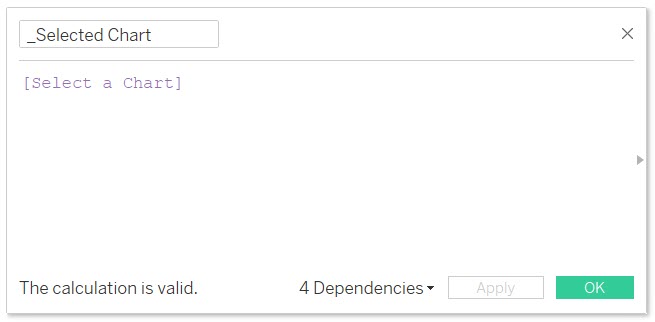
Step 1: I create a Parameter named “Select a Chart”. You can see that I have chosen a list of allowable values and I place into the list the names of charts that I want to swap.
Step 2: I create a calculated field named “_Selected Chart”. It only holds the value of the parameter I created in Step 1.
Step 3: (Use screenshot below)
1. Place the “_Selected Chart” calculated field on the filter shelf of a chart that you wish to show and hide.
2. Edit the “_Selected Chart” filter and select the “Custom value list” option.
3. Type in the respective name of the chart that corresponds to the value that you entered in the parameters allowable values list in Step 1. Hit the plus button to the far right to add the value. Additionally add the value of “All” to the Custom value list in the same manner.
IMPORTANT: the value that you enter into your chart must match EXACTLY to the value that you placed on the parameter allowable values list.
Repeat this process for every chart that you wish to show and hide, making sure to type in the exact samechart name that you entered in the parameter allowable values list in Step 1.
Step 4:
Now it’s time to place all of your charts into the same object (i.e., horizontal or vertical container) on your dashboard . Make sure to show the parameter named “Select a Chart” on the dashboard so you have a combo box with the names of your charts inside that you can select.
So you want to add some spice to your bland looking Sparklines in Tableau? You have come to the right place (start by watching the video above). Let’s talk about how a Sparkline is defined per Wikipedia:
“A sparkline is a very small line chart, typically drawn without axes or coordinates. It presents the general shape of the variation (typically over time) in some measurement, such as temperature or stock market price, in a simple and highly condensed way. Sparklines are small enough to be embedded in text, or several sparklines may be grouped together as elements of a small multiple. Whereas the typical chart is designed to show as much data as possible, and is set off from the flow of text, sparklines are intended to be succinct, memorable, and located where they are discussed.”
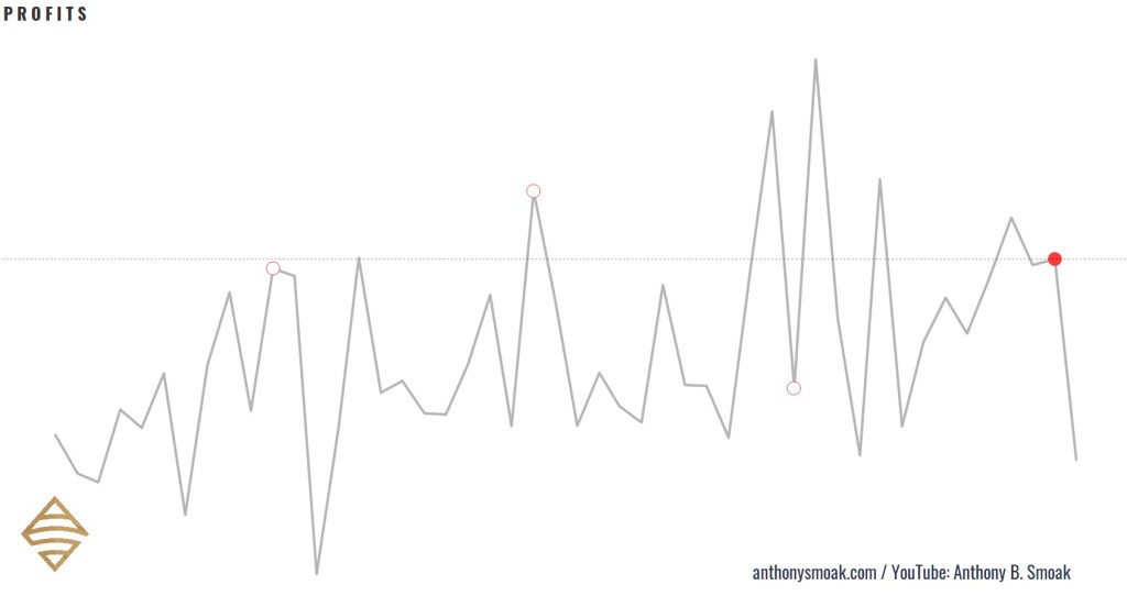
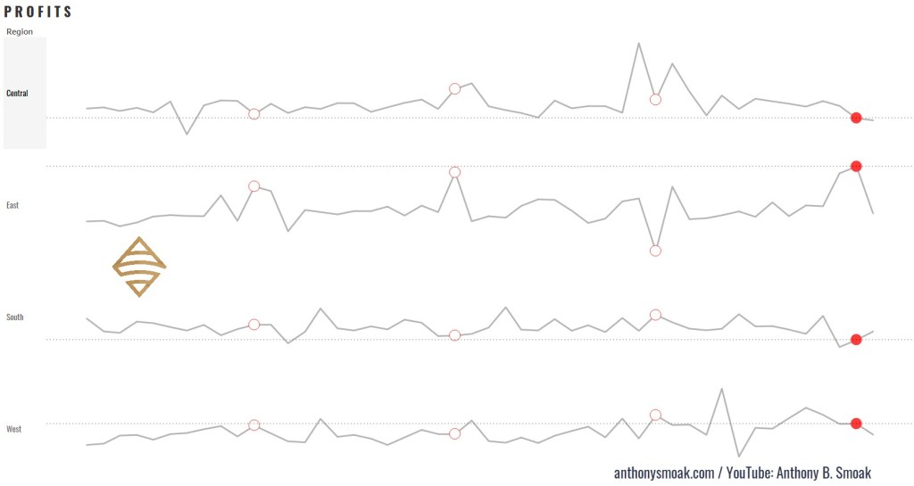
Here are a few examples of Tableau specific sparklines in action (with latest complete month bubble indicators and reference lines): Notice how I do not include any data axes, but you can clearly recognize the data trends in the visuals.
Here is an example of how I used the sparklines demonstrated in the video to build a out a classic yet refined looking Tableau dashboard.
For reference purposes I am going to list three formulas used in the completion of the sparklines, you’ll have to watch the video to learn how to put them together.
In this exercise I am using that standard Tableau Superstore data set which you can perform a Google search to find if you are using Tableau Public.
Calculated Fields
Calculated Field #1 (Name: SPRK_CircleMonths)
This calculated field puts a circle on the penultimate month data points. Penultimate is just a fancy SAT word way of saying “next to last”. When the month of the data point on the line chart (Order Date) equals the next to last order date month in the dataset, then return the Order Date.
//IF THE MONTH OF THE DATE ON THE LINE CHART EQUALS THE MONTH-1 OF THE MAXIMUM DATA POINT
// THEN RETURN THE DATE
If DATEPART('month',[Order Date]) = DATEPART('month',dateadd('month',-1,{MAX([Order Date])}))
Then [Order Date] END
Calculated Field #2 (Name: SPRK_CircleMonths)
This logic will be applied to the circles generated by the previous calculation SPRK_CircleMonths. Only the next to last month will meet the TRUE condition (which will be colored as red).
// IS THE MONTH OF THE CHART DATE EQUAL TO THE MOST RECENT DATE MONTH MINUS 1 MONTH
// E.G., NOV 2018 = NOV 2020 WILL RESOLVE TO TRUE DUE TO MATCHING MONTHS
DATETRUNC('month',[Order Date]) = DATEADD('month',-1,DATETRUNC('month',{max([Order Date])}))
Calculated Field #3 (Name: SPRK_RefLine Profit)
This logic will return the profit associated with the next to last month in the dataset to display on the reference line.
// RETURNS A VALUE USED FOR THE REFERENCE LINE
// IF THE MONTH OF THE DATE = THE MONTH OF THE MAXIMUM DATE MINUS 1 MONTH (GET A COMPLETE FIRST MONTH)
if DATETRUNC('month',[Order Date])
= DATEADD('month',-1,DATETRUNC('month',{max([Order Date])}))
THEN [Profit] END
When you put all the functions together in a manner according to the video, you end up with a more refined sparkline in my opinion. Big shoutout to the Data Duo for the inspiration on the dashboard I created and this technique. If you haven’t checked out any of their work make sure to do so.
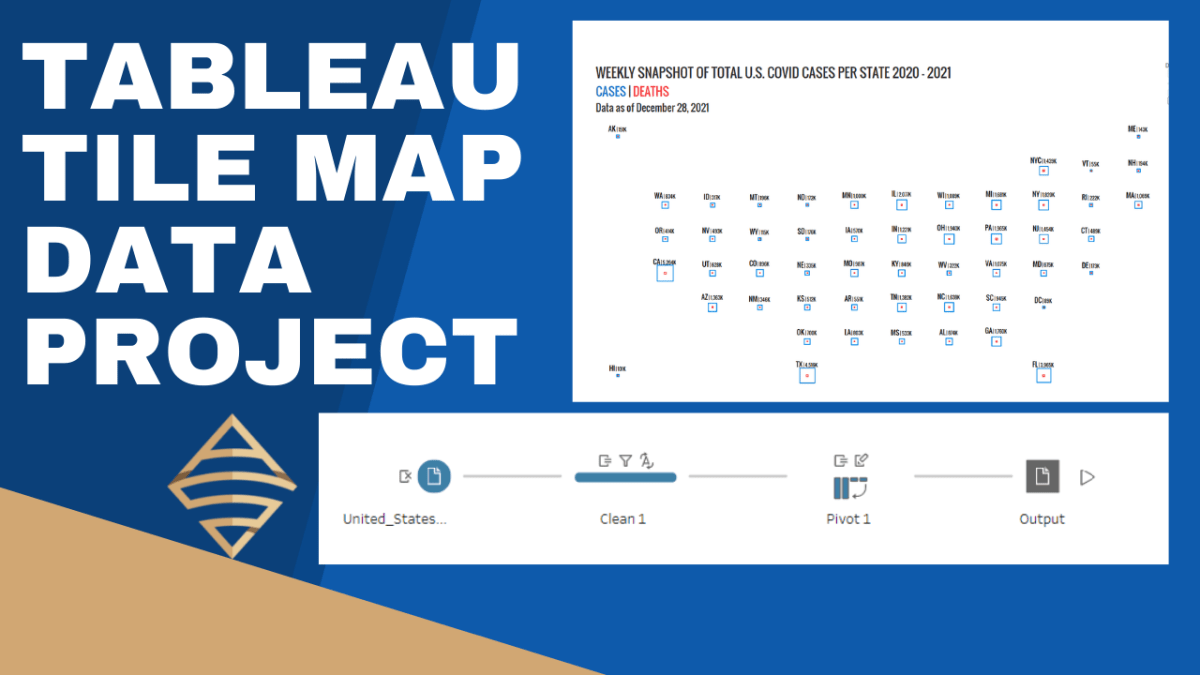
I was recently inspired by some really great tile-maps that have been created in the Tableau community (e.g., see beautiful work by Chimdi Nwosu and Michael Dunphy). Thus, you know I had to come up with a way to construct a simplified map in this style with some data and share with my followers. In these two videos, I’m going to walk you through how to prepare the necessary data file in Tableau Prep Builder and then we’ll build out the tile-map in the second video, step by step.
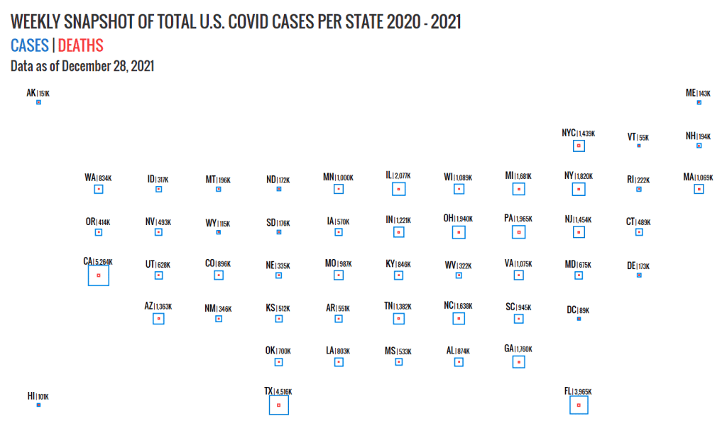
This is a good intermediate level portfolio project for you to follow along with in order to increase your Tableau Desktop and Tableau Prep skills. We’ll use CDC data, specifically United States COVID-19 Cases and Deaths by State over Time, to build the tile-map.
The advantage of a tile-map is that it represents geographic regions (like states) at equal sizes. Thus, the distortions and biases introduced by differences in sizes are eliminated. In the case of the United States, data for smaller regions like Washington D.C. can be interpreted on equal footing with data for a much larger region like California.
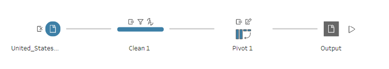
Tableau Prep Builder helps to greatly simply the data shaping process. My only wish is that Tableau would integrate Prep into Tableau Desktop for one seamless data tool to rule them all, but I digress. The process below illustrates how simple it is take some data from an input file, and subsequently clean and pivot the data into a new file. Watch the first video, to learn how to build out this simple flow in Tableau Prep. If you do not have a copy of Tableau Prep, you can complete this lesson on a 14 day trial license of the tool, which you can download here.
Watch the second video for the step by step instructions to build out the tile-map above.