Tableau Dynamic Maps with Parameters: A COVID Dashboard Breakdown

Operation “Reverse Engineer” a Tableau Zen Master dashboard is back in full effect. You know the drill by now, I spent weekend hours analyzing an impressive dashboard put together by Tableau Zen Masters Anya A’Hearn, Tamas Foldi, Allan Walker, and Jonathan Drummey.

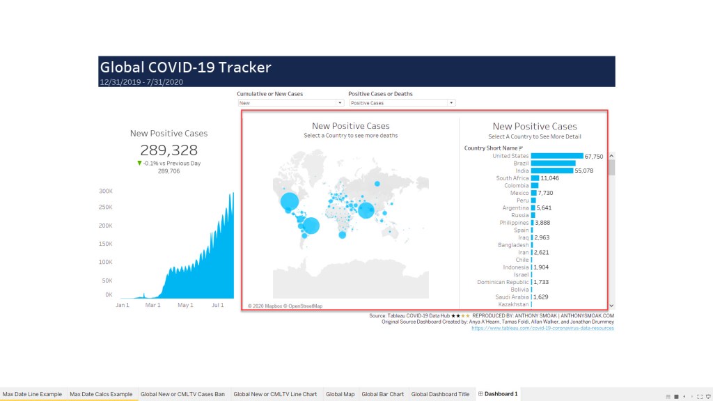
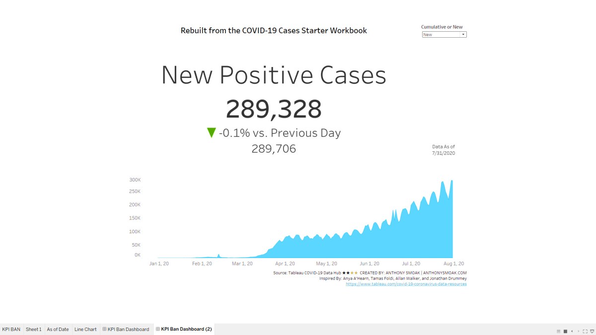
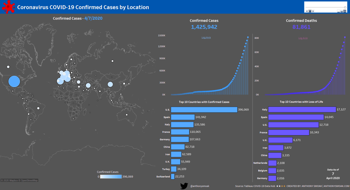
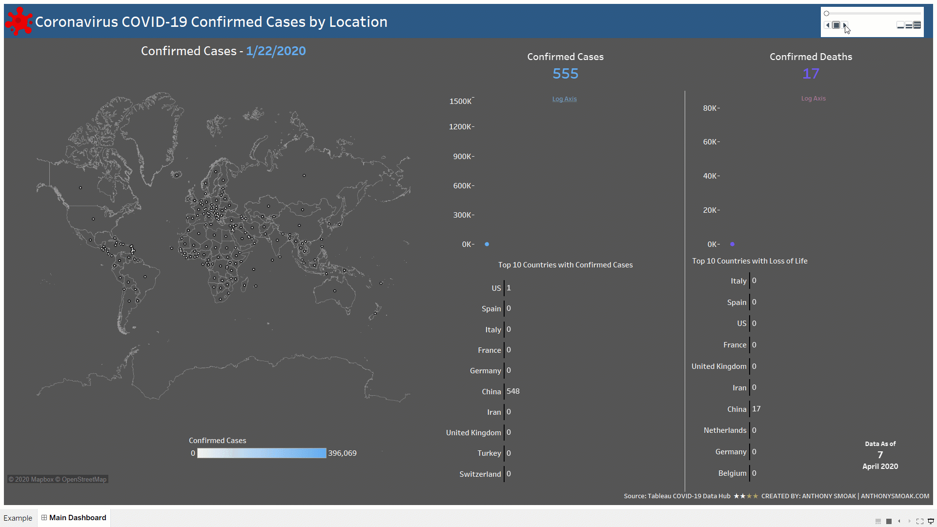
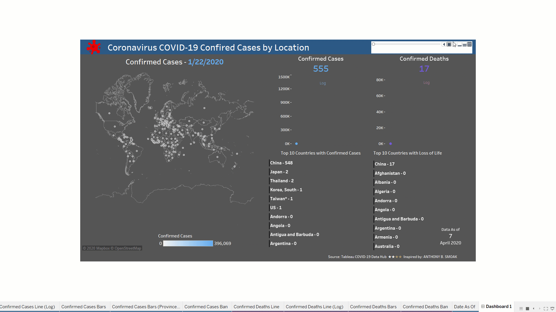
In this video I will demonstrate to you how they use parameters to dynamically change the measure that is displayed on both a map and bar chart. Accurate data is made possible through the use of a context filter to equalize the data that is displayed between the United States and all other countries (U.S. data lags by one day).

I should mention that we are using the carefully curated data offered at the Tableau’s COVID-19 Data Hub.

What’s in it for You?

You will learn a neat little trick that encapsulates multiple measures into one calculated field. By using two parameters we can update our visuals to display the correct measure based upon user selected options. This even applies to the size of our marks on a map. You have to love the dynamic nature of Tableau!

In order to understand how we work with the current Tableau COVID-19 data file, you should watch the first video as a prerequisite.

Also Make Sure to Watch this Additional Video Series

Make sure to also check out this extremely useful tutorial on building a COVID-19 Dashboard from scratch. It’s perfect for your first Tableau project with step by step instruction.

All views and opinions are solely my own and do NOT necessarily reflect those of my employer.

Do Great Things With Your Data

-Anthony B. Smoak

Build Advanced Tableau KPIs: A COVID-19 Dashboard Breakdown

You want to build an advanced Zen Master level KPI BAN using Tableau’s latest COVID-19 data? Well you’re in luck as I spent a lot of weekend hours analyzing an impressive dashboard put together by Tableau Zen Masters Anya A’Hearn, Tamas Foldi, Allan Walker, and Jonathan Drummey.

Specifically I was intrigued how they put together the KPI BAN from the dashboard below that highlights either NEW or CUMULATIVE Positive cases and the percentage difference from the previous day.

Official Tableau COVID Tracker

The official Tableau COVID-19 tracker database can be found here.

In breaking down their approach I renamed some calculations to better help me organize and understand how they come together to create the KPI.

What’s in it for You?

From a learning standpoint, there is a good mix of parameters, filters, context filters and Level of Detail (LOD) calculations that work in concert to deliver the desired outcome.

In the video you’ll learn how I simplified some of the back-end aspects to be a tad more approachable for beginner to moderate Tableau learners. Of course if you want to see the whole dashboard in context with the original back-end naming conventions and layout you can go download the official workbook and deconstruct it for yourself.

It’s all about learning! I encourage you to make use of workbooks that others have shared for bettering yourself and appreciating skills that are at the next level. Of course, always cite your sources and inspirations!!

As always, If you find this type of instruction valuable make sure to subscribe to my Youtube channel.

Make Sure to Watch this Additional Video Series

Make sure to also check out this extremely useful tutorial on building a COVID-19 Dashboard from scratch. It’s perfect for your first Tableau project with step by step instruction.

All views and opinions are solely my own and do NOT necessarily reflect those my employer.

Do Great Things With Your Data

– Anthony B. Smoak

Build a Tableau COVID-19 Dashboard

I hope everyone is safe and staying indoors during this challenging time. Like most of you, I find myself with an abundance of weekend time to spend indoors. I’ve used some of this time crafting a dashboard series leveraging the outstanding COVID-19 data hub provided by Tableau.

I did not expect the series to be as popular as it turned out to be, but it is one of my most viewed lessons on YouTube!

Tableau COVID Dashboard GIF

In this set of videos you will learn how to use Tableau and the Johns Hopkins data set which tracks COVID-19 cases across the globe, to assemble a dashboard. The great part about this dashboard is that it can be put together without reliance on overly complex calculations or the need to be a graphic designer, and it looks amazing if I do say so myself.

This dashboard utilizes the Tableau pages functionality to enable animation; as dates change the dashboard updates to reflect the current number of confirmed cases and deaths at that point in time.

Another cool trick is the use of containers to swap visualizations on the same dashboard. I use this functionality to switch between a linear and logarithmic scale for confirmed cases and deaths. You will need at least Tableau 2019.2 to use the sheet swapping functionality.

The first video provides an overview of the Tableau data-set and touches upon the visualizations required to build out the dashboard.

By popular demand, the second video goes more in-depth on the formatting and color scheme of each of the visualizations.

In my opinion the best part of the series is the 3rd video. I spend a full 93 minutes demonstrating various topics on dashboard refinement.

  1. Eliminating the hard-coding and manual sorts using a level of detail calculated field
  2. Detailed formatting with containers (applicable to all dashboards)
  3. Tableau sheet swapping using containers
  4. Making a Tableau Data Connection

When you get through with the first three videos you can opt for bonus material that teaches you how to implement a “bar chart race” aspect to the countries.

Instead of the same countries remaining static, they will move up and down depending upon the number of cases or deaths associated with a particular date.

Tableau COVID Dashboard Pt4 Gif Proj

Learn the Tableau “bar chart race” effect in Part 4 here:

Feel free to interact with the original viz or the Bar Chart Race version on Tableau public:

As always, If you find this type of instruction valuable make sure to subscribe to my Youtube channel.

All views and opinions are solely my own and do NOT necessarily reflect those of my employer.