Interact with my resume here: Anthony Smoak Interactive Tableau Public Resume
This post is for everyone who has ever asked, “How do you create an interactive resume in Tableau?” If you’re looking to get noticed as a Tableau visualization developer / subject matter expect, then building out an interactive resume using Tableau is a great place to start. It is a good starter visualization to build because you already have all the data! The data is inherently about you, but you just need some inspiration on how to get started building out your resume.
That’s where I come in, to share with you a place to start for inspiration, and direction on how to build out a few charts I leveraged to construct my interactive resume.
Where to Get Inspired
The first place you want to start looking for interactive Tableau resume inspiration is the Tableau Public Resume Gallery. The Tableau community has done an excellent job of sharing resumes so you don’t have to start from scratch with respect to idea generation. As I was looking through the gallery, I started to notice that most of the resumes had some common DNA, most notably a timeline chart (either linear or Gantt chart) and an abacas chart (both of which I will show you how to build in the video).
My resume is inspired by offerings from both Ann Jackson and Lindsay Betzendahl. When you look through the gallery you may find a resume that fits your personal vision. I’m sure you’ll use a few of the techniques I’m going to share as well.
You can also do a simple google image search on “Tableau Interactive Resume” and you’ll find additional images that link to resources that are not on the official Tableau Public Resume Gallery.
Format Your Data
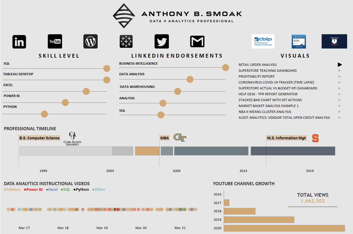
In order to build out the necessary charts to support your resume, you’ll use Excel to format the data. I cover the format for both the timeline chart and the abacas chart in the video, but below is a sneak peek of how I formatted my data for the abacas skills chart.
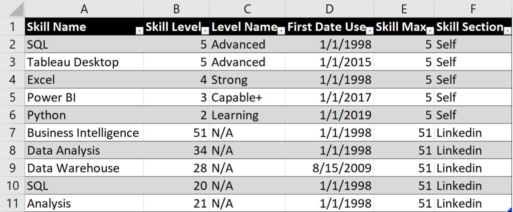
The data above supports the buildout for two separate abacas charts. One chart is for a self-rating of my skills (rows 2-6), while the other chart is a representation of LinkedIn endorsements (7-11).
Column E represents the maximum value of the skill that I want to present on the abacas chart. Since I was self-rating my skills from a scale of 1 to 5, then 5 was the maximum value represented. For the LinkedIn endorsements, 51 was the highest number I received, thus for all rows supporting this chart, 51 was the maximum value.
Gantt Chart
Every resume needs a timeline! Although I describe how to build a single linear timeline chart in the video above, I have another video that explains how to build a Gannt chart in Tableau. For some of our experiences, we have more than one activity happening at the same time, thus the following video will help in your resume build out as well.
Remember that we all have a story to tell and an interactive resume in Tableau will help you share your experiences and get noticed if done well. Good luck!
Please like and subscribe on the Anthony B. Smoak YouTube channel.
All views and opinions are solely my own and do not necessarily reflect those of my employer
I appreciate everyone who has supported this blog and my YouTube channel via merch. Please click here
Thank you!!
Anthony B Smoak
INCREASE YOUR FOCUS TRY BRAIN.FM
When I am focusing hard during the day at work or developing visualizations on the weekend. I use Brain.fm to help me focus when it matters. It’s Science-driven and research-backed functional music designed from the ground up to help you you focus, relax, meditate and sleep. If you’d like to try a free trial check out https://brain.fm/anthonyb
Please use coupon code anthonyb for a 20% discount upon checkout. It helps support this blog and my YouTube channel as I receive a small commission for purchases made through links in this post.