Place Bar Chart Labels Above Bars in Tableau

In this video I will provide a method in which you can place your bar chart labels above the bars in Tableau. This technique is based off Adolfo Hernandez’s technique with a little more explanation and additional alternatives for the zero line. Make sure to add this to your bar chart repertoire!

If you want to follow-along with the video, you can download the data at this link:

https://www.basketball-reference.com/leagues/NBA_2021.html

In the video I exported data from the “Per Game Stats” section but you are free to download from whichever stats section you’d prefer.

High Level Steps:

Make sure to watch the video to get more in-depth:

  1. Drag your measure to columns (e.g., 3P)
  2. Drag your dimension to Rows (e.g., Team)
  3. Sort the measure to descending value
  4. Place the Team and 3P on the label and format accordingly
  5. Create a placeholder directly on the Columns shelf : AVG(0))
  6. Drag the placeholder to the bottom of the visual onto the 3P axis to make a combined axis visual
  7. In the Measure Value area make sure that AGG(AVG(0)) is placed above SUM(3P)
  8. Uncheck “Show Headers” for the Team dimension and for the axis at the bottom of the visual
  9. Format the visual to remove unnecessary borders and lines
  10. Make the following adjustments on the Label:
    1. Marks to Label: Min/Max
    2. Scope: Pane
    3. Field: Measure Values
    4. Options:
      1. Allow Labels to Overlap Other Mark
      2. Label Minimum Value
  11. Change the color of the bar chart borders to the background color of your visual in order to camouflage the tiny bar created by AVG(0)
  12. Uncheck “Show Header” for AVG(0)

When it’s all said and done you have a fresh new take on adding labels to your bar chart that can add differentiation to your overall visual!

For more detail on how to add a zero line (which I believe is important for bar charts in general and is a good design practice), watch the video.

Please like and subscribe on the Anthony B. Smoak YouTube channel.

All views and opinions are solely my own and do not necessarily reflect those of my employer

Do Great Things with Your Data!

Advertisement

Stacked Bar Chart with Dynamic Totals in Tableau

Are you looking for the next viz to showcase on your Tableau Public page? In this video I will teach you a technique that spices up the humble stacked bar chart with dynamic totals (using Tableau Set Actions). We will build out the viz step by step with Superstore data.

Stacked Bar Chart with Dynamic Totals

This chart is powered by Tableau Superstore data which is a data set that is readily available on the internet and is packaged as the default data set with Tableau. As you select the three legend categories at the top of the visual, the stacked bar chart sections will appear or disappear. The totals will also automatically update based upon your selection.

How cool is that!!??

I have to give a shoutout to Dorian Banutoiu for originating this technique. A few years ago, Dorian used this technique in a Makeover Monday exercise and it recently caught my attention when I was checking out his Tableau Public page. I immediately attempted to reverse engineer the technique (which admittedly took some effort).

Because I wanted to enable everyone with Tableau and/or Tableau Public to duplicate the chart, I used Tableau Superstore data as my foundation. Make sure to give Dorian a Twitter follow at @canonicalizedco.

What’s In it for You?

By following along with the video, you will utilize multiple Tableau elements such as:

Practice makes perfect so this will be a good opportunity for you to practice multiple Tableau elements with the creation of one visualization. You can click the links on the list above to see additional videos that cover respective areas.

Give Credit

If you do reproduce this visualization step by step or leverage the technique for your Tableau Public page or Linkedin Page, please link to this post or the YouTube video and place “Inspired by Dorian Banutoiu & Anthony Smoak” somewhere on the viz and post text.

Interact with the Finished Visualization

You can interact with the finished visualization on my Tableau Public page here:

https://tabsoft.co/3oNxq5Z


Please like and subscribe on the Anthony B. Smoak YouTube channel.

All views and opinions are solely my own and do not necessarily reflect those of my employer

Do Great Things with Your Data!

★☆★ Support this Channel: ★☆★

Merch ► shop.spreadshirt.com/AnthonySmoak

★☆★ FOLLOW ME BELOW: ★☆★

Twitter ► https://twitter.com/AnthonySmoak

Facebook ► https://www.facebook.com/AnthonyBSmoak/

Tableau Public ►Search for “Anthony B. Smoak”

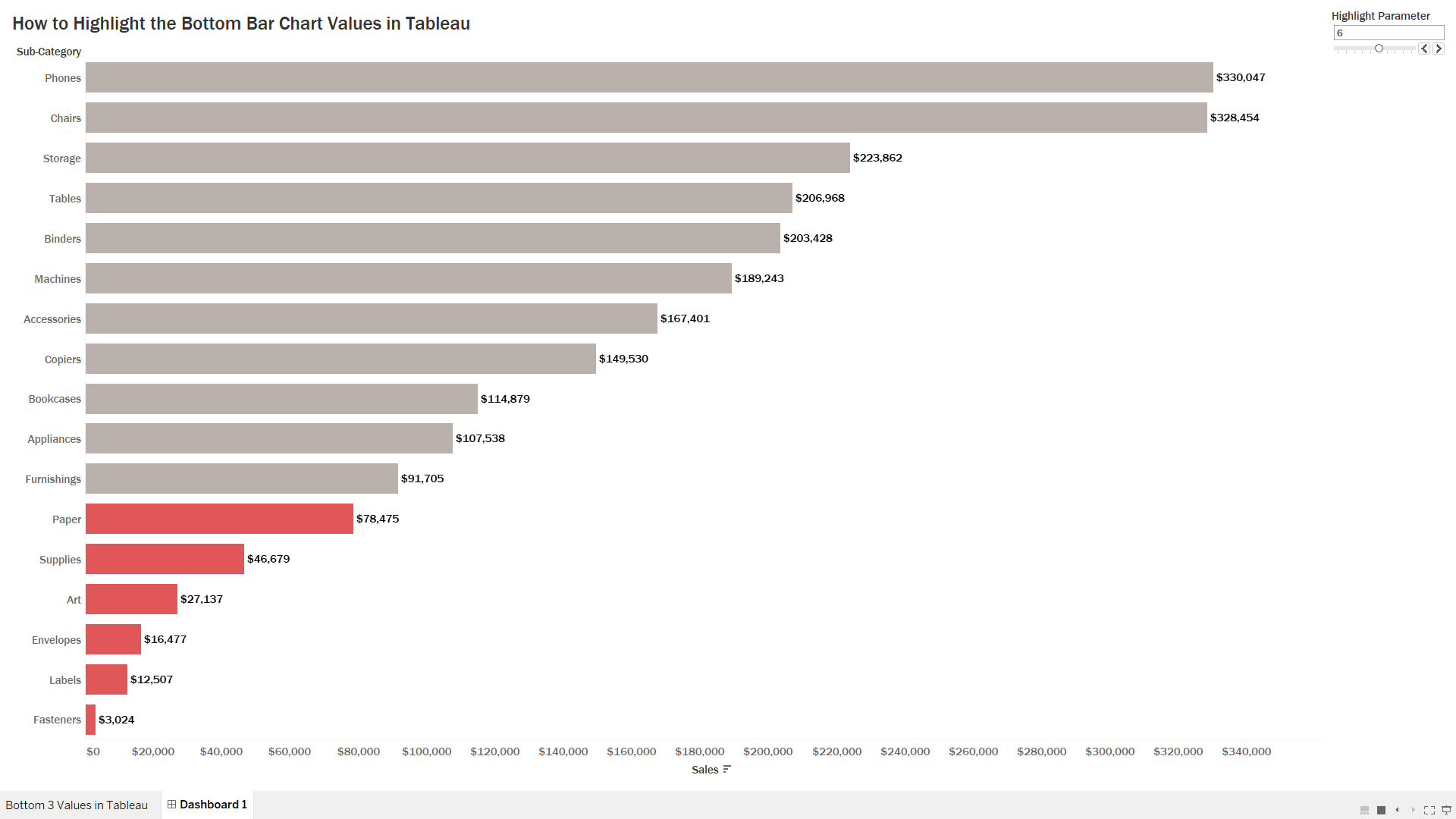
How to Highlight the Bottom Bar Chart Values in Tableau

I decided to make this video after someone left a comment on another video I made titled “How to Highlight the Top 3 Bar Chart Values in Tableau” asking how to find the last three values.

Youtube Comment Highlight Bottom 3

In this video I will show you how to highlight the bottom three sales values on a bar chart. You’ll also learn how to use a parameter to dynamically change the number of lowest bars highlighted.

Bottom 3 Bar Chart Values Thumbnail

We can accomplish the highlighting of the bottom N bar chart values via two ways. We can either create a set or create a calculated field to accomplish this task. The set method is cleaner but has its limitations when multiple dimensions are used in the visual. Therefore, the calculated field approach serves us well when we add multiple dimensions.

Watch the video to see how it all comes together but the calculation boils down to this:

RANK(SUM(0-[Sales]))<=[Highlight Parameter]

By adjusting the [Highlight Parameter] control, the user can determine how many bottom sales values are highlighted in the visual. This method also maintains its functionality when an additional dimension is added to the visual.

As always, If you find this type of instruction valuable make sure to subscribe to my Youtube channel.

All views and opinions are solely my own and do NOT necessarily reflect those of my employer.