The Issue:
I recently ran into the issue of not being able to color a dimensional value because my data did not yet contain that specific value. What I learned through trial and error is that I needed to change the calculated field I was using to force an expected value so I could color it appropriately.
I then had to change my calculated field back to what it was originally and hope that Tableau would remember the color. It would be nice if Tableau had a native built in interface to allow users to assign colors to expected values (regardless if the values are currently in the data), but this feature is not available in Tableau (looking at you very talented developers at Tableau).
Watch the Solution:
I created a calculated field with expected outcomes of “Bad”, “Normal” and “Great” based upon numerical profit data. The profit data I had did not support the “Great” value. Thus I had to doctor my calculated field to force the value and then color it. I didn’t know if Tableau would remember my color selection if I changed the calculated field and then changed it back, but it did.
The Forums:
Don’t worry, you are not the only one looking for a solution to this issue. Here are some Tableau forum links that basically ask the same questions.
- Assign colors to values that don’t exist (yet)?
- How to assign color coding to upcoming values in the field
- Assign color to non-existed values of calculated dimensions categories
Hopefully this post helped you in your search to color those non-existing values. For many of us, not all potential values are available in our data sources, and we many not have access to the underlying source data. Having a nice UI means to assign expected values in advance would be extremely useful.
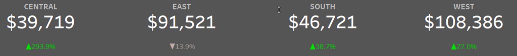
The Dashboard:
I certainly love to develop new dashboards to test out functionality. I built this one to test out a few Ryan Sleeper dashboard tips. Make sure to download the dashboard .twbx file from from my Tableau Public profile (Anthony B Smoak) for free!

Please like and subscribe on the Anthony B. Smoak YouTube channel.
All views and opinions are solely my own and do not necessarily reflect those of my employer
Do Great Things with Your Data!