
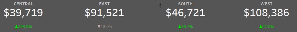
In this video you will learn a quick and easy approach to putting together KPIs that illustrate how profits perform in relation to a budget (i.e., targets vs actuals). Of course the KPIs will be interactive thanks to help from parameters.
Now the dashboard that I built around the KPIs will definitely form the basis of additional videos. There are several techniques here (filtering viz in tooltips, show/hide container, bar in bar chart, reset all filters button, etc.) that form the basis of a good intermediate level dashboard.

Inspiration comes in many forms. I have to give a shoutout to Keith Dykstra for offering his original dashboard for reverse engineering. The idea for the KPIs and bar in bar chart are inspired by Keith. I added additional elements such as the reset all filters button, filtering by states via treemap, parameters in lieu of hover over images.
Shoutout to the Kevin Flerlage for his great PowerPoint button workbook. I modified the on/off toggle button based upon a template from Kevin’s workbook.
Finally, I was watching an Oregon vs UCLA football game one Saturday and was impressed by Oregon’s latest uniform combination. I had to throw that grey and green combination together for use on the dashboard. Inspiration can come from many places! Here’s a little Oregon football and my “Saturday Night Lab” tweet.

Make sure you watch this video to learn and hopefully get inspired yourself!
If you’re interested in KPIs you can check out these other videos:
- COVID-19 KPIs using data from the Tableau data hub.
- Donut Chart KPIs
All views and opinions are solely my own and do NOT necessarily reflect those of my employer.
