In this video I kickstart the #VizznessFirst initiative where I describe a Tableau Dashboard I constructed using multiple resources from the Tableau #datafam community. Invest your valuable time in watching the videos as it will be worth the investment if you’re looking to pick up some new skills.
I describe the dashboard, show you the resources and then you attempt to build it. This is a perfect intermediate/advanced dashboard idea starter for students looking to improve their Tableau skills.

Background
Let’s start with a little background on how this initiative came together. I am a big fan of the Real World Fake Data (i.e., RWFD) project run by Mark Bradbourne at Tableau. I wanted to finally get involved and put together a dashboard and hopefully learn something new.
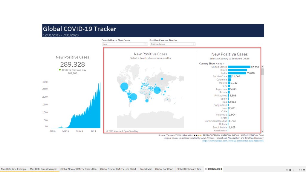
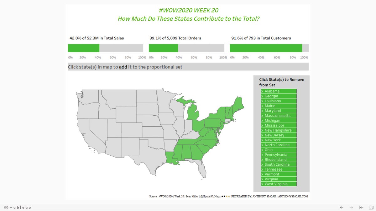
Because the particular data set used (Week 5: Help Desk) had very few measures to sum or aggregate; this left counting rows as the most informative means to squeeze some meaning from the data.
I stumbled upon an excellent blog post from Tableau Zen Master Lindsay Betzendahl where she explained a technique to highlight when a “filter” has been activated with a small indicator. I reversed engineered her dashboard to try and tease out how to pull this off with the RWFD data set.
In addition to this technique, I mashed up some other techniques from various members of the Tableau community. One of the great things that I enjoy about the Tableau community is that there are many creators who put out great content for others to learn from; whether it be videos, blog posts, PowerPoint slides, etc.
Once I had a dashboard I was proud of sharing. I figured I would release it as a series to try and teach others some of these techniques. The 3 videos in this series is the culmination of that effort.
VIDEO 1: Overview of the Project and Resources Required
Here are the references I used to put together the dashboard.
- Data File: REAL WORLD FAKE DATA DATSET #5 (HELP DESK)
- FILTER INDICATORS: LINDSAY BETZENDAHL
- PERCENTAGE OF RECORDS SELECTED
- BUTTONS: KEVIN FLERLAGE
- SHOW HIDE CONTAINER
- Build a Tableau COVID-19 Dashboard Part 3: https://anthonysmoak.com/2020/04/25/build-a-tableau-covid-19-dashboard/
- Anthony B Smoak YouTube Channel: Show and Hide Containers in Tableau: https://www.youtube.com/watch?v=iNjDDkWAXmM
- CONTAINER LAYOUTS
- Part 3: https://anthonysmoak.com/2020/04/25/build-a-tableau-covid-19-dashboard/
- Curtis Harris YouTube Channel : Things I Know About Tableau Layout Containers:https://www.youtube.com/watch?v=L1gC05jyMS8
VIDEO 2: STEP BY STEP INSTRUCTIONS
Make sure to watch Video 2 above because this is where I explain the main technique required to complete the dashboard.
VIDEO 3: STEP BY STEP INSTRUCTIONS (TABLE TRICKS)
Video three rounds out the series by demonstrating a cool trick that enables you to build a filter button that opens a detailed table dashboard populated with only the records of interest from the first page. Yes, it uses a filter action but there is twist. Make sure to check it out.
SHARE WHAT YOU CREATE
- POST YOUR FINISHED DASHBOARD TO TABLEAU PUBLIC:
- DASHBOARD BUILT USING TABLEAU DESKTOP 2020.4.1
- SHARE YOUR LINK IN THE COMMENTS ON THE YOUTUBE CHANNEL:
- 10K+ SUBSCRIBERS CAN VIEW YOUR ACCOMPLISHMENT
- YOU CAN ALSO POST TO:
- MAKE SURE TO INCLUDE:
- “Inspired by @AnthonySmoak”
- Include hashtag #ViznessFirst
- INTERACT WITH MY DASHBOARD VERSION ON TABLEAU PUBLIC:
If you enjoyed this tip, please like and subscribe on the Anthony B. Smoak YouTube channel.
Definitely pick up some merch if you’ve enjoyed this blog and YouTube channel over the years:
https://shop.spreadshirt.com/AnthonySmoak/
All views and opinions are solely my own and do not necessarily reflect those of my employer
Do Great Things with Your Data!
Anthony B. Smoak, CBIP