Use Clustering Analysis in Tableau to Uncover the Inherent Patterns in Your Data

This following is a guest post.

Clustering:

Clustering is the grouping of similar observations or data points. Tableau enables clustering analysis by using the K-means model and a centroid approach. This model divides the data into k segments with a centroid in each segment. The centroid is the mean value of all points in that segment. The objective of this algorithm is to place centroids in segments such that the total sum of distances between centroids and points in their segments is as small as possible.

In this post we will demonstrate some of clustering’s practical applications using Tableau. To get started, download the dataset from this link.

Let’s get our hands dirty!

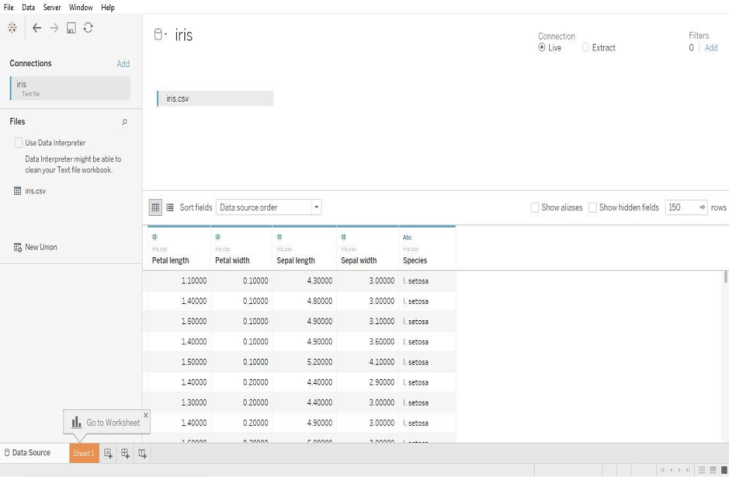
Examine the data-set, it contains data about different characteristics of flowers. Once the data is loaded into Tableau it will look like the screenshot below.

Picture1

Now let’s plot a visualization between petal width and length. Just drag and drop the petal width and length onto rows and columns as shown below.

Picture2

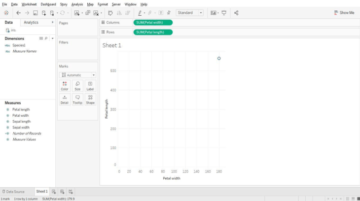
Here we see that there is only one data point as Tableau by default aggregates measures. We can “un-aggregate” the data with a click as shown below.

Picture3

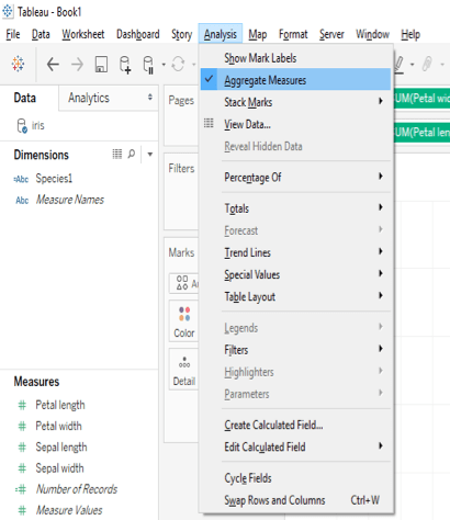
Just go to the analysis tab in the menu and un-tick the aggregate measures option.

Picture4

Now we can observe a scatter plot of two measures. Let’s cluster these data points according to their species by navigating to the analytics pane as shown below.

Picture5

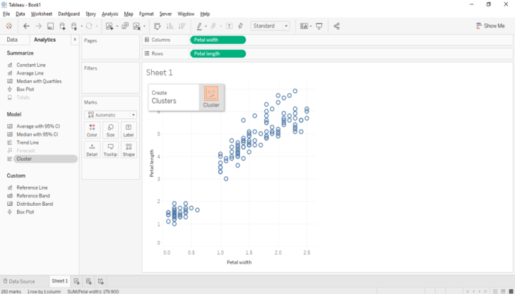
Drag and drop the cluster option on to the plot.

Picture6

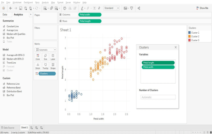
Clusters are formed automatically, although there is an option to change the number of clusters. Users can also select the variables used for cluster generation, although Tableau uses the fields in the view to form the initial clusters.

Picture7

We can visually observe the clusters and Tableau provides a handy option that displays cluster statistics.

Picture8

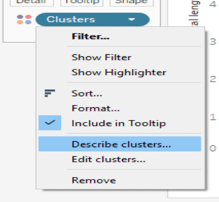
Click on the “describe clusters” option to observe a summary and model description.

Picture9

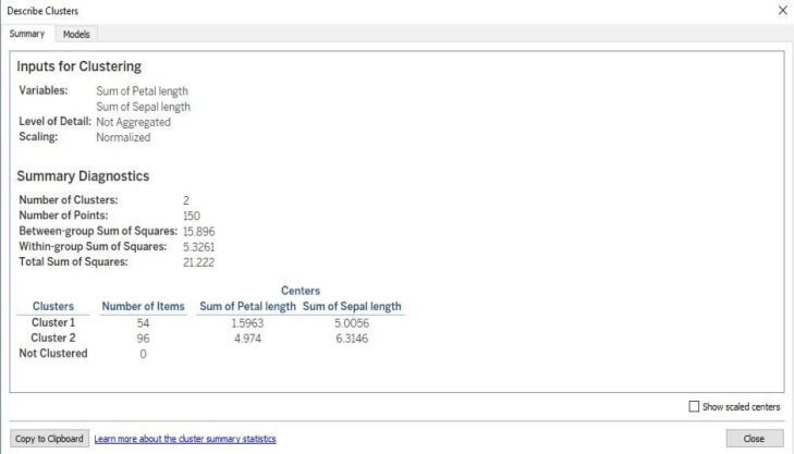
The summary tab provides a high level overview of the variables used in the model and various sum of squares information. Let’s turn our attention to the models tab and the main generated statistics.
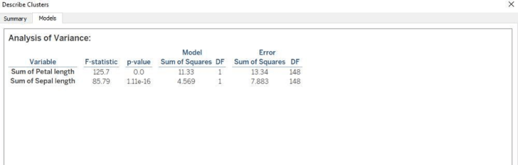
Picture10

F-Ratio:

The F-Ratio is used to determine if the expected values of a variable within groups differ from one another. It is the ratio of sum of squares (variances).

F= Between Group Variability/Within Group Variability

The greater the F-statistic, the better the corresponding variable in distinguishing between clusters.

P-Value:

In a statistical hypothesis test the P-value helps you determine the significance of your results. The p-value is the probability that the F-distribution of all possible values of the F-statistic takes on a value greater than the actual F-statistic for a variable. If the p-value falls below a specified significance level, then the null hypothesis can be rejected. The lesser the p-value, then more the expected values of the elements of the corresponding variable differ among clusters.

Tableau provides an option to save formed clusters into a group that can be used for subsequent analyses. Simply drag and drop the cluster from the marks pane to the dimensions section to save it as group.

Picture11

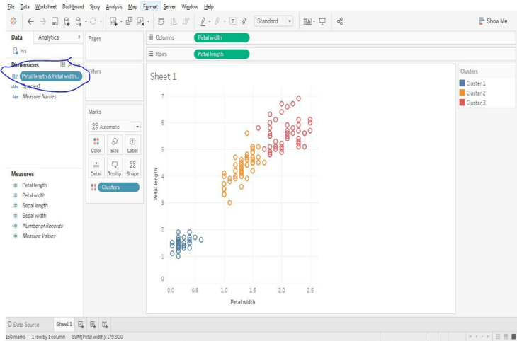
Tableau doesn’t allow clustering on these types of fields:

  • Dates
  • Bins
  • Sets
  • Table Calculations
  • Blended Calculations
  • Ad-hoc Calculations
  • Parameters
  • Generated Longitude and Latitude Values

Let’s look at another example using the default World Indicators data set that comes with Tableau. Open the sample workbook named World Indicators and explore the data regarding various countries.

Picture12

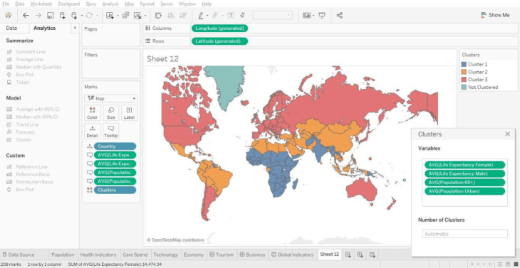
Try using different variables to form clusters. Use the model description to learn about the various countries based upon their clusters.

Picture13_1

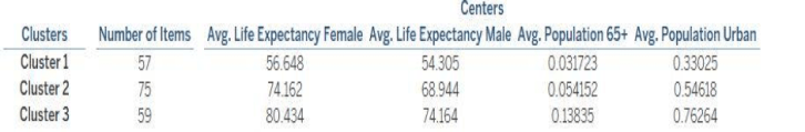
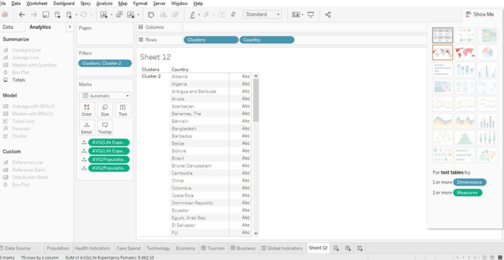
Here it shows average life expectancy, average population above 65 years and urban population. These statistics provide insight into the composition of the particular clusters. We can see which countries comprise each cluster as shown below. Select any cluster and go to the “Show Me” tab and select text “Table” to view the names of each country present in a cluster.

Picture14

Conclusion:

We’ve only covered a few scenarios using clustering and how it aids with the segmentation of data. Clustering is an essential function of exploratory data mining. Keep exploring the results of cluster analysis by using different types of data sets. Keep Rocking!

“Happy Clustering!!”

Author Bio

This article was contributed by Juturu Pavan, Prudhvi Sai Ram, Saneesh Veetil and Chaitanya Sagar contributed to this article.

My Submission to the University of Illinois at Urbana-Champaign’s Data Visualization Class

I’m a huge fan of MOOCs (Massive Open Online Courses). I am always on the hunt for something new to learn to increase my knowledge and productivity; and because I run a blog, MOOCs provide fodder for me to share what I learn.

I recently took the Data Visualization class offered by the University of Illinois at Urbana-Champaign on Coursera. The class is offered as part of the Data Mining specialty of six courses that when taken together can lead to graduate credit in its online Master of Computer Science Degree in Data Science.

Ok enough with the brochure items. For the first assignment I constructed a visualization based upon temperature information from NASA’s Goddard Institute for Space Studies (GISS).

Data Definition:

In order to understand the data, you have to understand why temperature anomalies are used as opposed to raw absolute temperature measurements. It is important to note that the temperatures shown in my visualization are not absolute temperatures but rather temperature anomalies.

Basic Terminology

Here’s an explanation from NOAA:

“In climate change studies, temperature anomalies are more important than absolute temperature. A temperature anomaly is the difference from an average, or baseline, temperature. The baseline temperature is typically computed by averaging 30 or more years of temperature data. A positive anomaly indicates the observed temperature was warmer than the baseline, while a negative anomaly indicates the observed temperature was cooler than the baseline.”

Interpreting the Visualization

The course leaves it up to the learner to decide which visualization tool to use in order to display the temperature change information. Although I have experience with multiple visualization programs like Qlikview and Power BI, Tableau is my tool of choice. I didn’t just create a static visualization, I created an interactive dashboard that you can reference by clicking below.

From a data perspective, I believe the numbers in the file that the course provides is a bit different than the one I am linked to here but you can see the format of the data that needs to be pivoted in order to make an appropriate line graph.

All of the data in this set illustrates that temperature anomalies are increasing from the corresponding 1951-1980 mean temperatures as years progress. Every line graph of readings from meteorological stations shows an upward trend in temperature deviation readings. The distribution bins illustrate that the higher temperature deviations occur in more recent years. The recency of years is indicated by the intensity of the color red.

Let’s break down the visualization:

UIUC Top Portion

Top Section Distribution Charts:

  • There are three sub-sections representing global, northern hemisphere and southern hemisphere temperature deviations
  • The x axis represents temperature deviations in bins of 10 degrees
  • The y axis is a count of the number of years that fall between the binned temperature ranges
    • For example, if 10 years have a recorded temperature anomaly between 60 and 69 degrees, then the x axis would be 60 and the y axis would be 10

UIUC Distribution Focus.png

  • Each 10 degree bin is comprised of the various years that correspond to a respective temperature anomaly range
    • For example in the picture above, the year 1880 (as designated by the tooltip) had a temperature anomaly that was 19 degrees lower than the 30 year average. This is why the corresponding box for the year 1880 is not intensely colored.
    • Additionally, the -19 degree anomaly is located in the -10 degree bin (which contains anomalies from -10 to -19 degrees)
    • These aspects are more clearly illustrated when interacting with the Tableau Public dashboard
  • The intensity of the color of red indicates the recency of the year; for example year 1880 would be represented as white while year 2014 would be indicated by a deep red color

Bottom Section Line Graph Chart:

UIUC Bottom Portion

  • The y axis represents the temperature deviation from the corresponding 1951-1980 mean temperatures
  • Each line represents the temperature deviation at a specific geographic location during the 1880-2014 period
  • The x axis represents the year of the temperature reading

UIUC Gobal Average

In the above picture I strip out the majority of lines leaving only the global deviation line. Climate science deniers may want to look away as the data clearly shows that global temperatures are rising.

Bottom Line:

All in all I thought it was a decent class covering very theoretical issues regarding data visualization. Practicality is exclusively covered in the exercises as the class does not provide any instruction on how to use any of the tools required to complete the class. I understand the reason as this is not a “How to Use a Software Tool” class.

I’d define the exercises as “BYOE” (i.e., bring your own expertise). The class forces you to do your own research in regards to visualization tool instruction. This is especially true regarding the second exercise which requires you to learn how to visualize graphs and nodes. I had to learn how to use a program called Gephi in order to produce a network map of the cities in my favorite board game named Pandemic. The lines between the city nodes are the paths that one can travel within the game.

UIUC Data Viz Week 3

If you’re looking for more practicality and data visualization best practices as opposed to hardcore computer science topics take a look at the Coursera specialization from UC Davis called “Visualization with Tableau”.

In case you were wondering I received at 96% grade in the UIUC course.

My final rating for the class is 3 stars out 5; worth a look.

Add a “Filters in Use” Alert to Your Tableau Dashboard

In this video we will learn to add a “Filters in Use Alert” to a Tableau Dashboard. If you have a dashboard with multiple filters, apply this quick and easy tip to inform your users that filters are in play. This tip builds upon the dashboard that I showcased recently in a previous post: Add a Reset All Filters Button to Your Tableau Dashboard.

I learned this current tip from a presentation given by Tableau Zen Master Ryan Sleeper, so I have to give credit where credit is due.

If you’re interested in Business Intelligence & Tableau subscribe and check out my videos either here on this site or on my Youtube channel.

Add Totals to Stacked Bar Charts in Tableau


In this video I demonstrate a couple of methods that will display the total values of your stacked bar charts in Tableau. The first method deals with a dual axis approach while the second method involves individual cell reference lines. Both approaches accomplish the same objective. Hope you enjoy this tip!

If you’re interested in Business Intelligence & Tableau subscribe and check out my videos either here on this site or on my Youtube channel.

Tableau K-Means Clustering Analysis w/ NBA Data

Interact with this visualization on Tableau Public.

In this video we will explore the Tableau K-Means Clustering algorithm. K-Means Clustering is an effective way to segment your data points into groups when those data points have not explicitly been assigned to groups within your population. Analysts can use clustering to assign customers to different groups for marketing campaigns, or to group transaction items together in order to predict credit card fraud.

In this analysis, we’ll take a look at the NBA point guard and center positions. Our aim is to determine if Tableau’s clustering algorithm is smart enough to categorize these two distinct positions based upon a player’s number of assists and blocks per game.

Nicola Jokic is a Statistical Unicorn

If you also watch the following video you’ll understand why 6 ft. 11 center Nikola Jokic is mistakenly categorized as a point guard by the algorithm. This big man can drop some dimes!

If you’re interested in Business Intelligence & Tableau subscribe and check out my videos either here on this site or on my Youtube channel.

Create Multiple KPI Donut Charts in Tableau

In honor of National Doughnut Day (June 1st), let’s devour this sweet Tableau tip without worrying about the calories. In this video I we will create a multiple donut chart visualization that will display the sum of profits by a region. Then we’ll use the donuts as a filter for a simple dashboard. Once you finish watching this video you’ll know how to create and use donut charts as a filter to other information on your dashboard.

I know that donuts are not considered best practice, (especially when negative numbers are involved) but they have their uses. Assuming you know that bar charts are a best practice, it never hurts to learn other techniques that add a little “flair” from the boring world of bar charts.

Have you ever looked at a Picasso painting? Obviously Picasso was well versed in painting best practices (understatement) but in some of his art, the people are not rendered in the best practice. Always learn the best practices, but know when to leave them behind and add a little flair! (In no way am I comparing myself to Picasso).

Three-Musicians-By-Pablo-Picasso

Three Musicians – Pablo Picasso

Three Musicians by Picasso is not best practice but it is a work of art!

If you’re interested in Business Intelligence & Tableau subscribe and check out my videos either here on this site or on my Youtube channel.

How to Use Jittering in Tableau (Scattered Data Points)


In this video I will explain the concept of jittering and how to use it to scatter your data points in Tableau. In a normal box plot Tableau data points are stacked on top of each other which makes it more difficult to understand positioning. By using this simple tip combining a calculated field a parameter, you will be on your way to gaining a better understanding of your data points. We’re going to get our “Moneyball” on by analyzing average NBA player points per game in the 2016 season.

If you’re interested in Business Intelligence & Tableau subscribe and check out my videos either here on this site or on my Youtube channel.


Add a Reset All Filters Button to Your Tableau Dashboard

Click on the picture to Interact with this visualization:

Help users navigate your Tableau dashboard with less effort. In this video I will show you how to create a “Reset All Filters” button on a Tableau dashboard. We achieve the desired effect by using a Tableau action that runs on select of a mark.

The data I am using for illustration purposes is primarily sourced from Mockaroo.com and is loosely based upon data from an actual client of mine. All vendor names, dates, amounts and other data are changed substantially from original form. Feel free to contact me if you need an analysis of your Accounts Payable ERP data from PeopleSoft, JD Edwards or any other source!

If you’re interested in Business Intelligence & Tableau subscribe and check out my videos either here on this site or on my Youtube channel.

Create a Hex Map in Tableau the Easy Way

There are may different ways to create a hex map in Tableau. The hex map helps visualize state geographic data at the same size which helps to overcome discrepancies that make smaller states harder to interpret. Also, larger states (e.g. Alaska) can overwhelm a traditional map with their size.

I’ve found that the quickest and easiest way to build a hex map is to leverage a pre-built shape file. Shape files can be found at various open data sources like census.gov or data.gov.

In this video I will use a shape file created by Tableau Zen Master Joshua Milligan who runs the blog vizpainter.com. He has a blog post where you can download the shape file I reference. Hats off to Joshua for creating and sharing this great shape file!