My Submission to the University of Illinois at Urbana-Champaign’s Data Visualization Class

I’m a huge fan of MOOCs (Massive Open Online Courses). I am always on the hunt for something new to learn to increase my knowledge and productivity; and because I run a blog, MOOCs provide fodder for me to share what I learn.

I recently took the Data Visualization class offered by the University of Illinois at Urbana-Champaign on Coursera. The class is offered as part of the Data Mining specialty of six courses that when taken together can lead to graduate credit in its online Master of Computer Science Degree in Data Science.

Ok enough with the brochure items. For the first assignment I constructed a visualization based upon temperature information from NASA’s Goddard Institute for Space Studies (GISS).

Data Definition:

In order to understand the data, you have to understand why temperature anomalies are used as opposed to raw absolute temperature measurements. It is important to note that the temperatures shown in my visualization are not absolute temperatures but rather temperature anomalies.

Basic Terminology

Here’s an explanation from NOAA:

“In climate change studies, temperature anomalies are more important than absolute temperature. A temperature anomaly is the difference from an average, or baseline, temperature. The baseline temperature is typically computed by averaging 30 or more years of temperature data. A positive anomaly indicates the observed temperature was warmer than the baseline, while a negative anomaly indicates the observed temperature was cooler than the baseline.”

Interpreting the Visualization

The course leaves it up to the learner to decide which visualization tool to use in order to display the temperature change information. Although I have experience with multiple visualization programs like Qlikview and Power BI, Tableau is my tool of choice. I didn’t just create a static visualization, I created an interactive dashboard that you can reference by clicking below.

From a data perspective, I believe the numbers in the file that the course provides is a bit different than the one I am linked to here but you can see the format of the data that needs to be pivoted in order to make an appropriate line graph.

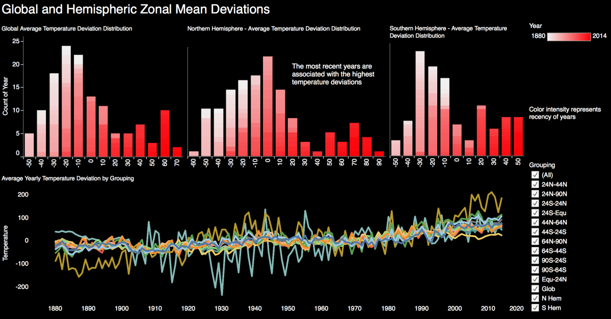
All of the data in this set illustrates that temperature anomalies are increasing from the corresponding 1951-1980 mean temperatures as years progress. Every line graph of readings from meteorological stations shows an upward trend in temperature deviation readings. The distribution bins illustrate that the higher temperature deviations occur in more recent years. The recency of years is indicated by the intensity of the color red.

Let’s break down the visualization:

UIUC Top Portion

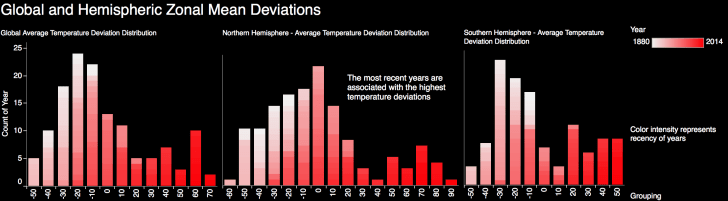
Top Section Distribution Charts:

  • There are three sub-sections representing global, northern hemisphere and southern hemisphere temperature deviations
  • The x axis represents temperature deviations in bins of 10 degrees
  • The y axis is a count of the number of years that fall between the binned temperature ranges
    • For example, if 10 years have a recorded temperature anomaly between 60 and 69 degrees, then the x axis would be 60 and the y axis would be 10

UIUC Distribution Focus.png

  • Each 10 degree bin is comprised of the various years that correspond to a respective temperature anomaly range
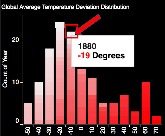
    • For example in the picture above, the year 1880 (as designated by the tooltip) had a temperature anomaly that was 19 degrees lower than the 30 year average. This is why the corresponding box for the year 1880 is not intensely colored.
    • Additionally, the -19 degree anomaly is located in the -10 degree bin (which contains anomalies from -10 to -19 degrees)
    • These aspects are more clearly illustrated when interacting with the Tableau Public dashboard
  • The intensity of the color of red indicates the recency of the year; for example year 1880 would be represented as white while year 2014 would be indicated by a deep red color

Bottom Section Line Graph Chart:

UIUC Bottom Portion

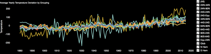
  • The y axis represents the temperature deviation from the corresponding 1951-1980 mean temperatures
  • Each line represents the temperature deviation at a specific geographic location during the 1880-2014 period
  • The x axis represents the year of the temperature reading

UIUC Gobal Average

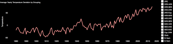
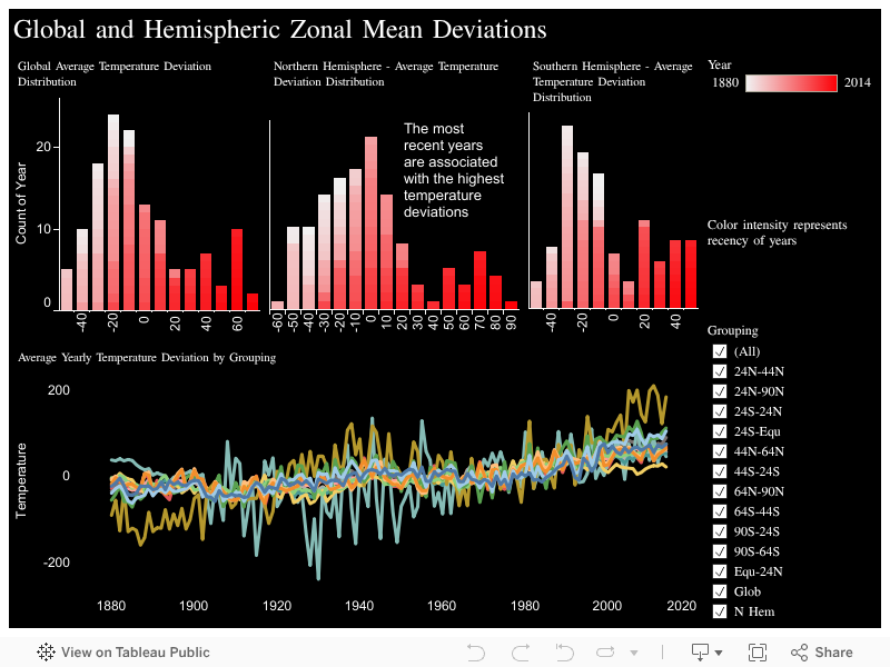
In the above picture I strip out the majority of lines leaving only the global deviation line. Climate science deniers may want to look away as the data clearly shows that global temperatures are rising.

Bottom Line:

All in all I thought it was a decent class covering very theoretical issues regarding data visualization. Practicality is exclusively covered in the exercises as the class does not provide any instruction on how to use any of the tools required to complete the class. I understand the reason as this is not a “How to Use a Software Tool” class.

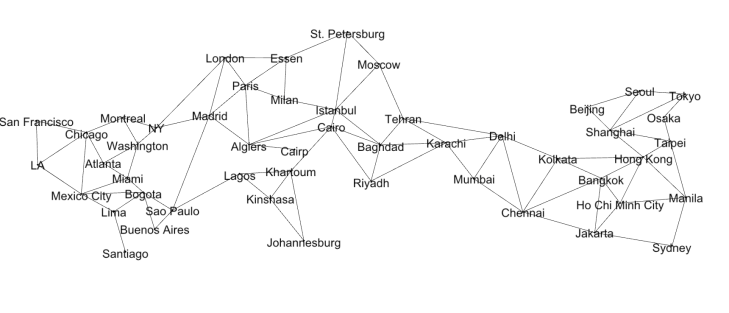
I’d define the exercises as “BYOE” (i.e., bring your own expertise). The class forces you to do your own research in regards to visualization tool instruction. This is especially true regarding the second exercise which requires you to learn how to visualize graphs and nodes. I had to learn how to use a program called Gephi in order to produce a network map of the cities in my favorite board game named Pandemic. The lines between the city nodes are the paths that one can travel within the game.

UIUC Data Viz Week 3

If you’re looking for more practicality and data visualization best practices as opposed to hardcore computer science topics take a look at the Coursera specialization from UC Davis called “Visualization with Tableau”.

In case you were wondering I received at 96% grade in the UIUC course.

My final rating for the class is 3 stars out 5; worth a look.

Advertisement

Coursera Review: Creating Dashboards and Storytelling with Tableau

Discounts Harm Profits

I recently finished the “Creating Dashboards and Storytelling with Tableau” course on Coursera. The course was taught by adjunct faculty at the University of California Davis. Although it is the fourth course of five in the “Data Visualization with Tableau” specialization, it is only the third course that I have taken. I skipped the very basic first course and will concentrate next on finishing the capstone. 

If you do take this course be prepared to put in a fair amount of work on weeks three and four when the dashboard and story project are respectively due. I put in at least five hours of effort on each individual assignment not including watching videos, reading materials and taking quizzes.

I found the storytelling course to be informative and worthwhile. Unlike a Udemy course on Tableau that wades right into the applied aspects of clicking and dragging items, Coursera courses offer more of an academic background on the subject matter.

The point of this course is to hammer home that stories provide context and meaning that can’t be matched by a list of facts. We’re informed that stories engage more of your brain than simply absorbing a list of facts.

We learn that you should always try to make your stories relatable to the viewer so that they personally connect or identify with some aspect of the story. You should find a specific story of a person who exemplifies the larger narrative rather than starting with a lot of general facts and figures.

Politicians employ this tactic all of the time. Instead of spouting off a list of facts about their particular issue, the politician will first paint a picture regarding Joe the small businessman or Jill the single mom. They’ll then discuss how legislation (or lack thereof) will affect their constituents particular situations; in the hope that the listener will relate to the individuals. This is an exercise in using the particular to illuminate the general.

Here are a few of the tips I learned in regard to telling stories with data:

  • Use time based trends and consider a line or bar graph depending upon the data;
  • Use rank ordering (e.g. use a bar graph to rank salespersons by sales);
  • Use data comparisons where appropriate (e.g. polling data showing candidate support over a period of time);
  • Use counter intuitive visualizations (e.g. most people are surprised to learn that the United States has the highest incarceration rate by far amongst OECD countries);
  • Tell stories through relationships (e.g. use scatterplots to illustrate the relationship between sales and profits);
  • Check your facts;
  • Focus on a key statistic or intriguing piece of information;
  • Make your story insightful; don’t leave the audience guessing on what you want them to take away form your presentation;
  • Make your story relatable;

By all means check out my submission for the final project. I illustrated the relationship between discounted orders and profits to show that discounted orders are by far less profitable. This was accomplished by creating a set in Tableau to identify all discounted orders.

Until next class!

See also:

Coursera Final Assignment: Essential Design Principles for Tableau

Coursera Final Project: Data Visualization and Communication with Tableau

Coursera Final Assignment: Essential Design Principles for Tableau

Dashboard 1

I recently completed Essential Design Principles for Tableau offered by the University of California Davis on Coursera. I’ll offer some review commentary. I thought it was a solid class as it covered data visualization concepts such as pre-attentive attributes and the Gestalt principles. This class was a bit more heavy on the conceptual side of the house as opposed to delving into practical Tableau instructions. However, there are other classes in the specialization that have a more hands on practical approach.

In this assignment we had to highlight the three worst performing product Sub-Categories in each region. Additionally, we had to demonstrate how these worst performers compared to other product Sub-Categories in their respective regions. Finally, the visualization had to highlight the three worst performing Sub-Product Categories overall with a color emphasis. The scenario given to the class was that a sales manager had to cut the three worst performing Sub-Categories in her region and needed a visualization that addressed her concerns.

Guidance was not provided on how to identify the three worst performing categories. Some people in the class simply used profit as their key performance indicator (KPI) which I think is misguided. You learn in business (or business education) that profits do not equal profitability.  From Investopedia:

Profitability is closely related to profit, but it is the metric used to determine the scope of a company’s profit in relation to the size of the business. Profitability is a measurement of efficiency – and ultimately its success or failure. It is expressed as a relative, not an absolute, amount. Profitability can further be defined as the ability of a business to produce a return on an investment based on its resources in comparison with an alternative investment. Although a company can realize a profit, this does not necessarily mean that the company is profitable.

For these reasons I used the Average Profit Ratio of the products in each Sub-Category as my KPI as opposed to raw profits. If you had to sell $100,000 of product A to make $1,000 in profit (1% profit ratio), would you eliminate product B which requires $1000 in sales to generate $500 in profit (50% profit ratio)? Only if you want to go out of business!

In order to complete the visualization you see above on Tableau Public I had to incorporate nested sorting principles and also highlight the three worst performing elements on a bar chart. Luckily for you, I have videos that will demonstrate how to accomplish these tasks.

You can check out the rest of my videos on my Youtube Channel or find them on this site under Videos.

Anthony Smoak Final Project: Data Visualization and Communication with Tableau


I recently earned a verified course certificate from Coursera in the “Data Visualization and Communication with Tableau” class. This class is the 3rd offered in the “Excel to MySQL: Analytic Techniques for Business” Coursera Specialization. I’m looking forward to taking a couple more MOOCs dealing with Tableau and visualization to supplement and reinforce existing knowledge. I would recommend the class to anyone looking to frame an analysis and learn a good bit about using Tableau.