Tableau Dashboard Layouts: Master the Art of Containers

The Wait is Over. Watch this Tableau Dashboard Container Layout Video!

This video was a long time coming. If you’ve ever dealt with layout containers in Tableau (which are about as intuitive as a Thomas Pynchon novel) you know they can leave you scratching your head if you’re new to the tool. And yes, I do own a copy of Gravity’s Rainbow.

Luckily for you I was up I was up at 2:30 a.m. on a Sunday recording the second part of my popular Tableau dashboard tutorial, because that’s how passionate (and stubborn) I am about providing you educational videos of value. Quality over Quantity!

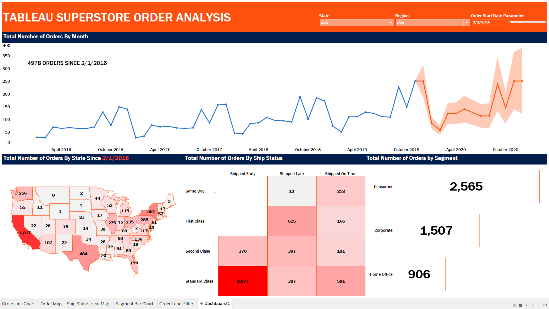
Watch the preview video above, you’ll observe that I’m teaching you a step-by-step breakdown of how I laid out the visual components for an advanced Tableau dashboard using layout containers. This is part two of the series, and while you can absolutely follow along here, the full experience (with all the dashboard elements, charts, and finishing touches) is available to members of my YouTube channel.

I demonstrate a floating container technique that I learned from Curtis Harris’s excellent video on the subject (look up “Things I Know About Tableau Layout Containers” on YouTube).

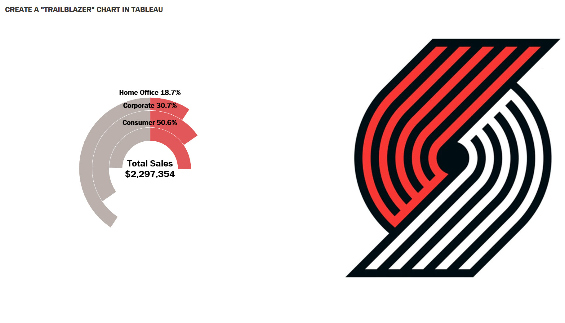
Before I forget, I want to give a shout out to Dmitry Shirikov, whose original design I reverse engineered and rebuilt (with his permission), and Murilo Cremon for original overall inspiration.

Let’s get into what I actually did.

What You’ll Miss If You Don’t Watch the Full Video

There’s much that you won’t fully grasp until you see it in action in the video. Things like:

  • How I embedded a YouTube link in an image element
  • The way I sequence container stacking to prevent the annoying TILE factor
  • How to work around Tableau’s quirks when resizing and aligning objects
  • What I do when Tableau auto-adds objects I don’t want
  • And most importantly, how all the complex pieces come together to form a professionally polished dashboard

All of this is explained in detail in the full tutorial video, available to my channel members.

Your Next Steps

If you’ve been struggling with dashboard layouts, or you’ve watched my first Tableau dashboard build and you’ve been waiting forever for part 2, here’s what I recommend:

  1. Rewatch Part 1 of this tutorial series (it’s free on my channel).
  2. Follow-along and implement the container techniques I’ve outlined here.
  3. Consider becoming a member to access the full Part 2 tutorial which clocks in at 45 minutes!
  4. Download and admire the actual Dashboard from Tableau Public.

Join the Channel, Build Better Dashboards

Becoming a member supports the channel and helps me keep making high-quality Tableau content. Tutorials like this take hours of research, recording, editing, and production. I don’t mind putting in the work because I know how much value it provides (thank you for all your wonderful comments, I read them all) but your support goes a long way.

Thanks for rocking with me all these years; now get out there and do some great things with your data!

-Anthony Smoak

I appreciate everyone who has supported this blog and my YouTube channel.

Stay in contact with me through my various social media presences.

Click here to Join my YouTube channel to get access to value added bonus videos and behind the scenes posts.

Increase SQL Query Performance with Indexes

I have always recommended that if you develop SQL based analytics, you should have some understanding of indexes when it comes to speeding up queries.

Sometimes we do not have access to create indexes on the physical tables (especially in a production environment), but approaching your DBA with some basic knowledge of indexing will put you ahead of the game.

if your queries are running longer than they need to be, it’s time to speed them up with some strategic indexing. Very briefly, here’s how you can fix your slow running query issues via indexing your tables.

Step 1: Implement a Covering Index Strategy 

A covering index includes all the columns referenced in your SELECT or WHERE clauses. This means the database engine can fulfill your query using just the index, without having to access the base table data. This act can drastically reduce query execution time and improve your data visualization processes if needed. The following is an example of TSQL code for MS SQL Server demonstrating a covering index using the INCLUDE keyword:


— Creates a nonclustered index on the Person.Address table with four included (non-key) columns.
— index key column is PostalCode and the non-key columns are
— AddressLine1, AddressLine2, City, and StateProvinceID.

CREATE NONCLUSTERED INDEX IX_Address_PostalCode
ON Person.Address (PostalCode)
INCLUDE (AddressLine1, AddressLine2, City, StateProvinceID);

Step 2: Utilize Clustered Indexes 

Clustered indexes should typically be applied to your primary key column. A clustered index sorts and stores the data rows in the table based upon the key values. This organization is particularly efficient for queries that retrieve a range of values.

Step 3: Apply Non-Clustered Indexes 

Non-clustered indexes are typically applied to foreign keys. These indexes create a separate structure that points back to the base data rows in the table. They are ideal for speeding up queries that involve joins, which are common in business intelligence operations. 

Find the Sweet Spot 

With indexing, balance is key. Under-indexing can cause your queries to run longer, while over-indexing can negatively impact data insertion and updates. Striking the right balance ensures your queries remain efficient without compromising the performance of other operations. 

Indexing Rule #4080: If it’s linked by it, filtered by it, or sorted by it….index by it.

(I saw that rule on a reddit forum once, and thought it made perfect sense. The 4080 reference is for my ATCQ fans.)

If you want more detail on indexing, you can read this blog post here. I wrote it a few years ago, but it is old gold, still valuable!

I appreciate everyone who has supported this blog and my YouTube channel via merch. Please check out the logo shop here.

Stay in contact with me through my various social media presences.

Join my YouTube channel to get access to perks:
https://www.youtube.com/channel/UCL2ls5uXExB4p6_aZF2rUyg/join

Know These SQL Concepts for your Data Interview

Over the years I have conducted a number of interviews with candidates who claimed to know SQL, but could not clearly verbalize their understanding of some basic concepts. I want you to understand these following concepts at a minimum, so your next SQL interview isn’t cut short.

First, distinguish between a left outer join and an inner join. A left outer join retrieves all records from the left table and returns only the matched records from the right table. On the other hand, an inner join retrieves only the matched records from both tables.

Next, familiarize yourself with the WHERE clause versus the HAVING clause. Use the WHERE clause to filter records before any groupings are made, while the HAVING clause filters records after grouping. This understanding will enable you to filter your data correctly. 

Also, understand the difference between the UNION and UNION ALL statements. UNION removes duplicate records, whereas UNION ALL includes all records, duplicates and all.

Be ready to discuss Common Table Expressions (CTEs) versus temporary tables for ease of query writing and to forgo complicated sub-queries. CTEs are best used for readability, while temp tables are physically stored in memory (allowing for the use of indexes if necessary to optimize performance).

Understanding clustered indexes versus non-clustered indexes is vital for query performance. Clustered indexes sort and store data rows in the table based upon key values, while non-clustered indexes create a separate structure with efficient pointers back to the base table. 

Lastly, ensure your queries are sargable (Search ARGument ABLE). Sargable queries use indexes efficiently, improving performance, unlike non-sargable queries, which slow down data retrieval. 

I appreciate everyone who has supported this blog and my YouTube channel via merch. Please check out the logo shop here.

Stay in contact with me through my various social media presences.

Join my YouTube channel to get access to perks:
https://www.youtube.com/channel/UCL2ls5uXExB4p6_aZF2rUyg/join

Create a Stunning Advanced Dashboard in Tableau

Since Tableau Public was recently upgraded to enable local saving (It’s about time), I decided to look and see what new dashboards were out there that I could learn from, and subsequently teach others to rebuild. My mantra is that you learn the most, by teaching others.

I did find the perfect dashboard built by Dmitry Shirikov on his Tableau Public page! There are also design elements from a dashboard created by Murilo Cremon so I tip my cap to him as well.

I reached out to Dmitry via Linkedin and asked for his permission to use this dashboard as a teaching tool for video lessons and he graciously gave me permission. This further demonstrates the collaborative spirit that thrives on Tableau Public. I offer a big thank you to Dmitry!

What I like about his dashboard is the use of the standard Tableau standard superstore dataset combined with interactive/dynamic year over years metrics and thoughtful design.

It contains deceptively simple KPIs, intermediate level metric swapping and a button selector process that relies on parameter actions. Parameter actions update the value of a parameter based on a user interacting with the marks in the view (in this case, the Sales, Profit or Orders dimensions).

I spent a great deal of after-work and weekend time researching how to put this dashboard back together and rebuilt it piece by piece so I could understand what was done.

It also took some time to record and edit this video as it is coming in at over an hour in length! I can’t believe I put this much time and effort into a free product!

My hope is that by dissecting the dashboard and teaching you how to build the chart elements, you can gain some valuable dashboard building insights to add to your repertoire.

If you think a part 2 video regarding the actual dashboard layout will be valuable, please leave a comment on my YouTube channel!

Your Next Steps

Here’s what I recommend:

You can also watch a preview of Part 1 here:

I appreciate everyone who has supported this blog and my YouTube channel via merch. Please check out the logo shop here.

Stay in contact with me through my various social media presences.

Join my YouTube channel to get access to perks:
https://www.youtube.com/channel/UCL2ls5uXExB4p6_aZF2rUyg/join

Thank you!!

Anthony B Smoak

Create Stacked Area Chart Totals In Tableau

In this video, we’re going to tackle an interesting little challenge – adding dynamic totals to stacked area charts in Tableau. While this may not be a technique for production-ready charts, it’s perfect for those one-time presentations or exports to PowerPoint.

Recently, I had a fantastic 90-minute private data tutoring session with someone who contacted me via this website. During this session, we worked together to address three different data issues, one of which was the quest to display totals for stacked area charts. With some creative thinking and a dash of Tableau magic, I found a solution that I’m excited to share with you.

Use the timestamps below to navigate directly to your desired point in the video.

  • 0:43 Intro to Area Chart
  • 1:38 Chart Build
  • 2:38 Totals by Year
  • 4:14 Dashboard Layout
  • 5:19 Fixed LOD Formulas
  • 6:35 Bonus Tip

If you’re “short” on time and want to see the 1 minute version, I have you covered as well

I appreciate everyone who has supported this blog and my YouTube channel via merch. Please check out the logo shop here.

Stay in contact with me through my various social media presences.

Thank you!!

Anthony B Smoak

Passing Parameter Values from Excel to SQL Server

If you’re working with data in Excel and need to connect to a SQL Server database, there are a couple of ways to pass parameter values from Excel to SQL Server. In my first video, “Passing Parameter Values from Excel to SQL Server,” I show you how to connect to SQL Server and read values from a cell and pass those values to a native SQL query without using parameters.

Advantage: The first approach has the advantage of being quick and easy to implement. This is because it does not require any additional setup or configuration, such as creating stored procedures in SQL Server. Instead, the values are passed directly to the query, which can be executed immediately.

However, this approach can also be prone to SQL injection attacks, where a hacker inputs malicious SQL code into an input field in order to gain unauthorized access to the database.

Verdict: Speed over Security. Good for Ad-Hoc personal use.

In my second video, “Call a SQL Server Stored Procedure using Excel Parameters,” I demonstrate how to connect to SQL Server from Excel and pass cell values from Excel to SQL Server using a stored procedure. This approach is more secure because the values are passed to a stored procedure rather than a query. It simply requires the setup of a stored procedure in SQL Server, and I show you two ways to accomplish this feat.

Advantage: Stored procedures provide an added layer of security because they can be set to execute with specific permissions, and can be audited for changes and usage. This makes it harder for an attacker to gain unauthorized access to the database or to execute malicious SQL commands.

However, the potential small disadvantage of this approach is that the stored procedures will need to be updated and managed separately from the Excel file.

If you’re new to working with SQL Server and Excel, I recommend watching both videos. The first video will give you a good overview of the basics, while the second video will show you a more secure way to pass parameter values.

I always have fun creating this type of content and sharing with you, my YouTube channel followers.

You can also follow my dapper data adventures on Instagram.

All views and opinions are solely my own and do not necessarily reflect those of my employer

I appreciate everyone who has supported this blog and my YouTube channel via merch. Please check out the logo shop here.

Thank you!!

Anthony B Smoak

How to Create a Dashboard in Tableau

I took the time to produce a dashboard series that would get a relatively new Tableau user up to speed in very little time. I put together the “Goldilocks” videos I wish I had when I was a novice; not too short but long enough to hammer the concepts home.

In the first video, I dive head first into constructing four basic charts that I believe every data user should know how to put together. You will watch me demonstrate how to put together the following charts:

Line Chart with Forecast

Tableau Dashboard Line Chart

The shaded area is a time series forecast predicting the number of orders for the year 2020.

Map

Tableau Dashboard Map

Heat Map

Tableau Dashboard Heat Map

Bar Chart

Tableau Dashboard Bar Chart

In the second video, I’ll cover the layout and formatting of the dashboard, as well as adding a little interactivity. When the user hovers the cursor over the Line Chart, all of the other charts will update to reflect the number of orders represented since the selected month and year.

Full Dashboard

Tableau Dashboard

Watch Part 1 to Build the Component Charts

Watch Part 2 for Layout and Interactivity

What You need:

  • Either Tableau or Tableau Desktop
  • Data set: Tableau Superstore Data (can be found all over the internet with a simple Google search).

Do some great things with your data!

If you find this type of instruction valuable make sure to subscribe to my Youtube channel. All views and opinions are mine alone, independently researched and do not necessarily represent those of my employer.

Tableau Bar Chart: Combining Small Values

In this video we’ll learn how to build a bar chart visualization that combines values below a certain threshold into an “OTHER” bucket. This technique is very useful when limiting the number of bars to show on your visualization while not losing sight of all the smaller values.

  • Using standard Tableau Superstore data, we’ll calculate the percentage of sales that are generated by each individual state.
  • We’ll then use a parameter to set a percentage threshold where all states below this percentage will be combined.
  • This technique also requires the use of sets and Fixed LODs.

This technique allows us to combine all states below a certain threshold (e.g., 2%) into one single bar chart showing a combined 24%.

Bar Chart Below Threshold Thumb 01

I have to give credit where credit is due to Ann Jackson for sharing this technique at TC19!

Feel free to interact with the viz and download the workbook on Tableau public:

As always, If you find this type of instruction valuable make sure to subscribe to my Youtube channel.

All views and opinions are solely my own and do NOT necessarily reflect those of my employer.

Build a Stacked Donut Chart in Tableau

Have you ever wanted to stack 4 pie charts on top of each other to build a visual? Let’s have some fun building out a stacked donut chart or a “TrailBlazer” chart as I call it due to its likeness to a particular NBA team’s logo.

Stacked Donut Chart Thumb

Portland Trailblazers anyone?

Stacked Donut vs Trailblazer

In order to build out this chart I used an innovative technique shared by Simon Runc on the Tableau forums. Feel free to check out that post here.

Using Tableau’s Sample Superstore Data, Simon came up with an innovative use of the INDEX() function and the Size functionality to create three different pie charts that each show a respective percentage of a measure (in this case Sales) to the Total amount of the measure.

For example, the chart highlights in red the percentage of Consumer Sales as a percentage of all segment sales (i.e., Consumer + Corporate + Home Office). The grey portions represent all other sales, other than the segment of interest.

The trick to this approach is using the Index function to create a pie chart per segment. For example Consumer is assigned a value of 1, Corporate a value of 2 and Home Office is assigned 3. When the INDEX() value is placed on size, the three different charts are assigned sizes where one is slightly larger than the next.

Stacked Donut Raw 2

With a little division and axis customization, the three segments are placed on top of each other to provide a stacked pie chart effect. The hole is courtesy of the standard methodology for creating a donut chart which involves a dual axis.

It makes much more sense when you see it in action so make sure to watch the video!

Here is an example of the raw stacked donut chart before the “TrailBlazer” formatting.

Stacked Donut Raw

Feel free to interact with the viz and download the workbook on Tableau public:

As always, If you find this type of instruction valuable make sure to subscribe to my Youtube channel.

Definitely check out other posts of interest for building donut charts in Tableau:

All views and opinions are solely my own and do NOT necessarily reflect those of my employer.

Make Visually Appealing Maps in Tableau with Mapbox

The default maps in Tableau are just fine but sometimes you need to kick up the flamboyancy factor in your visuals. Integrating maps from Mapbox with Tableau is the perfect way to add some Liberace flash to your development game.

Mapbox is an open source mapping platform for custom designed maps.  By creating an account with Mapbox, you can either design your own maps on the platform or use their preset maps, which are all more impressive than the out of the box option in Tableau.

All you need to do is enter your generated API token (provided by Mapbox) into Tableau’s Map Services interface and you’ll have access to some pretty impressive mapping options.

If you’re interested in Business Intelligence & Tableau subscribe to my  Youtube channel.