
Have you ever wanted to stack 4 pie charts on top of each other to build a visual? Let’s have some fun building out a stacked donut chart or a “TrailBlazer” chart as I call it due to its likeness to a particular NBA team’s logo.

Portland Trailblazers anyone?

In order to build out this chart I used an innovative technique shared by Simon Runc on the Tableau forums. Feel free to check out that post here.
Using Tableau’s Sample Superstore Data, Simon came up with an innovative use of the INDEX() function and the Size functionality to create three different pie charts that each show a respective percentage of a measure (in this case Sales) to the Total amount of the measure.
For example, the chart highlights in red the percentage of Consumer Sales as a percentage of all segment sales (i.e., Consumer + Corporate + Home Office). The grey portions represent all other sales, other than the segment of interest.
The trick to this approach is using the Index function to create a pie chart per segment. For example Consumer is assigned a value of 1, Corporate a value of 2 and Home Office is assigned 3. When the INDEX() value is placed on size, the three different charts are assigned sizes where one is slightly larger than the next.
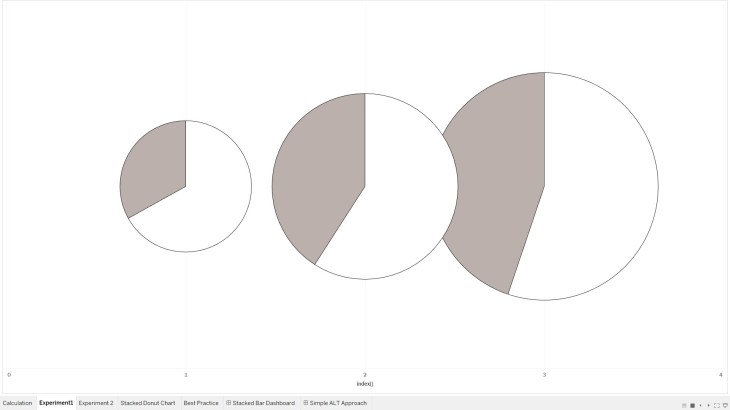
With a little division and axis customization, the three segments are placed on top of each other to provide a stacked pie chart effect. The hole is courtesy of the standard methodology for creating a donut chart which involves a dual axis.
It makes much more sense when you see it in action so make sure to watch the video!
Here is an example of the raw stacked donut chart before the “TrailBlazer” formatting.

Feel free to interact with the viz and download the workbook on Tableau public:
As always, If you find this type of instruction valuable make sure to subscribe to my Youtube channel.
Definitely check out other posts of interest for building donut charts in Tableau:
All views and opinions are solely my own and do NOT necessarily reflect those of my employer.
