Tableau for Marketing: Become a Segmentation Sniper

This article is a guest post.

Did you know that Netflix has over 76,000 genres to categorize its movie and tv show database? Genres, rather micro-genres, could be as granular as “Asian_English_Mother-Son-Love_1980.” This is the level of granularity to which Netflix has segmented its product offerings; i.e, movies and shows.

But do you think this level of segmentation is warranted?

I think the success of Netflix answers this question. Netflix is considered to have one of the best recommendation engines. They’ve even hosted a competition on Kaggle and offered a prize money of USD 1 million to the team beating their recommendation algorithm. This shows the sophistication and advanced capabilities developed by the company on its platform. This recommendation tool is nothing but a segmentation exercise to map the movies and users. Sounds easy, right?

Gone are the days when marketers used to identify their target customers based on their intuition and gut feelings. With the advent of big data tools and technologies, marketers are relying more and more on analytics software to identify the right customer with minimal spend. This is where segmentation comes into play and makes our lives easier. So, let’s first understand what is segmentation? and why do we need segmentation?

Segmentation, in very simple terms, is the grouping of customers in such a way that they have similar traits and attributes. The attributes could be in terms of their likings, preferences, demographic features or socio-economic behavior. Segmentation is mainly applied to customers, but it can refer to products as well. We will explore a few examples as we move ahead in the article.

With tighter marketing budgets, increasing consumer awareness, rising competition, easy availability of alternatives and substitutes, it is imperative to use marketing budgets to prudently to target the right customers, through the right channel, at the right time and offer them the right set of products. Let’s look at an example and understand why segmentation is important for marketers.

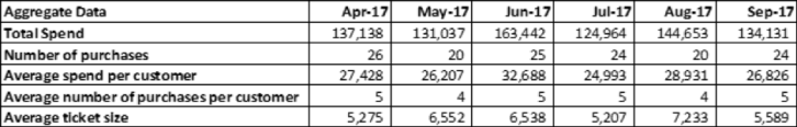
There is an e-commerce company which is launching a new service for a specific segment of customers who shop frequently and whose ticket size is also high. For this, the company wants to see which all customers to target for the service. Let’s first look at the data at an aggregate level and then further drill down to understand in detail. There are 5 customers for whom we want to evaluate the spend. The overall scenario is as follows:

Chart1

Should the e-commerce company offer the service to all the five customers?

Who is the right customer to target for this service? Or which is the right customer segment to target?

We will see the details of each of the customers and see the distribution of data.

2

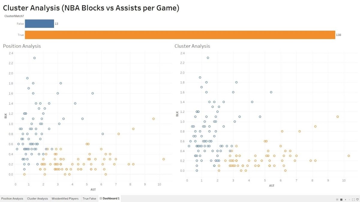
Looking at the data above, it looks like Customer 1 and Customer 2 would be the right target customers for company’s offering. If we were to segment these 5 customers into two segments, then Customer 1 and Customer 2 would fall in one segment because they have higher total spend and higher number of purchases than the other three customers. We can use Tableau to create clusters and verify our hypothesis. Using Tableau to create customer segments, the output would look like as below.

3

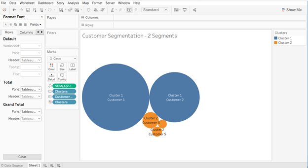
Customer 1 and customer 2 are part of cluster 1; while customer 3, customer 4 and customer 5 are part of cluster 2. So, the ecommerce company should focus on all the customers falling into cluster 1 for its service offering.

Let’s take another example and understand the concept further.

We will try to segment the countries in the world by their inbound tourism industry (using the sample dataset available in Tableau). Creating four segments we get the following output:

4

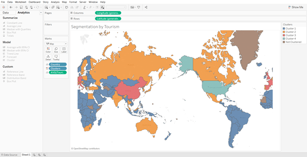
There are few countries which do not fall into any of the clusters because data for those countries is not available. Looking at clusters closely, we see that the United States of America falls in the cluster 4; while India, Russia, Canada, Australia, among others fall in the cluster 2. Countries in the Africa and South America fall in the cluster 1; while the remaining countries fall in the cluster 3. Thus, it makes it easier for us to segment countries based on certain macro-economic (or other) parameters and develop a similar strategy for countries in the same cluster.

Now, let’s go a step further and understand how Tableau can help us in segmentation.

Segmentation and Clustering in Tableau

Tableau is one of the most advanced visualization and business intelligence tools available in the market today. It provides a lot of interactive and user-friendly visualizations and can handle large amounts of data. It can handle millions of rows at once and provides connection support to almost all the major databases in the market.

With the launch of Tableau 10 in 2016, the company offered a new feature of clustering. Clustering was once considered a technique to be used only by statisticians and advanced data scientists, but with this new feature in Tableau it becomes as easy as simple drag and drop. This feature can provide a big support to marketers in segmenting their customers and products, and get better insights.

Steps to Becoming a Segmentation Sniper

Large number of sales channels, increase in product options and rise in advertisement cost has made it inevitable not only for marketers but for almost all the departments to analyze customer data and understand their behavior to maintain market position. We will now take a small example and analyze the data using Tableau to understand our customer base and zero-in on the target customer segment.

There is a market research done by a publishing company which is mainly into selling of business books. They want to further expand their product offerings to philosophy books, marketing, fiction and biographies. Their objective is to use customer responses and find out which age group like which category of books the most.

For an effective segmentation exercise, one should follow the below four steps.

  1. Understand the objective
  2. Identify the right data sources
  3. Creating segments and micro-segments
  4. Reiterate and refine

We will now understand each of the steps and use Tableau, along with, to see the findings at every step.

  1. Understand the objective

Understanding the objective is the most important thing that you should do before starting the segmentation exercise. Having a clear objective is the most imperative thing because it will help you channelize your efforts towards the objective and prevent you from just spending endless hours in plain slicing and dicing. In our publishing company example, the objective is to find out the target age group which the company should focus on in each of the segments, namely philosophy, marketing, fiction and biography. This will help the publishing company in targeting its marketing campaign to specific set of customers for each of the genres. Also, it will help the company in identifying the target age group that like both business and philosophy or business and marketing, or similar other groups.

  1. Identify the right data sources

In this digital age, data is spread across multiple platforms. Not using the right data sources could prove to be as disastrous as not using analytics at all. Customer data residing in CRM systems, operational data in SAP systems, demographic data, macro-economic data, financial data, social media footprint – there could be endless list of data sources which could prove to be useful in achieving our objective. Identifying right variables from each of the sources and then integrating them to form a data lake forms the basis of further analysis.

In our example, dataset is not as complex as it might be in real life scenarios. We are using a market survey data gathered by a publishing company. The data captures the age of customer and their liking/disliking for different genres of books, namely philosophy, marketing, fiction, business and biography.

  1. Creating segments and micro-segments

At this stage, we have our base data ready in the analyzable format. We will start analyzing data and try to form segments. Generally, you should start by exploring relationships in the data that you are already aware of. Once you establish few relationships among different variables, keep on adding different layers to make it more granular and specific.

We will start by doing some exploratory analysis and then move on to add further layers. Let’s first see the results of the market survey at an aggregate level.

5

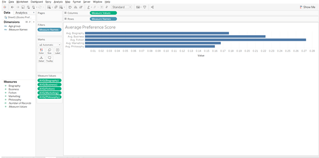
From the above analysis, it looks like fiction is the most preferred genre of books among the respondents. But before making any conclusions, let’s explore a little further and move closer to our objective.

If we split the results by age group and then analyze, results will look something like the below graph.

6

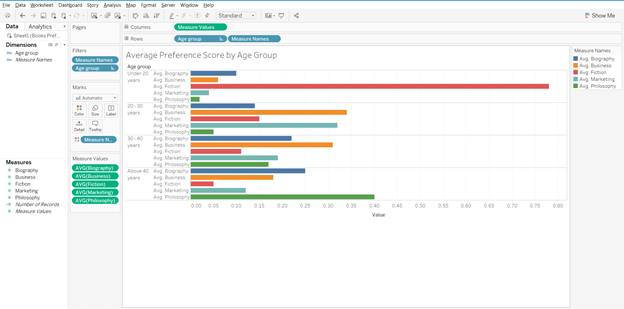
In the above graph, we get further clarity on the genre preferences by respondents. It gives us a good idea as to which age group prefers which genre. Fiction is most preferred by people under the age of 20; while for other age groups fiction is not among the top preference. If we had only taken the average score and went ahead with that, we would have got skewed results. Philosophy is preferred by people above the age of 40; while others prefer business books.

Now moving a step ahead, for each of the genre we want to find out the target age group.

7

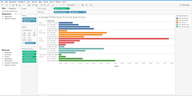
The above graph gives us the target group for each of the genres. For biography and philosophy genres, people above the age of 40 are the right customers; while for business and marketing, age group 20-30 years should be the target segment. For fiction, customers under the age of 20 are the right target group.

Reiterate and refine

In the previous section, we created different customer segments and identified the target segment for publishing company. Now, let’s say we need to move one more step ahead and identify only those age groups and genres which have overlap with business genres. To put it the other way, if the publishing company was to target only one new genre (remember, they already have customer base for business books) and one age group, which one should it be?

Using Tableau to develop a relation amongst the different variables, our chart should look like the one below.

8

Starting with the biography genre, age group 30-40 years comes closest to our objective, i.e., people in this age group like both biography and business genre (Biography score – 0.22, Business score – 0.31). Since, we have to find only one genre we will further explore the relationships.

For fiction, there is no clear overall with any of the age groups. For marketing, age group 20-30 year looks to be clear winner. The scores for the groups are – marketing – 0.32, business – 0.34. The relation between philosophy and business is not as strong as it is for business and marketing.

To sum it up, if the publishing company was to launch one more genre of books then it should be marketing and target customer group should be in the range of 20-30 years.

Such analysis can be refined further depending on the data we have. We can add gender, location, educational degree, etc. to the analysis and further refine our target segment to make our marketing efforts more focused.

I think after going through the examples in the article, you can truly appreciate the level of segmentation that Netflix has done and it clearly reflects the reason behind its success.

Author Bio:

Vishal Bagla, Chaitanya Sagar, Saurabh Sood and Saneesh Veetil contributed to this article.

Add Totals to Stacked Bar Charts in Tableau


In this video I demonstrate a couple of methods that will display the total values of your stacked bar charts in Tableau. The first method deals with a dual axis approach while the second method involves individual cell reference lines. Both approaches accomplish the same objective. Hope you enjoy this tip!

If you’re interested in Business Intelligence & Tableau subscribe and check out my videos either here on this site or on my Youtube channel.

Tableau K-Means Clustering Analysis w/ NBA Data

Interact with this visualization on Tableau Public.

In this video we will explore the Tableau K-Means Clustering algorithm. K-Means Clustering is an effective way to segment your data points into groups when those data points have not explicitly been assigned to groups within your population. Analysts can use clustering to assign customers to different groups for marketing campaigns, or to group transaction items together in order to predict credit card fraud.

In this analysis, we’ll take a look at the NBA point guard and center positions. Our aim is to determine if Tableau’s clustering algorithm is smart enough to categorize these two distinct positions based upon a player’s number of assists and blocks per game.

Nicola Jokic is a Statistical Unicorn

If you also watch the following video you’ll understand why 6 ft. 11 center Nikola Jokic is mistakenly categorized as a point guard by the algorithm. This big man can drop some dimes!

If you’re interested in Business Intelligence & Tableau subscribe and check out my videos either here on this site or on my Youtube channel.

Ranking Banks by Number of Complaints

I recently downloaded a dataset from the Consumer Finance Protection Bureau (CFPB) in order to construct a handy visualization. The CFPB maintains a database that houses a collection of complaints on a range of consumer financial products and services that are sent to companies for a response.

Per the CFPB, “the database also includes information about the actions taken by the company in response to the complaint, such as, whether the company’s response was timely and how the company responded.”

Although the database is updated daily, I chose to visualize information from the complete year of 2017. In fairness to the financial institutions, company level information should be considered in context of company size and/or market share.

Financial institutions analyze this information frequently as a way of understanding and continuously improving their customer service.

I highly recommend “The Big Book of Dashboards” by Jeffrey Shaffer, Andy Cotgreave and Steve Wexler. The book contains a number of visualization examples that provide guidance on dashboard creation for any number of business use cases. In this Tableau Public dashboard I relied heavily on the visual guidance for their Complaints Dashboard as you can observe.

Screen Shot 2018-06-03 at 10.02.14 PM

Complaints Dashboard from “The Big Book of Dashboards”

Click on the picture link to view the dashboard on Tableau Public (not optimized for mobile).

Dashboard 1

If you’re interested in Business Intelligence & Tableau subscribe and check out my videos either here on this site or on my Youtube channel.

Create Multiple KPI Donut Charts in Tableau

In honor of National Doughnut Day (June 1st), let’s devour this sweet Tableau tip without worrying about the calories. In this video I we will create a multiple donut chart visualization that will display the sum of profits by a region. Then we’ll use the donuts as a filter for a simple dashboard. Once you finish watching this video you’ll know how to create and use donut charts as a filter to other information on your dashboard.

I know that donuts are not considered best practice, (especially when negative numbers are involved) but they have their uses. Assuming you know that bar charts are a best practice, it never hurts to learn other techniques that add a little “flair” from the boring world of bar charts.

Have you ever looked at a Picasso painting? Obviously Picasso was well versed in painting best practices (understatement) but in some of his art, the people are not rendered in the best practice. Always learn the best practices, but know when to leave them behind and add a little flair! (In no way am I comparing myself to Picasso).

Three-Musicians-By-Pablo-Picasso

Three Musicians – Pablo Picasso

Three Musicians by Picasso is not best practice but it is a work of art!

If you’re interested in Business Intelligence & Tableau subscribe and check out my videos either here on this site or on my Youtube channel.

How to Use Jittering in Tableau (Scattered Data Points)


In this video I will explain the concept of jittering and how to use it to scatter your data points in Tableau. In a normal box plot Tableau data points are stacked on top of each other which makes it more difficult to understand positioning. By using this simple tip combining a calculated field a parameter, you will be on your way to gaining a better understanding of your data points. We’re going to get our “Moneyball” on by analyzing average NBA player points per game in the 2016 season.

If you’re interested in Business Intelligence & Tableau subscribe and check out my videos either here on this site or on my Youtube channel.


Add a Reset All Filters Button to Your Tableau Dashboard

Click on the picture to Interact with this visualization:

Help users navigate your Tableau dashboard with less effort. In this video I will show you how to create a “Reset All Filters” button on a Tableau dashboard. We achieve the desired effect by using a Tableau action that runs on select of a mark.

The data I am using for illustration purposes is primarily sourced from Mockaroo.com and is loosely based upon data from an actual client of mine. All vendor names, dates, amounts and other data are changed substantially from original form. Feel free to contact me if you need an analysis of your Accounts Payable ERP data from PeopleSoft, JD Edwards or any other source!

If you’re interested in Business Intelligence & Tableau subscribe and check out my videos either here on this site or on my Youtube channel.

Create a Hex Map in Tableau the Easy Way

There are may different ways to create a hex map in Tableau. The hex map helps visualize state geographic data at the same size which helps to overcome discrepancies that make smaller states harder to interpret. Also, larger states (e.g. Alaska) can overwhelm a traditional map with their size.

I’ve found that the quickest and easiest way to build a hex map is to leverage a pre-built shape file. Shape files can be found at various open data sources like census.gov or data.gov.

In this video I will use a shape file created by Tableau Zen Master Joshua Milligan who runs the blog vizpainter.com. He has a blog post where you can download the shape file I reference. Hats off to Joshua for creating and sharing this great shape file!

Tableau Quadrant Analysis Part 2: Dynamic Quadrants

There are a couple of tweaks that can be made to the Quadrant Analysis video I showed you earlier. We can enhance upon the first iteration of the analysis by making the visualization interactive. I will create parameter driven quadrants where the reference lines are not static at a 50% intersection.

You can tweak the instructions to suit your actual visualization as necessary, but the concepts will remain the same.

We’re going to create two new parameters and have those parameters dynamically control the placement of our reference lines. Then we’re going to update the calculated field which defines the color of each data point or mark, with the parameters we created. In this manner, the colors of each mark will dynamically update as the references lines are adjusted.

To put this in English, as you change the parameter values, the reference lines will move and the mark colors will update.

Watch the video above and/or follow along with the instructions below.

Remove Existing Reference Lines:

Step 1:

  • Remove all existing reference lines from the original quadrant analysis. Simply right click on a reference line and select “Remove”.
  • Also remove the annotations from the 4 quadrants.

Create Parameters

Step 2:

  • Create a parameter named “Percentile FG Pct” (without quotes). Select the dropdown triangle next to “Find Field” icon and choose “Create Parameter”.

QA2

Make sure your parameter is setup as a “Float” and the Range of values reflects the picture below. The Display Format will be set as “Percentage” with zero decimal places.

QA3.png

Step 3: Duplicate Your Parameter

  • Right click on your new parameter and select “Duplicate”.
  • Right click on “Percentile Wins” and select “Edit”.
  • Name the new parameter “Percentile Wins”.

Step 4: Show the Parameters Controls

  • Right click on each parameter and select “Show Parameter Control”.
  • Right click on each drop down triangle in the upper right corner of the Parameter Control and select “Slider”.

QA4

Step 5: Add Reference Lines

  • Right click on the Percentile of FG% Axis at the bottom of the viz. Select “Add Reference Line”. The Line Value should refer to the X axis parameter (i.e. Percentile FG Pct). For the Line Formatting I choose the third dashed lined option.

QA5

  • Right click on the Percentile of Wins Axis on the left side of the viz. Select “Add Reference Line”. The Line Value should refer to the Y axis parameter (i.e. Percentile of Wins).

At this point you should have two parameter controls that adjust the placement of the respective reference lines on the visualization.

However, you’ll notice that the colors of the marks do not change as the reference lines move in increments.

Step 6: Edit the original calculated field to use parameters instead of hardcoded percentage values

Right click on the calculated field (i.e. “Color Calc” in my case), select “Edit” and change all references of “.5” to the corresponding parameter name.

  • The original calculated field:

IF RANK_PERCENTILE(SUM([FG%])) >= .5 AND RANK_PERCENTILE(SUM([Wins])) >= .5 THEN ‘TOP RIGHT’

ELSEIF RANK_PERCENTILE(SUM([FG%])) < .5 and RANK_PERCENTILE(SUM([Wins])) >= .5 THEN ‘TOP LEFT’

ELSEIF RANK_PERCENTILE(SUM([FG%])) < .5 and RANK_PERCENTILE(SUM([Wins])) < .5 THEN ‘BOTTOM LEFT’

ELSEIF RANK_PERCENTILE(SUM([FG%])) >= .5 and RANK_PERCENTILE(SUM([Wins])) < .5 THEN ‘BOTTOM RIGHT’

ELSE ‘OTHER’

END

Is edited to become:

IF RANK_PERCENTILE(SUM([FG%])) >= [Percentile FG Pct] AND RANK_PERCENTILE(SUM([Wins])) >= [Percentile Wins] THEN ‘TOP RIGHT’

ELSEIF RANK_PERCENTILE(SUM([FG%])) < [Percentile FG Pct] and RANK_PERCENTILE(SUM([Wins])) >= [Percentile Wins] THEN ‘TOP LEFT’

ELSEIF RANK_PERCENTILE(SUM([FG%])) < [Percentile FG Pct] and RANK_PERCENTILE(SUM([Wins])) < [Percentile Wins] THEN ‘BOTTOM LEFT’

ELSEIF RANK_PERCENTILE(SUM([FG%])) >= [Percentile FG Pct] and RANK_PERCENTILE(SUM([Wins])) < [Percentile Wins] THEN ‘BOTTOM RIGHT’

ELSE ‘OTHER’

END

In the above formula both [Percentile FG Pct] and [Percentile Wins] are parameter values that have replaced the hardcoded values of “.5”.

Final Result:

As you change your parameter values on the parameter control, the corresponding reference line moves and the color of each mark changes automatically to fit its new quadrant.

QA8

Before w/ Static Quadrants

Notice how the marks are colored according to their respective quadrant in the screen print below.

QA7

After w/ Parameter Driven Quadrants

I hope you enjoyed this tip. Now, get out there and do some good things with your data!

Anthony Smoak

Quadrant Analysis in Tableau

Release your inner Gartner and learn how to create a 2×2 matrix in Tableau. In this video I will perform a quadrant analysis in Tableau using NBA data to plot FG% vs Wins. Since the data points will be compact, we’ll use percentiles to expand the data and create a calculated field to color the data points per respective quadrant.

Make sure to check out part 2 of this series where I will show you how to make the quadrant boundaries interactive.

If you’re interested in Business Intelligence & Tableau subscribe and check out my videos either here on this site or on my Youtube channel.