There are a couple of tweaks that can be made to the Quadrant Analysis video I showed you earlier. We can enhance upon the first iteration of the analysis by making the visualization interactive. I will create parameter driven quadrants where the reference lines are not static at a 50% intersection.
You can tweak the instructions to suit your actual visualization as necessary, but the concepts will remain the same.
We’re going to create two new parameters and have those parameters dynamically control the placement of our reference lines. Then we’re going to update the calculated field which defines the color of each data point or mark, with the parameters we created. In this manner, the colors of each mark will dynamically update as the references lines are adjusted.
To put this in English, as you change the parameter values, the reference lines will move and the mark colors will update.
Watch the video above and/or follow along with the instructions below.
Remove Existing Reference Lines:
Step 1:
- Remove all existing reference lines from the original quadrant analysis. Simply right click on a reference line and select “Remove”.
- Also remove the annotations from the 4 quadrants.
Create Parameters
Step 2:
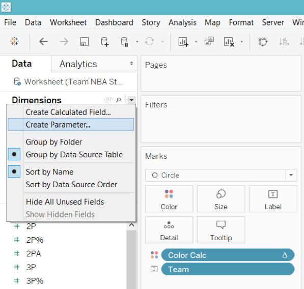
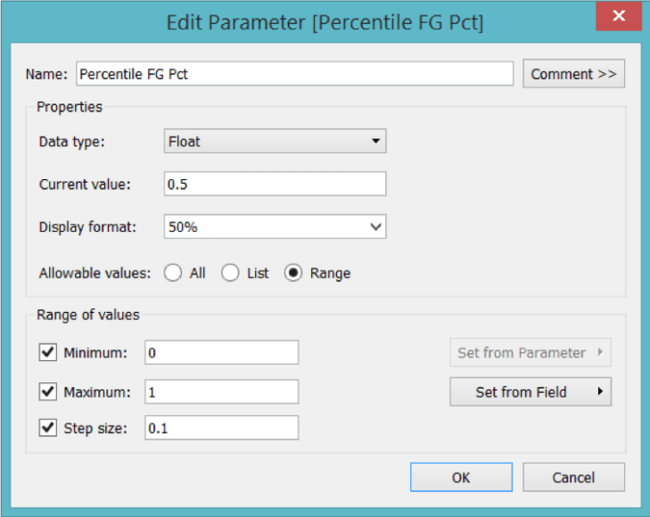
- Create a parameter named “Percentile FG Pct” (without quotes). Select the dropdown triangle next to “Find Field” icon and choose “Create Parameter”.
Make sure your parameter is setup as a “Float” and the Range of values reflects the picture below. The Display Format will be set as “Percentage” with zero decimal places.
Step 3: Duplicate Your Parameter
- Right click on your new parameter and select “Duplicate”.
- Right click on “Percentile Wins” and select “Edit”.
- Name the new parameter “Percentile Wins”.
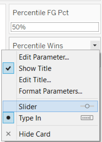
Step 4: Show the Parameters Controls
- Right click on each parameter and select “Show Parameter Control”.
- Right click on each drop down triangle in the upper right corner of the Parameter Control and select “Slider”.
Step 5: Add Reference Lines
- Right click on the Percentile of FG% Axis at the bottom of the viz. Select “Add Reference Line”. The Line Value should refer to the X axis parameter (i.e. Percentile FG Pct). For the Line Formatting I choose the third dashed lined option.
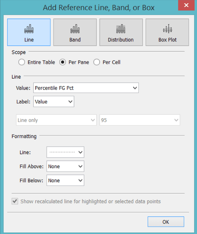
- Right click on the Percentile of Wins Axis on the left side of the viz. Select “Add Reference Line”. The Line Value should refer to the Y axis parameter (i.e. Percentile of Wins).
At this point you should have two parameter controls that adjust the placement of the respective reference lines on the visualization.
However, you’ll notice that the colors of the marks do not change as the reference lines move in increments.
Step 6: Edit the original calculated field to use parameters instead of hardcoded percentage values
Right click on the calculated field (i.e. “Color Calc” in my case), select “Edit” and change all references of “.5” to the corresponding parameter name.
- The original calculated field:
IF RANK_PERCENTILE(SUM([FG%])) >= .5 AND RANK_PERCENTILE(SUM([Wins])) >= .5 THEN ‘TOP RIGHT’
ELSEIF RANK_PERCENTILE(SUM([FG%])) < .5 and RANK_PERCENTILE(SUM([Wins])) >= .5 THEN ‘TOP LEFT’
ELSEIF RANK_PERCENTILE(SUM([FG%])) < .5 and RANK_PERCENTILE(SUM([Wins])) < .5 THEN ‘BOTTOM LEFT’
ELSEIF RANK_PERCENTILE(SUM([FG%])) >= .5 and RANK_PERCENTILE(SUM([Wins])) < .5 THEN ‘BOTTOM RIGHT’
ELSE ‘OTHER’
END
Is edited to become:
IF RANK_PERCENTILE(SUM([FG%])) >= [Percentile FG Pct] AND RANK_PERCENTILE(SUM([Wins])) >= [Percentile Wins] THEN ‘TOP RIGHT’
ELSEIF RANK_PERCENTILE(SUM([FG%])) < [Percentile FG Pct] and RANK_PERCENTILE(SUM([Wins])) >= [Percentile Wins] THEN ‘TOP LEFT’
ELSEIF RANK_PERCENTILE(SUM([FG%])) < [Percentile FG Pct] and RANK_PERCENTILE(SUM([Wins])) < [Percentile Wins] THEN ‘BOTTOM LEFT’
ELSEIF RANK_PERCENTILE(SUM([FG%])) >= [Percentile FG Pct] and RANK_PERCENTILE(SUM([Wins])) < [Percentile Wins] THEN ‘BOTTOM RIGHT’
ELSE ‘OTHER’
END
In the above formula both [Percentile FG Pct] and [Percentile Wins] are parameter values that have replaced the hardcoded values of “.5”.
Final Result:
As you change your parameter values on the parameter control, the corresponding reference line moves and the color of each mark changes automatically to fit its new quadrant.
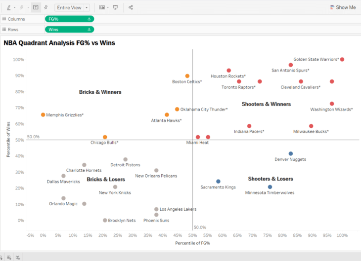
Before w/ Static Quadrants
Notice how the marks are colored according to their respective quadrant in the screen print below.
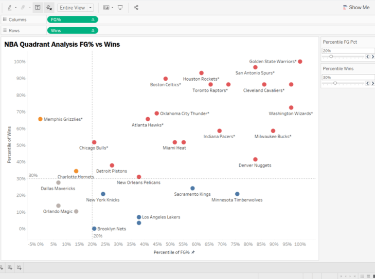
After w/ Parameter Driven Quadrants
I hope you enjoyed this tip. Now, get out there and do some good things with your data!
Anthony Smoak

[…] sure to check out part 2 of this series where I will show you how to make the quadrant boundaries […]
LikeLike
Hello, how can you do it with colouring the background and not the numbers? For example, if I have a scatterplot and then I want to switch to various months, then I’d like the axis to be readjusted to 50% and colour the background area
LikeLike