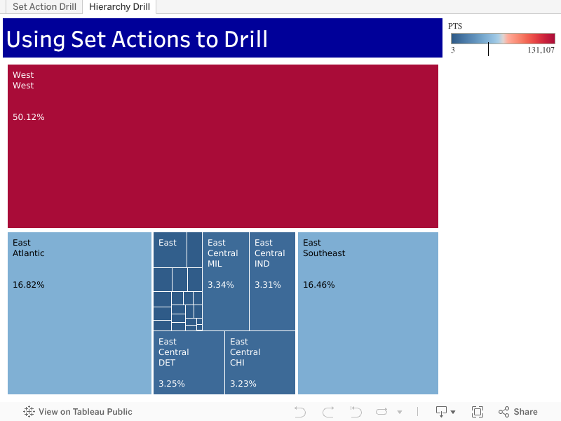
If you’ve ever tried to use the default drill functionality within Tableau, you know that it could be a more user friendly experience. The default table drill functionality opens all of the options at the next drill level which can force a user to lose sight of the data upon which they’re focusing. A more user-friendly option enables the user to only drill into a specific selected value where focus and attention can be maintained. This is otherwise known as asymmetric drill down.
Fortunately as of version 2018.3, Tableau has added Set Actions as a new functionality. At a high level, developers can take an existing set and update its values based upon a user’s actions in the visualization. The set can be employed via a calculated field within the visualization, via direct placement in the visualization or on the marks card property.
In lay terms this means empowering a user with more interactivity to impact their analyses.
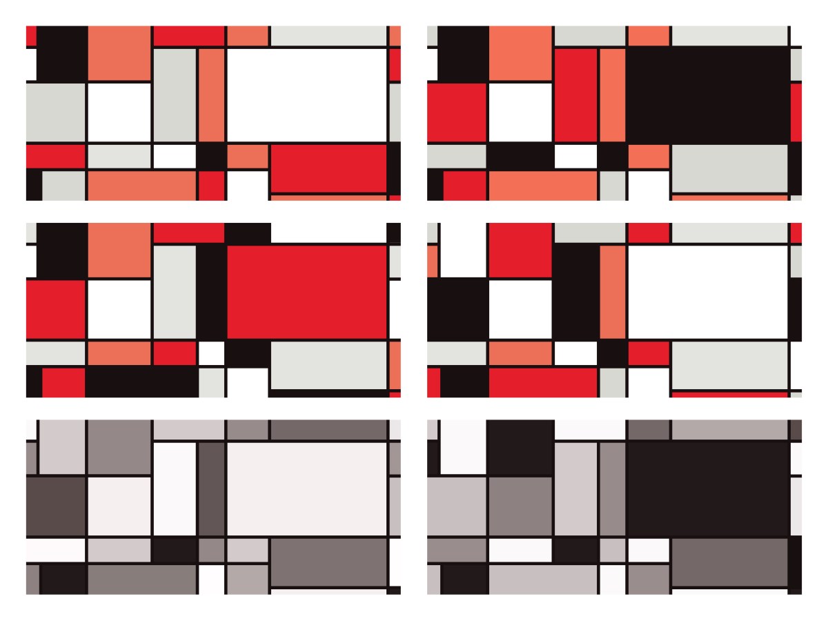
In this first video, I’ll demonstrate a use of set actions on an NBA data set. We’ll drill from Conference to Division to Team to Player. This tip will be easily applicable to your Tableau data. And with the bonus tree-map tip you’ll release your inner Piet Mondrian.
Feel free to interact with the set action example on Tableau Public and then download and dissect the workbook.
Drilling with Level of Detail (LOD) Calculations
If you want to stay with a classic approach, a nice Level of Detail (LOD) workaround can be employed to drill into the next level. Here is a tip that accomplishes a similar outcome where I demonstrate a technique originally presented by Marc Rueter at Tableau Conference 2017.
Now that I’ve equipped you with the knowledge to incorporate customized drilling functionality into your analyses, go forth and do some great things with your data!
In this video we will learn to add a “Filters in Use Alert” to a Tableau Dashboard. If you have a dashboard with multiple filters, apply this quick and easy tip to inform your users that filters are in play. This tip builds upon the dashboard that I showcased recently in a previous post: Add a Reset All Filters Button to Your Tableau Dashboard.
I learned this current tip from a presentation given by Tableau Zen Master Ryan Sleeper, so I have to give credit where credit is due.
If you’re interested in Business Intelligence & Tableau subscribe and check out my videos either here on this site or on my Youtube channel.
In this video I demonstrate a couple of methods that will display the total values of your stacked bar charts in Tableau. The first method deals with a dual axis approach while the second method involves individual cell reference lines. Both approaches accomplish the same objective. Hope you enjoy this tip!
If you’re interested in Business Intelligence & Tableau subscribe and check out my videos either here on this site or on my Youtube channel.
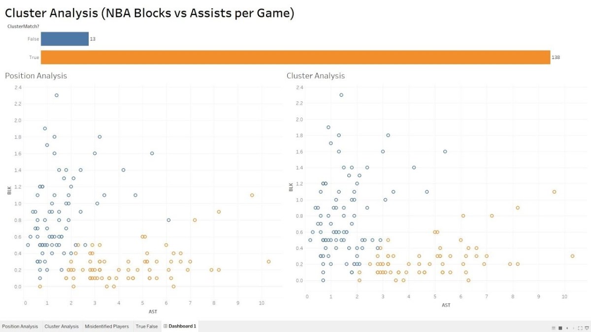
In this video we will explore the Tableau K-Means Clustering algorithm. K-Means Clustering is an effective way to segment your data points into groups when those data points have not explicitly been assigned to groups within your population. Analysts can use clustering to assign customers to different groups for marketing campaigns, or to group transaction items together in order to predict credit card fraud.
In this analysis, we’ll take a look at the NBA point guard and center positions. Our aim is to determine if Tableau’s clustering algorithm is smart enough to categorize these two distinct positions based upon a player’s number of assists and blocks per game.
Nicola Jokic is a Statistical Unicorn
If you also watch the following video you’ll understand why 6 ft. 11 center Nikola Jokic is mistakenly categorized as a point guard by the algorithm. This big man can drop some dimes!
If you’re interested in Business Intelligence & Tableau subscribe and check out my videos either here on this site or on my Youtube channel.
In honor of National Doughnut Day (June 1st), let’s devour this sweet Tableau tip without worrying about the calories. In this video I we will create a multiple donut chart visualization that will display the sum of profits by a region. Then we’ll use the donuts as a filter for a simple dashboard. Once you finish watching this video you’ll know how to create and use donut charts as a filter to other information on your dashboard.
I know that donuts are not considered best practice, (especially when negative numbers are involved) but they have their uses. Assuming you know that bar charts are a best practice, it never hurts to learn other techniques that add a little “flair” from the boring world of bar charts.
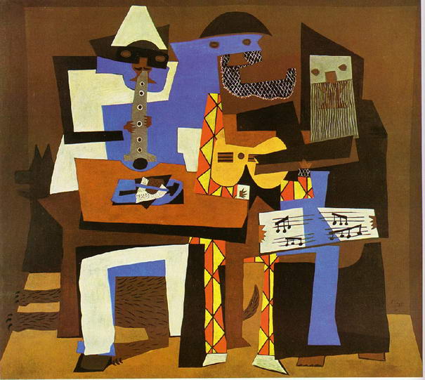
Have you ever looked at a Picasso painting? Obviously Picasso was well versed in painting best practices (understatement) but in some of his art, the people are not rendered in the best practice. Always learn the best practices, but know when to leave them behind and add a little flair! (In no way am I comparing myself to Picasso).
Three Musicians – Pablo Picasso
Three Musicians by Picasso is not best practice but it is a work of art!
If you’re interested in Business Intelligence & Tableau subscribe and check out my videos either here on this site or on my Youtube channel.
In this video I will explain the concept of jittering and how to use it to scatter your data points in Tableau. In a normal box plot Tableau data points are stacked on top of each other which makes it more difficult to understand positioning. By using this simple tip combining a calculated field a parameter, you will be on your way to gaining a better understanding of your data points. We’re going to get our “Moneyball” on by analyzing average NBA player points per game in the 2016 season.
If you’re interested in Business Intelligence & Tableau subscribe and check out my videos either here on this site or on my Youtube channel.
Click on the picture to Interact with this visualization:
Help users navigate your Tableau dashboard with less effort. In this video I will show you how to create a “Reset All Filters” button on a Tableau dashboard. We achieve the desired effect by using a Tableau action that runs on select of a mark.
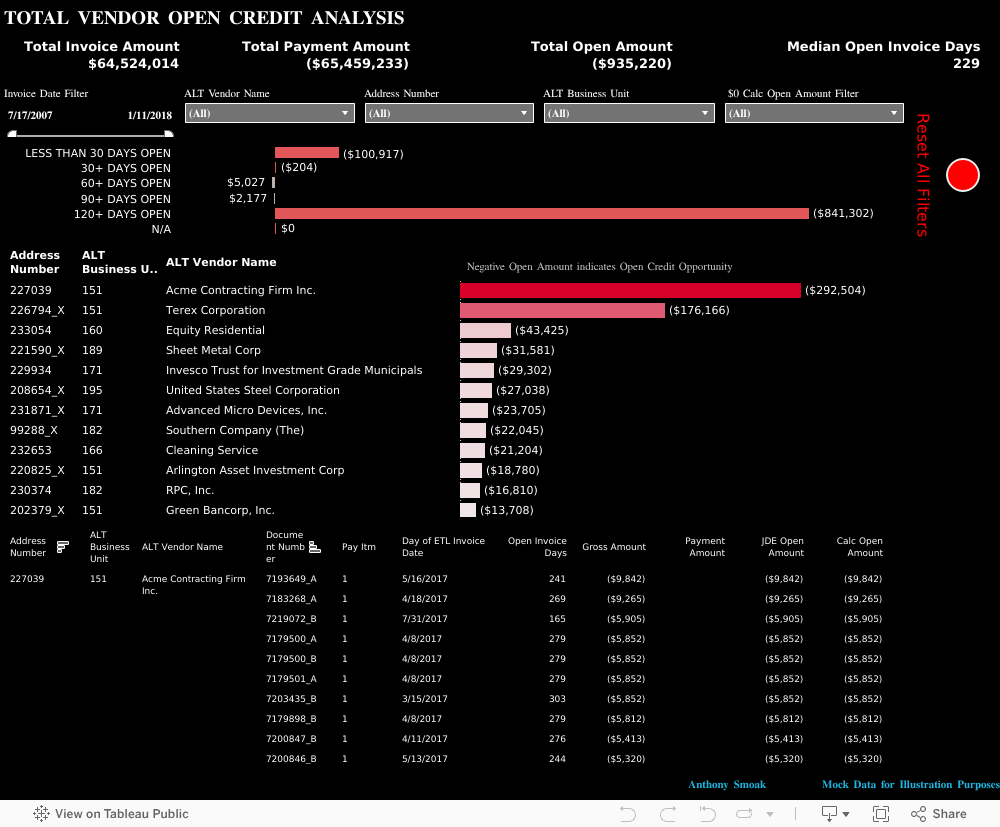
The data I am using for illustration purposes is primarily sourced from Mockaroo.com and is loosely based upon data from an actual client of mine. All vendor names, dates, amounts and other data are changed substantially from original form. Feel free to contact me if you need an analysis of your Accounts Payable ERP data from PeopleSoft, JD Edwards or any other source!
If you’re interested in Business Intelligence & Tableau subscribe and check out my videos either here on this site or on my Youtube channel.
There are may different ways to create a hex map in Tableau. The hex map helps visualize state geographic data at the same size which helps to overcome discrepancies that make smaller states harder to interpret. Also, larger states (e.g. Alaska) can overwhelm a traditional map with their size.
I’ve found that the quickest and easiest way to build a hex map is to leverage a pre-built shape file. Shape files can be found at various open data sources like census.gov or data.gov.
In this video I will use a shape file created by Tableau Zen Master Joshua Milligan who runs the blog vizpainter.com. He has a blog post where you can download the shape file I reference. Hats off to Joshua for creating and sharing this great shape file!
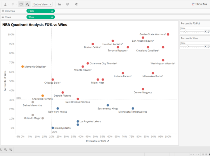
There are a couple of tweaks that can be made to the Quadrant Analysis video I showed you earlier. We can enhance upon the first iteration of the analysis by making the visualization interactive. I will create parameter driven quadrants where the reference lines are not static at a 50% intersection.
You can tweak the instructions to suit your actual visualization as necessary, but the concepts will remain the same.
We’re going to create two new parameters and have those parameters dynamically control the placement of our reference lines. Then we’re going to update the calculated field which defines the color of each data point or mark, with the parameters we created. In this manner, the colors of each mark will dynamically update as the references lines are adjusted.
To put this in English, as you change the parameter values, the reference lines will move and the mark colors will update.
Watch the video above and/or follow along with the instructions below.
Remove Existing Reference Lines:
Step 1:
Remove all existing reference lines from the original quadrant analysis. Simply right click on a reference line and select “Remove”.
Also remove the annotations from the 4 quadrants.
Create Parameters
Step 2:
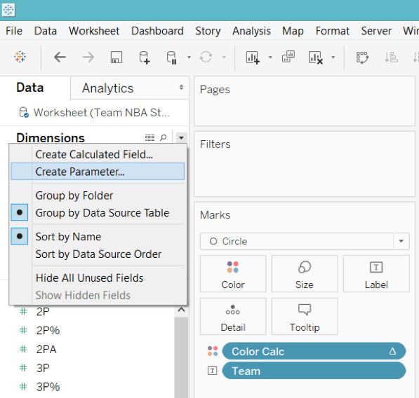
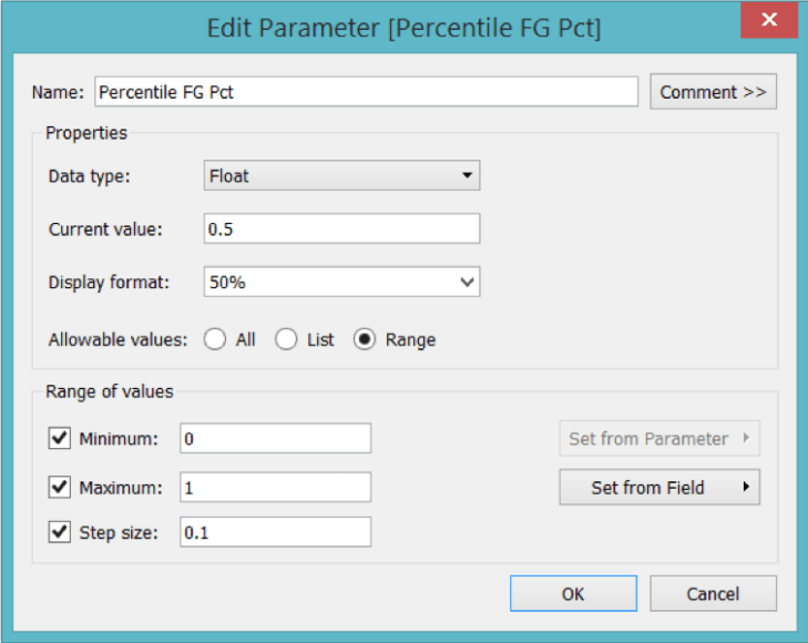
Create a parameter named “Percentile FG Pct” (without quotes). Select the dropdown triangle next to “Find Field” icon and choose “Create Parameter”.
Make sure your parameter is setup as a “Float” and the Range of values reflects the picture below. The Display Format will be set as “Percentage” with zero decimal places.
Step 3: Duplicate Your Parameter
Right click on your new parameter and select “Duplicate”.
Right click on “Percentile Wins” and select “Edit”.
Name the new parameter “Percentile Wins”.
Step 4: Show the Parameters Controls
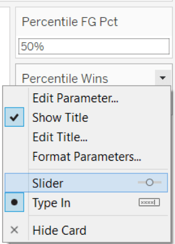
Right click on each parameter and select “Show Parameter Control”.
Right click on each drop down triangle in the upper right corner of the Parameter Control and select “Slider”.
Step 5: Add Reference Lines
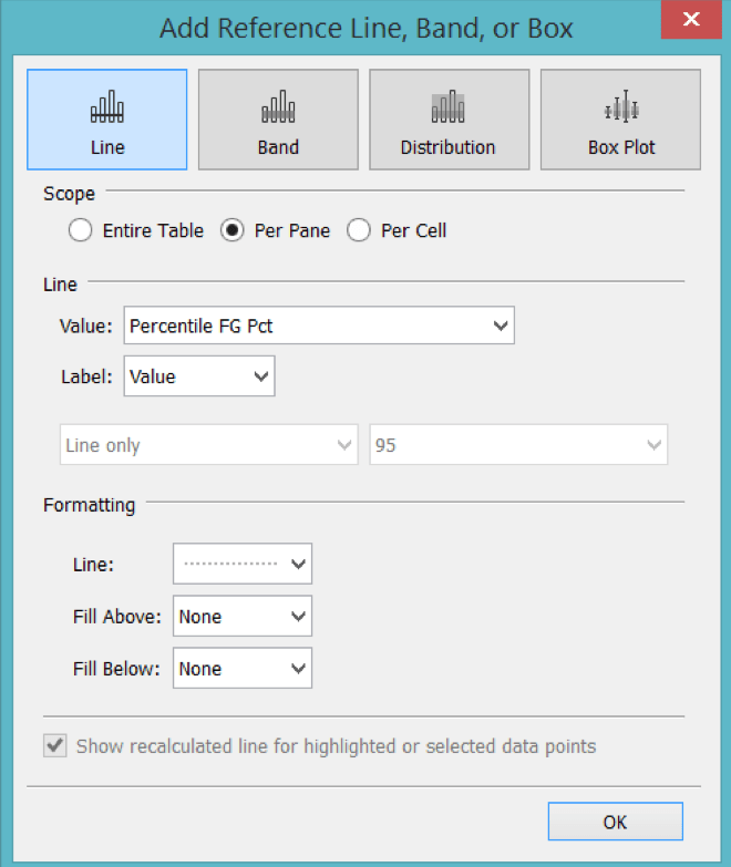
Right click on the Percentile of FG% Axis at the bottom of the viz. Select “Add Reference Line”. The Line Value should refer to the X axis parameter (i.e. Percentile FG Pct). For the Line Formatting I choose the third dashed lined option.
Right click on the Percentile of Wins Axis on the left side of the viz. Select “Add Reference Line”. The Line Value should refer to the Y axis parameter (i.e. Percentile of Wins).
At this point you should have two parameter controls that adjust the placement of the respective reference lines on the visualization.
However, you’ll notice that the colors of the marks do not change as the reference lines move in increments.
Step 6: Edit the original calculated field to use parameters instead of hardcoded percentage values
Right click on the calculated field (i.e. “Color Calc” in my case), select “Edit” and change all references of “.5” to the corresponding parameter name.
The original calculated field:
IF RANK_PERCENTILE(SUM([FG%])) >= .5 AND RANK_PERCENTILE(SUM([Wins])) >= .5 THEN ‘TOP RIGHT’
ELSEIF RANK_PERCENTILE(SUM([FG%])) < .5 and RANK_PERCENTILE(SUM([Wins])) >= .5 THEN ‘TOP LEFT’
ELSEIF RANK_PERCENTILE(SUM([FG%])) < .5 and RANK_PERCENTILE(SUM([Wins])) < .5 THEN ‘BOTTOM LEFT’
ELSEIF RANK_PERCENTILE(SUM([FG%])) >= .5 and RANK_PERCENTILE(SUM([Wins])) < .5 THEN ‘BOTTOM RIGHT’
ELSE ‘OTHER’
END
Is edited to become:
IF RANK_PERCENTILE(SUM([FG%])) >= [Percentile FG Pct]AND RANK_PERCENTILE(SUM([Wins])) >= [Percentile Wins] THEN ‘TOP RIGHT’
ELSEIF RANK_PERCENTILE(SUM([FG%])) < [Percentile FG Pct] and RANK_PERCENTILE(SUM([Wins])) >= [Percentile Wins] THEN ‘TOP LEFT’
ELSEIF RANK_PERCENTILE(SUM([FG%])) < [Percentile FG Pct] and RANK_PERCENTILE(SUM([Wins])) < [Percentile Wins] THEN ‘BOTTOM LEFT’
In the above formula both [Percentile FG Pct] and [Percentile Wins] are parameter values that have replaced the hardcoded values of “.5”.
Final Result:
As you change your parameter values on the parameter control, the corresponding reference line moves and the color of each mark changes automatically to fit its new quadrant.
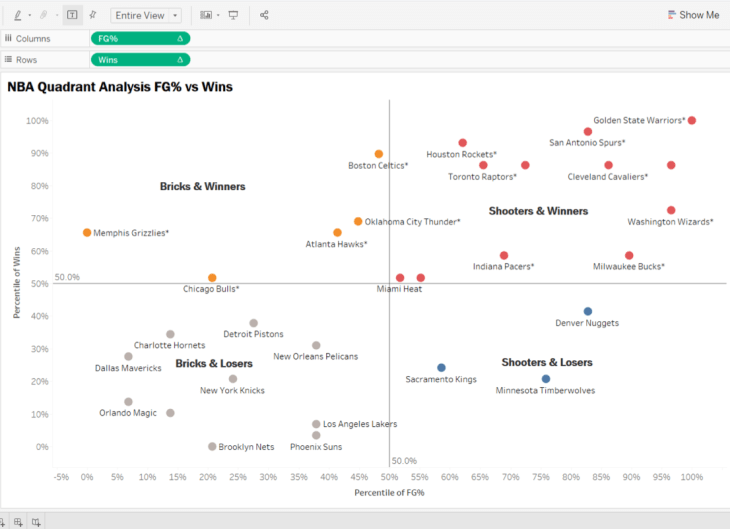
Before w/ Static Quadrants
Notice how the marks are colored according to their respective quadrant in the screen print below.
After w/ Parameter Driven Quadrants
I hope you enjoyed this tip. Now, get out there and do some good things with your data!
Release your inner Gartner and learn how to create a 2×2 matrix in Tableau. In this video I will perform a quadrant analysis in Tableau using NBA data to plot FG% vs Wins. Since the data points will be compact, we’ll use percentiles to expand the data and create a calculated field to color the data points per respective quadrant.
Make sure to check out part 2 of this series where I will show you how to make the quadrant boundaries interactive.
If you’re interested in Business Intelligence & Tableau subscribe and check out my videos either here on this site or on my Youtube channel.