Tableau Sales Dashboard Tutorial using Table Calculations

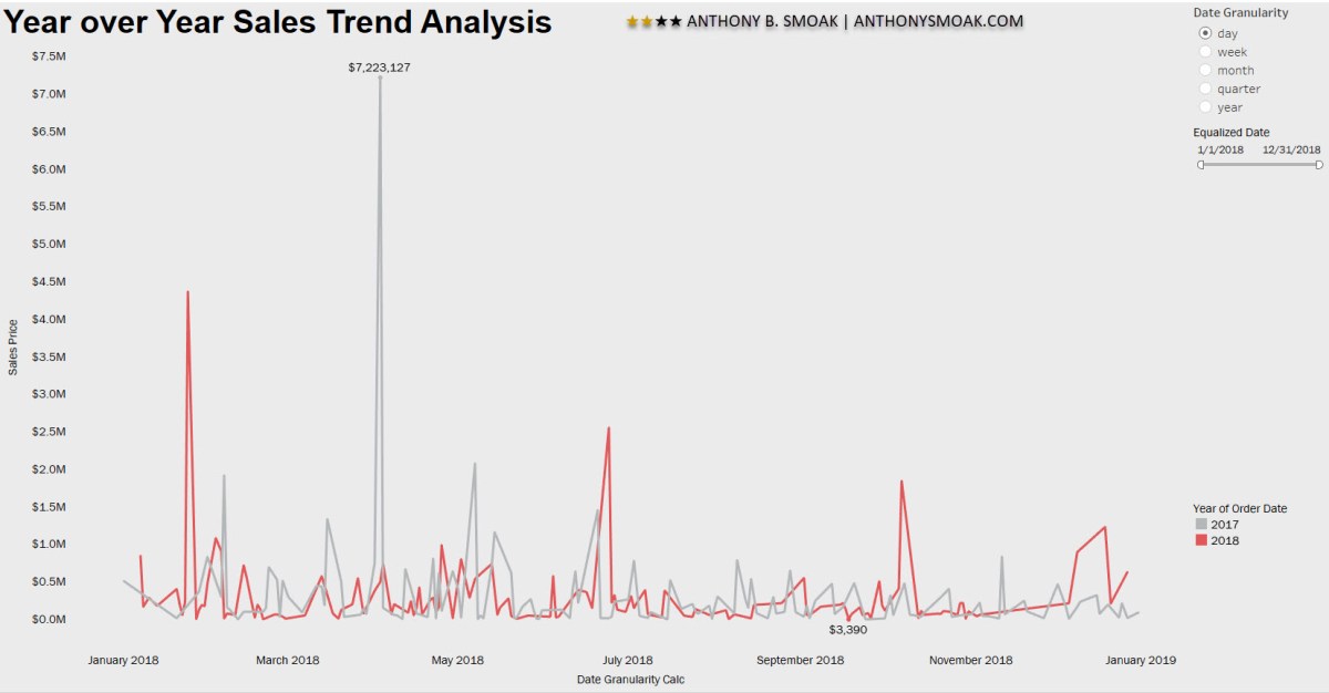
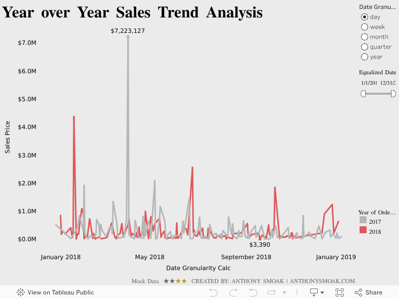
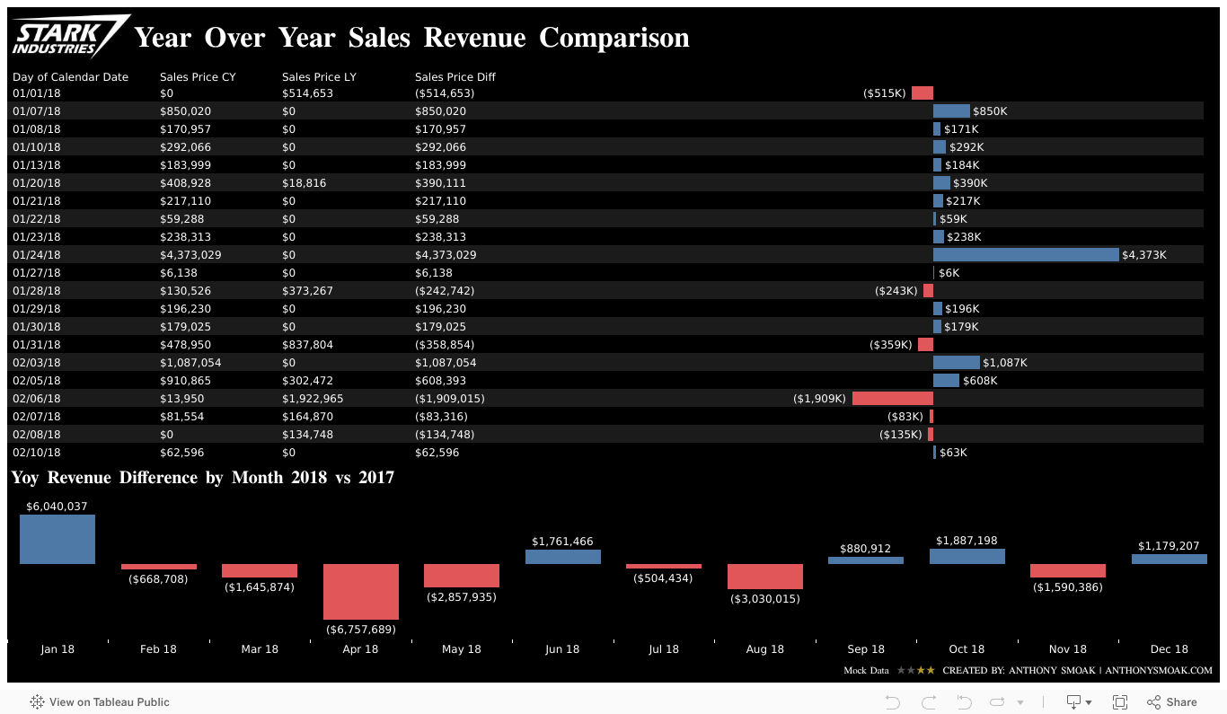
In this Tableau data visualization tutorial, we’ll learn to use the LOOKUP table calculation function to return sales revenue for the same day last year. A number of different techniques are used in the creation of this dashboard.

I designed this dashboard solely as a teaching exercise to help you understand the LOOKUP function and how to show the same date last year in a separate column.

  • As we learned in a previous video Tableau Table Calculations Simplified, (make sure to watch this video afterwards for more clarity), we’ll compute using specific dimensions and then use “At the level” to make sure our LOOKUP table calculation is performing correctly.
  • The “Show Missing Values” option is selected to fill in date gaps in the data set that do not exist. Ensuring 365 dates per year are present in the visualization enables the offset (i.e., -1) in the LOOKUP calculation to arrive at correct sales revenue from the same day in the previous year.
  • You’ll learn that we can filter on a table calculation by using another table calculation. Filters based on table calculations do not filter out underlying data. Instead, the data is hidden from the view, allowing dimension members to be hidden from the view without impacting the data in the view.

Tableau Order of Operations

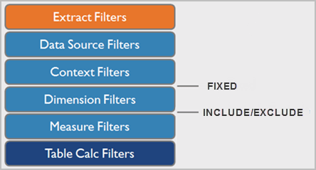
Observe the Tableau filter order of operations above. Applying a dimension filter before the Table Calculation filter removes underlying data which affects the proper functioning of Table calculations. Typically, Table Calculations only work on values that are visible in the view. By applying a table calculation (which is last in the order of operations) you preserve underlying data but filter out data from the view.

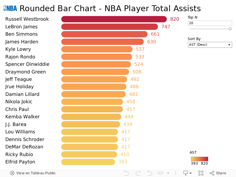
Interact with this dashboard via the picture link:

You need to read these posts and watch these videos for additional information:

As always, If you find this type of instruction valuable make sure to subscribe to my Youtube channel.

All views and opinions are solely my own and do NOT necessarily reflect those of my employer.

Tableau Sales Dashboard Tutorial: Year Over Year Comparison

In this Tableau data visualization tutorial I used a technique shared by Tableau Zen Master Ryan Sleeper to “equalize” dates across the same axis. This date equalization calculated field enables year over year, quarter over quarter, month over month, week over week and same day last year comparisons.

MAKEDATE(2018,MONTH([Your Date]), DAY([Your Date]))

Equalizer 2

Call in The Equalizer for this Analysis

It’s a pretty clever way of preserving the same month and day of date values across many years and updating their respective years to one common year.

For example, all dates would retain their current month and day but would share the year value of ‘2018’. In this manner, data points from various years can be stacked on top of each other for comparison purposes.


Additionally, by creating a parameter value for a specific date part (i.e., year, month, week, etc.,) the user has control over the level of comparisons in the visualization.

You’ll have to watch the video to see the details. Again, thanks to Ryan Sleeper for sharing this tip with the Tableau community which enabled me to apply it to my dataset and share it with you in video form.

As always, If you find this type of instruction valuable make sure to subscribe to my Youtube channel.

All views and opinions are solely my own and do NOT necessarily reflect those of my employer.

Tableau Dashboard Tutorial: Dot Strip Plot

In this video tutorial I describe a dashboard that I put together that displays the distribution of various NBA player statistics. I use the always handy parameter to enable the user to choose which statistics are displayed on the dashboard. Although I’m showing sports statistics measures in this dashboard, it could easily be repurposed to show the distribution of a variety of business related metrics.

I break the dashboard up into three areas: histogram, dot strip plot, and heat map. In the second part of the video, I describe in detail how to build out a jittered dot strip plot. The benefit of the jittered dot strip plot is that the marks representing NBA players obstruct each other much less as compared to the linear dot strip plot.

Techniques used in the dashboard were previous outlined in my Ultimate Slope Graph and How to Use Jittering in Tableau (Scattered Data Points) posts.

Feel free to head to my Tableau Public page and download the workbook for yourself. Drop me a line in the comments or on YouTube if you learned something.

As always, do great things with your data!

If you find this type of instruction valuable make sure to subscribe to my YouTube channel.

All views and opinions are solely my own and do NOT necessarily reflect those of my employer.

Create Rounded Bar Charts in Tableau

Part 1: How to Make Rounded Bar Charts in Tableau

In this post you’re getting two videos for the price of one (considering they’re all free for now, that’s a good thing). I put together a relatively simple dashboard to help illustrate a few intermediate level concepts. In this first video I take a look at the number of total assists by NBA players during the 2017-2018 season. In case you were wondering, Russell Westbrook led the league in assists during that season. If you don’t know who Russell Westbrook is, then skip this Tableau stuff and watch the last video immediately (and then come back to the Tableau stuff).

In the first Tableau dashboard video, you’ll learn two concepts:

  • How to make rounded bar charts;
  • How to filter the number of bar chart marks via use of a parameter;

Part 2: Apply Custom Sorting in Tableau

In the second video I build upon the dashboard built in the first video by showing you how to add a custom sort. The custom sort relies upon the creation of a parameter and a calculated field. The parameter and calculated field enable the user to select either a dimension (e.g., Player Name) or a measure (e.g., sum of assists) from a drop down box and the visualization will sort ascending or descending as requested.

The calculated field relies upon the RANK_UNIQUE function.

In this context, RANK_UNIQUE returns the unique rank of each player’s assist total. The key with RANK_UNIQUE is that identical values are assigned different ranks. As an example, the set of values (6, 9, 9, 14) would be ranked (4, 2, 3, 1), as no tied rankings are allowed.

Part 3: Interact with the Dashboard

Bonus: Russell Westbrook on the Attack

For those of you who do not know who Russell Westbrook is, I’ve got you covered. These aren’t assists but in these situations, he didn’t need to pass!

References:

Thanks to both the Tableau Magic blog for outlining the concept of rounded bar charts and the VizJockey blog for the custom sort methodology. Check out and support these  blogs!

As always, do great things with your data!

If you find this type of instruction valuable make sure to subscribe to my YouTube channel.

All views and opinions are solely my own and do NOT necessarily reflect those of my employer.

Add a “Filters in Use” Alert to Your Tableau Dashboard

In this video we will learn to add a “Filters in Use Alert” to a Tableau Dashboard. If you have a dashboard with multiple filters, apply this quick and easy tip to inform your users that filters are in play. This tip builds upon the dashboard that I showcased recently in a previous post: Add a Reset All Filters Button to Your Tableau Dashboard.

I learned this current tip from a presentation given by Tableau Zen Master Ryan Sleeper, so I have to give credit where credit is due.

If you’re interested in Business Intelligence & Tableau subscribe and check out my videos either here on this site or on my Youtube channel.

Ranking Banks by Number of Complaints

I recently downloaded a dataset from the Consumer Finance Protection Bureau (CFPB) in order to construct a handy visualization. The CFPB maintains a database that houses a collection of complaints on a range of consumer financial products and services that are sent to companies for a response.

Per the CFPB, “the database also includes information about the actions taken by the company in response to the complaint, such as, whether the company’s response was timely and how the company responded.”

Although the database is updated daily, I chose to visualize information from the complete year of 2017. In fairness to the financial institutions, company level information should be considered in context of company size and/or market share.

Financial institutions analyze this information frequently as a way of understanding and continuously improving their customer service.

I highly recommend “The Big Book of Dashboards” by Jeffrey Shaffer, Andy Cotgreave and Steve Wexler. The book contains a number of visualization examples that provide guidance on dashboard creation for any number of business use cases. In this Tableau Public dashboard I relied heavily on the visual guidance for their Complaints Dashboard as you can observe.

Screen Shot 2018-06-03 at 10.02.14 PM

Complaints Dashboard from “The Big Book of Dashboards”

Click on the picture link to view the dashboard on Tableau Public (not optimized for mobile).

Dashboard 1

If you’re interested in Business Intelligence & Tableau subscribe and check out my videos either here on this site or on my Youtube channel.

Add a Reset All Filters Button to Your Tableau Dashboard

Click on the picture to Interact with this visualization:

Help users navigate your Tableau dashboard with less effort. In this video I will show you how to create a “Reset All Filters” button on a Tableau dashboard. We achieve the desired effect by using a Tableau action that runs on select of a mark.

The data I am using for illustration purposes is primarily sourced from Mockaroo.com and is loosely based upon data from an actual client of mine. All vendor names, dates, amounts and other data are changed substantially from original form. Feel free to contact me if you need an analysis of your Accounts Payable ERP data from PeopleSoft, JD Edwards or any other source!

If you’re interested in Business Intelligence & Tableau subscribe and check out my videos either here on this site or on my Youtube channel.