Use Parameters in Tableau to Enhance Your Tables

When you receive a requirement to make a boring Excel style table in Tableau, consider spicing up the table by incorporating parameters. One clever use of parameters enables you to incorporate user defined rows and columns into a Tableau table layout. As a user selects a parameter value (representing a column or row), the table is dynamically updated to show the column or row that was selected.

“Parameters are useful when you want to add interactivity and flexibility to a report, or to experiment with what-if scenarios. Suppose you are unsure which fields to include in your view or which layout would work best for your viewers. You can incorporate parameters into your view to let viewers choose how they want to look at the data.

When you work with parameters, consider the following two things that are important in making them useful:

They need to be used in calculations.
The parameter control needs to be displayed so that viewers can interact with it.”

In this video I will show you how to infuse an otherwise boring table with some parameter driven interactivity. Enjoy!

Reference: Tableau Online Help

Benford’s Law Visualization in Tableau

Benford’s law, also called the first-digit law, is an observation about the frequency distribution of leading digits in sets of numerical data. The law states that in many naturally occurring collections of numbers, the leading significant digit is likely to be small [1]. For example, in sets that obey the law, the number 1 appears as the most significant digit about 30% of the time, and the percentages decrease all the way down to a leading digit of 9, which appears 4.6% of the time.

Why Run This Analysis?

When fraudsters are fabricating data, they may not know to manufacture fake data in a manner that conforms to Benford’s Law.  Constructing a Benford’s Law visualization in Tableau can help you determine if your numerical data is fake or at least raise doubts about its authenticity.

In short, remember that one isn’t always the loneliest number!

If you’re interested in Business Intelligence & Tableau subscribe and check out all my videos either here on this site or on my Youtube channel.

[1] https://en.wikipedia.org/wiki/Benford%27s_law


Use Separate Legends in Tableau (Distinct Column Coloring)

Here’s a handy tip for Tableau 10.2 and above. Learn to create an individual color legend for each measure in the view and then assign a different color palette to each column. This was very difficult to do prior to Tableau 10.2 but now you can apply different color palettes to individual columns with ease!

If you need to know how to apply conditional color formatting to dimensional values watch this video: How to Conditionally Format Text Cell Color in Tableau

If you’re interested in Business Intelligence & Tableau subscribe and check out all my videos either here on this site or on my Youtube channel.

How to Conditionally Format Text Cell Color in Tableau


Even though Excel and Tableau are far from the same tool, sometimes you have to find a way to force Tableau to behave in an Excel-like manner. Conditionally changing the background color of text in Excel is very easy but requires a hack in Tableau 10.3. Use my video to learn how to conditionally format the cell background of a text or dimensional value in Tableau. Trust me, this is a time saver!

If you’re interested in Business Intelligence & Tableau subscribe and check out my videos either here on this site or on my Youtube channel.

Create a Map with Multiple Layers in Tableau

In this video you’ll learn how to create a map with multiple layers in Tableau using Tableau’s included superstore data set.

  1. We’ll start by building a filled map that represents the profit by state.
  2. We’ll layer on top of this map a pie chart that breaks down Sales by Category.
  3. As a bonus tip we’ll touch upon the FIXED Level of Detail (LOD) expression in order to calculate a percentage of sales by state and category for the pie chart.

If you’re interested in Business Intelligence & Tableau please subscribe and check out my videos either here on this site or on my Youtube channel.

Create a Gantt Chart in Tableau


Learn to create a Gantt Chart in Excel following the steps I laid out in the above video. In case your tool of choice is Excel, check out my other video on how to create a Gantt Chart in Excel. Your inner project manager will thank you!

If you’re interested in Business Intelligence & Tableau subscribe and check out my videos either here on this site or on my Youtube channel. You will be smarter for it!


Coursera Review: Creating Dashboards and Storytelling with Tableau

Discounts Harm Profits

I recently finished the “Creating Dashboards and Storytelling with Tableau” course on Coursera. The course was taught by adjunct faculty at the University of California Davis. Although it is the fourth course of five in the “Data Visualization with Tableau” specialization, it is only the third course that I have taken. I skipped the very basic first course and will concentrate next on finishing the capstone. 

If you do take this course be prepared to put in a fair amount of work on weeks three and four when the dashboard and story project are respectively due. I put in at least five hours of effort on each individual assignment not including watching videos, reading materials and taking quizzes.

I found the storytelling course to be informative and worthwhile. Unlike a Udemy course on Tableau that wades right into the applied aspects of clicking and dragging items, Coursera courses offer more of an academic background on the subject matter.

The point of this course is to hammer home that stories provide context and meaning that can’t be matched by a list of facts. We’re informed that stories engage more of your brain than simply absorbing a list of facts.

We learn that you should always try to make your stories relatable to the viewer so that they personally connect or identify with some aspect of the story. You should find a specific story of a person who exemplifies the larger narrative rather than starting with a lot of general facts and figures.

Politicians employ this tactic all of the time. Instead of spouting off a list of facts about their particular issue, the politician will first paint a picture regarding Joe the small businessman or Jill the single mom. They’ll then discuss how legislation (or lack thereof) will affect their constituents particular situations; in the hope that the listener will relate to the individuals. This is an exercise in using the particular to illuminate the general.

Here are a few of the tips I learned in regard to telling stories with data:

  • Use time based trends and consider a line or bar graph depending upon the data;
  • Use rank ordering (e.g. use a bar graph to rank salespersons by sales);
  • Use data comparisons where appropriate (e.g. polling data showing candidate support over a period of time);
  • Use counter intuitive visualizations (e.g. most people are surprised to learn that the United States has the highest incarceration rate by far amongst OECD countries);
  • Tell stories through relationships (e.g. use scatterplots to illustrate the relationship between sales and profits);
  • Check your facts;
  • Focus on a key statistic or intriguing piece of information;
  • Make your story insightful; don’t leave the audience guessing on what you want them to take away form your presentation;
  • Make your story relatable;

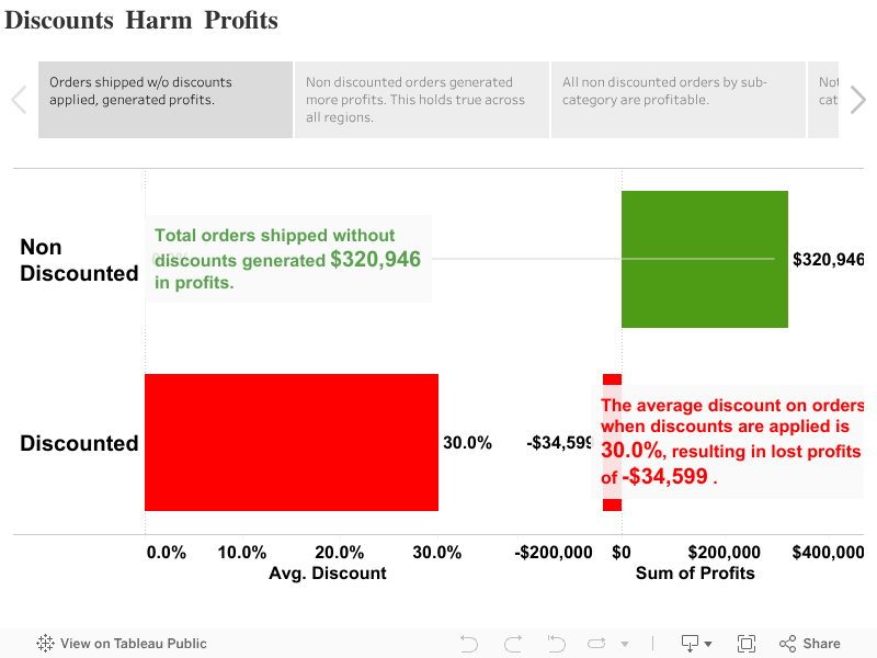
By all means check out my submission for the final project. I illustrated the relationship between discounted orders and profits to show that discounted orders are by far less profitable. This was accomplished by creating a set in Tableau to identify all discounted orders.

Until next class!

See also:

Coursera Final Assignment: Essential Design Principles for Tableau

Coursera Final Project: Data Visualization and Communication with Tableau

How to Build a Waterfall Chart in Tableau

In this video I will show you how to go “Chasing Waterfalls” in Tableau (apologies to TLC). Waterfall charts are ideal for demonstrating the journey between an initial value and an ending value. It is a visualization that breaks down the cumulative effect of positive and negative contributions. You’ve probably seen them used in financial statements or at your quarterly town hall meeting. Enjoy!

If you’re interested in Business Intelligence & Tableau please subscribe and check out my videos either here on this site or on my Youtube channel.

How to Highlight the Top 3 Bar Chart Values in Tableau

In this video I will show you how to highlight the top three highest sales values on a bar chart. I will also teach you how to add a nested dimension and properly sort the values while keeping the top three values highlighted. Enjoy!

If you’re interested in Business Intelligence & Tableau please subscribe and check out my videos either here on this site or on my Youtube channel.


Building a Donut Chart in Tableau Using NBA Data

In this video I will show you how to create a donut chart in Tableau. Since a donut chart is essentially a hoop, I put together this quick visualization using NBA data. Visualization aficionados will advise to use pie/donut charts sparingly but they can add value when showing values with respect to the whole. Enjoy!


If you’re interested in Business Intelligence & Tableau please subscribe and check out my videos either here on this site or on my Youtube channel.