Build a Tableau COVID-19 Dashboard

I hope everyone is safe and staying indoors during this challenging time. Like most of you, I find myself with an abundance of weekend time to spend indoors. I’ve used some of this time crafting a dashboard series leveraging the outstanding COVID-19 data hub provided by Tableau.

I did not expect the series to be as popular as it turned out to be, but it is one of my most viewed lessons on YouTube!

Tableau COVID Dashboard GIF

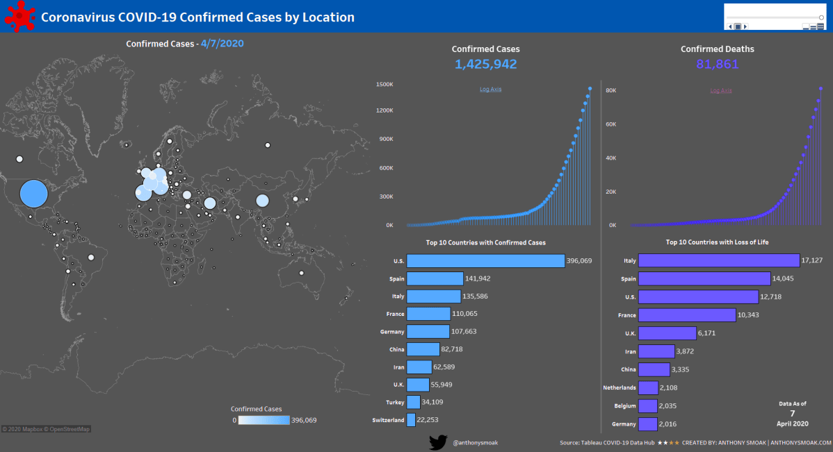
In this set of videos you will learn how to use Tableau and the Johns Hopkins data set which tracks COVID-19 cases across the globe, to assemble a dashboard. The great part about this dashboard is that it can be put together without reliance on overly complex calculations or the need to be a graphic designer, and it looks amazing if I do say so myself.

This dashboard utilizes the Tableau pages functionality to enable animation; as dates change the dashboard updates to reflect the current number of confirmed cases and deaths at that point in time.

Another cool trick is the use of containers to swap visualizations on the same dashboard. I use this functionality to switch between a linear and logarithmic scale for confirmed cases and deaths. You will need at least Tableau 2019.2 to use the sheet swapping functionality.

The first video provides an overview of the Tableau data-set and touches upon the visualizations required to build out the dashboard.

By popular demand, the second video goes more in-depth on the formatting and color scheme of each of the visualizations.

In my opinion the best part of the series is the 3rd video. I spend a full 93 minutes demonstrating various topics on dashboard refinement.

  1. Eliminating the hard-coding and manual sorts using a level of detail calculated field
  2. Detailed formatting with containers (applicable to all dashboards)
  3. Tableau sheet swapping using containers
  4. Making a Tableau Data Connection

When you get through with the first three videos you can opt for bonus material that teaches you how to implement a “bar chart race” aspect to the countries.

Instead of the same countries remaining static, they will move up and down depending upon the number of cases or deaths associated with a particular date.

Tableau COVID Dashboard Pt4 Gif Proj

Learn the Tableau “bar chart race” effect in Part 4 here:

Feel free to interact with the original viz or the Bar Chart Race version on Tableau public:

As always, If you find this type of instruction valuable make sure to subscribe to my Youtube channel.

All views and opinions are solely my own and do NOT necessarily reflect those of my employer.

Build a Power BI Pop Out Slicer

Save more screen for your team! The pop out slicer panel is a perfect way to conserve space while building out your dashboard (i.e., reports) in Power BI desktop. It really is a slick feature that allows you to conserve limited reporting space by hiding your slicers until the user presses a button to reveal your data filtering options.

In this video you can watch me build out the slicer panel step by step using bookmarks, selection panel and buttons.

Power BI Pop Out Slicer (Short GIF)

  • Bookmarks are a configured view of a report page, including filters, slicers, and the state of visuals.
  • The selection panel allows you to show and hide current objects on the current report page.
  • Buttons enable users to hover, click, and further interact with Power BI content

The data sample used for this tutorial is here: https://docs.microsoft.com/en-us/power-bi/sample-financial-download

As always, do great things with your data.

Anthony B. Smoak, CBIP

If you find this type of instruction valuable make sure to subscribe to my Youtube channel.

Check out other Power BI videos of interest definitely worth your time:

All views and opinions are solely my own and do not necessarily reflect those of my employer.

Join my YouTube channel to get access to perks:
https://www.youtube.com/channel/UCL2ls5uXExB4p6_aZF2rUyg/join

How to Drill Through in Power BI

One of the great options available in Power BI is the capability to “drill through” to another report page. In this manner you can focus on a particular entity such as a customer, internal division, supplier or any other dimension of importance.

Different users have different data needs. When designing a dashboard typically the Key Performance Indicators (KPIs) are aggregated at a high level on the initial visualization. This offers executives and management types a “bird’s eye view” of performance.

Personally, I am a fan of BANs (look up the term in a dashboard design context if you are not familiar) when I want to highlight key takeaways.

BANs

Subsequent lower level dashboard pages can offer analysts and others the ability to either explore data with additional interactivity or simply display a static detailed report. The point is to start at a high level and allow your user to drill to a more granular level of data.

In this video I demonstrate the use of the drill through functionality in Power BI. In this scenario, you are the Chief Supply Chain officer trying to gauge your Perfect Order Percentage KPI for several internal divisions. When it’s time to sit down with your four division mangers to discuss their performance on this metric, you want the ability to start at a high level and then drill through to a static report based upon their respective internal divisions or on a specific shipping error.

DrillThrough

Drill through on “In Full Delivery” error category

Do not try and cram every visualization, chart, table or gauge under the sun into a dashboard! Take advantage of drill through functionality and tailor your data presentation for specific user groups. This general concept applies to any data visualization tool, but if you’re using Power BI then this video will help you understand the specific steps required to enable drill through functionality.

I’m frequently questioned where I obtain mock data for my scenarios. My secret source is mockaroo.com which is a great starting point for developing test data.

As always, do great things with your data.

Anthony B. Smoak, CBIP

If you find this type of instruction valuable make sure to subscribe to my Youtube channel.

Check out other Power BI videos of interest definitely worth your time:

All views and opinions are solely my own and do NOT necessarily reflect those of my employer.

How to Create a Dashboard in Tableau

I took the time to produce a dashboard series that would get a relatively new Tableau user up to speed in very little time. I put together the “Goldilocks” videos I wish I had when I was a novice; not too short but long enough to hammer the concepts home.

In the first video, I dive head first into constructing four basic charts that I believe every data user should know how to put together. You will watch me demonstrate how to put together the following charts:

Line Chart with Forecast

Tableau Dashboard Line Chart

The shaded area is a time series forecast predicting the number of orders for the year 2020.

Map

Tableau Dashboard Map

Heat Map

Tableau Dashboard Heat Map

Bar Chart

Tableau Dashboard Bar Chart

In the second video, I’ll cover the layout and formatting of the dashboard, as well as adding a little interactivity. When the user hovers the cursor over the Line Chart, all of the other charts will update to reflect the number of orders represented since the selected month and year.

Full Dashboard

Tableau Dashboard

Watch Part 1 to Build the Component Charts

Watch Part 2 for Layout and Interactivity

What You need:

  • Either Tableau or Tableau Desktop
  • Data set: Tableau Superstore Data (can be found all over the internet with a simple Google search).

Do some great things with your data!

If you find this type of instruction valuable make sure to subscribe to my Youtube channel. All views and opinions are mine alone, independently researched and do not necessarily represent those of my employer.