In this Tableau tutorial I am serving up some delectable waffles in the form of a fast and easy waffle chart. Watch the video to learn the easiest and quickest way to create a waffle chart in Tableau.
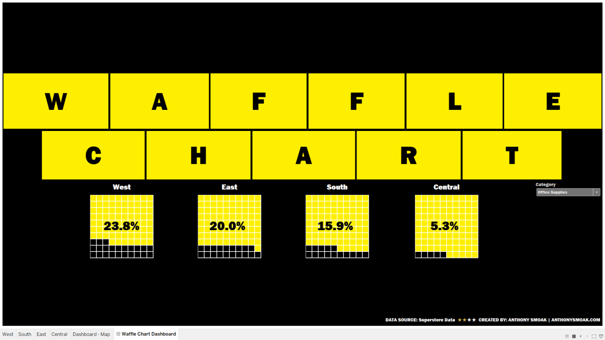
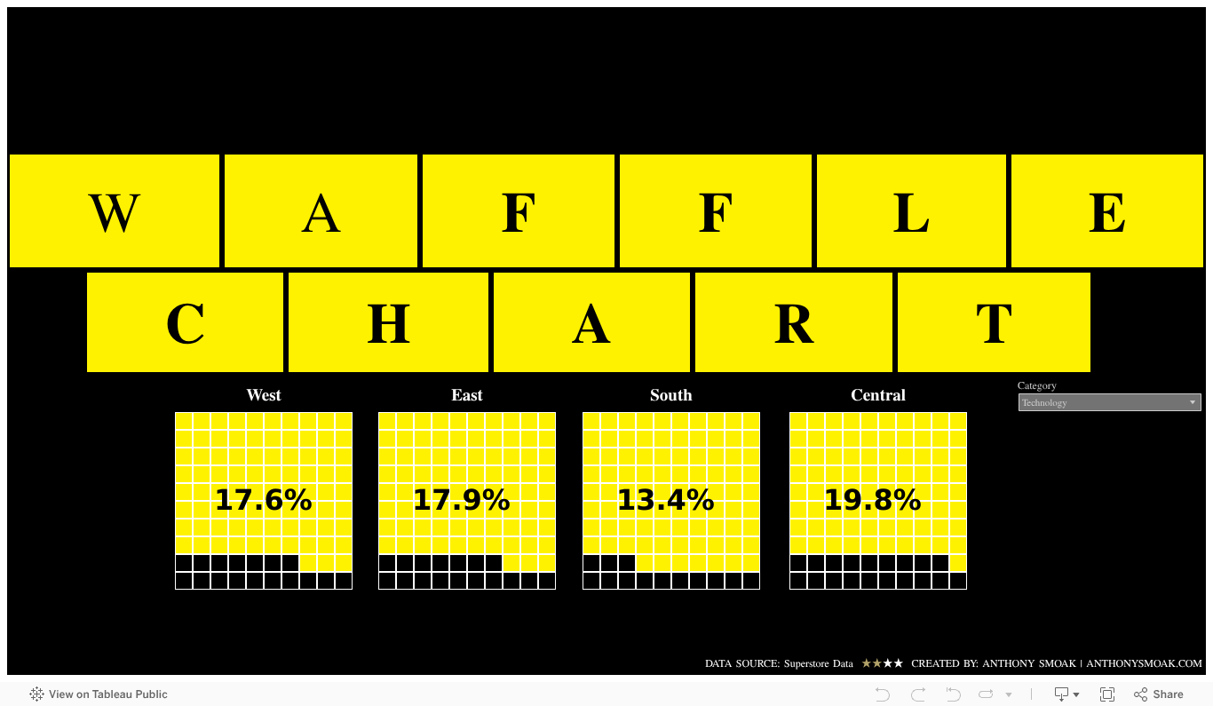
If you’re familiar with the Southeast United States then you know that we love The Waffle House down here. As an homage, I made a simple dashboard in the iconic Waffle House signage style.
A waffle chart depends upon a data connection to the data you wish to visualize and a data connection to the waffle chart template. Once you have these two items setup, you simply create a calculated field that marks the fill percentage in your waffle.
Help yourself to some waffles below:
As always, If you find this type of instruction valuable make sure to subscribe to my Youtube channel.
All views and opinions are solely my own and do NOT necessarily reflect those of my employer.
